


Are you trying to spew those lurker tentacles at us and failing or are you just in a state of constant amazement? 

The shoutbox is unavailable to non-members
Shoutbox History
Are you trying to spew those lurker tentacles at us and failing or are you just in a state of constant amazement?
CGMythology's Sketchbook (nudity)
- cgmythology
-
 Topic Author
- Offline
- Senior Member
-

Attachments:
Please Log in or Create an account to join the conversation.
- cgmythology
-
Topic Author
- Offline
- Senior Member
-
Attachments:
Please Log in or Create an account to join the conversation.

")
Please Log in or Create an account to join the conversation.
- cgmythology
-
Topic Author
- Offline
- Senior Member
-
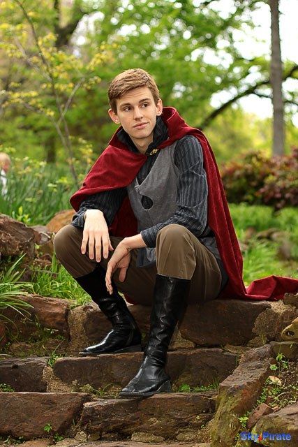
Started on a new illustration, featuring a prince with his mischievous dragon. I'm going for a classical fantasy feel with this one, so I'll likely use some cool colors for the painting process... we'll see! Figure referenced here , tried my best to stay close to the general pose while taking a lot of artistic liberties in regards to his design and overall look. Any feedback would be appreciate it before I try some quick color tests!
Attachments:
Please Log in or Create an account to join the conversation.
- cgmythology
-
Topic Author
- Offline
- Senior Member
-
Attachments:
Please Log in or Create an account to join the conversation.
I think D has the best colour harmony but, as with the previous one, you'll have to be careful to maintain that edge at the top of the head with so many similar hues.
Please Log in or Create an account to join the conversation.
- cgmythology
-
Topic Author
- Offline
- Senior Member
-
.............I proceeded the painting process, combined both A and B for the colors. It's come quite a long way too and I'm pretty happy with how it's shaping up. Any input is welcome as always!
Attachments:
Please Log in or Create an account to join the conversation.
- cgmythology
-
Topic Author
- Offline
- Senior Member
-
Attachments:
Please Log in or Create an account to join the conversation.

For the finished one, I think maybe the shadows should have been a bit deeper under the arm (not sure we should see the cloak all the way to his waist under the arm, but rather part of his waistcoat thingy?) and on the thigh/butt area on our right side. The fabrics look great though, as does his face. The other thing I do react to is the blue glow on the butterflies. I think the front one is a bit too blue and the back ones a bit too dark against the sky: if they glow they shouldn't look like they darken anything. I'd probably lighten the glow, or use a blend mode that lightens it/the colours behind it, so that it actually looks glowy.
Any an all misspellings are henceforth blamed on the cats.
Please Log in or Create an account to join the conversation.
Terrific textures on the outfit though and I really like the work on the guy's face and the expression.

Please Log in or Create an account to join the conversation.
Latest Activity


