


The shoutbox is unavailable to non-members
CGMythology's Sketchbook (nudity)
20 Jun 2022 15:11 #41126
by Banj
Replied by Banj on topic CGMythology's Sketchbook (nudity)
That does look a lot more integrated into the rest of the image now.
The following user(s) said Thank You: cgmythology
Please Log in or Create an account to join the conversation.
- cgmythology
-
 Topic Author
- Offline
- Senior Member
-

02 Jul 2022 05:57 - 02 Jul 2022 05:58 #41255
by cgmythology
Replied by cgmythology on topic CGMythology's Sketchbook (nudity)
Banj: Thanks, glad to hear it!
...............
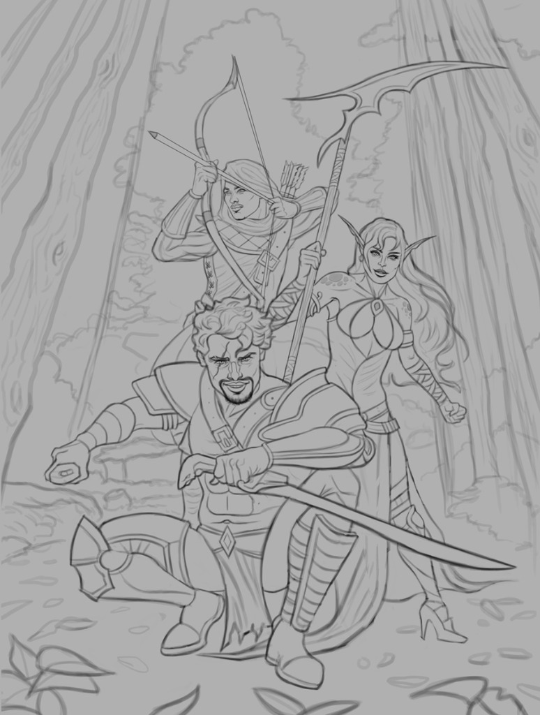
And it's time for a new illustration! This is a group of fantasy warriors, was going for a fairly iconic feel with this one. I had a reference for the general poses as well, while inventing my own character designs since the models were nude for the most part. Spent a lot of time bringing the sketch to life and I'm fairly satisfied with it. I attached it below, any input before I begin the painting process would be greatly appreciated!
...............
And it's time for a new illustration! This is a group of fantasy warriors, was going for a fairly iconic feel with this one. I had a reference for the general poses as well, while inventing my own character designs since the models were nude for the most part. Spent a lot of time bringing the sketch to life and I'm fairly satisfied with it. I attached it below, any input before I begin the painting process would be greatly appreciated!
Attachments:
Last edit: 02 Jul 2022 05:58 by cgmythology.
Please Log in or Create an account to join the conversation.

02 Jul 2022 09:23 #41256
by Charlotte
Any an all misspellings are henceforth blamed on the cats.
Replied by Charlotte on topic CGMythology's Sketchbook (nudity)
I like the group composition and their design but I do have a few issues:
1) The first thing I thought of was the front man's right leg (to our left). Might be the knee armour that does it, but the shape looks oddly bulbous and kind of cut off...
2) I'm not sure if these guys are supposed to be all the same approximate size or if the front guy's supposed to be a giant, but since the girl's feet are almost where his bum/feet are, she looks like she'd reach just over his waist, should he stand up. If they are all "human" in size, I think she needs to be pushed back. And also her foot might look better angled towards us than seen from the side - it looks like a bit of an awkward pose for her...
Any an all misspellings are henceforth blamed on the cats.
The following user(s) said Thank You: cgmythology
Please Log in or Create an account to join the conversation.

02 Jul 2022 11:17 #41257
by Valence
Replied by Valence on topic CGMythology's Sketchbook (nudity)
I don't like the way that the arm pulling the bow is at a completely different angle to the arrow and there doesn't seem to be any tension in the pose or bow. I'd have a look at some proper, more dynamic archery reference as it currently looks more like someone posing for a camera rather than someone ready to shoot.
The following user(s) said Thank You: cgmythology
Please Log in or Create an account to join the conversation.
- cgmythology
-
Topic Author
- Offline
- Senior Member
-
14 Jul 2022 17:08 #41386
by cgmythology
Replied by cgmythology on topic CGMythology's Sketchbook (nudity)
Charlotte: Thanks! I reworked the image a bit, hopefully it works better now!
Valence: I agree, I reworked the archer's pose significantly, hopefully it works better now!................I reworked the image significantly based on the great feedback I've received. Below is the final image followed by the steps for those interested; Of course there's still time for some changes if necessary, so if anything feels off please feel to let me know! Thanks again to everyone who offered their help!
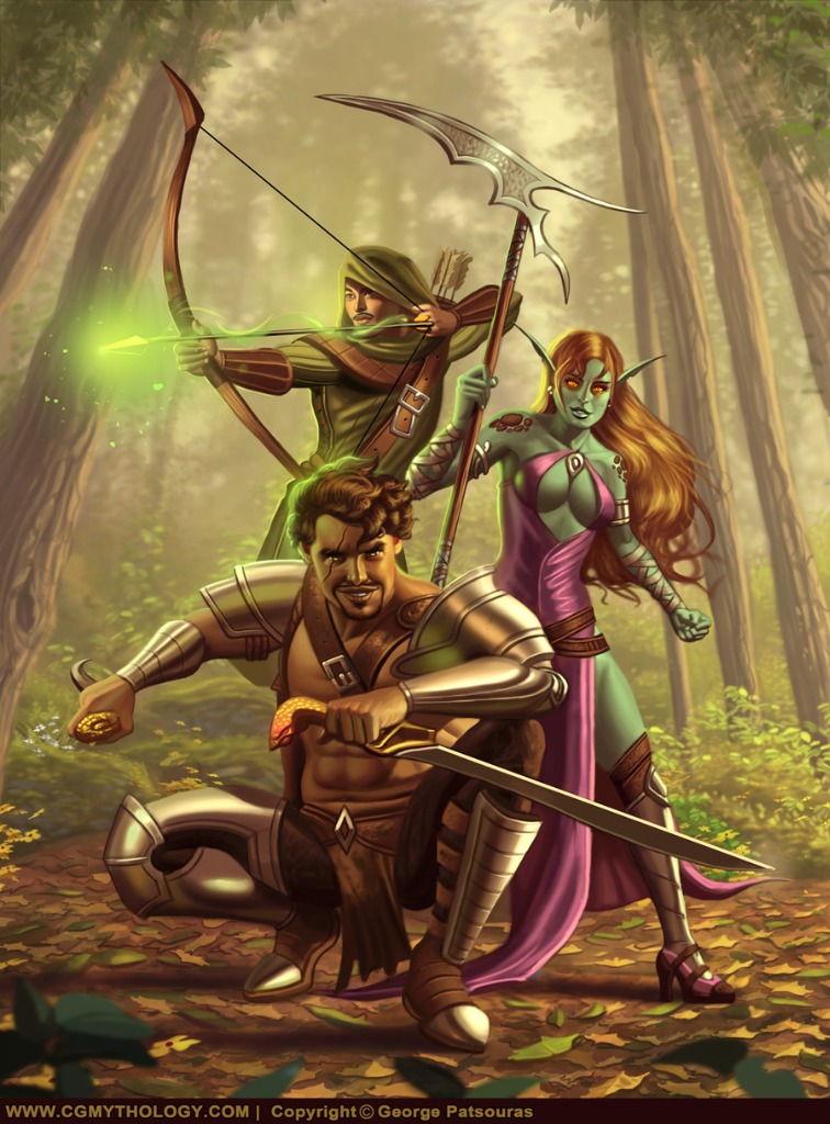
Valence: I agree, I reworked the archer's pose significantly, hopefully it works better now!................I reworked the image significantly based on the great feedback I've received. Below is the final image followed by the steps for those interested; Of course there's still time for some changes if necessary, so if anything feels off please feel to let me know! Thanks again to everyone who offered their help!
Attachments:
Please Log in or Create an account to join the conversation.
14 Jul 2022 17:59 #41388
by Valence
Replied by Valence on topic CGMythology's Sketchbook (nudity)
Much better pose on that archer! 
I like the hazy background trees too, it feels very "foresty" and natural.
I like the hazy background trees too, it feels very "foresty" and natural.
The following user(s) said Thank You: cgmythology
Please Log in or Create an account to join the conversation.
- cgmythology
-
Topic Author
- Offline
- Senior Member
-
16 Jul 2022 16:08 - 16 Jul 2022 16:08 #41413
by cgmythology
Replied by cgmythology on topic CGMythology's Sketchbook (nudity)
Valence: Thank you, glad to hear it!
.........
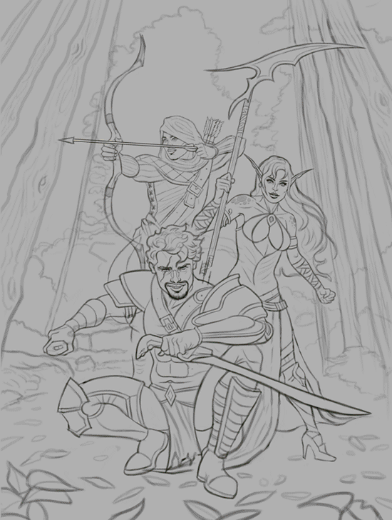
Time for a new sketch! This time I wanted to concentrate on one character. Was in the mood to paint a strong warrior woman, and for reference I had this great photo which you can view here . I did my best to recreate the general pose, while coming up with a new character design so I didn't want to be a complete slave to the reference. Any input before I begin the painting process would be welcome!
.........
Time for a new sketch! This time I wanted to concentrate on one character. Was in the mood to paint a strong warrior woman, and for reference I had this great photo which you can view here . I did my best to recreate the general pose, while coming up with a new character design so I didn't want to be a complete slave to the reference. Any input before I begin the painting process would be welcome!
Attachments:
Last edit: 16 Jul 2022 16:08 by cgmythology.
Please Log in or Create an account to join the conversation.
- cgmythology
-
Topic Author
- Offline
- Senior Member
-
17 Jul 2022 08:03 #41418
by cgmythology
Replied by cgmythology on topic CGMythology's Sketchbook (nudity)
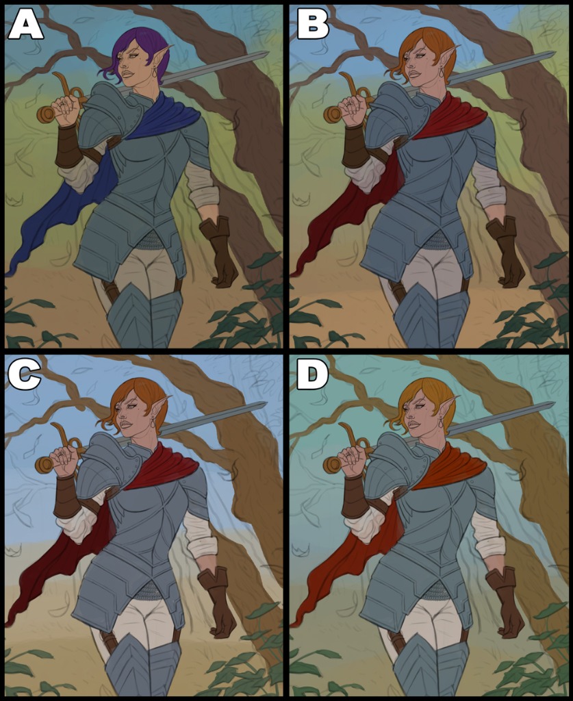
I did some changes to the line art and did some quick color tests as I didn't have a strong idea for the colors this time, so I chose to do some tests to try out different options. Ironically the first one I find the weakest, so it's a good thing I did them. My personal favorite my far is C, I feel it has the strongest colors and values. Any input would be appreciated!
Attachments:
Please Log in or Create an account to join the conversation.
17 Jul 2022 14:53 #41421
by Valence
Replied by Valence on topic CGMythology's Sketchbook (nudity)
I like the value range for C, it makes the image easier to read but I find the blue a little too cool. In terms of temperature B looks most appealing to my eye.
The following user(s) said Thank You: cgmythology
Please Log in or Create an account to join the conversation.
- cgmythology
-
Topic Author
- Offline
- Senior Member
-
18 Jul 2022 16:21 #41436
by cgmythology
Replied by cgmythology on topic CGMythology's Sketchbook (nudity)
Valence: Thank you, went with C and will likely introduce some more greenish tones as I progress!
...........
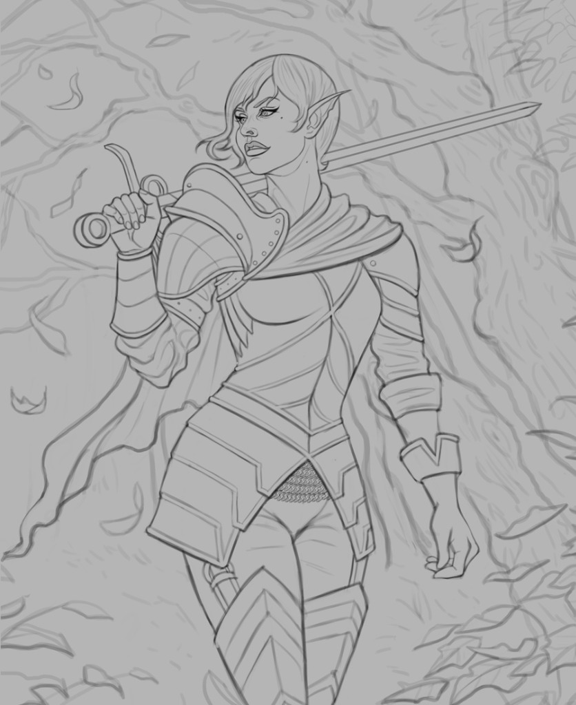
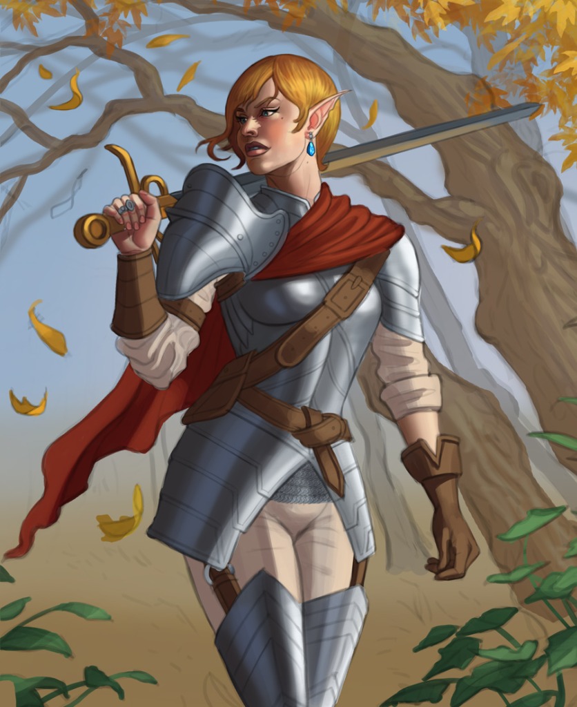
Here is the current progress, still has a long way to go but I'm happy with how it's turning out so far. Any input appreciated as always!
...........
Here is the current progress, still has a long way to go but I'm happy with how it's turning out so far. Any input appreciated as always!
Attachments:
Please Log in or Create an account to join the conversation.
Latest Activity

Banj updated their profile picture


Charlotte Still wearing a mask? Is it so we won't see you hoarding food in those cheeks of yours?
See More
Banj Mfmuh Guhmfpf
See More
Charlotte I'll take that as a yes...
See More
Charlotte Why is there a tiny flashing thing in front of the reply link/button? It's so small I can't see if it's an exclamation mark or a question mark... or...both?)
See More
Banj Because? Both!
See More
Charlotte *gasp*
See More

CaptainDeth updated their profile picture

CaptainDeth Ahoy folks, just a newbie here, just getting started. Thanks for allowing me in.
CaptainDeth Thank You
CaptainDeth and Mr.Bungle joined the site


honbasic joined the site


Gawk joined the site