


- Posts: 1449
- Thank you received: 55
 He can speak English?

Merlin says 


The shoutbox is unavailable to non-members
Micro's wips
- crankshaft
-

- Offline
- Platinum Member
-

Less
More
22 Mar 2015 15:04 #9773
by crankshaft
Replied by crankshaft on topic Micro's wips
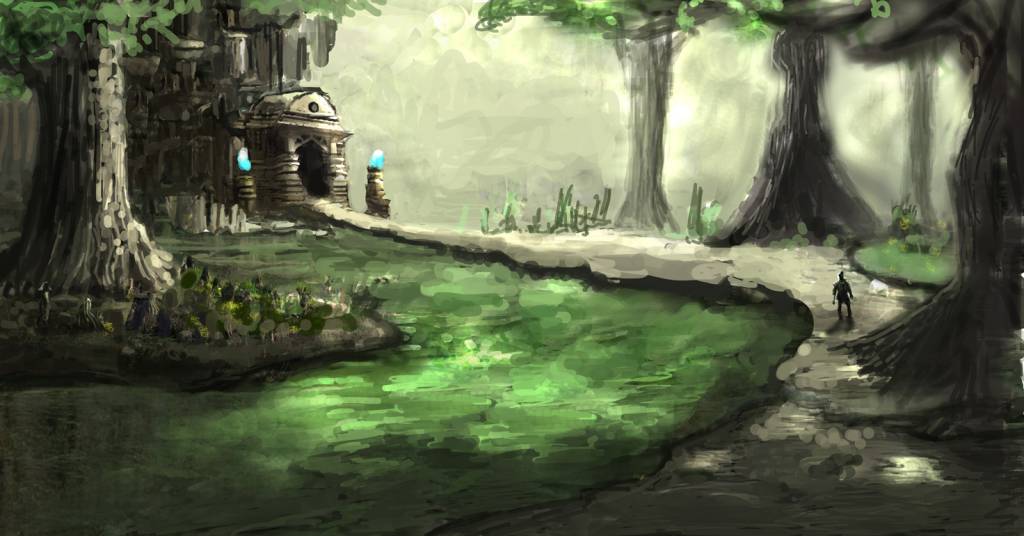
Great update! The flow is very good in this one. My eye is being led up to that building from the ground path. I do think the figure could benefit from being moved closer to the building/structure as his dark silhouette will contrast better with the sky.
Please Log in or Create an account to join the conversation.
- microscopi
-
 Topic Author
- Offline
- Premium Member
-

Less
More
- Posts: 743
- Thank you received: 79
23 Mar 2015 02:50 #9788
by microscopi
Replied by microscopi on topic Micro's wips
Thanks Crank  I was thinking your suggestion gave me an idea to add like a wise old master there instead, like he's on a journey to find him, I want to add a lot more depth right now i'm thinking just adding detail is not going to do it, so maybe i'll have to add more trees or just plants? Maybe an alien crocodile coming to eat him?
Dom, I would definitely collaborate with you sounds cool") I like the original to build from instead of the update tho, it has better perspective I think, what were you thinking would look good?
I like the original to build from instead of the update tho, it has better perspective I think, what were you thinking would look good? 

I was thinking your suggestion gave me an idea to add like a wise old master there instead, like he's on a journey to find him, I want to add a lot more depth right now i'm thinking just adding detail is not going to do it, so maybe i'll have to add more trees or just plants? Maybe an alien crocodile coming to eat him? Dom, I would definitely collaborate with you sounds cool
I like the original to build from instead of the update tho, it has better perspective I think, what were you thinking would look good? Please Log in or Create an account to join the conversation.
- Digital Dave
-

- Offline
- Platinum Member
-
Less
More
- Posts: 2242
- Thank you received: 163
26 Mar 2015 16:26 #9827
by Digital Dave
I get sketchy around pencils! ...
Replied by Digital Dave on topic Micro's wips
Agree with what crankshaft stated about moving the character closer to the structure, plus you could keep him at the same size. Right now, in his present position, those trees near him would be colossal. ... Nothing wrong with that, but think he would fit the pic better at that size.
I get sketchy around pencils! ...
Please Log in or Create an account to join the conversation.
- microscopi
-
Topic Author
- Offline
- Premium Member
-
Less
More
- Posts: 743
- Thank you received: 79
27 Mar 2015 22:52 #9853
by microscopi
Replied by microscopi on topic Micro's wips
Thanks for comments Dave, actually to be honest the character is my favorite part of the whole image atm  but when you mention how big the trees look next to him, it really helps me accomplish the scale that i'm going for, I tried moving him closer but he gets too big and the angle goes wrong, I like the pose he has.
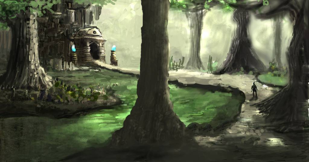
I'm trying to actually step up the background it's really plain next to the temple, but I did manage to get some work done on that, i'm going to come back to the character and work up the details more, here's my latest.
but when you mention how big the trees look next to him, it really helps me accomplish the scale that i'm going for, I tried moving him closer but he gets too big and the angle goes wrong, I like the pose he has.I'm trying to actually step up the background it's really plain next to the temple, but I did manage to get some work done on that, i'm going to come back to the character and work up the details more, here's my latest.
Please Log in or Create an account to join the conversation.
- microscopi
-
Topic Author
- Offline
- Premium Member
-
Less
More
- Posts: 743
- Thank you received: 79
27 Mar 2015 23:05 - 27 Mar 2015 23:24 #9854
by microscopi
Replied by microscopi on topic Micro's wips
Here's a tree in the forground, it might work to fill the space and show more perspective.
Last edit: 27 Mar 2015 23:24 by microscopi.
Please Log in or Create an account to join the conversation.
- crankshaft
-
- Offline
- Platinum Member
-
Less
More
- Posts: 1449
- Thank you received: 55
28 Mar 2015 02:09 #9857
by crankshaft
Replied by crankshaft on topic Micro's wips
I think it's great that you continue to make changes and progress on this painting. However having that tree in the middle like that is too obvious and "in your face" eg the extreme contrast of it with the lighter background. When you said perspective did you mean depth instead? You could try some silhouettes of trees of distinct values on the pale background instead.
Please Log in or Create an account to join the conversation.

29 Mar 2015 12:42 #9862
by Domtopia
Everything's on the right!!!
It's like driving abroad!
Replied by Domtopia on topic Micro's wips
I don't like the tree in the middle as it divides the image in half. The rule of thirds works better!
The open version works better for me. I think you could also make the character bigger. Being able to see some detail in him would help with the story telling.
Colour choices are once again excellent!! I really like the contrasts between the highlights and the shadow. Good work thus far!! There's a tighter, more substantial feel to this piece as a whole. Nice progress!
Everything's on the right!!!
It's like driving abroad!
Please Log in or Create an account to join the conversation.
- microscopi
-
Topic Author
- Offline
- Premium Member
-
Less
More
- Posts: 743
- Thank you received: 79
31 Mar 2015 04:28 #9884
by microscopi
Replied by microscopi on topic Micro's wips
Thanks for the feedback guys I agree with the tree it was a bad decision, wasn't liking the way things were going, so was willing to try anything.
I put down some more dramatic lighting and detailed the structure more, I want the shape of the ground and water to seem natural and not stationary, also made the character slightly bigger and gave him more lighting, although something seems off to me still, I don't know if it's because i've been staring at it too long already.
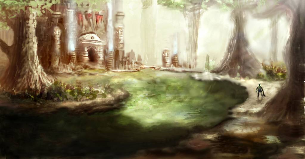
I agree with the tree it was a bad decision, wasn't liking the way things were going, so was willing to try anything.I put down some more dramatic lighting and detailed the structure more, I want the shape of the ground and water to seem natural and not stationary, also made the character slightly bigger and gave him more lighting, although something seems off to me still, I don't know if it's because i've been staring at it too long already.
Please Log in or Create an account to join the conversation.
- CherryGraphics
-

- Offline
- Junior Member
-

Less
More
- Posts: 366
- Thank you received: 33
31 Mar 2015 05:56 #9885
by CherryGraphics
Replied by CherryGraphics on topic Micro's wips
I didn't like the tree in the middle, too but i think now with this wonderful light you added it's a really good way to go forward ") I like the texture of the water, it looks like there are a lot of underwater plants! With adding the light in the background and the darkness in the foreground you split the picture in a natural way .... reeeeally nice micro!
I like the texture of the water, it looks like there are a lot of underwater plants! With adding the light in the background and the darkness in the foreground you split the picture in a natural way .... reeeeally nice micro! 
I like the texture of the water, it looks like there are a lot of underwater plants! With adding the light in the background and the darkness in the foreground you split the picture in a natural way .... reeeeally nice micro! Please Log in or Create an account to join the conversation.
- hobbyhorse
-
- Offline
- Junior Member
-
Less
More
- Posts: 132
- Thank you received: 15
31 Mar 2015 14:04 #9894
by hobbyhorse
Replied by hobbyhorse on topic Micro's wips
microscopi- love the lighting and the water like it's calm but with a few ripples. The one thing you might want to soften, or break up, is the hard shadow on the water. Maybe add some sun spots on the water surface leading into the dark area that indicate the more open tree canopy getting denser. Looking good though
Please Log in or Create an account to join the conversation.
Latest Activity

Banj updated their profile picture


Charlotte Still wearing a mask? Is it so we won't see you hoarding food in those cheeks of yours?
See More
Banj Mfmuh Guhmfpf
See More
Charlotte I'll take that as a yes...
See More
Charlotte Why is there a tiny flashing thing in front of the reply link/button? It's so small I can't see if it's an exclamation mark or a question mark... or...both?)
See More
Banj Because? Both!
See More
Charlotte *gasp*
See More

CaptainDeth updated their profile picture

CaptainDeth Ahoy folks, just a newbie here, just getting started. Thanks for allowing me in.
CaptainDeth Thank You
CaptainDeth and Mr.Bungle joined the site


honbasic joined the site


Gawk joined the site