


- Posts: 170
- Thank you received: 10


![:]](https://cgartnexus.com/images/mod_shoutbox/unsure.png)
You ate today's mermaid? 
 I had tuna sandwiches for lunch
Very fishy month.
And mermay, yes
 🐟
🐟
The shoutbox is unavailable to non-members
Shoutbox History
CGAN April 2015 Challenge - Me, Myself, and I
- SchizophreniaWolf
-
- Offline
- Junior Member
-

Less
More
21 Apr 2015 09:16 #10255
by SchizophreniaWolf
Replied by SchizophreniaWolf on topic CGAN April 2015 Challenge - Me, Myself, and I
Valence: haha yep idd
CherryGraphics: thx, Cherry!
Here's an update

CherryGraphics: thx, Cherry!
Here's an update
Please Log in or Create an account to join the conversation.
- edtuckerartist
-

- Offline
- New Member
-

Less
More
- Posts: 98
- Thank you received: 2
21 Apr 2015 15:48 #10256
by edtuckerartist
Replied by edtuckerartist on topic CGAN April 2015 Challenge - Me, Myself, and I
Just a little out of practice but holybatman if I'm not going to let that stop me, or will I?

Admittedly there's not a lot of me, myself or I in this")
Admittedly there's not a lot of me, myself or I in this
Please Log in or Create an account to join the conversation.

21 Apr 2015 16:01 #10257
by Charlotte
Any an all misspellings are henceforth blamed on the cats.
Replied by Charlotte on topic CGAN April 2015 Challenge - Me, Myself, and I
Hey Ed! Good to see you join in ")
Btw if you don't think Batman is enough "you", I think that photo ref would make for a good musketeer. Just a thought
Btw if you don't think Batman is enough "you", I think that photo ref would make for a good musketeer. Just a thought
Any an all misspellings are henceforth blamed on the cats.
Please Log in or Create an account to join the conversation.
- edtuckerartist
-
- Offline
- New Member
-
Less
More
- Posts: 98
- Thank you received: 2
21 Apr 2015 19:41 #10259
by edtuckerartist
Replied by edtuckerartist on topic CGAN April 2015 Challenge - Me, Myself, and I
Thought I'd try mixing in your idea of a musketeer - a Batketeer?

Don't know why but my tablet is behaving like a pen that's running out of ink, only drawing when it want's too.
Don't know why but my tablet is behaving like a pen that's running out of ink, only drawing when it want's too.
Please Log in or Create an account to join the conversation.
- hobbyhorse
-
- Offline
- Junior Member
-
Less
More
- Posts: 132
- Thank you received: 15
21 Apr 2015 20:25 #10263
by hobbyhorse
Replied by hobbyhorse on topic CGAN April 2015 Challenge - Me, Myself, and I
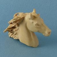
I've had that comment before about being a bit blurry and soft, yet I use a hard round brush for a lot of it. Is there something in the brush settings that I am over looking? It's on the hardest setting..as far as I can tell. Should I turn smoothing off in the brush panel? or is it because it's just 72 ppi ...no I think someone said that should not matter if your not going to export for printing. I looks fairly crisp on my monitor....is it a monitor problem. When I have done it for print the image didn't have a lot of crisp edges...I just thought it was the printer.
If anyone has some suggestions I would love to hear them. I could always use an unsharp mask at the end but that might make for too many sharp edges. This is a bit frustrating.
If anyone has some suggestions I would love to hear them. I could always use an unsharp mask at the end but that might make for too many sharp edges. This is a bit frustrating.
Please Log in or Create an account to join the conversation.
- edtuckerartist
-
- Offline
- New Member
-
Less
More
- Posts: 98
- Thank you received: 2
22 Apr 2015 00:27 #10276
by edtuckerartist
Replied by edtuckerartist on topic CGAN April 2015 Challenge - Me, Myself, and I
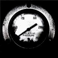
50ish shades of grey:

Please Log in or Create an account to join the conversation.

22 Apr 2015 02:32 - 22 Apr 2015 17:32 #10278
by jessie
Replied by jessie on topic CGAN April 2015 Challenge - Me, Myself, and I
Hobbyhorse: Looking good! I like the softness of this one.
Valence: Thanks hun. Unfortunately the "melancholic-ally" feel pretty much sums up my life right now. Drowning in stress. BUT on a positive note I did add a secondary color so hopefully it helps a little.
Micro: Thanks. I hope I can push this one and finish it in time. Yours is looking awesome. I see we went from goofy to serious. Very nice.
Susie: The snakes are coming along nicely. I love that you're doing them all different. Quite challenging for sure.
Schizo: WOWZA. I really like the lighting in yours. Like Hobby said. Order out of chaos. Love it.
Cherry: I would suggest adding more shadow to the neck area behind the globe to help shorten it a bit? Maybe? Possibly?
Ed! How are you? You know what they say about Batman. Always be yourself, unless you can be Batman...then always be Batman.
Last edit: 22 Apr 2015 17:32 by jessie.
Please Log in or Create an account to join the conversation.
22 Apr 2015 08:12 #10281
by Charlotte
Any an all misspellings are henceforth blamed on the cats.
Replied by Charlotte on topic CGAN April 2015 Challenge - Me, Myself, and I
Ed: Coming along nicely with the shading! (And I Think it a bit funny to make a batketeer because in Swedish bat = fladdermus (something like fluttermouse) so instead of a musketeer it'd be a fluttermusketeer or fladdermusketör...)
Hobby: to me it's mostly the unfinished areas and the background that look a bit blurry, like the horse's coat. The background blur should work nicely once all the foreground is done, though, I think.
Hobby: to me it's mostly the unfinished areas and the background that look a bit blurry, like the horse's coat. The background blur should work nicely once all the foreground is done, though, I think.
Any an all misspellings are henceforth blamed on the cats.
Please Log in or Create an account to join the conversation.
- CherryGraphics
-

- Offline
- Junior Member
-
Less
More
- Posts: 366
- Thank you received: 33
22 Apr 2015 08:48 #10282
by CherryGraphics
Replied by CherryGraphics on topic CGAN April 2015 Challenge - Me, Myself, and I
Hobby: I always paint at least on 300-500ppi just to have more and finer pixels to give my paintings a good sharpness. When I look at yours I can see the pixels on the edges. Maybe this is why your edges looking fuzzy and blurry and not that clear and sharp. Is there any reason you just paint with 72ppi?
You have to have in mind: pixels are squares. When you draw a line that is not horizontal or vertical you have a visible aliasing.

the left is the example for 72ppi - the right for 300ppi. I hope this makes it clearer for you
You have to have in mind: pixels are squares. When you draw a line that is not horizontal or vertical you have a visible aliasing.
the left is the example for 72ppi - the right for 300ppi. I hope this makes it clearer for you
Please Log in or Create an account to join the conversation.

22 Apr 2015 11:35 - 22 Apr 2015 11:40 #10283
by Valence
Replied by Valence on topic CGAN April 2015 Challenge - Me, Myself, and I
Hobby: I've said it before and I'll say it again... ppi only matters if you're planning on doing a print and then the physical dimensions dictates how much detail is required. (My pictures are always 72.) For images on screen what matters is the pixel dimensions. For professional sort of work this should be at least (at least!) 3000px on one side. (At this point I should also plead guilty and confess that I paint at much less than this due to memory limitations. I never follow my own advice! )
Edit: Also the forum requires images to be resized to about 1000px which again renders the original ppi value irrelevant.
Either way I don't think this is a problem for you. As Charlotte said it's just a combination of the out of focus background and the unfinished horse. Once you work a bit more form into the horse's coat, and perhaps add some detail to the grass at the bottom to suggest a progression of depth, then I think the whole picture will snap into focus.
)Edit: Also the forum requires images to be resized to about 1000px which again renders the original ppi value irrelevant.
Either way I don't think this is a problem for you. As Charlotte said it's just a combination of the out of focus background and the unfinished horse. Once you work a bit more form into the horse's coat, and perhaps add some detail to the grass at the bottom to suggest a progression of depth, then I think the whole picture will snap into focus.
Last edit: 22 Apr 2015 11:40 by Valence.
Please Log in or Create an account to join the conversation.
Latest Activity

Banj updated their profile picture


Charlotte Still wearing a mask? Is it so we won't see you hoarding food in those cheeks of yours?
See More
Banj Mfmuh Guhmfpf
See More
Charlotte I'll take that as a yes...
See More
Charlotte Why is there a tiny flashing thing in front of the reply link/button? It's so small I can't see if it's an exclamation mark or a question mark... or...both?)
See More
Banj Because? Both!
See More
Charlotte *gasp*
See More

CaptainDeth updated their profile picture

CaptainDeth Ahoy folks, just a newbie here, just getting started. Thanks for allowing me in.
CaptainDeth Thank You
CaptainDeth and Mr.Bungle joined the site


honbasic joined the site


Gawk joined the site