
![:]](https://cgartnexus.com/images/mod_shoutbox/unsure.png)
You ate today's mermaid? 
 I had tuna sandwiches for lunch
Very fishy month.
And mermay, yes 
 🐟
🐟
The shoutbox is unavailable to non-members
Shoutbox History
CGAN April 2015 Challenge - Me, Myself, and I
what matters is the pixel dimensions.
What he said.
Please Log in or Create an account to join the conversation.
EDIT: (Maths Nerd: Hmmm, I can see where you got that one quarter figure from by using the 500px value. But if you consider the 599 value as well I think you'll find that the fraction is closer to three tenths rather than one quarter.
Elsewhere....
Ed: That looks great fun and has really developed quickly. Keep going.
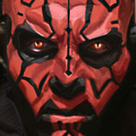
Schizo: Really well stylized. It looks like a movie poster with really bold and dynamic angles.
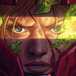
Micro: I like the mood you're getting now. Be careful with the lighting on the face and emphasize the glow on that lightsabre and it'll be fantastic.
And Cherry: Love the dewdrop spider's webs! Love it.
Please Log in or Create an account to join the conversation.
EDIT: I've noticed that the image on the forum doesn't have the punch that the image has in the program. I've double checked color setting in the file and when I exported the image. So I don't know.
Please Log in or Create an account to join the conversation.
Please Log in or Create an account to join the conversation.
- CherryGraphics
-
- Offline
- Junior Member
-

- Posts: 366
- Thank you received: 33
Please Log in or Create an account to join the conversation.
Any an all misspellings are henceforth blamed on the cats.
Please Log in or Create an account to join the conversation.
- CherryGraphics
-

- Offline
- Junior Member
-

- Posts: 366
- Thank you received: 33
Please Log in or Create an account to join the conversation.
- edtuckerartist
-

- Offline
- New Member
-

- Posts: 98
- Thank you received: 2
Please Log in or Create an account to join the conversation.
Please Log in or Create an account to join the conversation.
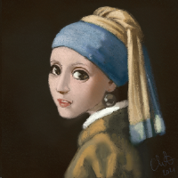
1: in the ref the head is bowed little obscuring the neck and the shoulders almost line up with the mouth whereas the painting has the head position higher relative to the shoulders which exposes the neck.
And 2: in the ref the hair lower down curves inwards again obscuring the neck and in the painting the hair curves outward which again exposes more of the neck.
If the neck is exposed in these ways then it would appear a little wider. Also darkening the neck below the chin would also push it a little further back and stop it from looking so extended from the face, and if you still wanted a bit of underlit glow then a bit of rim light delineating the chin and jaw would again separate things.
If it still looks a little awkward then I'd suggest taking another reference photo with the head raised a little and compare that to the painting.
It's still a terrific picture though.
Please Log in or Create an account to join the conversation.
Latest Activity
