

May the 4th be with you. 

Is Kenobi the only one in the universe who says "Hello there"? Or how did we get to that point of the.... conversation?

The shoutbox is unavailable to non-members
Shoutbox History


May the 4th be with you. 

Is Kenobi the only one in the universe who says "Hello there"? Or how did we get to that point of the.... conversation?

CGAN April 2015 Challenge - Me, Myself, and I
Please Log in or Create an account to join the conversation.
- hobbyhorse
-
- Offline
- Junior Member
-

- Posts: 132
- Thank you received: 15
Thomgirl- I would have loved to see what you would have come up with. Maybe you can join in on the next challenge.
micro- Yes what Banj says....for a quick fix just get rid of the blue 'glow' of the light saber just where it overlaps the face and then with a soft brush on low opacity lighten that part of the face just a bit.
schizo- The buildings add some verticality to the piece but now I don't know what to make of the diagonal objects...wings?
Please Log in or Create an account to join the conversation.
- SchizophreniaWolf
-
- Offline
- Junior Member
-

- Posts: 170
- Thank you received: 10
schizo- The buildings add some verticality to the piece but now I don't know what to make of the diagonal objects...wings?
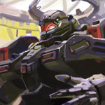
The thing behind me on the floor is just a piece of metal, the machines flying in the sky are drones. They are flying in (funny enough) something I wanted to call Wing-formations, but they can also fly separately.
Please Log in or Create an account to join the conversation.
Cherry: Thanks, Love. Love what you've added. The spider web and little ghosties are awesome!
Ed: Yours is coming along nicely! Excited to see how much farther you can push it in so little time.
Susie: Love it! Love the style but I have to agree - a little more push with the eyes would be awesome.
Hobby: Looking marvelous! I have zero critic for this piece. Love it.
Schizo: Wow. That really changed the over all composition. I'm dig'n it.
microscopi: Love the color palate you've got going in this piece.
Please Log in or Create an account to join the conversation.
Please Log in or Create an account to join the conversation.
I do think that the colours are rather highly saturated though. Your style is very brush-strokey too. Imo I think there could be more blending going on to smooth things out.
I didn't see a reference image in the thread, but it would be good to see what you are drawing from. The nose is turned toward us and it's effecting the depth. But I don't know if that is true to the reference or not. However, even if it is accurate to the reference, it might be an idea to change it a little for the sake of the image as a whole.
It's up to you. These are just some observations!
Here's a paintover with the changes. See what you think.
Everything's on the right!!!
It's like driving abroad!
Please Log in or Create an account to join the conversation.
I'm liking a lot of these drawings, sorry I haven't critiqued many along the way but good luck all
Please Log in or Create an account to join the conversation.
Whenever I get towards the end of a painting I like to experiment by tweaking colours in this way. My favourite ways of doing this are 1: Auto Colour Balance. I do this on a flattened version of the pic on a new layer and then fade it back with the opacity and experiment with the Colour blend mode. And 2: my other favourite tweak is the Photo Filter option, especially when used with a cool blue colour. This is great for getting rid of unwanted colour casts that I can't stop painting.
Just have a play around and see what looks best for you.
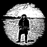
Micro: I agree with Banj's comment on the lightsabre shadow but I think just adding a bit of glow in there could still make a big difference. I do like the mood you've got there.
And after what seems like an infinite number of edits I think this post finally makes sense in English.
Please Log in or Create an account to join the conversation.
I admit I am much more "brush strokey" than alot, its sort of how I paint traditionally as well so I guess its just my style.
Dom - Really glad you like it, and thank you for the advice, check out page 5 in the thread - that has got my pic on it. I have reworked the nose several times and, as much as I can see what you are saying, this is as close as I have got to my nose if you know what I mean
Not sure how much more time im going to have but I will see if I can improve it.
Please Log in or Create an account to join the conversation.
- microscopi
-
- Offline
- Premium Member
-

- Posts: 743
- Thank you received: 79
Please Log in or Create an account to join the conversation.
Latest Activity
