


- Posts: 366
- Thank you received: 33

I thought so too - so I'm not sure he can suffer a lack of movies... 
 I think he has most of them
Does Val know about Netflix and other streaming services?  Either way I was too tired to actually DO anything including watching telly...

Not enough movies in the early morning. 
Why can I never sleep in the early morning hours but pretty much around the clock at all other hours? 
The shoutbox is unavailable to non-members
Shoutbox History
I thought so too - so I'm not sure he can suffer a lack of movies...
I think he has most of them
Does Val know about Netflix and other streaming services? Either way I was too tired to actually DO anything including watching telly...
Not enough movies in the early morning.
Why can I never sleep in the early morning hours but pretty much around the clock at all other hours?
CGAN April 2015 Challenge - Me, Myself, and I
- CherryGraphics
-

- Offline
- Junior Member
-

Less
More
27 Apr 2015 06:09 #10381
by CherryGraphics
Replied by CherryGraphics on topic CGAN April 2015 Challenge - Me, Myself, and I
Thanks Hobby & Dom 

I love all these kittys Hobby")
good update schizo! The wolf is great and your choice of colors is really nice - the vibrant orange and the blue accents works really well
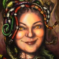
wow susie... a lot of new snakes, mh? They all look so shiny - I really wanna touch them!
I love all these kittys Hobby
good update schizo! The wolf is great and your choice of colors is really nice - the vibrant orange and the blue accents works really well
wow susie... a lot of new snakes, mh? They all look so shiny - I really wanna touch them!
Please Log in or Create an account to join the conversation.
- edtuckerartist
-

- Offline
- New Member
-

Less
More
- Posts: 98
- Thank you received: 2
27 Apr 2015 14:11 #10389
by edtuckerartist
Replied by edtuckerartist on topic CGAN April 2015 Challenge - Me, Myself, and I
Going to try and spend a few hours today improving my painting! (posting that so I now have to do it  )
)
) Please Log in or Create an account to join the conversation.
- edtuckerartist
-
- Offline
- New Member
-
Less
More
- Posts: 98
- Thank you received: 2
27 Apr 2015 18:38 #10391
by edtuckerartist
Replied by edtuckerartist on topic CGAN April 2015 Challenge - Me, Myself, and I
Hours later:

Please Log in or Create an account to join the conversation.
28 Apr 2015 00:06 #10392
by Susie1981
Replied by Susie1981 on topic CGAN April 2015 Challenge - Me, Myself, and I
Hi All,
Another night in and seem to have got on with it!
Ed - nice perspective, its going to be nice to see you bring the two styles/characters together.
I am not yet 100% on the background - gonna see what it looks like in the morning. Let me know if you have any thoughts

Another night in and seem to have got on with it!
Ed - nice perspective, its going to be nice to see you bring the two styles/characters together.
I am not yet 100% on the background - gonna see what it looks like in the morning. Let me know if you have any thoughts
Please Log in or Create an account to join the conversation.

28 Apr 2015 00:21 - 28 Apr 2015 00:33 #10393
by Valence
Replied by Valence on topic CGAN April 2015 Challenge - Me, Myself, and I
Susie: That's looking great now that the picture is filling with colour, all those different hues are playing off each other really well. And those snakes are awesome. There's such believable texture in those snakes that, unlike Cherry, I don't want to touch them. I really don't!  and I don't have to because I can tell what they feel like by just looking. The colour, the form, the variety and that slithery shine. Perfect. Can't wait to see what you'll do with the eyes.
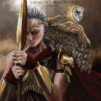
Ed: All the colours are working fine now, it looks like a unified image now just as you said it would. It just needs a few highlights to pick out the form of the figure, especially the logo on the chest so that we all know who this fearsome super hero is.
Schizo: I like that better now. Having a clearer silhouette for the figure makes him much more prominent, just as he should be. It also improves the overall lighting of the image and you've done it without sacrificing the dynamic angles. Nicely done.
Edit: Thought I'd typed this bit first but clearly didn't so...
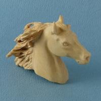
Hobby: Liking the progression including the work on the horse. I'd perhaps push the light and shadow a bit more on the head to emphasize the way that it's bending towards us away from the body, maybe adding a darker cast shadow on the neck and extending it just under it's face to push it all back behind the head. But the image is still reading very well as it is.
and I don't have to because I can tell what they feel like by just looking. The colour, the form, the variety and that slithery shine. Perfect. Can't wait to see what you'll do with the eyes.Ed: All the colours are working fine now, it looks like a unified image now just as you said it would. It just needs a few highlights to pick out the form of the figure, especially the logo on the chest so that we all know who this fearsome super hero is.
Schizo: I like that better now. Having a clearer silhouette for the figure makes him much more prominent, just as he should be. It also improves the overall lighting of the image and you've done it without sacrificing the dynamic angles. Nicely done.
Edit: Thought I'd typed this bit first but clearly didn't so...
Hobby: Liking the progression including the work on the horse. I'd perhaps push the light and shadow a bit more on the head to emphasize the way that it's bending towards us away from the body, maybe adding a darker cast shadow on the neck and extending it just under it's face to push it all back behind the head. But the image is still reading very well as it is.
Last edit: 28 Apr 2015 00:33 by Valence.
Please Log in or Create an account to join the conversation.
- hobbyhorse
-
- Offline
- Junior Member
-
Less
More
- Posts: 132
- Thank you received: 15
28 Apr 2015 16:53 #10400
by hobbyhorse
Replied by hobbyhorse on topic CGAN April 2015 Challenge - Me, Myself, and I
Valence- the horse's head was bothering me as well so went back to my reference to see what I missed. It did need to be more tucked around and I think it reads better.
susie- As others have mentioned the color in the BG works well and the snakes are wonderful.
Some love needs to be given to your face to bring it up to the level of the snakes..but looking good.
Ed- This is coming along nicely, and the ramparts look very realistic and contrast well with the more distant buildings and landscape....down to the final detailing on the figure and face.
Cherry- Thanks
Schizo- Agree with valence on the way the piece is working better.
I think I'm done unless you guys see anything that stands out, that I can change.
Please Log in or Create an account to join the conversation.
28 Apr 2015 17:05 #10401
by Thomgirl
Replied by Thomgirl on topic CGAN April 2015 Challenge - Me, Myself, and I
Damnit... you guys would be doing self portraits again... They're looking awesome, I wish I could join in  I might try, but time is... really not on my side with this now.
I might try, but time is... really not on my side with this now. Please Log in or Create an account to join the conversation.
28 Apr 2015 18:46 #10402
by Valence
Replied by Valence on topic CGAN April 2015 Challenge - Me, Myself, and I
Hobby: Excellent changes there and they're so subtle it took me ages to work out what you'd done yet it makes an obvious difference. That extra light on the horse's neck and the dark edge to its nose really helps to explain that curve towards us and fixes the head in three dimensional space so that it's clearly connecting with the cat at the same depth. Well done.
And Susie (again): I kind of agree with Hobbyhorse. I liked the face before but the snakes are now so very good that you could use a bit more work on the skin. I think the colours are working it just needs a bit of softening with some kind of blender brush to get the texture nice and smooth. Keep going, it'll work out for you.
And Susie (again): I kind of agree with Hobbyhorse. I liked the face before but the snakes are now so very good that you could use a bit more work on the skin. I think the colours are working it just needs a bit of softening with some kind of blender brush to get the texture nice and smooth. Keep going, it'll work out for you.
Please Log in or Create an account to join the conversation.
- microscopi
-

- Offline
- Premium Member
-

Less
More
- Posts: 743
- Thank you received: 79
29 Apr 2015 04:23 #10403
by microscopi
Replied by microscopi on topic CGAN April 2015 Challenge - Me, Myself, and I
Update, haven't really been commenting much but definitely will in the finals, i'm almost done with mine, going to work on the background a bit more and forearms then pretty much done 

Please Log in or Create an account to join the conversation.
- SchizophreniaWolf
-
- Offline
- Junior Member
-
Less
More
- Posts: 170
- Thank you received: 10
29 Apr 2015 07:01 #10404
by SchizophreniaWolf
Replied by SchizophreniaWolf on topic CGAN April 2015 Challenge - Me, Myself, and I
Valence: Thx! I often start somewhere like a mad man and then I clean up
hobbyhorse: Thank you!
CherryGraphics: Also thx! But I changed the color of the sky, because I started adding buildings in the back and I suddenly wanted a more realistic enviroment.

hobbyhorse: Thank you!
CherryGraphics: Also thx! But I changed the color of the sky, because I started adding buildings in the back and I suddenly wanted a more realistic enviroment.
Please Log in or Create an account to join the conversation.
Latest Activity

Banj updated their profile picture


Charlotte Still wearing a mask? Is it so we won't see you hoarding food in those cheeks of yours?
See More
Banj Mfmuh Guhmfpf
See More
Charlotte I'll take that as a yes...
See More
Charlotte Why is there a tiny flashing thing in front of the reply link/button? It's so small I can't see if it's an exclamation mark or a question mark... or...both?)
See More
Banj Because? Both!
See More
Charlotte *gasp*
See More

CaptainDeth updated their profile picture

CaptainDeth Ahoy folks, just a newbie here, just getting started. Thanks for allowing me in.
CaptainDeth Thank You
CaptainDeth and Mr.Bungle joined the site


honbasic joined the site


Gawk joined the site