


- Posts: 1256
- Thank you received: 96
 He can speak English?

Merlin says 


The shoutbox is unavailable to non-members
Someone's gotta start this ball a-rolling!!
22 Feb 2015 00:15 #9023
by Domtopia
Everything's on the right!!!
It's like driving abroad!
Replied by Domtopia on topic Someone's gotta start this ball a-rolling!!
Thanks Crank!
I think it's because I am painting on to another painting that the two images are conflicting, making it difficult for the piece to read well. That will improve as I eventually make progress onto the background I think.
Been working on this today. Hopefully It reads a little more clearly now, but if not, please be patient! I will get there eventually!
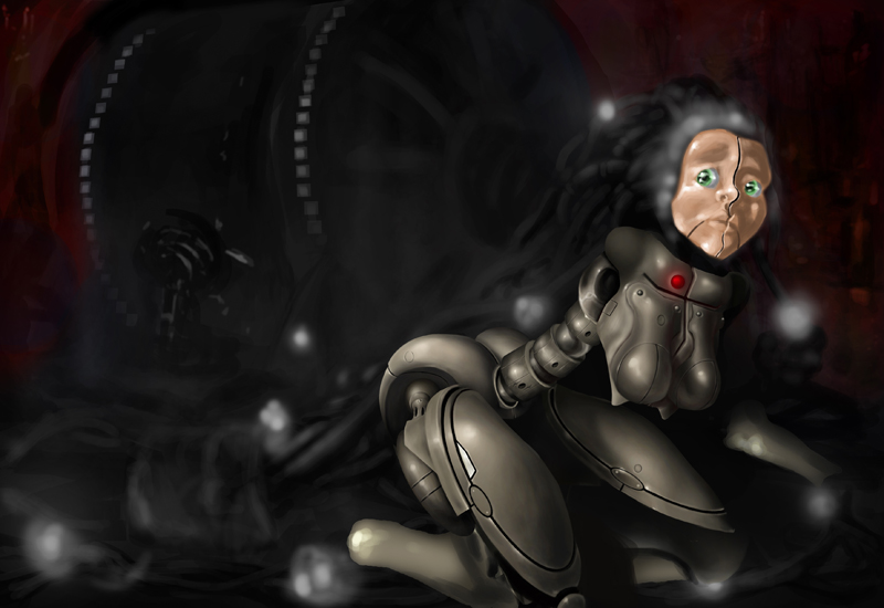
Comments and whatnot are welcome!
I think it's because I am painting on to another painting that the two images are conflicting, making it difficult for the piece to read well. That will improve as I eventually make progress onto the background I think.
Been working on this today. Hopefully It reads a little more clearly now, but if not, please be patient! I will get there eventually!
Comments and whatnot are welcome!
Everything's on the right!!!
It's like driving abroad!
Please Log in or Create an account to join the conversation.
26 Feb 2015 23:28 - 26 Feb 2015 23:32 #9140
by Domtopia
Everything's on the right!!!
It's like driving abroad!
Replied by Domtopia on topic Someone's gotta start this ball a-rolling!!
Done a bit more. Progress is slow, but I am learning a lot from it!
I am gagging to get to the face, but I have promised myself that I will do all the more structural elements first and then get into the fun stuff later! The hair is going to be fun to do too!
Comments, criticisms and general feedback is always welcome!!
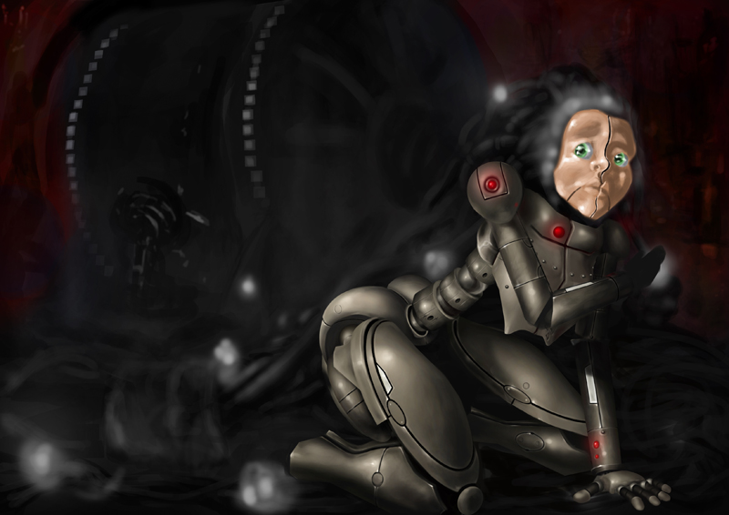
I decided that there needed to be a few changes. The butt was sticking out quite a lot and I didn't want it to look either stupid or provocative. Also, the breast were sexualising it and I don't want that. I think that often cheapens an image, so I have removed them and put in a flatter chest instead. Not that you can see much of it with the arm like it is, but... meh.
I am gagging to get to the face, but I have promised myself that I will do all the more structural elements first and then get into the fun stuff later! The hair is going to be fun to do too!
Comments, criticisms and general feedback is always welcome!!
I decided that there needed to be a few changes. The butt was sticking out quite a lot and I didn't want it to look either stupid or provocative. Also, the breast were sexualising it and I don't want that. I think that often cheapens an image, so I have removed them and put in a flatter chest instead. Not that you can see much of it with the arm like it is, but... meh.
Everything's on the right!!!
It's like driving abroad!
Last edit: 26 Feb 2015 23:32 by Domtopia.
Please Log in or Create an account to join the conversation.

27 Feb 2015 08:35 #9144
by kazky
Replied by kazky on topic Someone's gotta start this ball a-rolling!!
dom have you painted something like this before? it looks really familiar, but it may just be that I've been watching it progress. love the suit, that is rendered beautifully! looking really good.
Please Log in or Create an account to join the conversation.
27 Feb 2015 13:53 #9148
by Domtopia
Everything's on the right!!!
It's like driving abroad!
Replied by Domtopia on topic Someone's gotta start this ball a-rolling!!
Wow! Thanks Kaz!
Yeah, it's an old drawing that I started, but never finished. It was for an old challenge back when the site was affiliated with an art magazine I forget the name of...
Painting Optimus Prime has taught me loads about using the selection tools to create hard-edged objects, so I thought I would use some of those newly learned skills on some older images I still have. It seems a waste to just leave them there half done.
Well spotted!
Everything's on the right!!!
It's like driving abroad!
Please Log in or Create an account to join the conversation.
27 Feb 2015 13:59 #9150
by kazky
Replied by kazky on topic Someone's gotta start this ball a-rolling!!
the optimus prime is fantastic too!
The following user(s) said Thank You: Domtopia
Please Log in or Create an account to join the conversation.
27 Feb 2015 14:02 #9151
by Domtopia
Everything's on the right!!!
It's like driving abroad!
Replied by Domtopia on topic Someone's gotta start this ball a-rolling!!
Everything's on the right!!!
It's like driving abroad!
Please Log in or Create an account to join the conversation.
28 Feb 2015 00:32 - 28 Feb 2015 00:34 #9169
by Domtopia
Everything's on the right!!!
It's like driving abroad!
Replied by Domtopia on topic Someone's gotta start this ball a-rolling!!
OK, so I tackled the face and have started on the hair too.
The lighting effects around her head are just a test for now, but I do quite like them.
She's also a bit big, so I will adjust that in time and get her to fit a little better. I think she is too close to the picture plane at the moment.
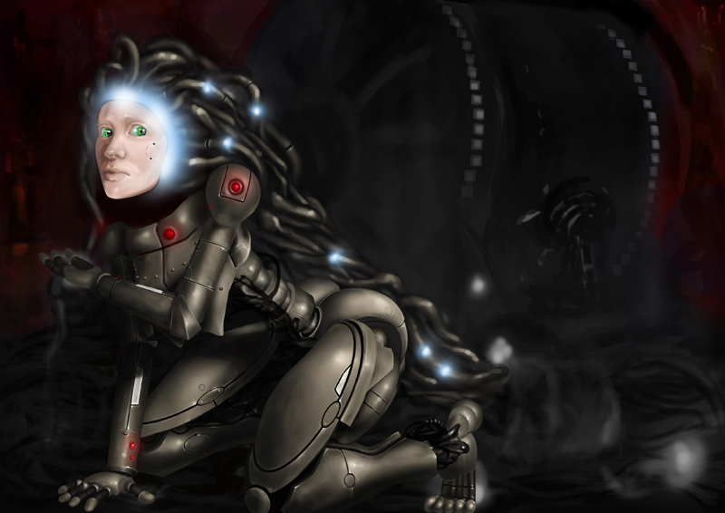
As always, comments are welcomed!
The lighting effects around her head are just a test for now, but I do quite like them.
She's also a bit big, so I will adjust that in time and get her to fit a little better. I think she is too close to the picture plane at the moment.
As always, comments are welcomed!
Everything's on the right!!!
It's like driving abroad!
Last edit: 28 Feb 2015 00:34 by Domtopia.
Please Log in or Create an account to join the conversation.
28 Feb 2015 00:42 #9170
by kazky
Replied by kazky on topic Someone's gotta start this ball a-rolling!!
Lol, ya loon,
Wow! Thanks Kaz!
Wow! Thanks Kaz!!
... this is getting to a habit!
Please Log in or Create an account to join the conversation.
01 Mar 2015 00:04 - 01 Mar 2015 00:07 #9214
by Domtopia
Everything's on the right!!!
It's like driving abroad!
Replied by Domtopia on topic Someone's gotta start this ball a-rolling!!
Thanks Kaz! I do try!!
Been playing with colour and here's a sample. I love the red, but the gold is doubtful. Plus the hair is getting there, bit by bit. I need to work on the depth when the hair is finished. It is pulled forward by the brightness and high contrast, so I will have to give it some drop shadows and lower the contrast somewhat.
Anyways, here it is as it stands.
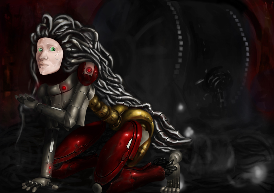
I posted this one up a little bigger than usual because I was quite pleased with the scratches and weathering on her legs.Hopefully the larger image will help you guys to see them better!
Plus, I know I'm spamming with so many posts of this, but it's my WIP thread, so I'm doing it anyway!!
Been playing with colour and here's a sample. I love the red, but the gold is doubtful. Plus the hair is getting there, bit by bit. I need to work on the depth when the hair is finished. It is pulled forward by the brightness and high contrast, so I will have to give it some drop shadows and lower the contrast somewhat.
Anyways, here it is as it stands.
I posted this one up a little bigger than usual because I was quite pleased with the scratches and weathering on her legs.Hopefully the larger image will help you guys to see them better!
Plus, I know I'm spamming with so many posts of this, but it's my WIP thread, so I'm doing it anyway!!
Everything's on the right!!!
It's like driving abroad!
Last edit: 01 Mar 2015 00:07 by Domtopia.
Please Log in or Create an account to join the conversation.
- microscopi
-

- Offline
- Premium Member
-

Less
More
- Posts: 743
- Thank you received: 79
01 Mar 2015 01:37 - 01 Mar 2015 01:42 #9217
by microscopi
Replied by microscopi on topic Someone's gotta start this ball a-rolling!!
Hey Dom, the lighting on the red/yellow texture of the 2nd image really looks well detailed, reminds me a lot of Ironmans armor, because of the colors. I think the color choices of the pic before work much better as a whole, and the same with the details, you really have an awesome HR Giger vibe going on with your pic right now, the 2nd image sort of takes that away, imo.
What stands out to me the most is her face, the lighting is fairly dark in your pic but her face seems too bright, its definitely the focal point of your image right now, maybe you can rough her face up a bit, make it darker and give her some scratches, showing metal texture more.
Overall looking really good !
Last edit: 01 Mar 2015 01:42 by microscopi.
Please Log in or Create an account to join the conversation.
Latest Activity

Banj updated their profile picture


Charlotte Still wearing a mask? Is it so we won't see you hoarding food in those cheeks of yours?
See More
Banj Mfmuh Guhmfpf
See More
Charlotte I'll take that as a yes...
See More
Charlotte Why is there a tiny flashing thing in front of the reply link/button? It's so small I can't see if it's an exclamation mark or a question mark... or...both?)
See More
Banj Because? Both!
See More
Charlotte *gasp*
See More

CaptainDeth updated their profile picture

CaptainDeth Ahoy folks, just a newbie here, just getting started. Thanks for allowing me in.
CaptainDeth Thank You
CaptainDeth and Mr.Bungle joined the site


honbasic joined the site


Gawk joined the site