


- Posts: 1256
- Thank you received: 96


Are you trying to spew those lurker tentacles at us and failing or are you just in a state of constant amazement? 
The shoutbox is unavailable to non-members
Shoutbox History
Are you trying to spew those lurker tentacles at us and failing or are you just in a state of constant amazement?
Someone's gotta start this ball a-rolling!!
07 Mar 2015 17:44 #9418
by Domtopia
Everything's on the right!!!
It's like driving abroad!
Replied by Domtopia on topic Someone's gotta start this ball a-rolling!!
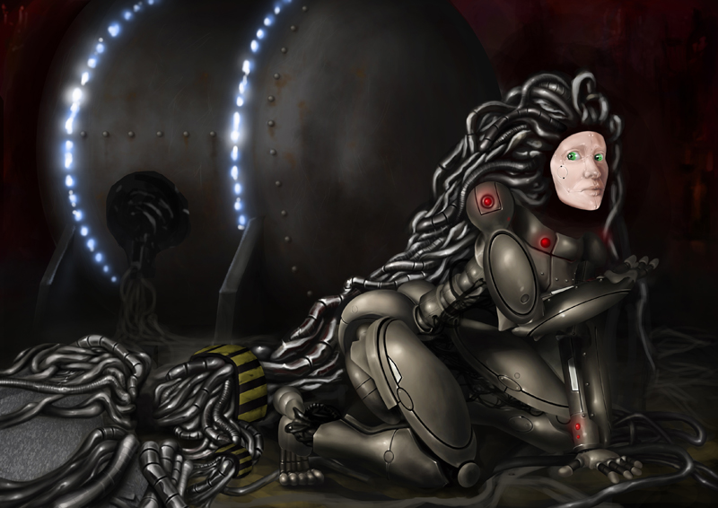
I noticed that about the head, so I have scaled that down a bit. Huge noggins seem to be my thing! I am always doing it!
The lights in her hair look great. I think I would like to use that some more. As I am working on it now, I am aware of how samey it's getting with the cables. That internal lighting would make a great device to break up the monotony. It was a good paint over Mic. Thanks!
The lights in her hair look great. I think I would like to use that some more. As I am working on it now, I am aware of how samey it's getting with the cables. That internal lighting would make a great device to break up the monotony. It was a good paint over Mic. Thanks!
Everything's on the right!!!
It's like driving abroad!
Please Log in or Create an account to join the conversation.
- crankshaft
-

- Offline
- Platinum Member
-

Less
More
- Posts: 1449
- Thank you received: 55
07 Mar 2015 18:11 #9420
by crankshaft
Replied by crankshaft on topic Someone's gotta start this ball a-rolling!!
Wow Dom the image looks awesome! My opinions on critique: I think there's too much unnecessary space on the right side so maybe try cropping some out? Also I'd really blur out or tone down the contrast of her hair once it passes her torso since it's really jarring/too detailed and competing with her face. Also the generator light idea is cool but I'd rearrange them in a way that directs flow to her face Eg have faint curved glowing wires routing to the left side of the image/face.
Please Log in or Create an account to join the conversation.

07 Mar 2015 18:25 #9423
by Charlotte
Any an all misspellings are henceforth blamed on the cats.
Replied by Charlotte on topic Someone's gotta start this ball a-rolling!!
I think micro had some really good ideas in that paintover ") (not the boobs though lol - robots don't need to feed babies after all)
(not the boobs though lol - robots don't need to feed babies after all)
I think the "partially metal" face and the point lights instead of one uniform glow works really well, and I also agree with the fleshing out of the arm. The legs are much more "curvy" (rounded) in form, so I felt the more straight cylindrical arms looked too different - like a different kind of (robot) model.
Regarding the background, I also thought there was a maintenance tunnel or something in the back But I thought I'd point out that from my work computer the background was pitch black (besides the lights), so while I know you're still working on it, be careful not to make it too dark.
(not the boobs though lol - robots don't need to feed babies after all)I think the "partially metal" face and the point lights instead of one uniform glow works really well, and I also agree with the fleshing out of the arm. The legs are much more "curvy" (rounded) in form, so I felt the more straight cylindrical arms looked too different - like a different kind of (robot) model.
Regarding the background, I also thought there was a maintenance tunnel or something in the back
But I thought I'd point out that from my work computer the background was pitch black (besides the lights), so while I know you're still working on it, be careful not to make it too dark. Any an all misspellings are henceforth blamed on the cats.
Please Log in or Create an account to join the conversation.
08 Mar 2015 18:15 - 08 Mar 2015 21:56 #9447
by Domtopia
Everything's on the right!!!
It's like driving abroad!
Replied by Domtopia on topic Someone's gotta start this ball a-rolling!!
Thanks guys! I think the darkness/lighting issue is a tricky one, because it seems to be dependant on what screen you're looking at it from. On my laptop, it's fine. I can see the rudiments of the generator in the background and the environment beyond that. If I plug my laptop into my TV, I get a 40" version of it! The contrast is higher on the TV though, so I can see even more detail through that. When I use PSE 9 the background is quite a dark grey too, so that makes everything brighter by contrast. When I post up here it's on a white background, so it's much darker and more difficult to make out the darker image details. It's a bit like snow blindness.
There seems to be no rhyme or reason to it!
Crank: The area to the right will be filled eventually, so it won't be so empty once it's finished. Like Charlotte said though, I will have to watch how dark the background is. I will look into the cable thing... although I don't think it posses that much of a problem personally. What does anyone else think?
Charlotte: I am now looking into the arm thing. It is pretty hard to come up with a design that doesn't require a complete redraw! But I will try my best and if a redraw is what is necessary, then I will just have to do that! Thanks for the feedback guys! Keeps me going!
There's just one point that is bothering me. I want her face to be detached from the cables because I want to give the impression that there is something mysterious going on back there. I really like the idea of putting in internal lights within the cables, but I don't want to lose that mystery. Any ideas?
Everything's on the right!!!
It's like driving abroad!
Last edit: 08 Mar 2015 21:56 by Domtopia.
Please Log in or Create an account to join the conversation.
12 Mar 2015 14:56 - 12 Mar 2015 14:56 #9536
by Domtopia
Everything's on the right!!!
It's like driving abroad!
Replied by Domtopia on topic Someone's gotta start this ball a-rolling!!
Hopefully you can see what's in the background now!
Everything's on the right!!!
It's like driving abroad!
Last edit: 12 Mar 2015 14:56 by Domtopia.
Please Log in or Create an account to join the conversation.
12 Mar 2015 17:35 #9541
by Charlotte
Any an all misspellings are henceforth blamed on the cats.
Replied by Charlotte on topic Someone's gotta start this ball a-rolling!!
Yup I see the background (can't speak for my work computer though). Nice rust. Also like the arm remake.
Also like the arm remake. Any an all misspellings are henceforth blamed on the cats.
The following user(s) said Thank You: Domtopia
Please Log in or Create an account to join the conversation.
12 Mar 2015 23:04 #9544
by Domtopia
Everything's on the right!!!
It's like driving abroad!
Replied by Domtopia on topic Someone's gotta start this ball a-rolling!!
Thanks Charlotte! The rust was applied with a custom brush I made for adding grime and grubbiness. It's the first time I have ever made a custom brush all my own!
I have a question though. Which of these do you guys prefer? The one on the left has the lights curving around the barrel of the generator. The one on the right puts the lights along the metal joins. I think that makes more sense, but I don't like it as much.
A bit of feedback would be useful as I am getting a bit fed up with this now and really want to get it finished! Thanks guys!
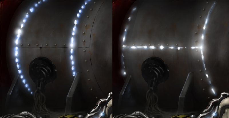
Everything's on the right!!!
It's like driving abroad!
Please Log in or Create an account to join the conversation.
- microscopi
-

- Offline
- Premium Member
-

Less
More
- Posts: 743
- Thank you received: 79
12 Mar 2015 23:26 #9545
by microscopi
Replied by microscopi on topic Someone's gotta start this ball a-rolling!!
I really like the generator on the left, theglowing lines flow with the shape of the generator nicely, plus the blue is nice to add color, also seeing the seams of the metal really helps push the realism, oh and I like the arm now great idea with the shape. (*but her face is too bright still* *cough*  )
)
) Please Log in or Create an account to join the conversation.

13 Mar 2015 08:40 #9553
by kazky
Replied by kazky on topic Someone's gotta start this ball a-rolling!!
yep I agree, the one on the left 'reads' better to me, there is something bugging me about the perspective of the barrel though, I don't know if it's how the seam of the metal is?
Please Log in or Create an account to join the conversation.
13 Mar 2015 15:05 #9556
by Domtopia
Everything's on the right!!!
It's like driving abroad!
Replied by Domtopia on topic Someone's gotta start this ball a-rolling!!
The lateral one is at horizon level, so that's ok I think. But the other one, the one on the end, is a bit of a guess... it also doesn't match either the ring of rivets, the perspective of the round edge of the barrel, or the ring of lights! It's probably that that you are picking up on Kaz.
If I was drawing this traditionally I could use ellipse guides, but I don't know how to do something like that in digital media. So I am just guessing! Is it quite noticeable?
If I was drawing this traditionally I could use ellipse guides, but I don't know how to do something like that in digital media. So I am just guessing! Is it quite noticeable?
Everything's on the right!!!
It's like driving abroad!
Please Log in or Create an account to join the conversation.
Latest Activity

Banj updated their profile picture


Charlotte Still wearing a mask? Is it so we won't see you hoarding food in those cheeks of yours?
See More
Banj Mfmuh Guhmfpf
See More
Charlotte I'll take that as a yes...
See More
Charlotte Why is there a tiny flashing thing in front of the reply link/button? It's so small I can't see if it's an exclamation mark or a question mark... or...both?)
See More
Banj Because? Both!
See More
Charlotte *gasp*
See More

CaptainDeth updated their profile picture

CaptainDeth Ahoy folks, just a newbie here, just getting started. Thanks for allowing me in.
CaptainDeth Thank You
CaptainDeth and Mr.Bungle joined the site


honbasic joined the site


Gawk joined the site