- Posts: 1452
- Thank you received: 55


The shoutbox is unavailable to non-members
Crankshaft's Sketchbook
- crankshaft
-
 Topic Author
- Offline
- Platinum Member
-

Less
More
07 Mar 2016 01:21 - 07 Mar 2016 01:24 #13477
by crankshaft
Replied by crankshaft on topic Crankshaft's Sketchbook
Updates.
Car rendering. Those lights and wheels are going to be a challenge...
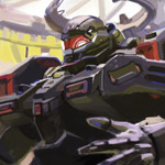
Rough design sketching. I focus on design with these sketches and imaginative work.
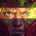
Schoolism. Focused on getting the major values down and forms. Then I tried to add strands of hair and clumping. I also understand values so much better now but I'm still struggling with the fur.
Last edit: 07 Mar 2016 01:24 by crankshaft.
Please Log in or Create an account to join the conversation.
- microscopi
-

- Offline
- Premium Member
-

Less
More
- Posts: 743
- Thank you received: 79
07 Mar 2016 07:51 #13479
by microscopi
Replied by microscopi on topic Crankshaft's Sketchbook
Love the character Crank, lots of emotion, like he's really in deep thought, you could try to use a real fur texture and just overlay it on top of your lion, it might give it a unique look that way.
The car looks really great also, the reflections really make it stand out. The wheels will be difficult but it you can make them really detailed it will make the car look just that much cooler.
You're getting better at sketching from what I can see I like the machine in the background the most.
It's like your studies have brought you up a couple levels recently, awesome!
Please Log in or Create an account to join the conversation.
- crankshaft
-
 Topic Author
- Offline
- Platinum Member
-

Less
More
- Posts: 1452
- Thank you received: 55
12 Mar 2016 03:00 - 12 Mar 2016 03:01 #13507
by crankshaft
Replied by crankshaft on topic Crankshaft's Sketchbook
Updates. Thanks Micro! I think I'm going to keep at it with the fur. It's very hard but I'm seeing improvement.
Schoolism. I think I'm finally getting it.
Car rendering. Testing some stuff with the wheels.
Nuclear reactor sketch. It's based off the hoist controls at work.
Anatomy fail.
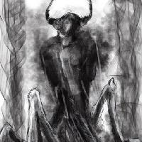
Spider mech wip. Going to do a semi detailed line drawing with those tone legs then I'm going to sketchup to get the perspective of those legs. Then I'll do another line drawing but in a better camera angle.
Last edit: 12 Mar 2016 03:01 by crankshaft.
Please Log in or Create an account to join the conversation.
- crankshaft
-
 Topic Author
- Offline
- Platinum Member
-

Less
More
- Posts: 1452
- Thank you received: 55
13 Mar 2016 21:39 #13522
by crankshaft
Replied by crankshaft on topic Crankshaft's Sketchbook
Please Log in or Create an account to join the conversation.
14 Mar 2016 20:48 #13524
by Valence
Replied by Valence on topic Crankshaft's Sketchbook
The pen and markers work looks interesting. I've never tried markers, I think I make too many mistakes to get away with such a permanent medium.  Just give me my pencil or graphite and more importantly let me have an eraser!
That car is really starting to come together. The addition of the wheels makes such a difference, especially with that concave geometry of the hubs. Looks really good so far.
That car is really starting to come together. The addition of the wheels makes such a difference, especially with that concave geometry of the hubs. Looks really good so far.
Please Log in or Create an account to join the conversation.
- crankshaft
-
 Topic Author
- Offline
- Platinum Member
-

Less
More
- Posts: 1452
- Thank you received: 55
19 Mar 2016 02:49 #13572
by crankshaft
Replied by crankshaft on topic Crankshaft's Sketchbook
Please Log in or Create an account to join the conversation.
- crankshaft
-
 Topic Author
- Offline
- Platinum Member
-

Less
More
- Posts: 1452
- Thank you received: 55
19 Mar 2016 02:51 #13573
by crankshaft
Replied by crankshaft on topic Crankshaft's Sketchbook
Thanks Valence! Sometimes I go back to pencil because I really like being able to erase 
Please Log in or Create an account to join the conversation.
- crankshaft
-
 Topic Author
- Offline
- Platinum Member
-

Less
More
- Posts: 1452
- Thank you received: 55
25 Mar 2016 13:44 #13596
by crankshaft
Spider mech. Planning values, color palette and lighting. My next concerns is getting texture because the mech basically has 2 sides and with it being top lit it has a good 1-3 read. Texture is usually best seen on the number 2 side. The other problem are the legs, I want to reuse the same value as the body but then the left front leg would blend/disappear so choosing a dark local value makes it harder to show form. What's a good way to go about values? I remember people saying to just stick to 2-3 local values and avoid contrast creep eg light on dark repeatedly. But then what do you about mid tone values?
Replied by crankshaft on topic Crankshaft's Sketchbook
Spider mech. Planning values, color palette and lighting. My next concerns is getting texture because the mech basically has 2 sides and with it being top lit it has a good 1-3 read. Texture is usually best seen on the number 2 side. The other problem are the legs, I want to reuse the same value as the body but then the left front leg would blend/disappear so choosing a dark local value makes it harder to show form. What's a good way to go about values? I remember people saying to just stick to 2-3 local values and avoid contrast creep eg light on dark repeatedly. But then what do you about mid tone values?
Please Log in or Create an account to join the conversation.
- crankshaft
-
 Topic Author
- Offline
- Platinum Member
-

Less
More
- Posts: 1452
- Thank you received: 55
28 Mar 2016 01:06 - 28 Mar 2016 01:08 #13600
by crankshaft
Replied by crankshaft on topic Crankshaft's Sketchbook
Updates.
So I'm seeing a fatal flaw in my personal work. The more I try to get things accurate the more my work stiffens up and becomes dead. Conversely the more I pay little to no attention to the fundamentals and just draw my work comes more lively and natural. I think it's from doing such focused time consuming studies. This whole car was done from my imagination/visual library and took me about 6 hrs. Maybe I just need to loosen up and just sketch more. I love cars!
So I'm seeing a fatal flaw in my personal work. The more I try to get things accurate the more my work stiffens up and becomes dead. Conversely the more I pay little to no attention to the fundamentals and just draw my work comes more lively and natural. I think it's from doing such focused time consuming studies. This whole car was done from my imagination/visual library and took me about 6 hrs. Maybe I just need to loosen up and just sketch more. I love cars!
Last edit: 28 Mar 2016 01:08 by crankshaft.
Please Log in or Create an account to join the conversation.
28 Mar 2016 14:41 #13601
by Valence
Replied by Valence on topic Crankshaft's Sketchbook
Although I don't know the specific goals of the schoolism assignments I do think that the fur still looks a little too neat and flat. Try and break it down into managable clumps to give it more form rather than layering single strands. The shorter, speckled texture on the nose is much more successful.
The shiny cars look good as usual.
The shiny cars look good as usual.
Please Log in or Create an account to join the conversation.
Latest Activity
Banj updated their profile picture


Charlotte Still wearing a mask? Is it so we won't see you hoarding food in those cheeks of yours?
See More

Banj Mfmuh Guhmfpf
See More

Charlotte I'll take that as a yes...
See More

Charlotte Why is there a tiny flashing thing in front of the reply link/button? It's so small I can't see if it's an exclamation mark or a question mark... or...both?)
See More

Banj Because? Both!
See More

Charlotte *gasp*
See More
CaptainDeth updated their profile picture
CaptainDeth Ahoy folks, just a newbie here, just getting started. Thanks for allowing me in.
CaptainDeth Thank You
CaptainDeth and Mr.Bungle joined the site
honbasic joined the site
Gawk joined the site

