


- Posts: 1450
- Thank you received: 55

I'm sure. Well, I'm literally going to 
literally 
I think you're projecting 
He can't communicate from all the gagging he's doing 
 Val hasn't actually said how he feels about mayo...

The shoutbox is unavailable to non-members
Shoutbox History
I'm sure. Well, I'm literally going to
literally
I think you're projecting
He can't communicate from all the gagging he's doing
Val hasn't actually said how he feels about mayo...
Crankshaft's Sketchbook
- crankshaft
-
 Topic Author
- Offline
- Platinum Member
-

Less
More
10 Jan 2016 23:30 #13156
by crankshaft
Replied by crankshaft on topic Crankshaft's Sketchbook
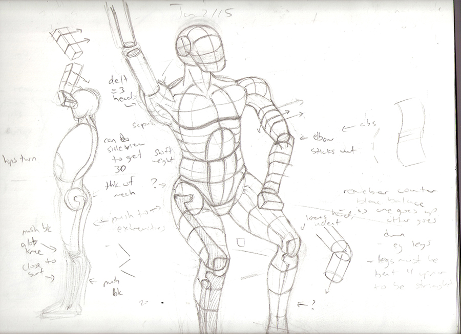
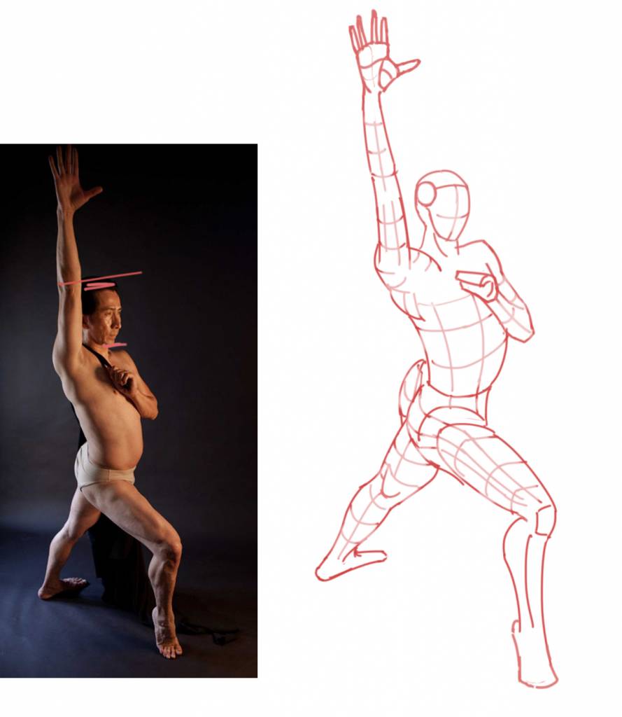
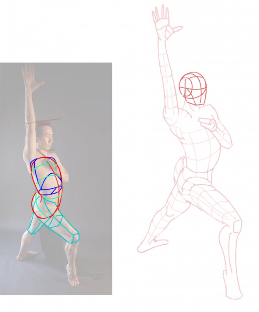
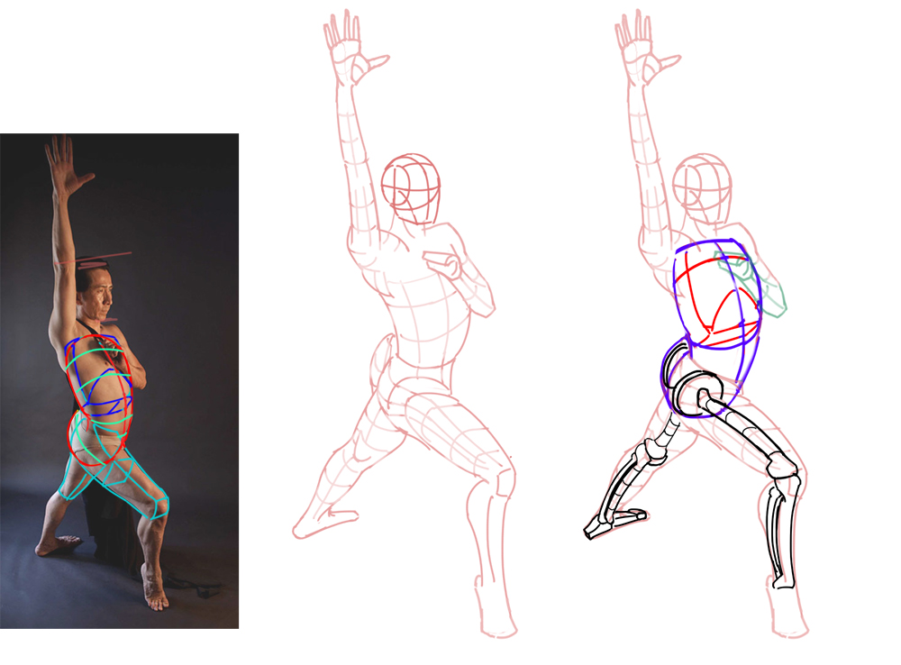
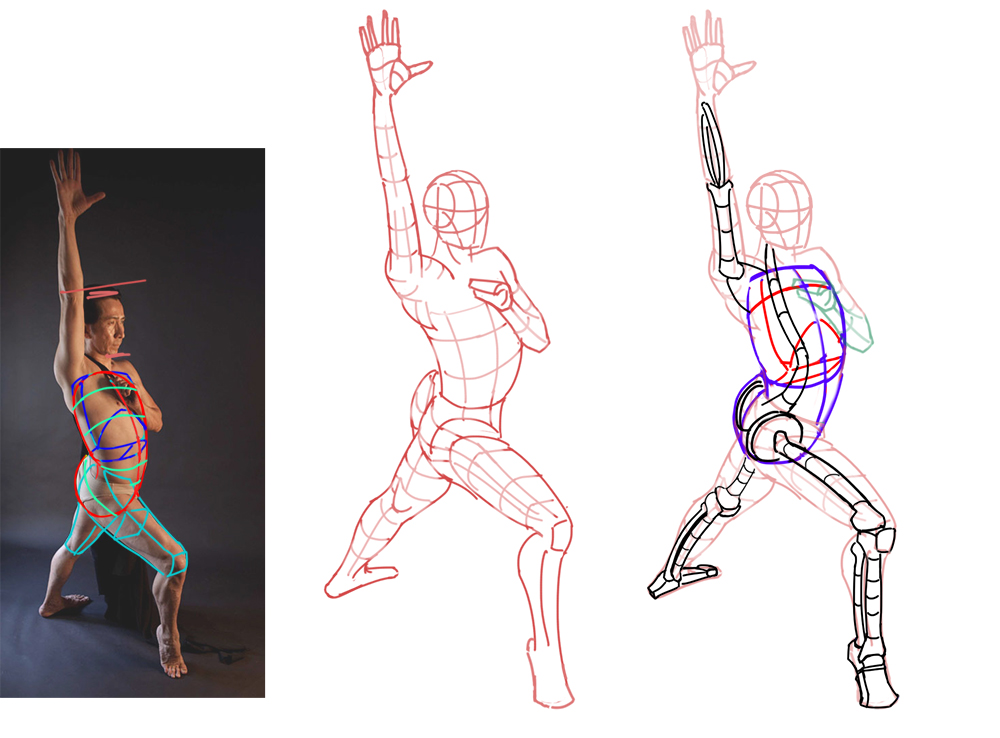
Update on my current anatomy pose.
Please Log in or Create an account to join the conversation.
- crankshaft
-
Topic Author
- Offline
- Platinum Member
-
Less
More
- Posts: 1450
- Thank you received: 55
16 Jan 2016 02:56 #13184
by crankshaft
Replied by crankshaft on topic Crankshaft's Sketchbook
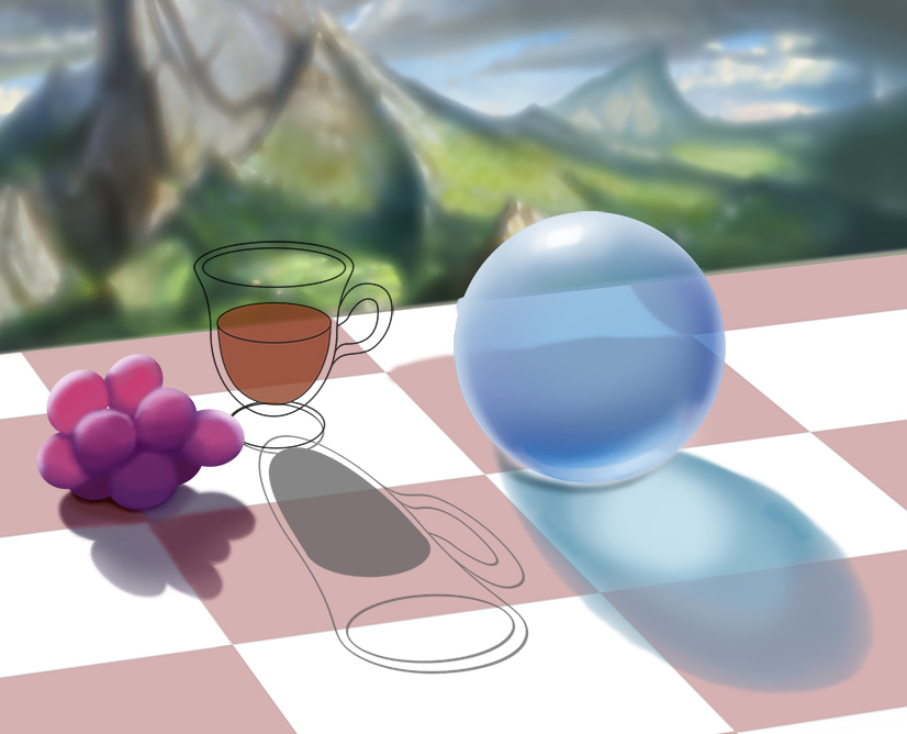
Updates. I think the grapes look better now. Also wip of the rendering of the mech. As for the reactor, still going big to small. And lastly, some anatomy fail.
Please Log in or Create an account to join the conversation.
- crankshaft
-
Topic Author
- Offline
- Platinum Member
-
Less
More
- Posts: 1450
- Thank you received: 55
17 Jan 2016 23:35 - 17 Jan 2016 23:41 #13188
by crankshaft
Replied by crankshaft on topic Crankshaft's Sketchbook
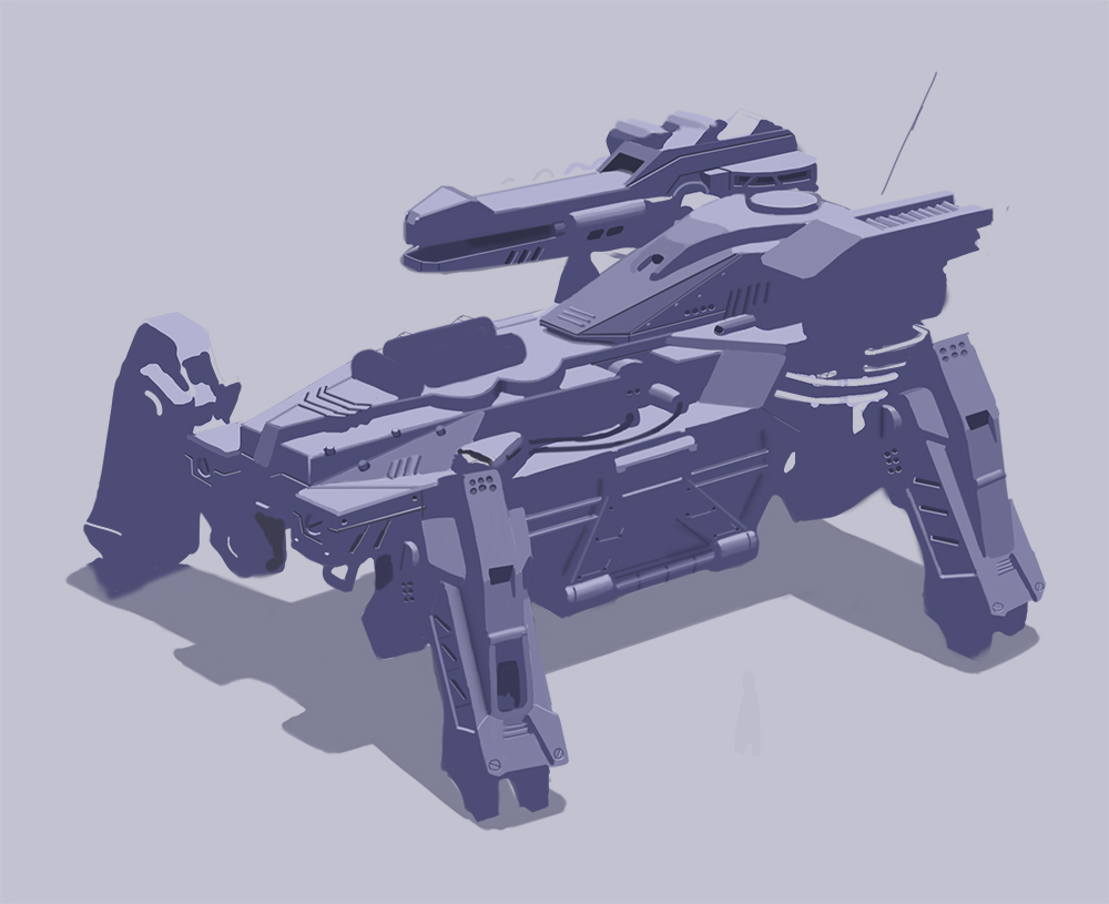
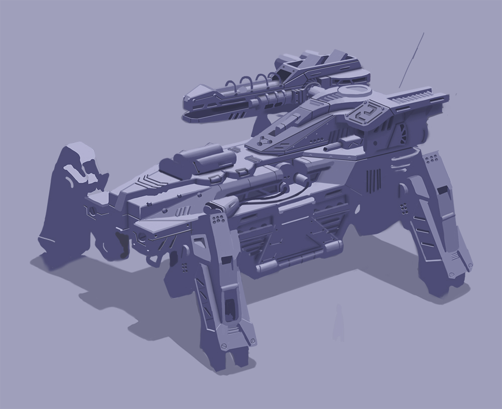
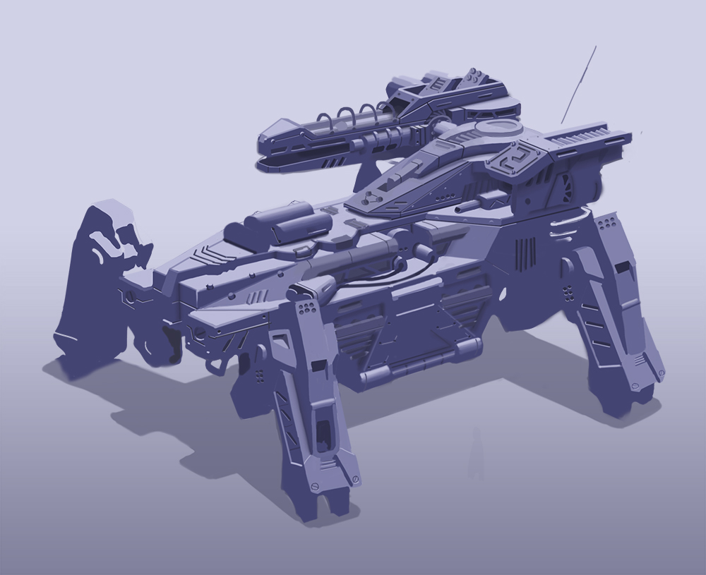
Update on my mech.
Last edit: 17 Jan 2016 23:41 by crankshaft. Reason: wrong pic
Please Log in or Create an account to join the conversation.

18 Jan 2016 01:41 #13191
by Atto
No smudge tool was harmed in the making of this image.
Replied by Atto on topic Crankshaft's Sketchbook
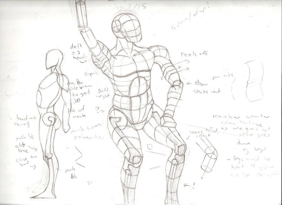
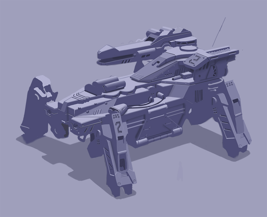
Looking good Crank. Just watch that No. 2 on the leg closest to us, it doesn't have your usual accuracy in terms of form and perspective.
No smudge tool was harmed in the making of this image.
Please Log in or Create an account to join the conversation.
- crankshaft
-
Topic Author
- Offline
- Platinum Member
-
Less
More
- Posts: 1450
- Thank you received: 55
23 Jan 2016 03:32 #13209
by crankshaft
Replied by crankshaft on topic Crankshaft's Sketchbook
Thanks Atto! I took a quick look and you're right the perspective is off. The leg is turned away from us so it should have compressed forms which I don't have. I'll fix it soon.
Updates. Went back to my anatomy pose and attempting to finish it now that I have some experience with the shoulder muscles. Getting the structure of the torso was a nightmare and it still looks off. There's always next time
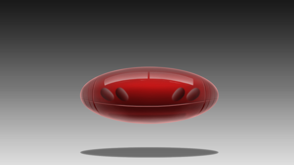
Spider mech. I love machines! Going to render it all in blue then add accents. My knowledge of color is really lacking. Noob question: are accents just the complementary of your base color? I also want to apply some of my schoolism lessons, like playing with warm and cool tones, adding sub surface scattering, specular highlights etc. Excited but nervous at the same time.
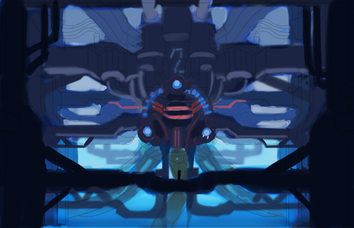
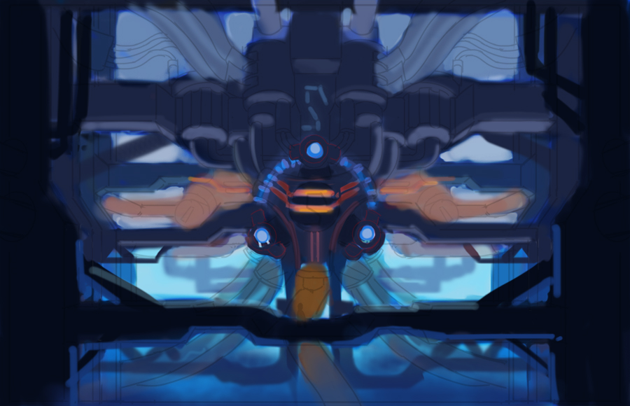
Reactor: Trying to play with warm and cool colors. Still focusing on the whole picture. More noob questions: how should I go about creating a color palette? I remember people saying to use a photo but I cant find one that matches my ideas. Or should I stop worrying and just keep practicing?
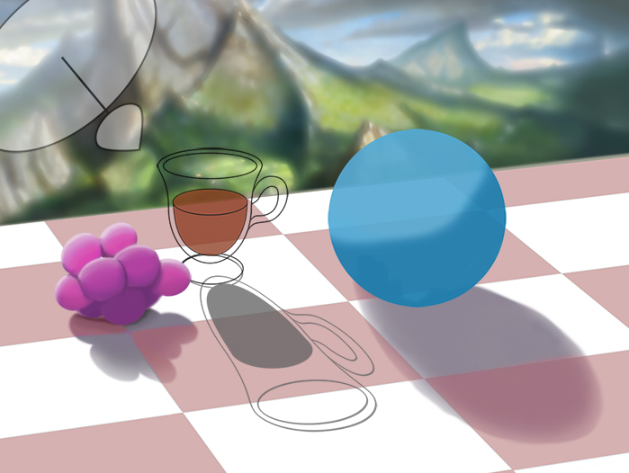
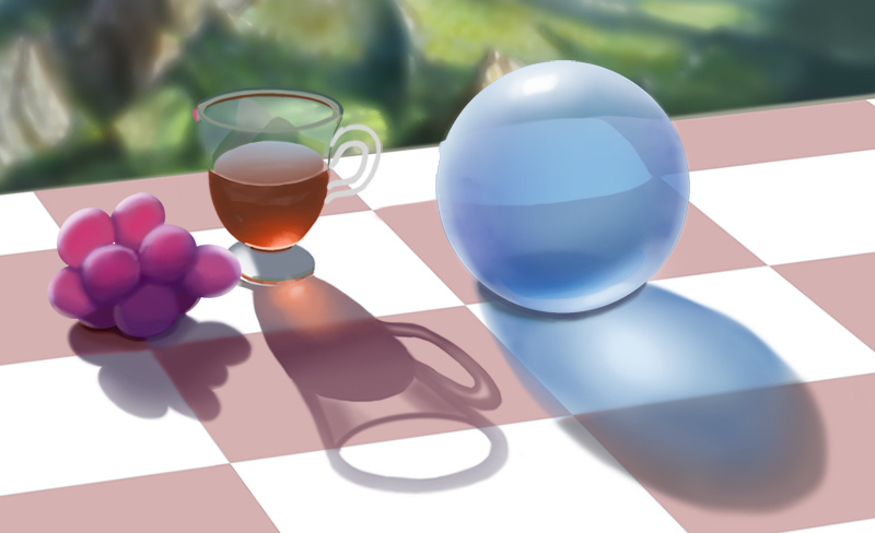
Schoolism update. Painfully re did those grapes 3 times. I guess no pain no gain. Definitely learning through the struggle. I think it looks better now but they still feel off.
Updates. Went back to my anatomy pose and attempting to finish it now that I have some experience with the shoulder muscles. Getting the structure of the torso was a nightmare and it still looks off. There's always next time
Spider mech. I love machines! Going to render it all in blue then add accents. My knowledge of color is really lacking. Noob question: are accents just the complementary of your base color? I also want to apply some of my schoolism lessons, like playing with warm and cool tones, adding sub surface scattering, specular highlights etc. Excited but nervous at the same time.
Reactor: Trying to play with warm and cool colors. Still focusing on the whole picture. More noob questions: how should I go about creating a color palette? I remember people saying to use a photo but I cant find one that matches my ideas. Or should I stop worrying and just keep practicing?
Schoolism update. Painfully re did those grapes 3 times. I guess no pain no gain. Definitely learning through the struggle. I think it looks better now but they still feel off.
Please Log in or Create an account to join the conversation.
- crankshaft
-
Topic Author
- Offline
- Platinum Member
-
Less
More
- Posts: 1450
- Thank you received: 55
24 Jan 2016 04:51 #13217
by crankshaft
Replied by crankshaft on topic Crankshaft's Sketchbook
Realized I made some mistakes on my pose so now I'm implementing some fixes. I'll transfer the robo bean to the pose soon.
Please Log in or Create an account to join the conversation.

24 Jan 2016 12:38 #13218
by Valence
Replied by Valence on topic Crankshaft's Sketchbook
Those grapes are really impressive. The inner glow of the light scattered through them is just right and so different from your solid metallic work. Well Done.
As to your noob questions: accents are usually small touches of colour that are repeated in different areas of the image to act as a way of linking the picture together. You can use any colour really but complementaries and warm\cool combinations work well to catch the eye and add variety and subtlety to the image.
And one other way of defining a palette or colour scheme is to use the Gamut Mask method to simplify your choices. (I think I've mentioned this before so forgive my repetition.)
Please Log in or Create an account to join the conversation.
- crankshaft
-
Topic Author
- Offline
- Platinum Member
-
Less
More
- Posts: 1450
- Thank you received: 55
30 Jan 2016 03:36 #13243
by crankshaft
Replied by crankshaft on topic Crankshaft's Sketchbook
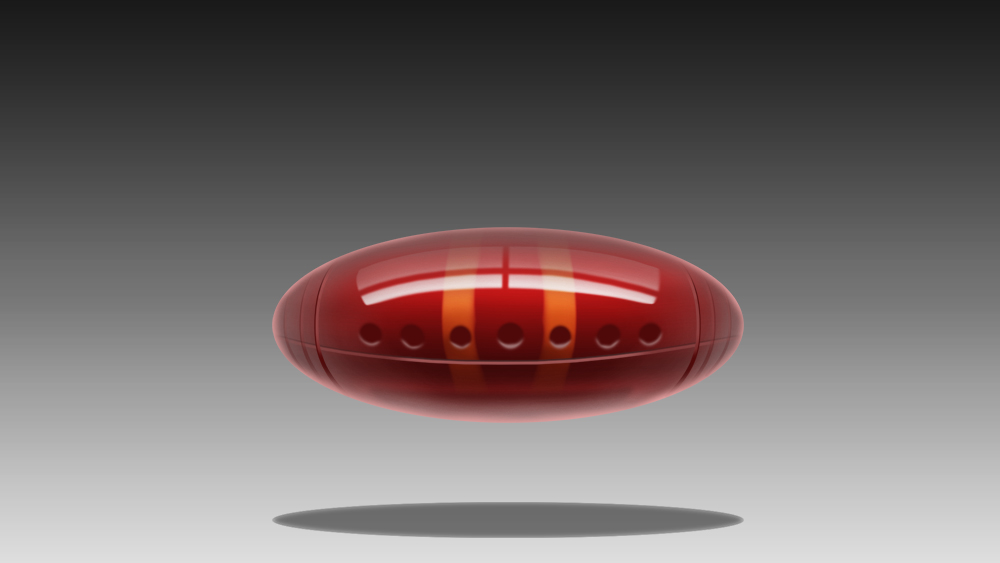
Great advice Valence! Thanks a lot! Hmm the grapes are still off to me, they feel more like lumps of plaster compared to the other students. But I'm glad there's progress so thanks. Another noob question: for the reactor I already got the values down. When I choose a garmut mask can I simply paint those colors over the greyscale values? Would that still ensure harmony? Forgive my ignorance.

I couldn't understand the Fresnel effect so I did a bunch of studies. Now I get it. I'm excited to add this to upcoming work.
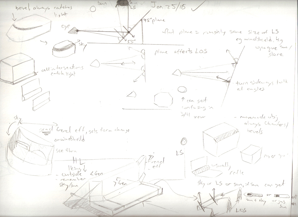
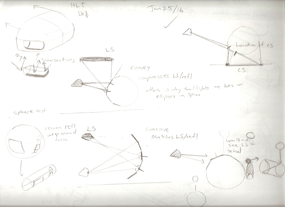
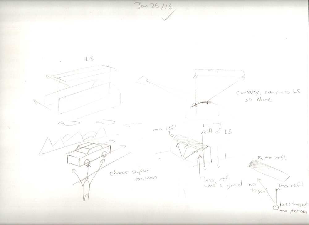
I couldn't understand the Fresnel effect so I did a bunch of studies. Now I get it. I'm excited to add this to upcoming work.
Please Log in or Create an account to join the conversation.
05 Feb 2016 21:04 - 05 Feb 2016 21:05 #13298
by Valence
Replied by Valence on topic Crankshaft's Sketchbook
The gamut mask method doesn't really affect how you apply paint (whether directly or over greyscale.) It's merely a way of restricting your choices but as a result it should give more unity to an image.
The main thing it does is to force you to understand how you can also use saturation as a way of varying colour.
Nice updates by the way. That shiny reflective red object is lovely.
The main thing it does is to force you to understand how you can also use saturation as a way of varying colour.
Nice updates by the way. That shiny reflective red object is lovely.
Last edit: 05 Feb 2016 21:05 by Valence.
Please Log in or Create an account to join the conversation.
- crankshaft
-
Topic Author
- Offline
- Platinum Member
-
Less
More
- Posts: 1450
- Thank you received: 55
06 Feb 2016 02:49 #13301
by crankshaft
Replied by crankshaft on topic Crankshaft's Sketchbook
Thanks Val! I guess I still have much to learn. Thanks for all the help!
I got lots of work done with all my other stuff but I'll just post the stuff with the most progress to avoid boring everyone.
Wanted to understand how to make a form change using the Fresnel effect.
Finally finished this pose. Going to move to the head.
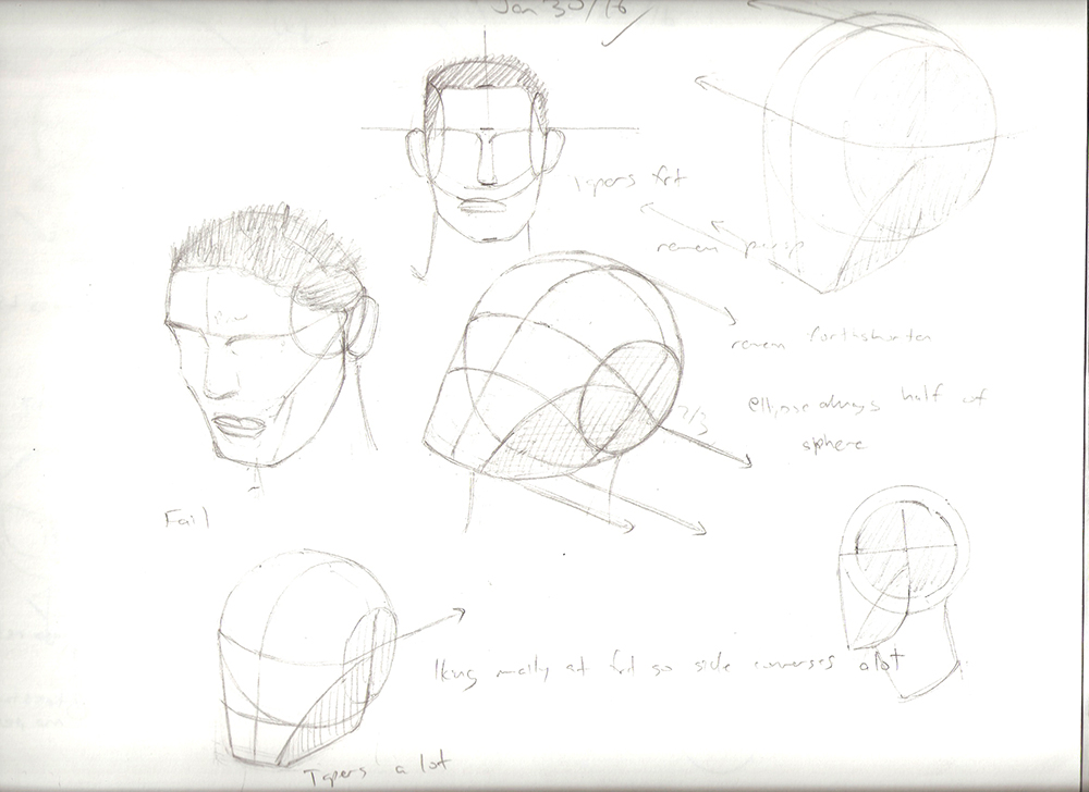
Head studies from Hampton and Loomis.
I got lots of work done with all my other stuff but I'll just post the stuff with the most progress to avoid boring everyone.
Wanted to understand how to make a form change using the Fresnel effect.
Finally finished this pose. Going to move to the head.
Head studies from Hampton and Loomis.
Please Log in or Create an account to join the conversation.
Latest Activity

Banj updated their profile picture


Charlotte Still wearing a mask? Is it so we won't see you hoarding food in those cheeks of yours?
See More
Banj Mfmuh Guhmfpf
See More
Charlotte I'll take that as a yes...
See More
Charlotte Why is there a tiny flashing thing in front of the reply link/button? It's so small I can't see if it's an exclamation mark or a question mark... or...both?)
See More
Banj Because? Both!
See More
Charlotte *gasp*
See More

CaptainDeth updated their profile picture

CaptainDeth Ahoy folks, just a newbie here, just getting started. Thanks for allowing me in.
CaptainDeth Thank You
CaptainDeth and Mr.Bungle joined the site


honbasic joined the site


Gawk joined the site