


- Posts: 1450
- Thank you received: 55


Oh, you just died earlier than usual, then...


 I didn't go to bed early, in fact I was probably up later than I normally am last night
seems everyone went to bed early yesterday... 
Almost 
The shoutbox is unavailable to non-members
Shoutbox History
Oh, you just died earlier than usual, then...
I didn't go to bed early, in fact I was probably up later than I normally am last night
seems everyone went to bed early yesterday...
Almost
Crankshaft's Sketchbook
- crankshaft
-
 Topic Author
- Offline
- Platinum Member
-

Less
More
07 Nov 2015 02:16 #12771
by crankshaft
Replied by crankshaft on topic Crankshaft's Sketchbook
Some figure studies from imagination. Trying to feel the weight and even the balance. These are stiff probably because I did them slowly in a constructive manner. Trying to go for a faster more fluid gestural approach.

Speaking of gesture I did some 1 minute figure gestures. These are horrible and I focused too much on contour. I'm posting them so I can scrutinize on how much I suck at them. I'm just not use to quick observational drawing (most of my stuff is constructive) but I also just need more practice.
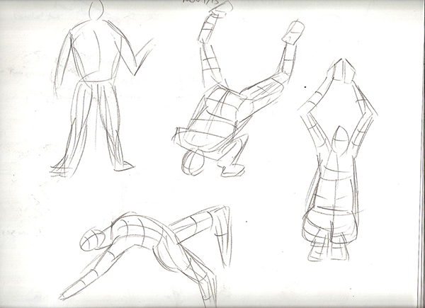
Speaking of gesture I did some 1 minute figure gestures. These are horrible and I focused too much on contour. I'm posting them so I can scrutinize on how much I suck at them. I'm just not use to quick observational drawing (most of my stuff is constructive) but I also just need more practice.
Please Log in or Create an account to join the conversation.
- crankshaft
-
Topic Author
- Offline
- Platinum Member
-
Less
More
- Posts: 1450
- Thank you received: 55
07 Nov 2015 02:22 #12772
by crankshaft
Thanks Val! I made some "rust" brushes that I'm going to put to good use now.
I choose to keep things monochromatic because I suck at color so I thought keeping things simple was better. As for color mode I just use normal and hue layers. I basically set everything using a hue/sat layer then I thought maybe I'll just put normal layers of color on top. My color theory is really bad.
Replied by crankshaft on topic Crankshaft's Sketchbook
Agree with Atto.
Yes to some more layering of texture.
And yes to using reference for more subtle inspiration and style.
Also the picture currently looks very monochrome. Some complementary colour touches here and there around the image will make an enormous difference and will help you progress further.
Are you working on a Colour blending mode at the moment or are you painting on a Normal layer?
Thanks Val! I made some "rust" brushes that I'm going to put to good use now.
I choose to keep things monochromatic because I suck at color so I thought keeping things simple was better. As for color mode I just use normal and hue layers. I basically set everything using a hue/sat layer then I thought maybe I'll just put normal layers of color on top. My color theory is really bad.
Please Log in or Create an account to join the conversation.
- crankshaft
-
Topic Author
- Offline
- Platinum Member
-
Less
More
- Posts: 1450
- Thank you received: 55
07 Nov 2015 02:31 #12773
by crankshaft
Thanks Atto! I don't deserve any praise, I was actually very close to giving up on the piece I realized why I'm having such a hard go at this is because I had no plan or direction. I was haphazardly juggling things like perspective, design, lighting, mood, color scale, function etc all at once. This is only my second full painting (FAIL) so I have no benchmark and I'm learning everything as I go.
As for a photo that's a great idea because then I can use the photo's color palette. I should of thought of that before! For rim lighting you reminded me of to how to render cut lines from my last study so I'm going to apply it here.
Thanks everyone for the help!
Replied by crankshaft on topic Crankshaft's Sketchbook
Very nice to see you still working on this Crank, you have a dedication that is very impressive.
I'm liking the colours you have down at the moment, my only suggestion at this stage is to find a reference image for the type of mood you are striving for. When I was producing visuals of schemes for architectural companies I often threw together a number of images just to pin down the exact lighting effect I was trying to depict. They don't even have to be related to your subject matter, (I once used a Jack Daniels advert to illustrate how I wanted to light a visual of a clients barn conversion - only to find out later he was a recovering alcoholic).
You have a very nice sense of the ambient light going on right now - I think it's the other light sources that need more clarification.
The pits at the front and left side of your image where you have the arcs of power would benefit from uplighting with a seperate light source from below highlighting the bottom of the handrail and the edge of the floor structure.
The foreground elements would benefit from rim lighting and the machinery near the two bright constructions either side of the main element should be lit from these sources instead of the ambient light as it appears now.
All that being said I know its still early on in the process and from your studies I have no doubt you've probably considered this. I must admit that I have never (successfully) completed an image as complex as this so good luck and keep up the good work.
Edit: I notice you also mention you want a grungy looking aspect to the image. For me (and I may be misunderstanding your intention here) 'grunge' is all about texture. If you search for grunge design on google it may give you a few ideas. Rust,flakey paint, hand drawn iconography and dirty stains all give that individual or 'authentic' look that in my mind sums up grunge.
Thanks Atto! I don't deserve any praise, I was actually very close to giving up on the piece
I realized why I'm having such a hard go at this is because I had no plan or direction. I was haphazardly juggling things like perspective, design, lighting, mood, color scale, function etc all at once. This is only my second full painting (FAIL) so I have no benchmark and I'm learning everything as I go.As for a photo that's a great idea because then I can use the photo's color palette. I should of thought of that before! For rim lighting you reminded me of to how to render cut lines from my last study so I'm going to apply it here.
Thanks everyone for the help!
Please Log in or Create an account to join the conversation.
- crankshaft
-
Topic Author
- Offline
- Platinum Member
-
Less
More
- Posts: 1450
- Thank you received: 55
07 Nov 2015 23:35 #12778
by crankshaft
Replied by crankshaft on topic Crankshaft's Sketchbook
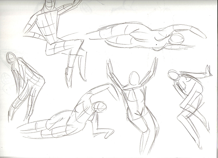
Rendering studies. Going to move to mainly design work since my sb is boring with mainly studies.
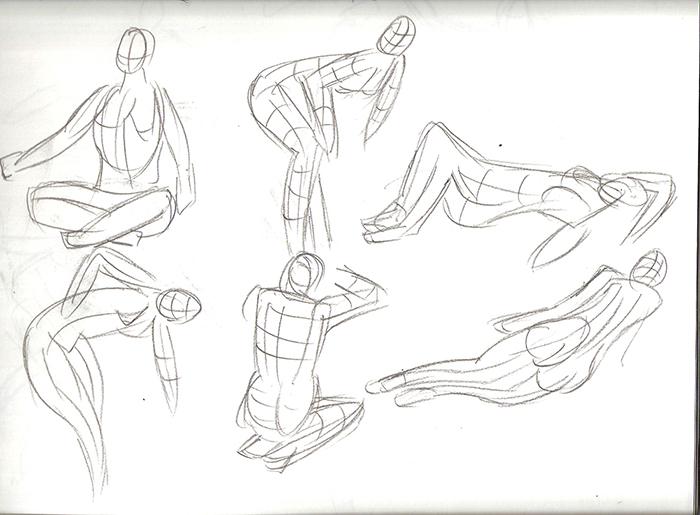
Full poses from imagination. Going to alternate between the manikin and skeleton.
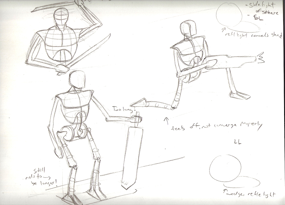
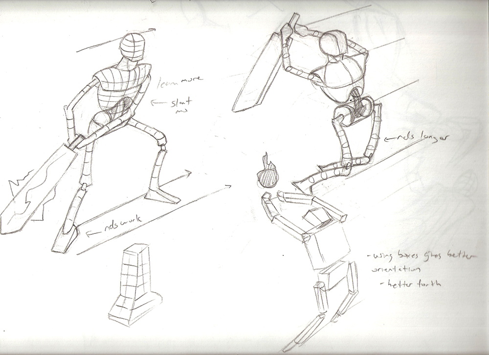
Full poses from imagination. Going to alternate between the manikin and skeleton.
Please Log in or Create an account to join the conversation.
- crankshaft
-
Topic Author
- Offline
- Platinum Member
-
Less
More
- Posts: 1450
- Thank you received: 55
08 Nov 2015 23:50 #12782
by crankshaft
Replied by crankshaft on topic Crankshaft's Sketchbook
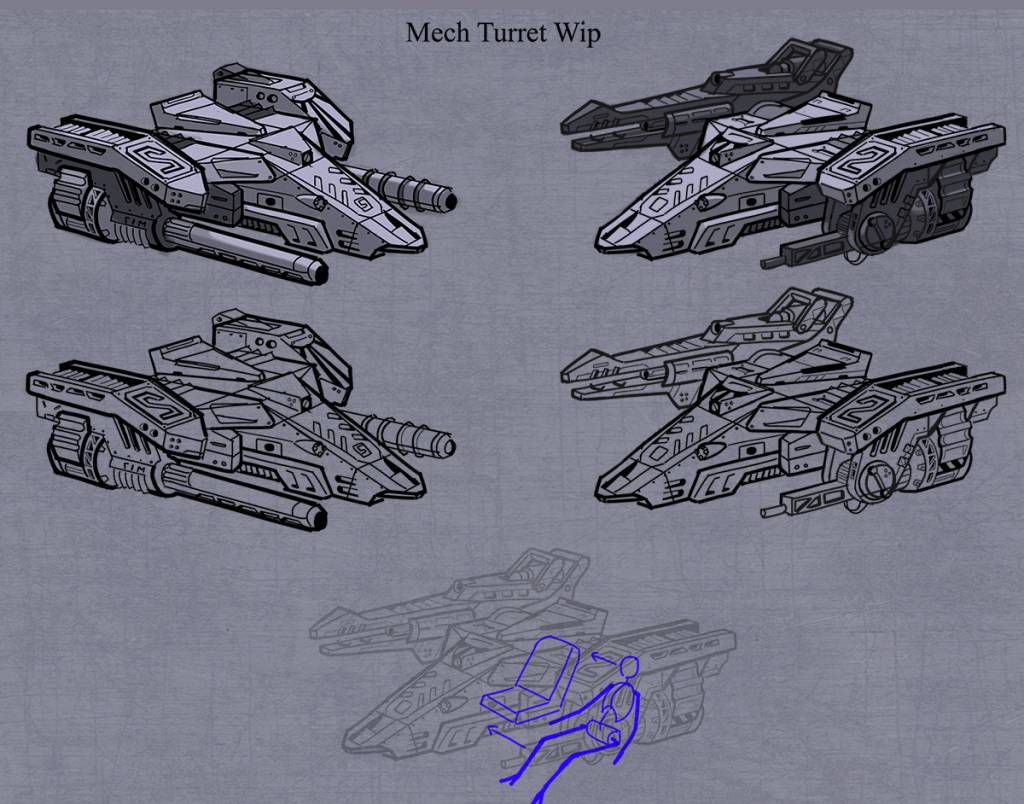
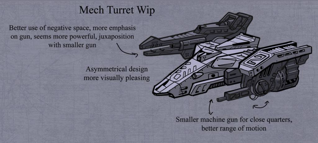
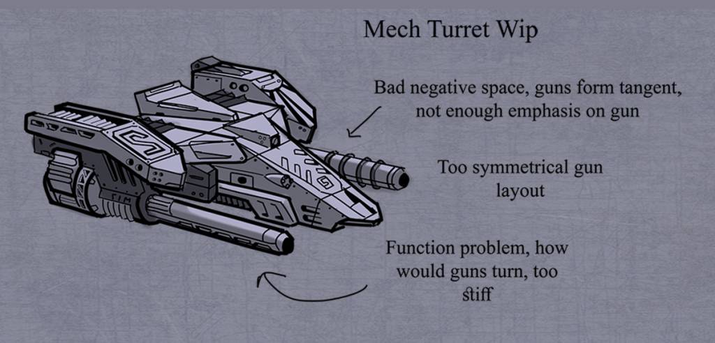
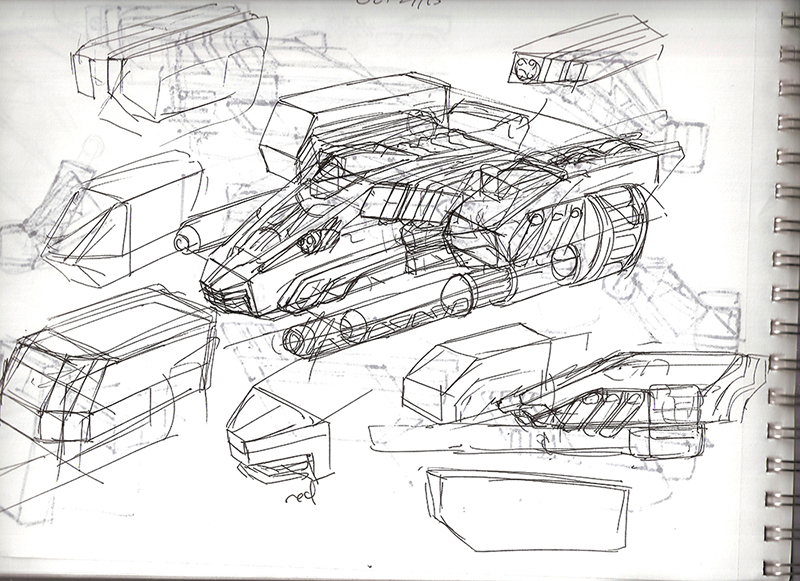
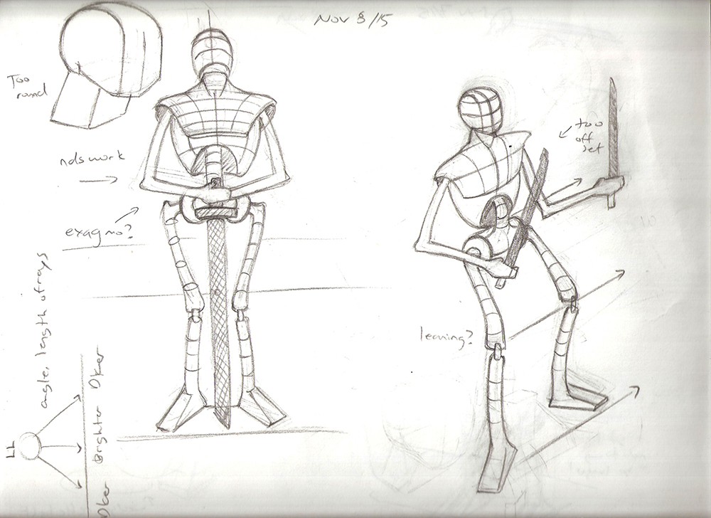
Some rough sketches of design parts for an upcoming spider mech.
Please Log in or Create an account to join the conversation.

09 Nov 2015 00:24 #12783
by Atto
No smudge tool was harmed in the making of this image.
Replied by Atto on topic Crankshaft's Sketchbook
Looking really good Crank,
The line weight variations are helping to sell the mass of the designs and the shading is looking really nice.
I like the textured paper too, I am wondering if it's a little dark though?
Also watch the font size you're using, a large font can make the layout seem a little like a childrens book.
Still very nice to see you producing a more finished image.
Keep it up.
No smudge tool was harmed in the making of this image.
Please Log in or Create an account to join the conversation.
- crankshaft
-
Topic Author
- Offline
- Platinum Member
-
Less
More
- Posts: 1450
- Thank you received: 55
09 Nov 2015 03:46 #12785
by crankshaft
Replied by crankshaft on topic Crankshaft's Sketchbook
Thanks Atto! You're right! I knew something felt off. I actually thought the line weights felt too big. I've seen others line work and I don't know how people get such thin lines. I actually think mine look cartoon like compared to others. I'll brighten the background for the future as well.
Update on my engine room. Still lots to do. Tell me what you think. Does the metal look like metal now? Before it looked like plastic Does it look grungy now? Is it over done?
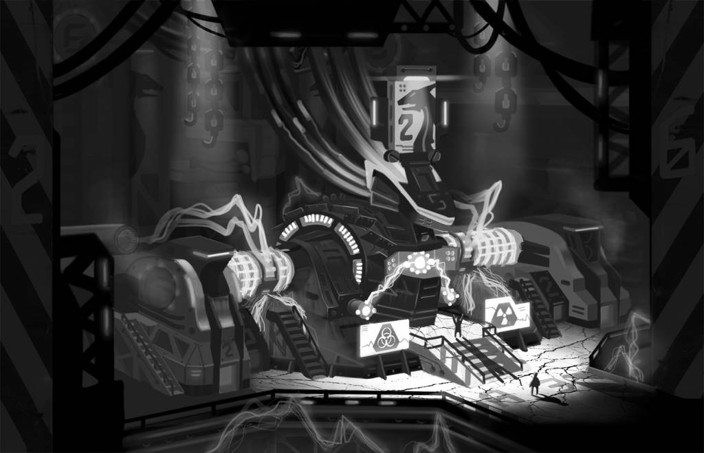
Update on my engine room. Still lots to do. Tell me what you think. Does the metal look like metal now? Before it looked like plastic
Does it look grungy now? Is it over done?Please Log in or Create an account to join the conversation.

09 Nov 2015 22:19 #12789
by Valence
Replied by Valence on topic Crankshaft's Sketchbook
The wheel looks much better now and I also like the addition of the chains and hooks in that softer light.
You can still keep the picture mostly monochrome (boiler/engine rooms always have a fiery hot glow to them) but adding some notes of a different colour around the picture will only enhance the colour that you already have. For instance, you could have some of the lightning arcs (or those extra lights you've added to the wheel) glow with a cooler colour to throw a bit of a different hue onto some of the edges/faces and this would add more dimension and depth to the forms.
As for the texture/details: the areas you've done do look better. It's just a case of zooming in and working the details. It's boring stuff, I know, but it'll pay off in the end.")
You can still keep the picture mostly monochrome (boiler/engine rooms always have a fiery hot glow to them) but adding some notes of a different colour around the picture will only enhance the colour that you already have. For instance, you could have some of the lightning arcs (or those extra lights you've added to the wheel) glow with a cooler colour to throw a bit of a different hue onto some of the edges/faces and this would add more dimension and depth to the forms.
As for the texture/details: the areas you've done do look better. It's just a case of zooming in and working the details. It's boring stuff, I know, but it'll pay off in the end.
Please Log in or Create an account to join the conversation.
- Digital Dave
-

- Offline
- Platinum Member
-
Less
More
- Posts: 2242
- Thank you received: 163
09 Nov 2015 23:16 #12793
by Digital Dave
I get sketchy around pencils! ...
Replied by Digital Dave on topic Crankshaft's Sketchbook
Agree with Valence, really liking the added chains and it works quite well with the lighting.
I get sketchy around pencils! ...
Please Log in or Create an account to join the conversation.
- crankshaft
-
Topic Author
- Offline
- Platinum Member
-
Less
More
- Posts: 1450
- Thank you received: 55
14 Nov 2015 03:22 #12810
by crankshaft
Replied by crankshaft on topic Crankshaft's Sketchbook
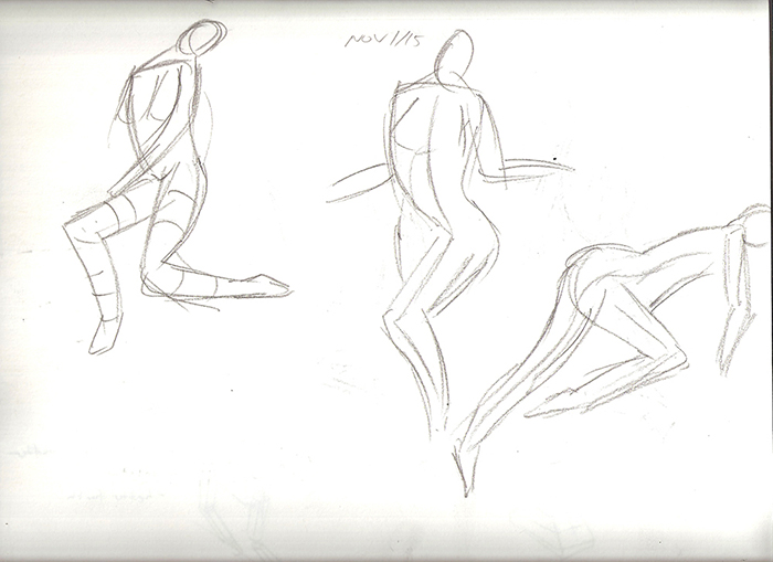
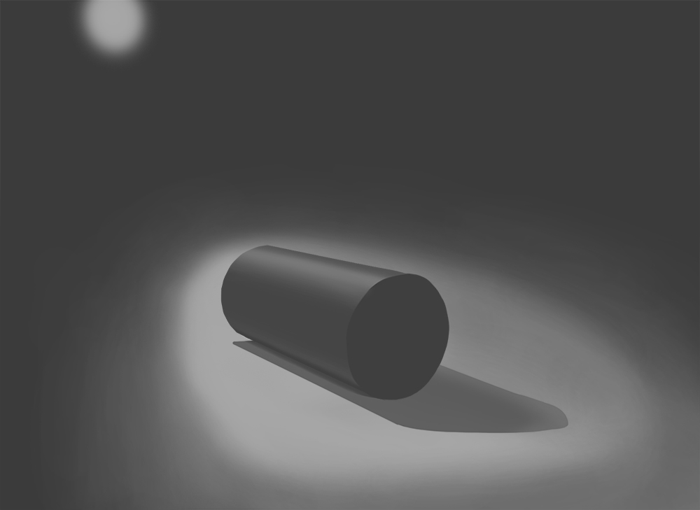
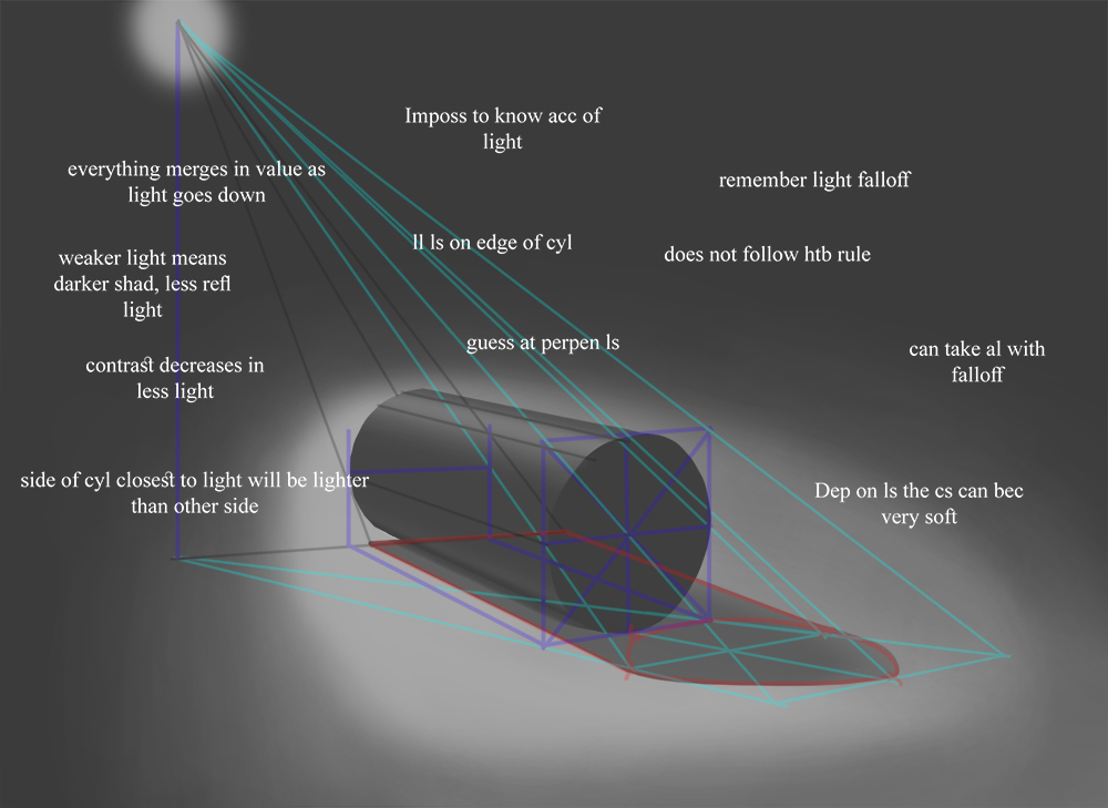
More anatomy studies. I also signed up for a schoolism subscription and I'm currently learning basic lighting. So far it's really good and I recommend it. Not much to update because I've been multi tasking too much eg spider mech, engine room, rendering, anatomy, schoolism, and now I want to get into design/purge my plethora of ideas. Maybe I'll do some tips/tutorials to make up for the lack of updates.
Thanks Dave! Thanks Valence! Your advice has been a big help! I'm going to take a break from the engine room and go back to my spider mech/sketching.
Thanks Dave! Thanks Valence! Your advice has been a big help! I'm going to take a break from the engine room and go back to my spider mech/sketching.
Please Log in or Create an account to join the conversation.
Latest Activity

Banj updated their profile picture


Charlotte Still wearing a mask? Is it so we won't see you hoarding food in those cheeks of yours?
See More
Banj Mfmuh Guhmfpf
See More
Charlotte I'll take that as a yes...
See More
Charlotte Why is there a tiny flashing thing in front of the reply link/button? It's so small I can't see if it's an exclamation mark or a question mark... or...both?)
See More
Banj Because? Both!
See More
Charlotte *gasp*
See More

CaptainDeth updated their profile picture

CaptainDeth Ahoy folks, just a newbie here, just getting started. Thanks for allowing me in.
CaptainDeth Thank You
CaptainDeth and Mr.Bungle joined the site


honbasic joined the site


Gawk joined the site