


- Posts: 59
- Thank you received: 9
Almost 


Oh. I'd never heard of that until I read about his death yesterday...
Yosser Hughes is the character he played in Boys from the black stuff

The shoutbox is unavailable to non-members
Shoutbox History
Almost
Oh. I'd never heard of that until I read about his death yesterday...
Yosser Hughes is the character he played in Boys from the black stuff
Crankshaft's Sketchbook
29 Aug 2015 07:00 #12177
by Yian
Just noticed this image here. I will take a guess here and say that you used these Chinese characters because one says energy and the other one says gas. From my understanding of Chinese language, this is not quite how it works. In order to say a word, Chinese characters often have to use two or three characters together. This is like, in English, you don't simply write ENE when you want to say ENERGY, or GA When you want to say GAS.
Also, even if you do spelled out the words correctly, I'm not sure if it makes a lot of sense to have these giant letters on the floor that doesn't mean anything special. Just something to keep in mind because to people who don't read Chinese this might look cool, but to those who reads and understands its cultural context, this might appear quite silly.
Replied by Yian on topic Crankshaft's Sketchbook
Just noticed this image here. I will take a guess here and say that you used these Chinese characters because one says energy and the other one says gas. From my understanding of Chinese language, this is not quite how it works. In order to say a word, Chinese characters often have to use two or three characters together. This is like, in English, you don't simply write ENE when you want to say ENERGY, or GA When you want to say GAS.
Also, even if you do spelled out the words correctly, I'm not sure if it makes a lot of sense to have these giant letters on the floor that doesn't mean anything special. Just something to keep in mind because to people who don't read Chinese this might look cool, but to those who reads and understands its cultural context, this might appear quite silly.
Please Log in or Create an account to join the conversation.
- crankshaft
-
 Topic Author
- Offline
- Platinum Member
-

Less
More
- Posts: 1450
- Thank you received: 55
30 Aug 2015 22:52 #12181
by crankshaft
Replied by crankshaft on topic Crankshaft's Sketchbook
Thanks for the advice as usual Yian! My new update of the piece make may not use any of it in order to keep things cleaner.
Please Log in or Create an account to join the conversation.
- crankshaft
-
Topic Author
- Offline
- Platinum Member
-
Less
More
- Posts: 1450
- Thank you received: 55
30 Aug 2015 22:59 #12182
by crankshaft
Replied by crankshaft on topic Crankshaft's Sketchbook
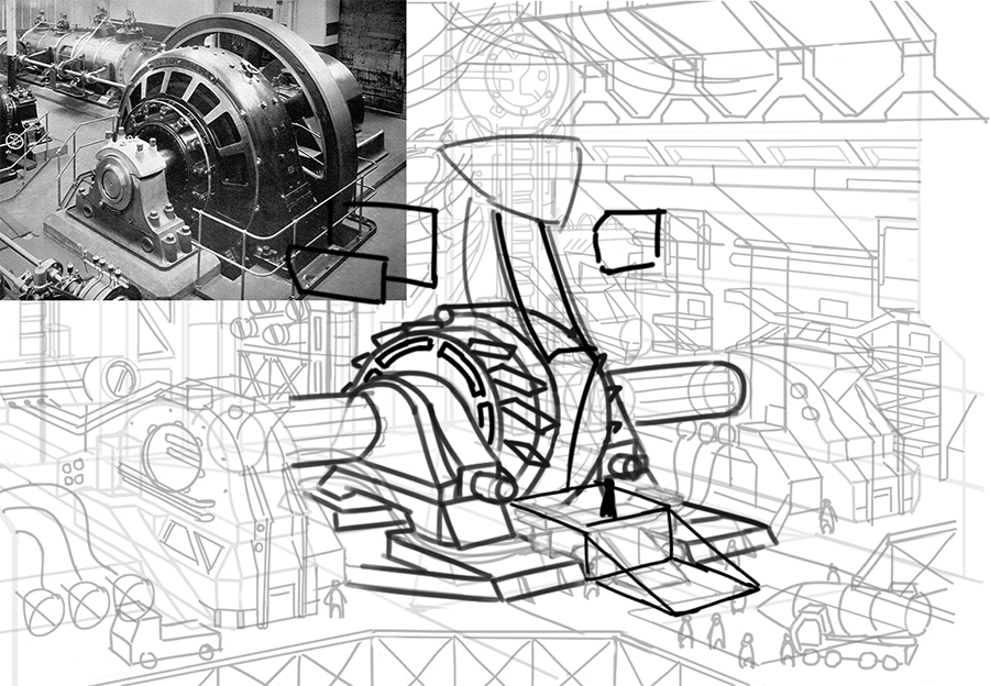
Update on my engine room. Goodbye details. You were simply too much for the human eye to handle  . Did a quick paint over but spent a lot of time on the following things:
-Composition
-Story/design
-Flow to the focal point (the dragon's head and the orb of electricity)
-Better contrast at the focal(s)
-Depth
-Framing elements
-Atmosphere
-Light Balance
-Simplifying values, avoiding contrast creep
-Using a few values over a wide range
-There are two light sources, one weak one on top and a strong one in front (the orb)
-Simplifying details
Before
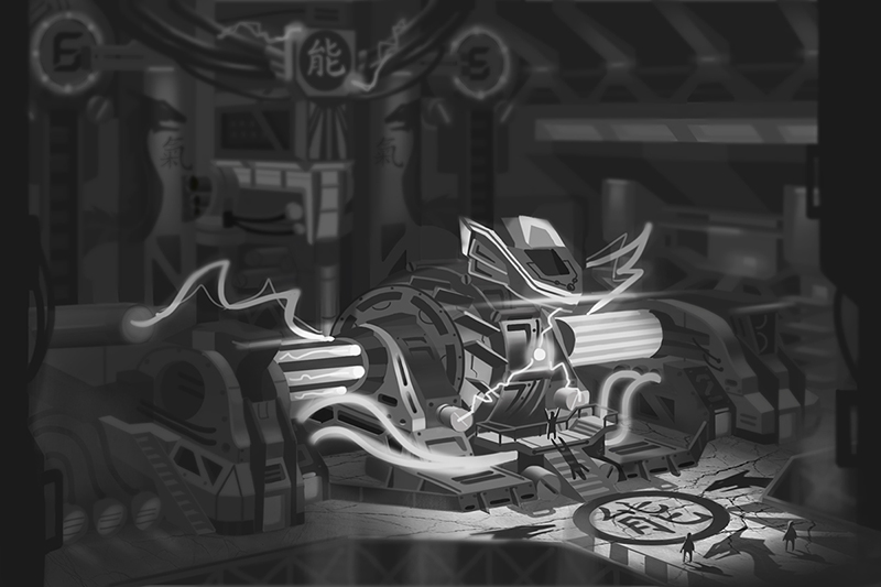
After:
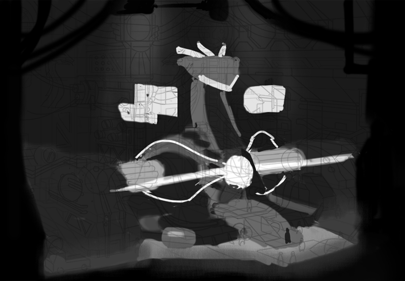
Behind the scenes:
. Did a quick paint over but spent a lot of time on the following things:-Composition
-Story/design
-Flow to the focal point (the dragon's head and the orb of electricity)
-Better contrast at the focal(s)
-Depth
-Framing elements
-Atmosphere
-Light Balance
-Simplifying values, avoiding contrast creep
-Using a few values over a wide range
-There are two light sources, one weak one on top and a strong one in front (the orb)
-Simplifying details
Before
After:
Behind the scenes:
Please Log in or Create an account to join the conversation.
- crankshaft
-
Topic Author
- Offline
- Platinum Member
-
Less
More
- Posts: 1450
- Thank you received: 55
30 Aug 2015 23:01 #12183
by crankshaft
Replied by crankshaft on topic Crankshaft's Sketchbook
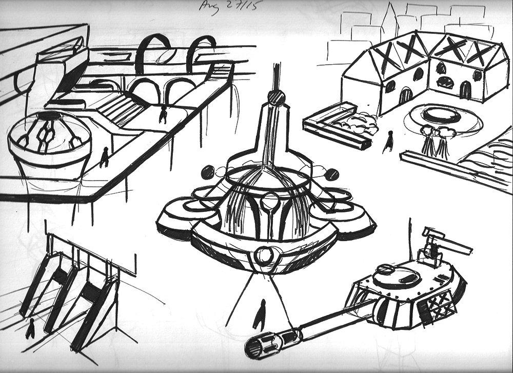
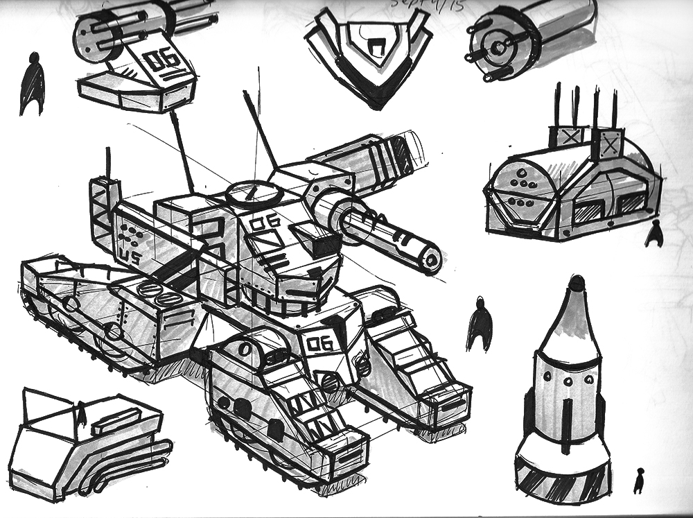
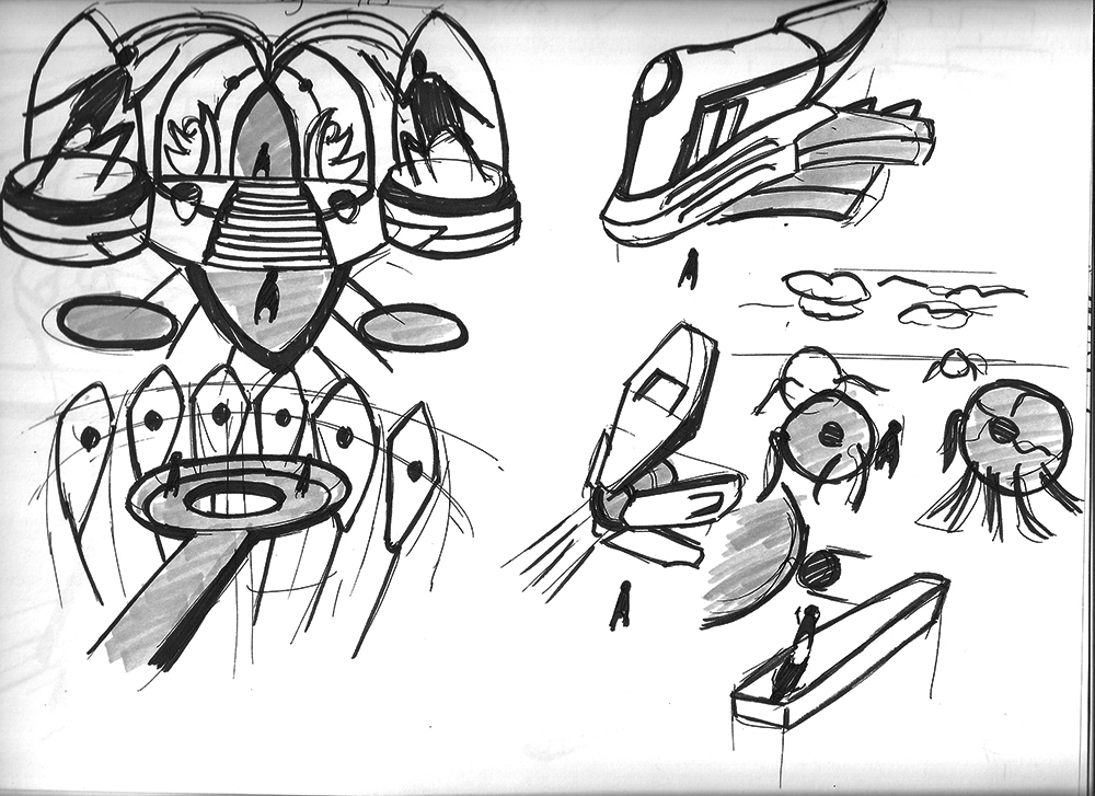
Design sketches. The middle image (a water fountain) is leaning I know.
Please Log in or Create an account to join the conversation.
30 Aug 2015 23:56 #12184
by Yian
Replied by Yian on topic Crankshaft's Sketchbook
Your new composition and new lighting scheme is much better than your old one. I feel a sense of depth and scale from your new sketch.
Please Log in or Create an account to join the conversation.
- crankshaft
-
Topic Author
- Offline
- Platinum Member
-
Less
More
- Posts: 1450
- Thank you received: 55
01 Sep 2015 01:15 #12190
by crankshaft
Thanks for the reply Yian! That's a relief to hear because I spent a lot of time fixing everything. Your advice needed: I've posted the piece for critique on other forums and I'm getting confused on what people are saying. I know they're trying to help but it's hard to understand their intentions.
Here's the discussion.
www.conceptart.org/forums/showthread.php...ectrical-Engine-Room
My main concern: One guy is telling me to do a 3D underlay to nail the perspective and get accurate lighting. I see this as useless because:
-I've already double checked the perspective and I'm sure it's accurate enough.
-I already understand the 3 D space. I can take any object in the picture, rotate it and draw it accurately.
- I want to practice perspective freehand since I'm still a beginner. 3D is a tool, not a replacement for the fundamentals. I will get into it later since it makes sense for my line of work.
-He says to use sketchup (which I love and do use) to get the lighting, perspective, and scale. There is scale (I'll put more stuff for scale like cars) and I know the perspective is correct. Sketchup is useless for lighting because you can't create artificial light sources, there's only sunlight.
I honestly feel like I'm being misled since the piece is simply too advanced for them and they're jumping to conclusions. Should I follow my gut and continue working on it as I was?
Replied by crankshaft on topic Crankshaft's Sketchbook
Your new composition and new lighting scheme is much better than your old one. I feel a sense of depth and scale from your new sketch.
Thanks for the reply Yian! That's a relief to hear because I spent a lot of time fixing everything. Your advice needed: I've posted the piece for critique on other forums and I'm getting confused on what people are saying. I know they're trying to help but it's hard to understand their intentions.
Here's the discussion.
www.conceptart.org/forums/showthread.php...ectrical-Engine-Room
My main concern: One guy is telling me to do a 3D underlay to nail the perspective and get accurate lighting. I see this as useless because:
-I've already double checked the perspective and I'm sure it's accurate enough.
-I already understand the 3 D space. I can take any object in the picture, rotate it and draw it accurately.
- I want to practice perspective freehand since I'm still a beginner. 3D is a tool, not a replacement for the fundamentals. I will get into it later since it makes sense for my line of work.
-He says to use sketchup (which I love and do use) to get the lighting, perspective, and scale. There is scale (I'll put more stuff for scale like cars) and I know the perspective is correct. Sketchup is useless for lighting because you can't create artificial light sources, there's only sunlight.
I honestly feel like I'm being misled since the piece is simply too advanced for them and they're jumping to conclusions. Should I follow my gut and continue working on it as I was?
The following user(s) said Thank You: Yian
Please Log in or Create an account to join the conversation.
01 Sep 2015 01:55 #12191
by Yian
Replied by Yian on topic Crankshaft's Sketchbook
This is a rather deep issue that might need to take time to thoroughly examined. I'm currently in the process of a lawsuit regarding a contract dispute, so I won't have time for a week or so. Please let me gather my thoughts in the mean time. Thank you.
The following user(s) said Thank You: crankshaft
Please Log in or Create an account to join the conversation.
- crankshaft
-
Topic Author
- Offline
- Platinum Member
-
Less
More
- Posts: 1450
- Thank you received: 55
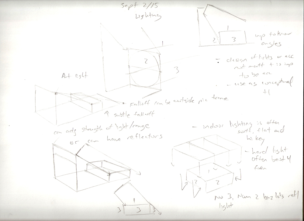
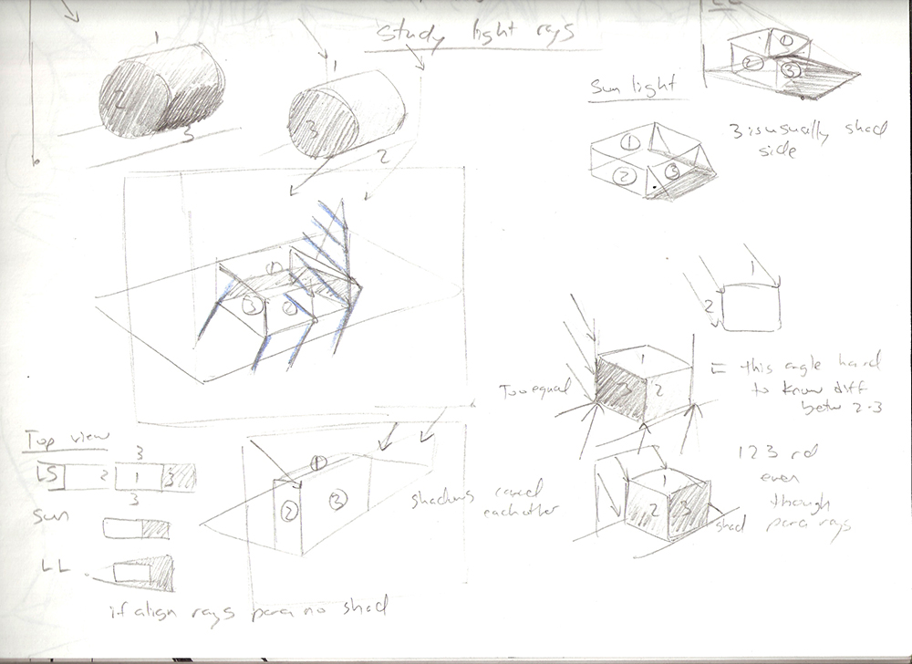
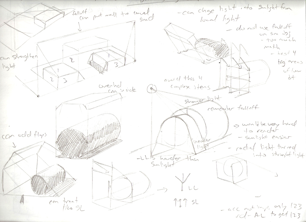
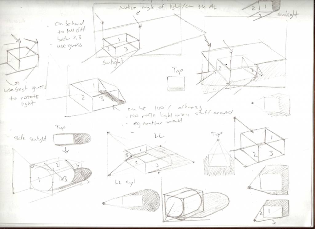
05 Sep 2015 01:27 #12233
by crankshaft
Replied by crankshaft on topic Crankshaft's Sketchbook
Studies on light rays and their placement.
Please Log in or Create an account to join the conversation.
- crankshaft
-
Topic Author
- Offline
- Platinum Member
-
Less
More
- Posts: 1450
- Thank you received: 55
07 Sep 2015 13:53 #12239
by crankshaft
Replied by crankshaft on topic Crankshaft's Sketchbook
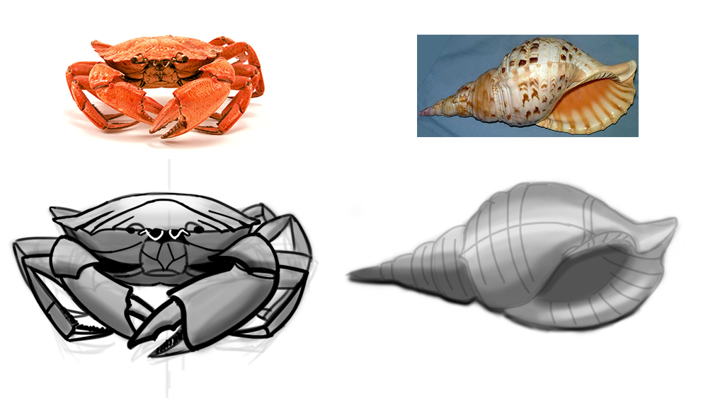
Design sketches. Some of these were done on a road trip so the lines are messy.
Goal of these sketches:
-Improve line economy, only needing to put the minimum amount of lines necessary to convey the idea
-Improve my ability to transfer what's in my head to paper, attempting to get a 1:1 ratio
-Improve my creativity and imagination, idea output
-Improve speed and efficiency
-Find new forms that work well together
-Improve my sense of design
-Apply some fundamentals
-Show people what my interests and strengths are
-Have something besides boring studies to show

Design sketch as well. Photo study of organic forms.
Anatomy study of landmarks.

Goal of these sketches:
-Improve line economy, only needing to put the minimum amount of lines necessary to convey the idea
-Improve my ability to transfer what's in my head to paper, attempting to get a 1:1 ratio
-Improve my creativity and imagination, idea output
-Improve speed and efficiency
-Find new forms that work well together
-Improve my sense of design
-Apply some fundamentals
-Show people what my interests and strengths are
-Have something besides boring studies to show
Design sketch as well. Photo study of organic forms.
Anatomy study of landmarks.
Please Log in or Create an account to join the conversation.

07 Sep 2015 21:39 #12241
by Atto
No smudge tool was harmed in the making of this image.
Replied by Atto on topic Crankshaft's Sketchbook
Hey Crank,
Another wealth of sketches you've produced here and its nice to see the photos you have used as ref for the studies.
On a side note it may sell your sketches a little more if you vary the width of line you use to add more three dimensionality to your work.
Lines that seperate an object from the negative space surrounding it read better if they are wider than those that are describing the details on a surface. Lines that are closer to the viewer also benefit from being wider than those in the distance. I produced a massive quantity of similar (architectural) sketches at university and weight of line really helps the viewer understand how such sketches exist in the three dimensional world.
Just a thought.
No smudge tool was harmed in the making of this image.
The following user(s) said Thank You: crankshaft
Please Log in or Create an account to join the conversation.
Latest Activity

Banj updated their profile picture


Charlotte Still wearing a mask? Is it so we won't see you hoarding food in those cheeks of yours?
See More
Banj Mfmuh Guhmfpf
See More
Charlotte I'll take that as a yes...
See More
Charlotte Why is there a tiny flashing thing in front of the reply link/button? It's so small I can't see if it's an exclamation mark or a question mark... or...both?)
See More
Banj Because? Both!
See More
Charlotte *gasp*
See More

CaptainDeth updated their profile picture

CaptainDeth Ahoy folks, just a newbie here, just getting started. Thanks for allowing me in.
CaptainDeth Thank You
CaptainDeth and Mr.Bungle joined the site


honbasic joined the site


Gawk joined the site