


I can't sleep  Again
Again


His papa is English
 He can speak English?
Merlin says
The shoutbox is unavailable to non-members
Shoutbox History
CGMythology's Sketchbook (nudity)
- cgmythology
-
 Topic Author
- Offline
- Senior Member
-

Less
More
21 Jun 2023 02:49 #45933
by cgmythology
Replied by cgmythology on topic CGMythology's Sketchbook (nudity)
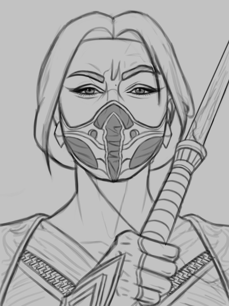
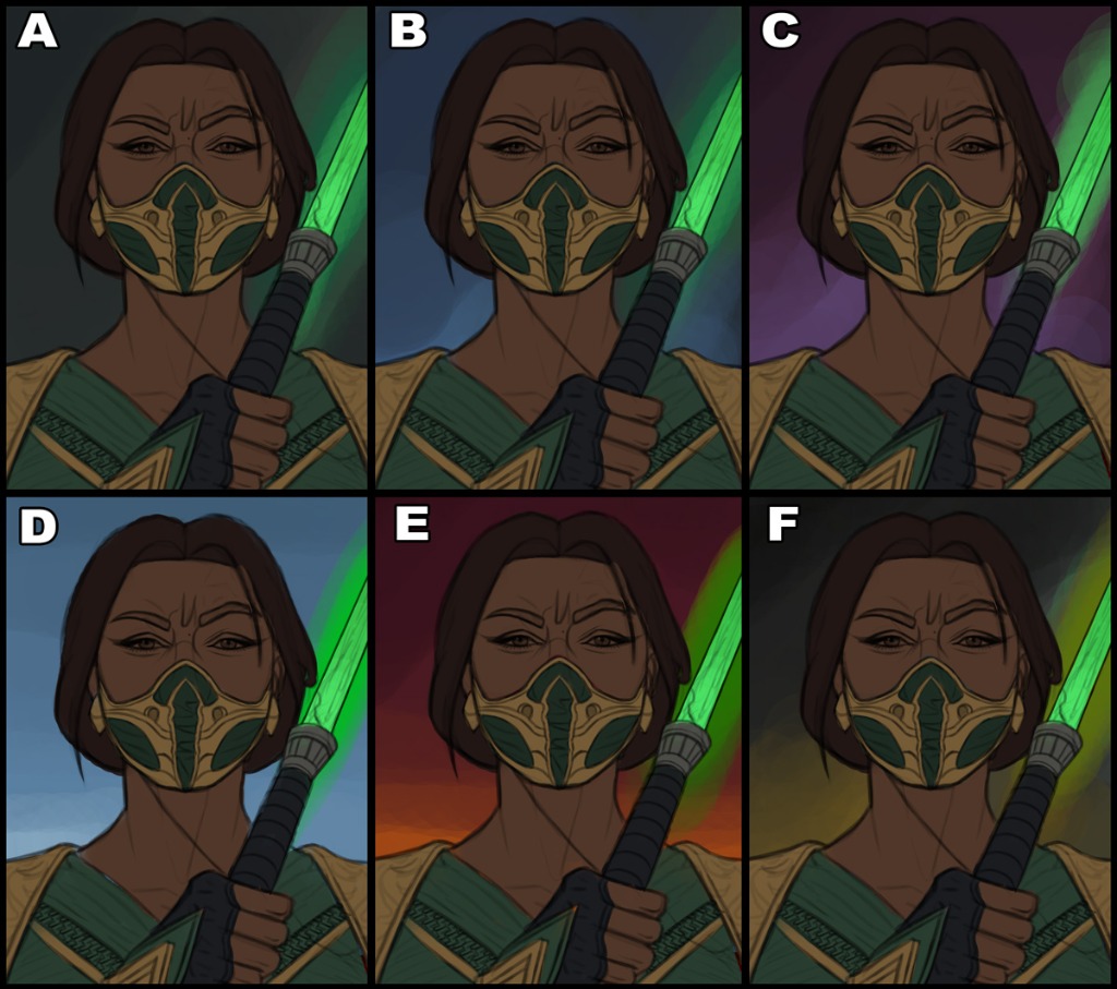
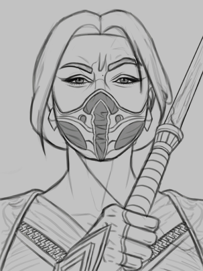
I think I'm going to be focusing a bit on portrait work as I'm tackling some complex illustrations for various clients, so doing something simple on the side that I enjoy I feel is the best way to go about it while avoiding burnout. I finished up a sketch of 'Jade' from the 'Mortal Kombat' series. For the face, I tried to capture the likeness of actress Tati Gabrielle who will be portraying her in the upcoming movie. Overall I was very satisfied with the sketch so I went ahead and proceeded with some quick color tests. My favorite by far is 'A', I feel it pops the most which is important for a piece like this. I'm open to hearing suggestions or any feedback on the sketch/color tests, so please feel free to let me know what you feel works best! Below is the sketch and color tests.
Attachments:
Please Log in or Create an account to join the conversation.

21 Jun 2023 07:21 #45934
by Charlotte
Any an all misspellings are henceforth blamed on the cats.
Replied by Charlotte on topic CGMythology's Sketchbook (nudity)
I think I like B. A might end up looking a bit too monochrome green but I agree the two first might "pop" the best. ")
Any an all misspellings are henceforth blamed on the cats.
The following user(s) said Thank You: cgmythology
Please Log in or Create an account to join the conversation.
- cgmythology
-
Topic Author
- Offline
- Senior Member
-
21 Jun 2023 17:13 #45935
by cgmythology
Replied by cgmythology on topic CGMythology's Sketchbook (nudity)
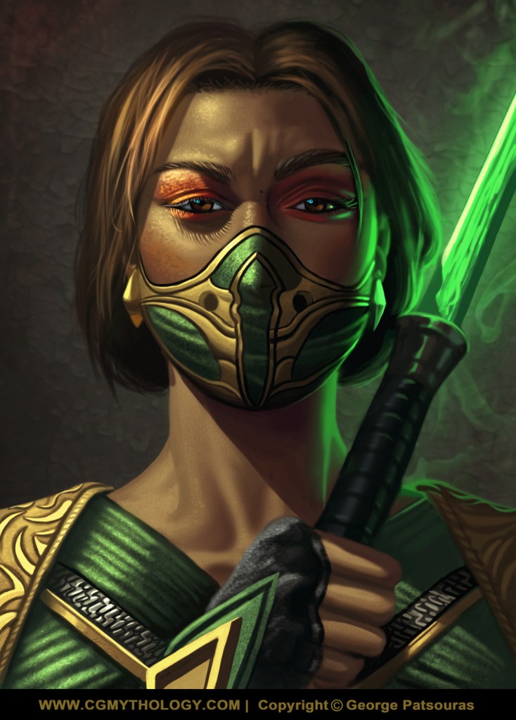
Charlotte: B is a great choice as well. I did want a darker vibe for the image overall, so I ultimately decided to go with A. Hopefully it was the right choice! Thanks for your input as always
...................I finished up the painting process. It was pretty straight forward and it didn't take as long as I anticipated. I'm pretty pleased with it overall. There's still time for tweaking and such if necessary, so if something feels off please feel free to let me know. Below is the current progress followed by some steps for those interested.
...................I finished up the painting process. It was pretty straight forward and it didn't take as long as I anticipated. I'm pretty pleased with it overall. There's still time for tweaking and such if necessary, so if something feels off please feel free to let me know. Below is the current progress followed by some steps for those interested.
Attachments:
Please Log in or Create an account to join the conversation.
- cgmythology
-
Topic Author
- Offline
- Senior Member
-
22 Jun 2023 14:08 #45938
by cgmythology
Replied by cgmythology on topic CGMythology's Sketchbook (nudity)
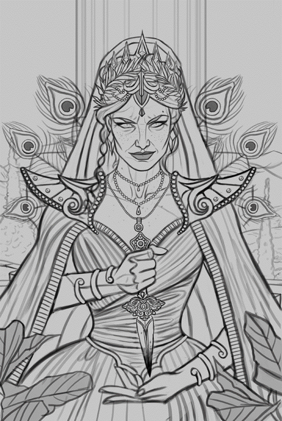
Time for a new painting! I had this image in mind for quite some time, a portrait of Hera. I spent a lot of time on this one especially in regards to the character design and I'm overall pleased with it. Any input would be appreciated, will begin work on some color tests shortly!

Attachments:
Please Log in or Create an account to join the conversation.
22 Jun 2023 14:47 #45939
by Charlotte
Any an all misspellings are henceforth blamed on the cats.
Replied by Charlotte on topic CGMythology's Sketchbook (nudity)
It's probably due to the tangents between her fingertips and the bodice but it looks like she has six fingers on the lower hand...
Any an all misspellings are henceforth blamed on the cats.
Please Log in or Create an account to join the conversation.
- cgmythology
-
Topic Author
- Offline
- Senior Member
-
22 Jun 2023 17:30 #45940
by cgmythology
Replied by cgmythology on topic CGMythology's Sketchbook (nudity)
Charlotte: Those damn tangents  I colored it in so the fingers are more obvious, I'll take care of the tangents as I continue to work on it. Thanks for your input as always!
................Finished up some color tests. My personal favorite is the last one, F, and it's not even close, so I will be developing that one!
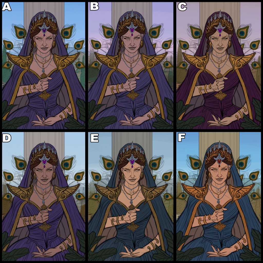
I colored it in so the fingers are more obvious, I'll take care of the tangents as I continue to work on it. Thanks for your input as always!................Finished up some color tests. My personal favorite is the last one, F, and it's not even close, so I will be developing that one!
Attachments:
Please Log in or Create an account to join the conversation.

23 Jun 2023 10:35 #45948
by Valence
Replied by Valence on topic CGMythology's Sketchbook (nudity)
I like the shadow of the eyelashes on the previous pic. It's a lovely little detail that emphasises the lighting and realism.
The following user(s) said Thank You: cgmythology
Please Log in or Create an account to join the conversation.
- cgmythology
-
Topic Author
- Offline
- Senior Member
-
24 Jun 2023 04:37 - 24 Jun 2023 06:28 #45964
by cgmythology
Replied by cgmythology on topic CGMythology's Sketchbook (nudity)
Valence: Thank you, glad to hear you enjoy that.
...............
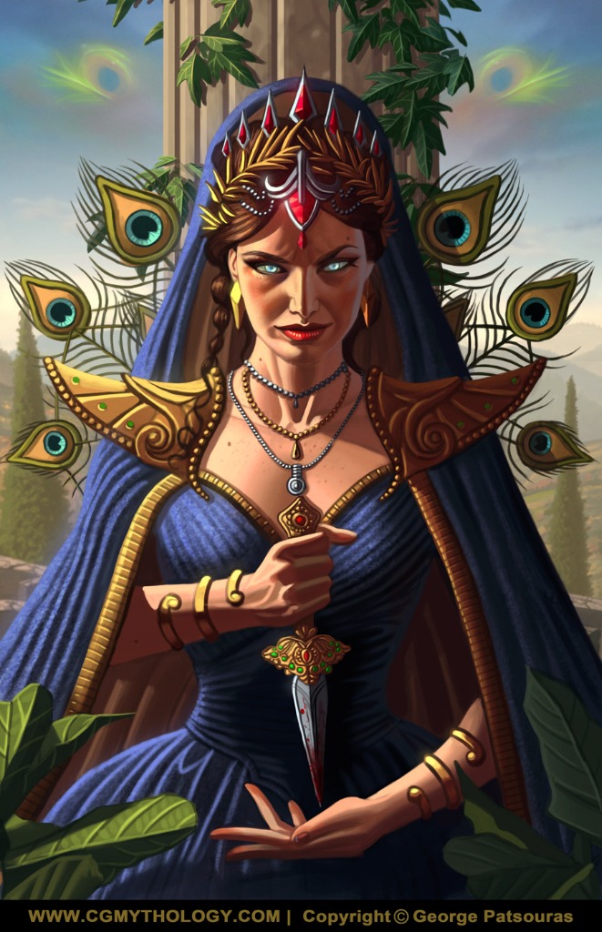
I finished up the painting. Everything went fairly smoothly thankfully and I'm fairly pleased with the painting. Of course there's still time to make changes if needed, so if something is majorly off please feel free to let me know. Below is the current preview followed by the steps for those interested.
...............
I finished up the painting. Everything went fairly smoothly thankfully and I'm fairly pleased with the painting. Of course there's still time to make changes if needed, so if something is majorly off please feel free to let me know. Below is the current preview followed by the steps for those interested.
Attachments:
Last edit: 24 Jun 2023 06:28 by cgmythology.
Please Log in or Create an account to join the conversation.
24 Jun 2023 10:46 #45966
by Charlotte
Any an all misspellings are henceforth blamed on the cats.
Replied by Charlotte on topic CGMythology's Sketchbook (nudity)
There's nothing major "off" and I really like her face, but I do have some "preferences" I guess you can call it. I'd rather have liked if her clothes turned out more blue-green like the colour sketch you went with, instead of this slightly purply blue but that's really minor. I also would have preferred a different colour than red for her crown - it just doesn't seem to match the rest of the colour scheme. I might have perhaps gone with amber, myself, even if it isn't a precious gem. Lastly, while the tight folds on her dress works fine, I'm not convinced her "veil" would fold the same way. It makes the fabric look kind of thick and fluffy, a bit like a luxury towel on her head... In the sketch the folds were sparser, and I honestly think you could have made them sparser still on the "larger areas" (i.e. below her shoulders) - Actually now I look more carefully I'm not sure if it's a veil falling over her shoulders or if the veil and a mantle kind of "merge" visually? If the latter, maybe the veil edge lines should have had a steeper incline than the mantle ones, since they look like one and the same shape, but then the hems at the front make no sense...
Anyway, mostly thinking aloud. Still really love her face - the look seems very fitting for Hera.
Anyway, mostly thinking aloud. Still really love her face - the look seems very fitting for Hera.
Any an all misspellings are henceforth blamed on the cats.
The following user(s) said Thank You: cgmythology
Please Log in or Create an account to join the conversation.
- cgmythology
-
Topic Author
- Offline
- Senior Member
-
30 Jun 2023 12:34 #46030
by cgmythology
Replied by cgmythology on topic CGMythology's Sketchbook (nudity)
Charlotte: Glad to hear it! I agree about the colors of the clothes, so I reverted it to a more greenish hue. I experimented with different colors for the gems, such as amber but it didn't pop as much as I wanted so I think I'll leave it as is, as it brings a lot of attention to the face which is intentional. Great point about the veil, I think it works well enough but I might revisit it in the future. I uploaded the updated version on my official website
here
if you're interested in seeing how it looks like now!
.....................
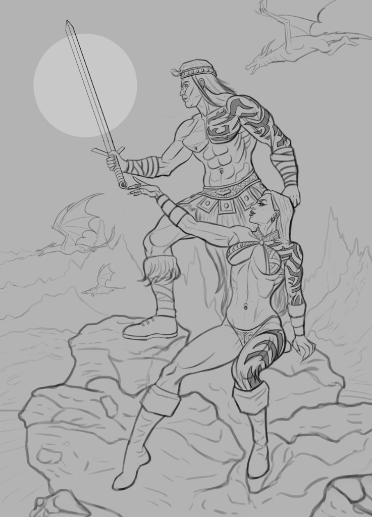
Time for a new illustration! I'm in the mood to paint something Boris Vallejo-ish as I haven't done that in quite a while, so I created a sketch based on some figures from Grafit Studio. Pretty pleased with how the sketch turned out overall, and I think I'll begin work on some color tests soon... but until then please feel free to let me know any input as I prefer doing corrections early in the process, just makes the painting process easier for me and can save a lot of time! Below is the current sketch:
.....................
Time for a new illustration! I'm in the mood to paint something Boris Vallejo-ish as I haven't done that in quite a while, so I created a sketch based on some figures from Grafit Studio. Pretty pleased with how the sketch turned out overall, and I think I'll begin work on some color tests soon... but until then please feel free to let me know any input as I prefer doing corrections early in the process, just makes the painting process easier for me and can save a lot of time! Below is the current sketch:
Attachments:
Please Log in or Create an account to join the conversation.
Latest Activity

Banj updated their profile picture


Charlotte Still wearing a mask? Is it so we won't see you hoarding food in those cheeks of yours?
See More
Banj Mfmuh Guhmfpf
See More
Charlotte I'll take that as a yes...
See More
Charlotte Why is there a tiny flashing thing in front of the reply link/button? It's so small I can't see if it's an exclamation mark or a question mark... or...both?)
See More
Banj Because? Both!
See More
Charlotte *gasp*
See More

CaptainDeth updated their profile picture

CaptainDeth Ahoy folks, just a newbie here, just getting started. Thanks for allowing me in.
CaptainDeth Thank You
CaptainDeth and Mr.Bungle joined the site


honbasic joined the site


Gawk joined the site