
Are you trying to spew those lurker tentacles at us and failing or are you just in a state of constant amazement? 


The shoutbox is unavailable to non-members
Shoutbox History


Are you trying to spew those lurker tentacles at us and failing or are you just in a state of constant amazement? 


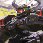
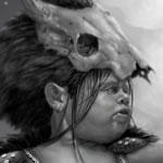
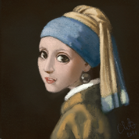
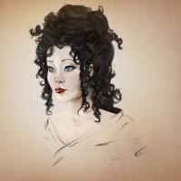
Charlotte's Works
"I'm not going to go crazy"
"I'm not going to go crazy"
"I'm not going to go crazy"
"I'm not going to go crazy"
*is trying to add a textured background in ArtRage by trial and error and every trial takes about 5 minutes of dawdling on ArtRage's account...*
Any an all misspellings are henceforth blamed on the cats.
Please Log in or Create an account to join the conversation.
Of course you can also tell me to hush.
I don't know much about artrage, however I've used gimp a lot and it isn't too bad.
Please Log in or Create an account to join the conversation.
Well currently (and for an awfully long time now, it feels like) I am trying to use only artRage in order to actually learn to use it. I do have an old old old version of Photoshop in a drawer somewhere as well, but if I reinstall that I'll just go back to using that alone and since it's so old that's no fun either. I'm not totally averse to trying to learn another program though, at least not eventually... But I have tried Gimp and I couldn't even figure out how to get marks down on the canvas...
Any an all misspellings are henceforth blamed on the cats.
Please Log in or Create an account to join the conversation.
At that time I had not used photoshop and when I eventually did, I hated it and found the brush dynamics much too complicated. Over time I have come to prefer photoshop, but I still have a soft spot for GIMP. You should give it a try.
Everything's on the right!!!
It's like driving abroad!
Please Log in or Create an account to join the conversation.
But I meant what I said - I couldn't understand how to even make the pen tool make a line on the canvas. I got nothing. So not very tempted to try that one again. Really.
Any an all misspellings are henceforth blamed on the cats.
Please Log in or Create an account to join the conversation.
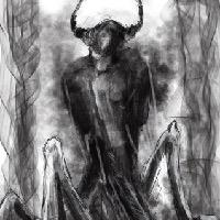
I had artrage too for a bit. I got it along with my subscription which was nice. I thought it was beautiful art package, but really tricky to use. You have done a wonderful job with this Giger image using it.
Everything's on the right!!!
It's like driving abroad!
Please Log in or Create an account to join the conversation.
Regarding gimp, I can answer some questions on it and it looks like Dom can too.
As for the pen tool, I think it was the curve tool that you're talking about. The brush system works well. It has pressure sensitivity with a wacom tablet too.
Ok enough rambling.... sorry
Please Log in or Create an account to join the conversation.
It's about time I posted some more wips. And then it's really time I eat something. I just realised I've had brunch and half an apple today and it's half past eleven... Hmm...
Anyway, first wip is comparing the greyscale version to my so far coloured version. I wasn't sure the colours were working out at all - first tried to get closer to Giger's colouring but apart from cool background and warm foreground I found it too difficult and decided to just have fun instead
Also posting a test where the background colour was cut out from behind the foreground characters. I think it makes their colour too bright and strong though. Not sure. (Btw the central character isn't coloured yet - still struggling with separating her from the background... I think she's OK for the most part except her arms and I've tried rim lights and a few other things but not liked it so far... Thinking maybe colour might turn out to be enough. Again will have to sleep on it!)
I should mention that I've tried to listen to earlier feedback, as you can see the background is darker and I've added a gradient. I wasn't sure what you meant, Smolin, about vignettes (a border?) and radial gradients - nor am I sure I can do radial gradients in ArtRage... But anyhow I think it's better for the changes and I hope you all agree
(Now I should just remember to attach images before clicking submit...)
Any an all misspellings are henceforth blamed on the cats.
Please Log in or Create an account to join the conversation.
Anyhow I'm leaning towards a mix of the last two (having the cool background colour behind the characters but at a lower and probably varying opacity compared to the rest of the image...). Thoughts?
Any an all misspellings are henceforth blamed on the cats.
Please Log in or Create an account to join the conversation.
- Digital Dave
-
- Offline
- Platinum Member
-

- Posts: 2242
- Thank you received: 163
I get sketchy around pencils! ...
Please Log in or Create an account to join the conversation.
Latest Activity


