


- Posts: 234
- Thank you received: 26


 Like I said. Now
*presses B again*
![:]](https://cgartnexus.com/images/mod_shoutbox/unsure.png)
He does like meowing a lot.
I meant *here* but I guess Val might be a cat...
The shoutbox is unavailable to non-members
Shoutbox History
Like I said. Now
*presses B again*
He does like meowing a lot.
I meant *here* but I guess Val might be a cat...
Charlotte's Works
20 Jul 2014 22:19 #3613
by Thomgirl
Replied by Thomgirl on topic Charlotte's Works
Wow Charlotte, it's great to see what you've done with this! Despite your issues with Artrage, you seem to producing some fine work with it.
The following user(s) said Thank You: Charlotte
Please Log in or Create an account to join the conversation.

21 Jul 2014 20:02 #3760
by Charlotte
Any an all misspellings are henceforth blamed on the cats.
Replied by Charlotte on topic Charlotte's Works
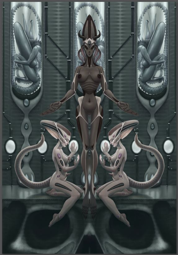
I forgot to add some sort of unifying texture on top (and couldn't figure it out quickly so I left it for now) but other than that I think it's maybe, possibly, a little finished. Perhaps? I'm not sure about the colours yet, especially of the middle character, but again I need to sleep on it. Anyway I've been spending way too much time on this one and I've decided that all the value/form bits are done though I might still tweak the colouring...
Any an all misspellings are henceforth blamed on the cats.
Please Log in or Create an account to join the conversation.
21 Jul 2014 20:35 - 21 Jul 2014 20:38 #3761
by evilrobot
Replied by evilrobot on topic Charlotte's Works
The the tone and the illustration itself are beautiful;) I like the colors on the bottom two characters and the background but like you said I'm not sure if the middle character's color is working. It seems she needs to pop out a little more right now she almost blends into the background even with her being a warmer color. If she is to be the main focus of the image you might ramp up the saturation on her more than the rest of the illustration (I would focus the attention on the great head and crown you gave her perhaps give that crown a bright accent color like a saturated red or deep saturated purple to really draw our attention there a color that is nowhere else in the illustration) Maybe even a super bright highlight in those dark eyes.
Last edit: 21 Jul 2014 20:38 by evilrobot.
The following user(s) said Thank You: Charlotte
Please Log in or Create an account to join the conversation.

21 Jul 2014 21:01 - 21 Jul 2014 21:02 #3769
by Domtopia
Everything's on the right!!!
It's like driving abroad!
Replied by Domtopia on topic Charlotte's Works
What about making her jet black with bright reflective highlights? (Like the original Giger alien)
I think that this is looking wonderfully sharp and polished. A remarkable piece of work. Really liking it!
I think that this is looking wonderfully sharp and polished. A remarkable piece of work. Really liking it!
Everything's on the right!!!
It's like driving abroad!
Last edit: 21 Jul 2014 21:02 by Domtopia.
The following user(s) said Thank You: Charlotte
Please Log in or Create an account to join the conversation.

22 Jul 2014 05:34 #3791
by Smolin
Replied by Smolin on topic Charlotte's Works
The whole thing looks excellent but the central figure could use more contrast -- perhaps some strong highlights as Dom suggested. Love the lighting you added to the background and the kneeling figures. (PS. By vignette, I meant sort of dark around the edges, but it doesn't seem to need that now!)
The following user(s) said Thank You: Charlotte
Please Log in or Create an account to join the conversation.

22 Jul 2014 09:43 #3803
by Atto
No smudge tool was harmed in the making of this image.
Replied by Atto on topic Charlotte's Works
Simply beautiful work! Personally I'm not sure a high saturated focus point is the way to go. I'd be more tempted to explore the use of tone to create the focal point. Geiger also did a number of works where the focal point was less pronounced than in more illustrative works. I think it often gave a more surrealist look to his images. Not saying that's where you should take this one, just a thought.
No smudge tool was harmed in the making of this image.
The following user(s) said Thank You: Charlotte
Please Log in or Create an account to join the conversation.
22 Jul 2014 11:48 - 22 Jul 2014 11:49 #3808
by Charlotte
Any an all misspellings are henceforth blamed on the cats.
Replied by Charlotte on topic Charlotte's Works
Thank you everyone for your help with this one! I tried various things with the central character, both making her much darker and quite a lot lighter but didn't like the results much - I decided on a colour that ties in with the two other characters but also making her a bit darker and adding a bit of light behind her (god rays, woohoo!  )
)
I have decided that it's now finished and have uploaded the image to my gallery here (though it displays it with less than satisfactory quality I'm afraid...) and I might do a finished images thread as well (though I suspect I'll only be able to add one or two images a year there!)
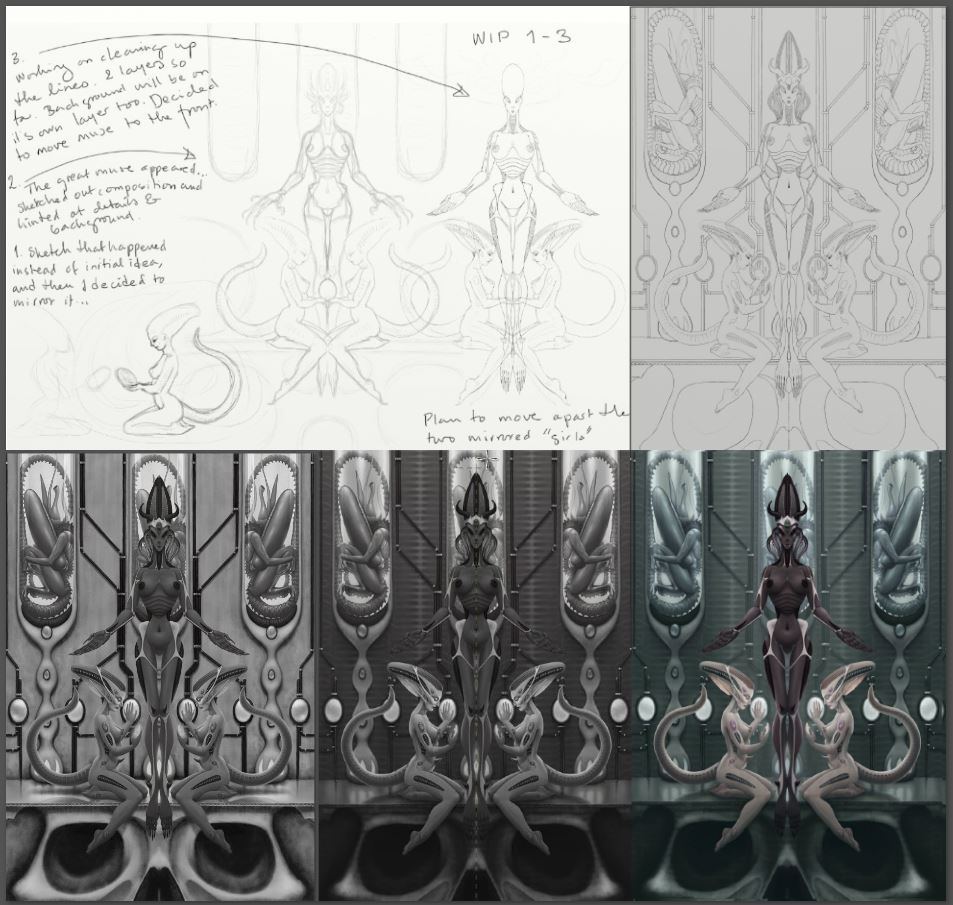
Anyhow, I thought I'd make a "compilation" of the different stages of this image, from sketches and finished line drawings, to initial values and then, very much with all of your help, final values and colours.
)I have decided that it's now finished and have uploaded the image to my gallery here (though it displays it with less than satisfactory quality I'm afraid...) and I might do a finished images thread as well (though I suspect I'll only be able to add one or two images a year there!)
Anyhow, I thought I'd make a "compilation" of the different stages of this image, from sketches and finished line drawings, to initial values and then, very much with all of your help, final values and colours.
Any an all misspellings are henceforth blamed on the cats.
Last edit: 22 Jul 2014 11:49 by Charlotte. Reason: wrong file :P
Please Log in or Create an account to join the conversation.
22 Jul 2014 14:16 #3819
by Atto
No smudge tool was harmed in the making of this image.
Replied by Atto on topic Charlotte's Works
Just checked out the finished piece and it looks AWESOME. Loving the colour on the main figure you decided on and the quality isn't too bad when you bring up the floating image box thingy.
No smudge tool was harmed in the making of this image.
The following user(s) said Thank You: Charlotte
Please Log in or Create an account to join the conversation.
22 Jul 2014 17:08 #3848
by Domtopia
Everything's on the right!!!
It's like driving abroad!
Replied by Domtopia on topic Charlotte's Works
Cool. Those progress sheets look awesome!
I love annotated drawings too. So interesting!
I love annotated drawings too. So interesting!
Everything's on the right!!!
It's like driving abroad!
The following user(s) said Thank You: Charlotte
Please Log in or Create an account to join the conversation.
23 Jul 2014 02:37 #3881
by gixgidea
Replied by gixgidea on topic Charlotte's Works
I love the compilation process image, because I really like to see the steps that lead to the final images that people make.
I also really like the crisp line work that you used in this image. Plus I think the color work took care of a lot of what you were looking for with this one.
Well done!
I also really like the crisp line work that you used in this image. Plus I think the color work took care of a lot of what you were looking for with this one.
Well done!
The following user(s) said Thank You: Charlotte
Please Log in or Create an account to join the conversation.
Latest Activity

Banj updated their profile picture


Charlotte Still wearing a mask? Is it so we won't see you hoarding food in those cheeks of yours?
See More
Banj Mfmuh Guhmfpf
See More
Charlotte I'll take that as a yes...
See More
Charlotte Why is there a tiny flashing thing in front of the reply link/button? It's so small I can't see if it's an exclamation mark or a question mark... or...both?)
See More
Banj Because? Both!
See More
Charlotte *gasp*
See More

CaptainDeth updated their profile picture

CaptainDeth Ahoy folks, just a newbie here, just getting started. Thanks for allowing me in.
CaptainDeth Thank You
CaptainDeth and Mr.Bungle joined the site


honbasic joined the site


Gawk joined the site