


- Posts: 2242
- Thank you received: 163


The shoutbox is unavailable to non-members
Charlotte's Works
- Digital Dave
-

- Offline
- Platinum Member
-

Less
More
23 Aug 2014 14:45 #5537
by Digital Dave
I get sketchy around pencils! ...
Replied by Digital Dave on topic Charlotte's Works
This is absolutely fantastic work, Charlotte! You did this in Artrage? Wow, I love the shadows and light in it.
Only crit would be her left (our right) shoulder. Looks to be popped up too high.
Only crit would be her left (our right) shoulder. Looks to be popped up too high.
I get sketchy around pencils! ...
Please Log in or Create an account to join the conversation.

23 Aug 2014 15:59 #5540
by Charlotte
Any an all misspellings are henceforth blamed on the cats.
Replied by Charlotte on topic Charlotte's Works
Thanks Dave - I took a look at the ref and yes the shoulder line should have been more of a straight horisontal line without the dip between/from shoulder strap and/to shoulder...
Any an all misspellings are henceforth blamed on the cats.
Please Log in or Create an account to join the conversation.
01 Sep 2014 19:17 #5841
by Charlotte
Any an all misspellings are henceforth blamed on the cats.
Replied by Charlotte on topic Charlotte's Works
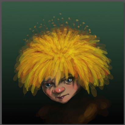
Some sort of "speed paint" for a new FB avatar - I don't think I'll use it though. Was going for "kinda cute" and ended up with "kinda creepy". And dull... Ho hum.
Any an all misspellings are henceforth blamed on the cats.
Please Log in or Create an account to join the conversation.

01 Sep 2014 21:38 #5849
by Domtopia
Everything's on the right!!!
It's like driving abroad!
Replied by Domtopia on topic Charlotte's Works
I think it is both cute and creepy Charlotte!
The dandelion hair looks great! I really like the face too because the character looks just as likely to give you a magical gift as bite you!
The dandelion hair looks great! I really like the face too because the character looks just as likely to give you a magical gift as bite you!
Everything's on the right!!!
It's like driving abroad!
Please Log in or Create an account to join the conversation.
20 Sep 2014 15:27 #6304
by Charlotte
Any an all misspellings are henceforth blamed on the cats.
Replied by Charlotte on topic Charlotte's Works
The election is over so I guess there's no point in having a dandelion avatar anymore  I'd forgotten about that - I keep starting new pics without finishing any of them...
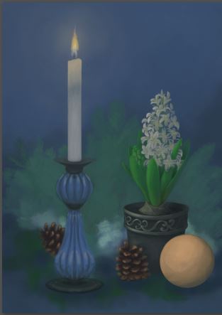
This weekend I started this year's christmas card. Figured I'd better start before it was too late seeing as I always take so long to finish anything. Last year the xmas card was sort of red so this year I'm going for sort of blue... (Guess next year's will be green ) It's still early stages and I'm not sure how to get the spruce and the moss to look like I want... (the only thing pretty much finished - I think - is the pot). Anyway I'm currently working with postcard size (but 300 ppi) as I haven't decided whether I want to make it bigger in case I ever want it for anything but postcard sized postcards...
I'd forgotten about that - I keep starting new pics without finishing any of them...This weekend I started this year's christmas card. Figured I'd better start before it was too late seeing as I always take so long to finish anything. Last year the xmas card was sort of red so this year I'm going for sort of blue... (Guess next year's will be green
) It's still early stages and I'm not sure how to get the spruce and the moss to look like I want... (the only thing pretty much finished - I think - is the pot). Anyway I'm currently working with postcard size (but 300 ppi) as I haven't decided whether I want to make it bigger in case I ever want it for anything but postcard sized postcards...Any an all misspellings are henceforth blamed on the cats.
Please Log in or Create an account to join the conversation.
- Digital Dave
-
- Offline
- Platinum Member
-
Less
More
- Posts: 2242
- Thank you received: 163
22 Sep 2014 11:31 #6320
by Digital Dave
I get sketchy around pencils! ...
Replied by Digital Dave on topic Charlotte's Works
Nice start, and cool idea on creating your own Christmas Cards. Look forward to seeing it completed.
I get sketchy around pencils! ...
The following user(s) said Thank You: Charlotte
Please Log in or Create an account to join the conversation.
23 Sep 2014 12:56 #6338
by Charlotte
yeah, me too Hopefully in time... I still haven't figured out how to best paint the spruce but I think I might be able to handle the moss... maybe...
Any an all misspellings are henceforth blamed on the cats.
Replied by Charlotte on topic Charlotte's Works
Look forward to seeing it completed.
yeah, me too
Hopefully in time... I still haven't figured out how to best paint the spruce but I think I might be able to handle the moss... maybe... Any an all misspellings are henceforth blamed on the cats.
Please Log in or Create an account to join the conversation.
23 Sep 2014 20:00 #6354
by Kodabble
Replied by Kodabble on topic Charlotte's Works
Charlotte, what a creative idea to do your own card. Nice start. Not sure what the moss and spruce are going to be. Is it the green in the background going to be a branch on the ground/table? Right now the only real issue I see is the image appears split in two down the middle by the candle and the flower. If you are putting words/greeting then they could be used to breakup the split. Looking forward to seeing more.
Please Log in or Create an account to join the conversation.
24 Oct 2014 19:44 - 24 Oct 2014 19:45 #6829
by Charlotte
Any an all misspellings are henceforth blamed on the cats.
Replied by Charlotte on topic Charlotte's Works
uhm, seems I sorta er... got side tracked. Again. Anyway, I've tried several times to paint the spruce (yes the green in the background) but it never looks right and I'm back to the issue of the colours greying out the more I paint. Darn you ArtRage. Considering giving Painter 2015 a go (tried Painter XIII and didn't like it but perhaps I was unfair? ) Anyway yes the spruce and the moss is the fluffy blur in the background for now. Not too concerned about the "split" since I hope the other stuff (moss and all) will tie it together a bit, but yes if I ever get back to it I suppose there should be writing too...
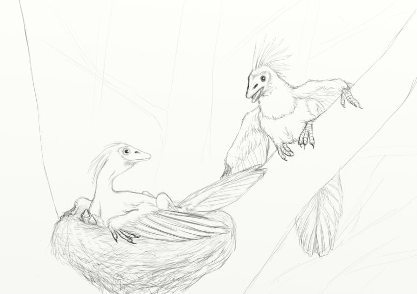
Anyway, in light of the brief discussion on bird evolution over in the Random thread, I figured I might as well show another thing I've been working on. Which I'm also stuck on... It looks rather crappy right now and I have no idea to move forward. Probably need to practice painting birds from refs, anyway...
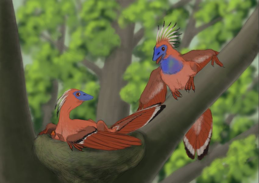
(the leafy background doesn't look so bad if you view the image stamp size but oh I hate it at full size lol)
) Anyway yes the spruce and the moss is the fluffy blur in the background for now. Not too concerned about the "split" since I hope the other stuff (moss and all) will tie it together a bit, but yes if I ever get back to it I suppose there should be writing too...Anyway, in light of the brief discussion on bird evolution over in the Random thread, I figured I might as well show another thing I've been working on. Which I'm also stuck on... It looks rather crappy right now and I have no idea to move forward. Probably need to practice painting birds from refs, anyway...
(the leafy background doesn't look so bad if you view the image stamp size but oh I hate it at full size lol)
Any an all misspellings are henceforth blamed on the cats.
Last edit: 24 Oct 2014 19:45 by Charlotte.
Please Log in or Create an account to join the conversation.
24 Oct 2014 21:34 #6833
by Domtopia
Everything's on the right!!!
It's like driving abroad!
Replied by Domtopia on topic Charlotte's Works
I think it looks good.
The depth of field works really well.
What have you used for reference? Hoatzin are an example of a modern bird with clawed wings. It might help as a photo reference and for lighting maybe.
The depth of field works really well.
What have you used for reference? Hoatzin are an example of a modern bird with clawed wings. It might help as a photo reference and for lighting maybe.
Everything's on the right!!!
It's like driving abroad!
The following user(s) said Thank You: Charlotte
Please Log in or Create an account to join the conversation.
Latest Activity

Banj updated their profile picture


Charlotte Still wearing a mask? Is it so we won't see you hoarding food in those cheeks of yours?
See More
Banj Mfmuh Guhmfpf
See More
Charlotte I'll take that as a yes...
See More
Charlotte Why is there a tiny flashing thing in front of the reply link/button? It's so small I can't see if it's an exclamation mark or a question mark... or...both?)
See More
Banj Because? Both!
See More
Charlotte *gasp*
See More

CaptainDeth updated their profile picture

CaptainDeth Ahoy folks, just a newbie here, just getting started. Thanks for allowing me in.
CaptainDeth Thank You
CaptainDeth and Mr.Bungle joined the site


honbasic joined the site


Gawk joined the site