


- Posts: 743
- Thank you received: 79

I gotta run, bbl

I thought you were a hamster
I'm always lurking, I'm a lurker ![:]](https://cgartnexus.com/images/mod_shoutbox/unsure.png)
or are you usually just lurking until Val shows up? 


The shoutbox is unavailable to non-members
Shoutbox History
I gotta run, bbl
I thought you were a hamster
I'm always lurking, I'm a lurker
or are you usually just lurking until Val shows up?
Charlotte's Works
- microscopi
-

- Offline
- Premium Member
-

Less
More
07 Mar 2015 17:32 #9415
by microscopi
Replied by microscopi on topic Charlotte's Works
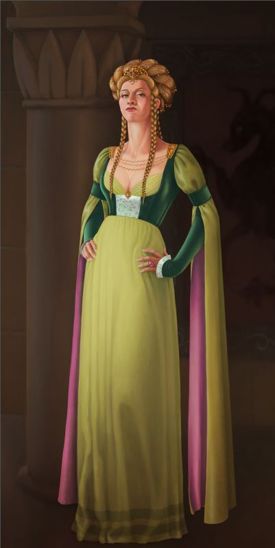
The detail of the hair looks great Charlotte, I keep looking at it thinking it would look better with a light source to the upper left, that way you can bump up the lighting on the left side of her face and down her bosom to show more realism and her hair could have rim lighting behind it, just an idea. The expression on her face is perfect, she literally looks like shes looking down at the viewer with her nose in the air.
The following user(s) said Thank You: Charlotte
Please Log in or Create an account to join the conversation.

07 Mar 2015 17:40 #9417
by Domtopia
Everything's on the right!!!
It's like driving abroad!
Replied by Domtopia on topic Charlotte's Works
I think it may benefit from some up lighting, personally. Her expression is perfect, as his her hair, but I think some uplight might sell the story that she is a schemer a bit better. Just a thought.
Also, her breasts look hard and angular at the moment. I can't help thinking that they could be softened and made just a little fuller.
Also, her breasts look hard and angular at the moment. I can't help thinking that they could be softened and made just a little fuller.
Everything's on the right!!!
It's like driving abroad!
The following user(s) said Thank You: Charlotte
Please Log in or Create an account to join the conversation.

07 Mar 2015 18:08 #9419
by Charlotte
Any an all misspellings are henceforth blamed on the cats.
Replied by Charlotte on topic Charlotte's Works
Thanks for the feedback everyone.
With regards to lighting, I did have the left light source from a different direction initially which gave a sort of rim light to the hair. Dave said it made her look like a cut-out and I agreed, so I moved the light. Personally I'm happy the way the light is now
With regards to lighting, I did have the left light source from a different direction initially which gave a sort of rim light to the hair. Dave said it made her look like a cut-out and I agreed, so I moved the light. Personally I'm happy the way the light is now
Any an all misspellings are henceforth blamed on the cats.
Please Log in or Create an account to join the conversation.
- crankshaft
-

- Offline
- Platinum Member
-

Less
More
- Posts: 1449
- Thank you received: 55
07 Mar 2015 18:17 #9422
by crankshaft
Replied by crankshaft on topic Charlotte's Works
Wow this look awesome! I do think she could use slightly darker shadows on the neck (her left). Awesome rendering of the hair!
The following user(s) said Thank You: Charlotte
Please Log in or Create an account to join the conversation.
08 Mar 2015 18:32 #9448
by Charlotte
Any an all misspellings are henceforth blamed on the cats.
Replied by Charlotte on topic Charlotte's Works
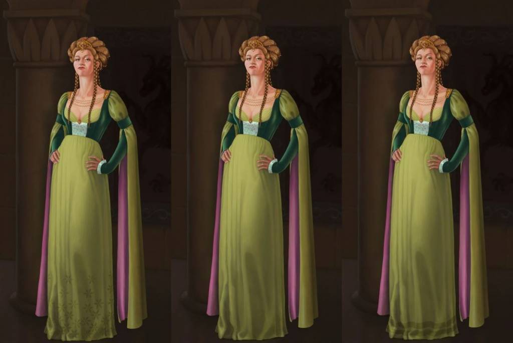
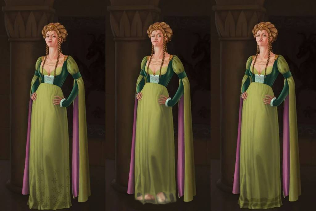
Been struggling all weekend with some sort of embroidery at the base of her skirt. I feel the skirt looks empty without but I can't seem to get anything to look right (pattern wise mostly, though the latest attempt where I've erased and moved bits, lightened and darkened areas and used blend modes still look like a flat texture overlay...). Not to mention "flowery" isn't really the Cersei style, is it? So I did a quicky with "ribbons" instead... Not sure which way to go. Thoughts?
Any an all misspellings are henceforth blamed on the cats.
Please Log in or Create an account to join the conversation.
08 Mar 2015 18:49 - 08 Mar 2015 19:04 #9449
by Domtopia
Everything's on the right!!!
It's like driving abroad!
Replied by Domtopia on topic Charlotte's Works
How about raising the skirt a little bit and having a thinner, chiffon sort of fabric that you can see her feet through? That way you will sell the idea of multi-fabric luxury!
Everything's on the right!!!
It's like driving abroad!
Last edit: 08 Mar 2015 19:04 by Domtopia.
The following user(s) said Thank You: Charlotte
Please Log in or Create an account to join the conversation.
- hobbyhorse
-
- Offline
- Junior Member
-

Less
More
- Posts: 132
- Thank you received: 15
10 Mar 2015 01:46 #9477
by hobbyhorse
Replied by hobbyhorse on topic Charlotte's Works
I like the ribbon on the bottom of the dress the best. The layered look with the transparent fabric might be nice as well but she would then have to have shoes or sandals...something else to design.
The fabric folds of the sleeves are in the right place but I think there needs to be a...what's it called...the darker 'line' between the lighted side and the fill light. It was just in the traditional art section of IFX...for the figure, I just can't find it right now. Darkening that dividing area in the face as well with a saturated dark orange/red would make the lit side of the face appear brighter. Do it with a soft brush.
The right side of her hair..her left needs to be darker to show that it curves away from the light. Right now it looks a bit flat and all on the same plane. Hope that helps.
The following user(s) said Thank You: Charlotte
Please Log in or Create an account to join the conversation.
10 Mar 2015 17:38 #9497
by Charlotte
Any an all misspellings are henceforth blamed on the cats.
Replied by Charlotte on topic Charlotte's Works
Thanks Hobby, yes her entire right side (our right) will need to be darker I think. I intend to make her a bit darker and the background a bit lighter. Will see how that all goes
When it comes to the dress, I do not intend to shorten it for the one simple reason that it already has a high waist and the long skirt is (in my opinion) necessary to balance that out. If I shorten the skirt it will look like she's just wearing a dress that's too small for her or hitched too high... (Also I really wouldn't want to repaint something like the dress folds which I found terribly difficult to get "right" in the first place, but I know one sometimes has to repaint things and the dress design IS my reason. I promise!)
When it comes to the dress, I do not intend to shorten it for the one simple reason that it already has a high waist and the long skirt is (in my opinion) necessary to balance that out. If I shorten the skirt it will look like she's just wearing a dress that's too small for her or hitched too high... (Also I really wouldn't want to repaint something like the dress folds which I found terribly difficult to get "right" in the first place, but I know one sometimes has to repaint things and the dress design IS my reason. I promise!)
Any an all misspellings are henceforth blamed on the cats.
Please Log in or Create an account to join the conversation.
14 Mar 2015 15:18 #9577
by Charlotte
Any an all misspellings are henceforth blamed on the cats.
Replied by Charlotte on topic Charlotte's Works
Maybe I'm just in a bad mood but I'm feeling rather fed up with Cersei now. I think I'll call it done, but I'll leave a last wip to simmer a bit before I decide for certain... I always see something new to fix when I post an image here anyway...
Seems every fix I've tried since the last wip just ends up messy or muddy. I've changed her face a bit and it almost gave her a black eye... The shading of her shoulder looks awful and the ring on her hand is just wrong. I tried adding a gradient instead of ribbons to the hem of her skirt but that just ended up looking like dirt. Grrr.
Seems every fix I've tried since the last wip just ends up messy or muddy. I've changed her face a bit and it almost gave her a black eye... The shading of her shoulder looks awful and the ring on her hand is just wrong. I tried adding a gradient instead of ribbons to the hem of her skirt but that just ended up looking like dirt. Grrr.
Any an all misspellings are henceforth blamed on the cats.
Please Log in or Create an account to join the conversation.
- microscopi
-
- Offline
- Premium Member
-
Less
More
- Posts: 743
- Thank you received: 79
14 Mar 2015 16:44 #9580
by microscopi
Replied by microscopi on topic Charlotte's Works
I can definitely relate to your frustration Charlotte, this happens to me all the time.
Tbh I started doing a paint over (I didn't save it tho..sorry), and noticed if you darken the part of the pillar closest to Cersai, it will make her light skin tone pop out even more and you could add more highlights to the left part of her face to push it more. Also noticed her bosom seems a bit flat color wise, it doesn't quite match the quality of lighting as her neck and face. a bit more lighting on the left would really bring out that area also and make it more shapely.
Other then those suggestions, I think it's looking great !
The following user(s) said Thank You: Charlotte
Please Log in or Create an account to join the conversation.
Latest Activity

Banj updated their profile picture


Charlotte Still wearing a mask? Is it so we won't see you hoarding food in those cheeks of yours?
See More
Banj Mfmuh Guhmfpf
See More
Charlotte I'll take that as a yes...
See More
Charlotte Why is there a tiny flashing thing in front of the reply link/button? It's so small I can't see if it's an exclamation mark or a question mark... or...both?)
See More
Banj Because? Both!
See More
Charlotte *gasp*
See More

CaptainDeth updated their profile picture

CaptainDeth Ahoy folks, just a newbie here, just getting started. Thanks for allowing me in.
CaptainDeth Thank You
CaptainDeth and Mr.Bungle joined the site


honbasic joined the site


Gawk joined the site