- Posts: 132
- Thank you received: 15

well... maybe not anymore... 


It's 20 degrees out today! Here anyway. 

 I did NOT dress for summer! I only used my new non-winter jacket once and it's already too warm
![:]](https://cgartnexus.com/images/mod_shoutbox/unsure.png)
The shoutbox is unavailable to non-members
Shoutbox History

well... maybe not anymore... 


It's 20 degrees out today! Here anyway. 

 I did NOT dress for summer! I only used my new non-winter jacket once and it's already too warm
![:]](https://cgartnexus.com/images/mod_shoutbox/unsure.png)
CGAN Mar 2015 Challenge - Tribute to Nimoy - WIPs
- hobbyhorse
-
- Offline
- Junior Member
-

Cherry, thanks, does this look better even if I keep the brightness the same? I kind of like the low key coloring on it.
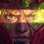
OK, Added a bit more detail and clarity around the eyes with brighter shine on them, Smoothed out some of the value changes in the hand..so not so busy. Added a basic texture in background, and some 'pores' to the face.
jessie - turned out wonderfully
Please Log in or Create an account to join the conversation.
- hobbyhorse
-

- Offline
- Junior Member
-

- Posts: 132
- Thank you received: 15
This is what I was seeing on my monitor...turned my monitor level all the way down...is this where others have their's? I have a Mac.
Please Log in or Create an account to join the conversation.
- CherryGraphics
-

- Offline
- Junior Member
-

- Posts: 366
- Thank you received: 33
I don't know if you can see it correctly on your display... left is your first, middle is your last and right is the one I played with a little bit.
If you want your brightness and contrast strong the middle is good on my display. But you said you like the low key coloring on it so the right might be more what you want.
Please Log in or Create an account to join the conversation.
The Spock picture looks good with your changes. Although I do accept that it was dark I still liked the tones of the original, it had a kind of sepia/nostalgic look to it. The brighter version does look better as a portrait though. However I'd prefer the background to be a bit darker, brightening it by the same amount as the face pushes it a bit too far forward.
Please Log in or Create an account to join the conversation.
- hobbyhorse
-

- Offline
- Junior Member
-

- Posts: 132
- Thank you received: 15
...so yes Valence I will darken the background. By the way can you increase your monitor brightness so you can see a more true rendition of people's work and your own as well without having to double check it on your tablet?
With the monitor brightness turned down hopefully this will help for future paintings.
Thanks again for all your helpful comments
Please Log in or Create an account to join the conversation.
Personally I always struggle with bright monitors, they give me shocking headaches when I'm trying to read stuff so I've always tended to go towards The Dark Side (cue the Imperial March!) and learned to compensate.
Also Colour Calibration is a tedious chore. I actually did calibrate my monitor many moons ago with Adobe Gamma (and the defunct nature of that software should give a clue to exactly how long ago) and having got used to it as it is I'm now scared of twiddling any more knobs. Of course if you're a professional person the best thing to do is throw away lots of money on one of those ColorMunki type devices that do the job for you, or you can just trust your own eye with one of those calibration charts which are easily Googleable.
Please Log in or Create an account to join the conversation.
The subsurface scattering looks great and the composition is strong. Nice work indeed!
Everything's on the right!!!
It's like driving abroad!
Please Log in or Create an account to join the conversation.
- CherryGraphics
-

- Offline
- Junior Member
-

- Posts: 366
- Thank you received: 33
Please Log in or Create an account to join the conversation.
Please Log in or Create an account to join the conversation.
Anywaaay... here are my two virtually finished versions (unless I spot any last minute gaffes or do some colour correction.)
I just need to make my decision over the weekend before posting in the finals, but I'm pretty sure which one it'll be. As I said before I think the plain one is the better picture, the simplicity makes it more poignant and more intimate and for that reason I thought I'd post that one here too. However I do like the the nebula one, even though it's a little more contrived and the dual nature of it ruins the effect of the lighting, it does though have a more narrative quality that explains how people will remember him. Also I did enjoy doing it: learning something from scratch in a few days and then having it work out happens so rarely these days that I can't help but prefer that version on those grounds even though I acknowledge that any viewer won't see it from that point of view.
Sadly I couldn't wean myself away from the Spock-Uniform-Blue colour, even though I accept the critique was correct, so I tried to add some more reds and purples and a bit of green to the nebula to break it up in a subtle way while contrasting that by toning down the blue in the outfit and using more rim light to "turn" the edges. It sort of works but not necessarily in the way that was suggested; sorry. I also added some brighter clouds to get rid of the two-handed wave illusion. Thanks to hobbyhorse for spotting that, I was nowhere near noticing it but as soon as it was mentioned I couldn't take my eyes of it.
Also let me add that for anyone else wanting to learn how to do a space nebula let me direct you to the fantastic works and tutorials of Tim Barton on his YouTube channel here and his DA page here (for those that understand deviantArt?!) His pictures are amazing and his techniques really work! Really!
Please Log in or Create an account to join the conversation.
Latest Activity


