- Posts: 1140
- Thank you received: 118


Are you trying to spew those lurker tentacles at us and failing or are you just in a state of constant amazement? 

The shoutbox is unavailable to non-members
Shoutbox History


Are you trying to spew those lurker tentacles at us and failing or are you just in a state of constant amazement? 

Attos' Sketchbook and Studies NSFW Nudity
No smudge tool was harmed in the making of this image.
Please Log in or Create an account to join the conversation.
No smudge tool was harmed in the making of this image.
Please Log in or Create an account to join the conversation.
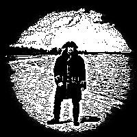
I like the technique with the square brush you have above. It gives a somewhat traditional feel with more textural interest. Not crazy about the added font though - perhaps it'd work better if that too looked a bit traditional. Kind of like a collage, with edges (maybe ripped, maybe cut out letters?). Just a thought
Any an all misspellings are henceforth blamed on the cats.
Please Log in or Create an account to join the conversation.
I agree that the text is unnecessary. My first thought on seeing it was: Five pounds is less than what?!
Please Log in or Create an account to join the conversation.
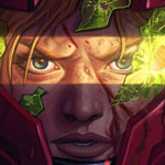
The second image has some weird fuzziness to the top of the head area in the highly saturated red colour. This wasn't on the original so does anyone know of an issue with jpegs that may account for this? I noticed a little on my entry for the dragon slayer challenge too. I'll look into my jpeg save settings but in the meantime has anyone encountered a similar issue?
Thanks in advance.
No smudge tool was harmed in the making of this image.
Please Log in or Create an account to join the conversation.
Any an all misspellings are henceforth blamed on the cats.
Please Log in or Create an account to join the conversation.
- crankshaft
-

- Offline
- Platinum Member
-

- Posts: 1449
- Thank you received: 55
Please Log in or Create an account to join the conversation.
No smudge tool was harmed in the making of this image.
Please Log in or Create an account to join the conversation.
No smudge tool was harmed in the making of this image.
Please Log in or Create an account to join the conversation.
- crankshaft
-

- Offline
- Platinum Member
-

- Posts: 1449
- Thank you received: 55
Please Log in or Create an account to join the conversation.
Latest Activity
