


- Posts: 1140
- Thank you received: 118


The shoutbox is unavailable to non-members
Attos' Sketchbook and Studies NSFW Nudity
30 Jan 2016 22:27 #13246
by Atto
No smudge tool was harmed in the making of this image.
Replied by Atto on topic Attos' Sketchbook and Studies NSFW Nudity
Thanks for the feedback Charlotte. The skin on the ref image was a little pasty to be fair however I totally agree with you. I think the paint over you so kindly posted (and no that isn't sarcasm, I really do appreciate it when people take the time to do it as I mentioned to Val in the current challenge wip thread) doesn't really work but I understand exactly what you are getting at and it does give that nice warm (living) look to the skin.
I have tried it before but it never seems to look natural to me, always too pinky or orange. I must admit I'm at a loss on how to achieve it, I've even tried colour selecting from a ref image which I'm normally loathe to do.
It's the same with ears and hands when there is a strong light source behind them, that warm edge to the highlights that describe the translucency of flesh.
Ill see if I can find that Marta Dahlig tip.
No smudge tool was harmed in the making of this image.
Please Log in or Create an account to join the conversation.

31 Jan 2016 02:08 - 31 Jan 2016 12:34 #13248
by Valence
Replied by Valence on topic Attos' Sketchbook and Studies NSFW Nudity
I think Charlotte's paintover works very well with the left side arm and breast, the effect isn't quite as clear on the other arm because of the flat shading there. (Using the Colour blending layer only works if the smooth shading is already there underneath.)
If you blend it a little more smoothly then you can get the warmth there too...
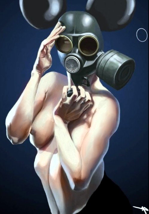
(And yes, I realise you were going for a cool desaturated effect but it's always worthwhile experimenting with colours afterwards.)
The best way I've found to get your head around warm sub-surface effects came from a Jace Wallace Q&A in a recent(ish) issue of IFX. In it he emphasized by using the colour picker that skin tones don't fall off in a linear way but as a curve that bends towards more saturated tones...
Of course you have to take into account some hue shift as well but remembering that curve idea really helps.
If you blend it a little more smoothly then you can get the warmth there too...
(And yes, I realise you were going for a cool desaturated effect but it's always worthwhile experimenting with colours afterwards.)
The best way I've found to get your head around warm sub-surface effects came from a Jace Wallace Q&A in a recent(ish) issue of IFX. In it he emphasized by using the colour picker that skin tones don't fall off in a linear way but as a curve that bends towards more saturated tones...
Of course you have to take into account some hue shift as well but remembering that curve idea really helps.
Last edit: 31 Jan 2016 12:34 by Valence.
The following user(s) said Thank You: Atto
Please Log in or Create an account to join the conversation.

31 Jan 2016 12:01 - 31 Jan 2016 12:02 #13249
by Charlotte
Any an all misspellings are henceforth blamed on the cats.
Replied by Charlotte on topic Attos' Sketchbook and Studies NSFW Nudity
That sounds like a good tip Val, I'll see if I can find it on one of the many issues I haven't read through yet... I'm so behind on my IFX reading I've decided to not renew my subscription this year....  I think I have at least 6 unread issues and some art specials... (they should last me a while)
I think I have at least 6 unread issues and some art specials... (they should last me a while) Any an all misspellings are henceforth blamed on the cats.
Last edit: 31 Jan 2016 12:02 by Charlotte.
Please Log in or Create an account to join the conversation.
31 Jan 2016 23:45 #13250
by Atto
No smudge tool was harmed in the making of this image.
Replied by Atto on topic Attos' Sketchbook and Studies NSFW Nudity
Thank you both so much, the combination of your two posts has really helped and I'm a lot more confident I can nail this effect now. That was the area (her left arm - our right) that threw me with Charlottes paintover but I can now clearly identify my mistake. My bad Charlotte, it was an issue with my drawing not yours that I was concerned about.
Looking forward to trying your tips in my next image.
Cheers,
Looking forward to trying your tips in my next image.
Cheers,
No smudge tool was harmed in the making of this image.
Please Log in or Create an account to join the conversation.
01 Feb 2016 16:23 #13258
by Valence
Replied by Valence on topic Attos' Sketchbook and Studies NSFW Nudity
Your shading and drawing worked perfectly fine with the original style and colour scheme. It's just that if something starts to look out AFTER you make a change on a colour layer the solution is usually to make a corresponding change to the underlying values. The uber-boring technical reason is that different hues have different intrinsic values to the human eye (ie a midtone blue is darker than a midtone yellow) but Photoshop's colour layer doesn't understand this!
It took me an absolute eternity to grasp this so I always like to stick my nose in and interfere to save other people from those hours of frustration. (In fact there's a Colouring Book thread that's all about this problem.)
And that IFX Q&A I mentioned is in issue 92. So it's not as recent as I thought.
It took me an absolute eternity to grasp this so I always like to stick my nose in and interfere to save other people from those hours of frustration.
(In fact there's a Colouring Book thread that's all about this problem.)And that IFX Q&A I mentioned is in issue 92. So it's not as recent as I thought.
The following user(s) said Thank You: Atto
Please Log in or Create an account to join the conversation.
02 Feb 2016 18:12 #13272
by evilrobot
Replied by evilrobot on topic Attos' Sketchbook and Studies NSFW Nudity
This one is coming out really awesome Atto nice work.
The following user(s) said Thank You: Atto
Please Log in or Create an account to join the conversation.
- crankshaft
-

- Offline
- Platinum Member
-

Less
More
- Posts: 1448
- Thank you received: 55
06 Feb 2016 02:55 #13302
by crankshaft
Replied by crankshaft on topic Attos' Sketchbook and Studies NSFW Nudity
Wow great tips here! The piece is coming along great. I've never rendered skin tones before so all this is new to me.
Please Log in or Create an account to join the conversation.
22 Feb 2016 02:44 #13387
by Atto
No smudge tool was harmed in the making of this image.
Replied by Atto on topic Attos' Sketchbook and Studies NSFW Nudity
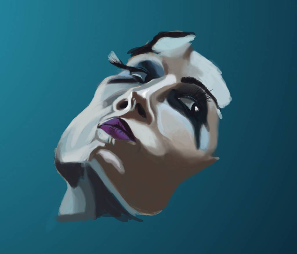
Thought I would start on a serious portrait and finally try to tackle some of those issues that I've been avoiding for too long.
Another study with a cold light source - I must also try your tip Val with the subsurface scattering we were discussing earlier. Next one perhaps.
Up to about 2 hours work on this so its progressing quicker than I feared.
Another study with a cold light source - I must also try your tip Val with the subsurface scattering we were discussing earlier. Next one perhaps.
Up to about 2 hours work on this so its progressing quicker than I feared.
No smudge tool was harmed in the making of this image.
Please Log in or Create an account to join the conversation.
24 Feb 2016 01:18 #13403
by Atto
No smudge tool was harmed in the making of this image.
Replied by Atto on topic Attos' Sketchbook and Studies NSFW Nudity
Did a little experiment today to see how accurate my observation is - with some surprising results. I am actually a lot further off than I thought I was.
What is interesting (to me anyhow) is the uniformity of my inaccuracy. My scale is off toward the top of the image and my observation of angles is off toward the bottom.
I'm well aware of issues that effect traditional techniques when working on a level surface (as opposed to an angled one, parallel to the plane of my face) where the eye compensates for foreshortening across the surface of the image so the scale of a drawing is usually larger at the top of the image but wasn't aware I was suffering from something similar when working digitally.
Anyone know what this may be?
I work on a bamboo tablet that I hold in my lap and the top of my screen sits level with the top of my head when I'm drawing.
Could it be due to the position of my tab? I hold it parallel to my face as I would when working traditionally but could the low angle be the issue. I can't afford a desk mounted tab right now but I could always nail my little bamboo to a board .
.
What is interesting (to me anyhow) is the uniformity of my inaccuracy. My scale is off toward the top of the image and my observation of angles is off toward the bottom.
I'm well aware of issues that effect traditional techniques when working on a level surface (as opposed to an angled one, parallel to the plane of my face) where the eye compensates for foreshortening across the surface of the image so the scale of a drawing is usually larger at the top of the image but wasn't aware I was suffering from something similar when working digitally.
Anyone know what this may be?
I work on a bamboo tablet that I hold in my lap and the top of my screen sits level with the top of my head when I'm drawing.
Could it be due to the position of my tab? I hold it parallel to my face as I would when working traditionally but could the low angle be the issue. I can't afford a desk mounted tab right now but I could always nail my little bamboo to a board
.No smudge tool was harmed in the making of this image.
Please Log in or Create an account to join the conversation.
25 Feb 2016 00:46 #13409
by Valence
Replied by Valence on topic Attos' Sketchbook and Studies NSFW Nudity
I would think that measurements and angles would have more to do with the screen where you are looking rather than the tablet (unless you have one of those Cintiq things with their built-in screen)
I have a Bamboo as well but mine is on the desk to the side but my eyes never go there, all the feedback is from the cursor on the screen so I assume all my own errors come from there.
I have a Bamboo as well but mine is on the desk to the side but my eyes never go there, all the feedback is from the cursor on the screen so I assume all my own errors come from there.
The following user(s) said Thank You: Atto
Please Log in or Create an account to join the conversation.
Latest Activity

Banj updated their profile picture


Charlotte Still wearing a mask? Is it so we won't see you hoarding food in those cheeks of yours?
See More
Banj Mfmuh Guhmfpf
See More
Charlotte I'll take that as a yes...
See More
Charlotte Why is there a tiny flashing thing in front of the reply link/button? It's so small I can't see if it's an exclamation mark or a question mark... or...both?)
See More
Banj Because? Both!
See More
Charlotte *gasp*
See More

CaptainDeth updated their profile picture

CaptainDeth Ahoy folks, just a newbie here, just getting started. Thanks for allowing me in.
CaptainDeth Thank You
CaptainDeth and Mr.Bungle joined the site


honbasic joined the site


Gawk joined the site