


Are you trying to spew those lurker tentacles at us and failing or are you just in a state of constant amazement? 

The shoutbox is unavailable to non-members
Shoutbox History
Are you trying to spew those lurker tentacles at us and failing or are you just in a state of constant amazement?
CGAN - June 2015 - IT Movie Poster - Pennywise remake - WIPS

Valence - just wanted to say I rather like the lopsidedness of your clown's mouth - I think it's just the corners of the mouth that needs fixing really.
Any an all misspellings are henceforth blamed on the cats.
Please Log in or Create an account to join the conversation.
Well last month was a bit of a dead loss for me - Just no time as usual. But determined to get something in this month. Went up to york this weekend and as I have said before Trains are the best place for sketching!
So started this... Kinda like him so far but lots to do....
Please Log in or Create an account to join the conversation.
- microscopi
-

- Offline
- Premium Member
-

- Posts: 743
- Thank you received: 79

Please Log in or Create an account to join the conversation.
- CherryGraphics
-

- Offline
- Junior Member
-

- Posts: 366
- Thank you received: 33
")
He reminds me a bit of someone but I can't tell who... o.O I'll think about it ^^
omg micro - this is a nightmare!
and thank you all for these lovely words
 worked a bit on the lights again and placed a nice little spider belonging to the net in the head...
  (Yes I hate clowns. And I hate spiders.)
Please Log in or Create an account to join the conversation.

Cherry: I was gonna suggest some extra light to outline the head but you've already done it before I could say. I agree with Dragon; this pic is too good and too quick. Perhaps we can have an "end of month" contest for the rest of us.
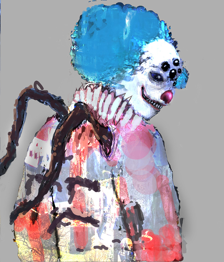
I've expanded the canvas on mine in order to make space for the text and/or logos but I'm not sure how that's gonna work just yet. I've straightened the mouth but tried to keep some creepy asymmetry with the hair and makeup, and in the way the image "drains" downwards towards the right. Painting the frilly collar has been tedious and awful but it's mostly done now. Next I need to add some shadows across the whole picture and then try to make it look like a "Film Poster"... Somehow.
Please Log in or Create an account to join the conversation.
- CherryGraphics
-
- Offline
- Junior Member
-
- Posts: 366
- Thank you received: 33
I really "like" your clown! The eyebrow is really special
And I think you did a good work by straightened the mouth a bit - it looks much more scary than last time. Please Log in or Create an account to join the conversation.
- SchizophreniaWolf
-
- Offline
- Junior Member
-
- Posts: 170
- Thank you received: 10
Hey guys nice updates, glad you like my first wip,
Valence, you put a lot of detail in your pic and I think it looks great, definitely creepy though, it's easy to switch things up if they're not working, you will just waste more time on something you don't like.
Cherry loving the direction yours is going also from your usual stuff, it's really coming along great.
This one is great, Micro!!! the texture and the colors are very artistic, LOVE IT!
Please Log in or Create an account to join the conversation.
- microscopi
-
- Offline
- Premium Member
-
- Posts: 743
- Thank you received: 79
Means a lot coming from you, your a tough critic, hopefully I didn't ruin it with my update as you didn't copy the one after that!Susie, that's a great sketch so far, I should sketch on the train too, tried drawing on my phone but it really isn't user friendly yet. Hopefully you can get some more time to color and detail more.
Dragon, that's an interesting pose, I can really imagine where you could take it, would be cool to see.
Valence, I like the eyebrow and the mouth works now, you really captured the creppyness of his expression, looks like he could just start eating you like a watermellon with those teeth.
Cherry really like the background details almost more then the clown, the little kids look awesome just with the sillouette and shadows, and the font for IT is really cool
Please Log in or Create an account to join the conversation.

I haven't done too much on mine as I was distracted by a Photoshop problem but I did try to add some more details in that newly acquired space at the bottom. I've been having go at incorporating that open graves scene just to act as a ground plane to draw you in before fading it out beneath the clown. However it currently looks a little too much like two separate paintings stuck together (which of course it is!)
In fact I'm somewhat baffled by the way Cherry's pic looks exactly like a film poster and mine doesn't. There must be some kind of intangible style of composition that subconsciously says "Film Poster" to me and that picture has it. So I have just downloaded a job lot of horror movie posters and tomorrow I shall study them until I have a headache in order to find out what I need to do.
Please Log in or Create an account to join the conversation.
- CherryGraphics
-
- Offline
- Junior Member
-
- Posts: 366
- Thank you received: 33
(And if not - I had enough fun doing this for two  )
)I really like your color choices. It looks like a psychodelic shock to see such a horror clown so your own world swooshes away and gets unnatual colors.
Thanks again Val
 Maybe it would be good for you playing around with fonts to get a better feeling for film poster? So you can see which space you need and which space you can fill in other ways.
edit: worked a bit on his face again. Too much cracks or not? ^^
Please Log in or Create an account to join the conversation.
Latest Activity


