


- Posts: 10084
- Thank you received: 475
 Like I said. Now
*presses B again*
![:]](https://cgartnexus.com/images/mod_shoutbox/unsure.png)
He does like meowing a lot.
I meant *here* but I guess Val might be a cat...
Does one belong to a cat?
I suspect there are two brains here. 
The shoutbox is unavailable to non-members
Shoutbox History
Like I said. Now
*presses B again*
He does like meowing a lot.
I meant *here* but I guess Val might be a cat...
Does one belong to a cat?
I suspect there are two brains here.
CGAN - June 2015 - IT Movie Poster - Pennywise remake - WIPS
18 Jun 2015 13:34 #11342
by Valence
Replied by Valence on topic CGAN - June 2015 - IT Movie Poster - Pennywise remake - WIPS
Cherry: The crack across the forehead looks great. I think the one on the cheek is unnecessary plus it's really hard to get it to follow the shape of the face in that area so if it was me I'd remove that one or tone it down a little. But of course that's just a personal opinion, feel free to keep it there and make it look even better! ")
If you are still looking for something to fiddle with then a bit of work on the ear could add that extra bit of polish (if your layers permit with that overlapping hair.) To my eye that's the only area that could use the improvement, everything else looks pretty damn good.
If you are still looking for something to fiddle with then a bit of work on the ear could add that extra bit of polish (if your layers permit with that overlapping hair.) To my eye that's the only area that could use the improvement, everything else looks pretty damn good.
Please Log in or Create an account to join the conversation.
- CherryGraphics
-

- Offline
- Junior Member
-

Less
More
- Posts: 366
- Thank you received: 33
19 Jun 2015 05:27 #11358
by CherryGraphics
Replied by CherryGraphics on topic CGAN - June 2015 - IT Movie Poster - Pennywise remake - WIPS
I'll try to paint the ear a bit better thanks ") (I don't like ears. it's like hands.
(I don't like ears. it's like hands.  )
)
but hey there's still a lot of month leftover so I began the big project I wanted since I was... what... 12?
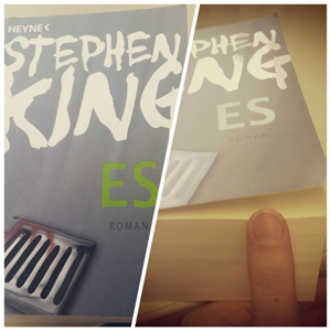
1. thought: Oh my..... what a tome!
2. thought: Who the hell made this weird cover?
(I don't like ears. it's like hands. )but hey there's still a lot of month leftover so I began the big project I wanted since I was... what... 12?
1. thought: Oh my..... what a tome!
2. thought: Who the hell made this weird cover?
Please Log in or Create an account to join the conversation.
19 Jun 2015 13:53 - 19 Jun 2015 13:55 #11362
by Valence
Replied by Valence on topic CGAN - June 2015 - IT Movie Poster - Pennywise remake - WIPS
Nope I don't like hands either. It'd be great if everyone wore mittens! 
But I love doing ears! And I love doing them because of this tip, and it's a tip that requires no knowledge or skill, nor do you have to learn anything but once you know it you can do ears easily. And the tip is this...
Think of the ear as a letter "y" inside the number "9". And that's it.
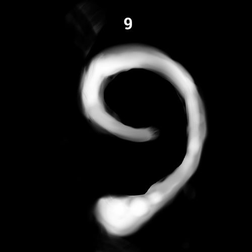
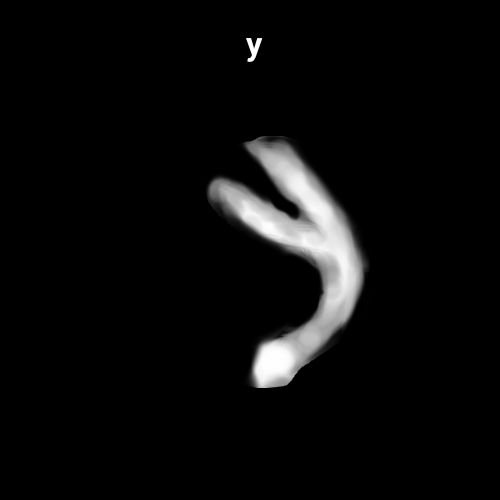
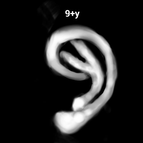
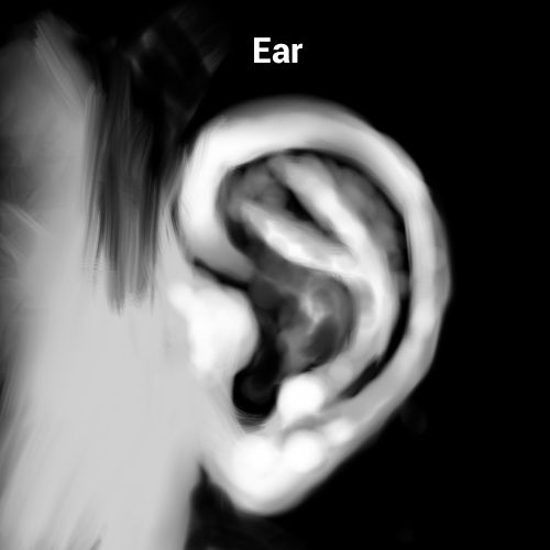
Obviously you have to flip it for the other side but it's easy. (Easier than trying to make those pictures into an animated gif!)
But I love doing ears! And I love doing them because of this tip, and it's a tip that requires no knowledge or skill, nor do you have to learn anything but once you know it you can do ears easily. And the tip is this...
Think of the ear as a letter "y" inside the number "9". And that's it.
Obviously you have to flip it for the other side but it's easy. (Easier than trying to make those pictures into an animated gif!)
Last edit: 19 Jun 2015 13:55 by Valence.
Please Log in or Create an account to join the conversation.
19 Jun 2015 19:54 #11371
by Valence
Replied by Valence on topic CGAN - June 2015 - IT Movie Poster - Pennywise remake - WIPS
Right, I've put the graveyard scene in and spent some time adding some subtle shadows on a multiply layer. One of the weaknesses of the image was the dominance of the light areas so softening the transitions has helped a little.
I've also made a little logo. One of my favourite movie logos was from A.I. where the letters were spelled out by the positive and negative shapes of the robot boy so I've tried to do something similar with a boy and the clown to spell out "iT". I'm not sure it works but it'll suffice unless I have another idea.
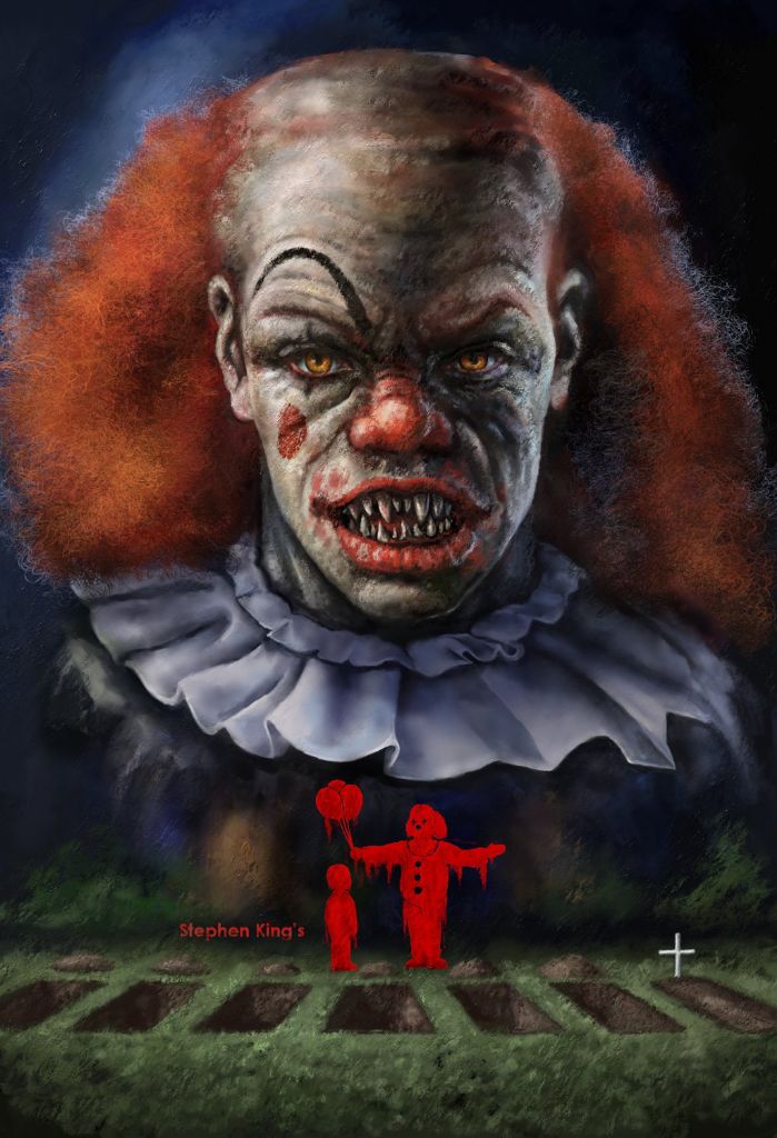
I'll leave it now until next week and then I shall add some more text and perhaps fiddle with the overall colour balance.
I've also made a little logo. One of my favourite movie logos was from A.I. where the letters were spelled out by the positive and negative shapes of the robot boy so I've tried to do something similar with a boy and the clown to spell out "iT". I'm not sure it works but it'll suffice unless I have another idea.
I'll leave it now until next week and then I shall add some more text and perhaps fiddle with the overall colour balance.
Please Log in or Create an account to join the conversation.

19 Jun 2015 21:04 #11375
by kazky
Replied by kazky on topic CGAN - June 2015 - IT Movie Poster - Pennywise remake - WIPS
That's Brilliant Valence, it also reminds me of The Stand so double Stephen King value
Sent from my iPad using Tapatalk
Sent from my iPad using Tapatalk
The following user(s) said Thank You: Valence
Please Log in or Create an account to join the conversation.
20 Jun 2015 10:23 #11395
by bergy68
Replied by bergy68 on topic CGAN - June 2015 - IT Movie Poster - Pennywise remake - WIPS
Valence I absolutely love this poster concept. My only critique if I may is cause the lettering concept for "IT" is fantastic but I think it needs some POP, maybe some rim lighting on one of its side to give it some more form. Maybe you were already planning something else. Either way awesome poster!
Best Mikey.
Best Mikey.
The following user(s) said Thank You: Valence
Please Log in or Create an account to join the conversation.
20 Jun 2015 10:46 #11398
by kazky
Replied by kazky on topic CGAN - June 2015 - IT Movie Poster - Pennywise remake - WIPS
Oh yeah rim light would really work well!
Sent from my iPad using Tapatalk
Sent from my iPad using Tapatalk
Please Log in or Create an account to join the conversation.
20 Jun 2015 13:36 #11400
by Valence
Replied by Valence on topic CGAN - June 2015 - IT Movie Poster - Pennywise remake - WIPS
Thank you both, I completely agree it needs something else there.
I do struggle with typography. When I try to freehand it it just ends up looking like my handwriting and when I use fonts it just looks like something from another picture that I've pasted in.
For this I was initially trying to create a stencil look in a flat bright red colour but it looked ridiculously artificial so I tried to knock it back with some textured smeary blood colour sampled from the lips. But yes, I have taken it too far the other way, I will try to bring it back from the darkness.
One other issue is that when doing these gimmicky logos the ultimate question is: does it actually read as lettering at first glance without extraneous explanation? And to be honest, as it is, I don't think it does. Perhaps the suggested changes will help that too. I'm also thinking about removing the clown details of nose and buttons to make it a more solid silhouette.
But anyway... I shall leave it for the weekend and not look at it in order to come at it with fresh eyes next week.
Many thanks for comments and advice.
Please Log in or Create an account to join the conversation.
- microscopi
-

- Offline
- Premium Member
-

Less
More
- Posts: 743
- Thank you received: 79
20 Jun 2015 17:50 - 20 Jun 2015 17:53 #11410
by microscopi
Replied by microscopi on topic CGAN - June 2015 - IT Movie Poster - Pennywise remake - WIPS
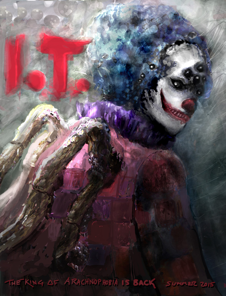
Cherry I agree with Valence about the scratches, maybe just some less subtle ones, I really like the shading you did on the kids in the background, looks really atmospheric.
Valence that's a cool idea with the graves in the front, I definitely agree the letters need some more umph but I really think how you shaped them was an awesome idea.
Haven't been on much, just getting to that time of year where awesome weather and busy outdoor schedules go hand in hand I think i'm going with this direction, worked up the lighting more, next updates i'm just going to be cleaning it up more and more and adding small details to the background.
Valence that's a cool idea with the graves in the front, I definitely agree the letters need some more umph but I really think how you shaped them was an awesome idea.
Haven't been on much, just getting to that time of year where awesome weather and busy outdoor schedules go hand in hand
I think i'm going with this direction, worked up the lighting more, next updates i'm just going to be cleaning it up more and more and adding small details to the background.
Last edit: 20 Jun 2015 17:53 by microscopi. Reason: double attachement
Please Log in or Create an account to join the conversation.
21 Jun 2015 00:13 - 21 Jun 2015 00:15 #11419
by Valence
Replied by Valence on topic CGAN - June 2015 - IT Movie Poster - Pennywise remake - WIPS
Micro: The lighting on your picture is just perfect! The transition from light to dark down the picture balances in exactly the way it should. And just like Cherry's pic it has the look and feel of a film poster.
The extra detailing to the face give it that direct connection with evil that we all fear. Super sinister.
I also like having the release date at the bottom (I might steal that!)
The IT lettering is a little smooth and transparent in places. Perhaps making it grittier with some dirty hard opaque edges would make it fit with the overall textured style.
But I'll say it again: Super Sinister!
Last edit: 21 Jun 2015 00:15 by Valence.
Please Log in or Create an account to join the conversation.
Latest Activity

Banj updated their profile picture


Charlotte Still wearing a mask? Is it so we won't see you hoarding food in those cheeks of yours?
See More
Banj Mfmuh Guhmfpf
See More
Charlotte I'll take that as a yes...
See More
Charlotte Why is there a tiny flashing thing in front of the reply link/button? It's so small I can't see if it's an exclamation mark or a question mark... or...both?)
See More
Banj Because? Both!
See More
Charlotte *gasp*
See More

CaptainDeth updated their profile picture

CaptainDeth Ahoy folks, just a newbie here, just getting started. Thanks for allowing me in.
CaptainDeth Thank You
CaptainDeth and Mr.Bungle joined the site


honbasic joined the site


Gawk joined the site