


- Posts: 743
- Thank you received: 79
![:]](https://cgartnexus.com/images/mod_shoutbox/unsure.png)
Well I was awake between 2 am and 6.30 or 7 or so.


and then... 
I can't sleep  Again
Again

The shoutbox is unavailable to non-members
Shoutbox History
CGAN August 2014 Challenge - Ode to Banj - WIPs
- microscopi
-

- Offline
- Premium Member
-

Less
More
18 Aug 2014 04:13 - 18 Aug 2014 04:21 #5309
by microscopi
Replied by microscopi on topic CGAN August 2014 Challenge - Ode to Banj - WIPs
I really like the shield idea a lot Dave, what you have going so far looks great, your handwriting is so neat!
I just had a thought that might work also, changing the background behind the queen to maybe a wall tapestry or something. or darken the background and add some torch flames, that might be more adventurous though.
Oak, I could of swore I saw an update from you, or was I imagining things?
I just had a thought that might work also, changing the background behind the queen to maybe a wall tapestry or something. or darken the background and add some torch flames, that might be more adventurous though.
Oak, I could of swore I saw an update from you, or was I imagining things?
Last edit: 18 Aug 2014 04:21 by microscopi.
Please Log in or Create an account to join the conversation.
18 Aug 2014 15:43 #5316
by oaktree
Replied by oaktree on topic CGAN August 2014 Challenge - Ode to Banj - WIPs
Well spotted micro there was an update posted for a couple of hours but looking at it later I really did not like it and so removed it. Hope to have an update I like better later.
Please Log in or Create an account to join the conversation.

18 Aug 2014 16:05 - 18 Aug 2014 16:54 #5317
by AngieA
Replied by AngieA on topic CGAN August 2014 Challenge - Ode to Banj - WIPs
So as a self taught hobbyist I do feel a bit intimidated by all the great wip's I've seen so far but I'm determined to have a go at a challenge.
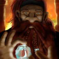
My first wip is a rough idea of how I want my Banj to look. I'm keeping the nappy/wrap style of pants from Banj's avatar and I thought that the idea of a thimble, button and needle as his helmet, shield and sword would be a nice way to hint at his small scale. I don't think I can create a very detailed environment or multi character scene so I'm thinking I might just have him in front of a set of huge doors as if guarding the throne room. Any feedback on what I have so far would be very welcome and any tips on making a Hamster look more fierce while still being cute would be great.
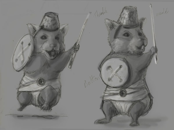
My first wip is a rough idea of how I want my Banj to look. I'm keeping the nappy/wrap style of pants from Banj's avatar and I thought that the idea of a thimble, button and needle as his helmet, shield and sword would be a nice way to hint at his small scale. I don't think I can create a very detailed environment or multi character scene so I'm thinking I might just have him in front of a set of huge doors as if guarding the throne room. Any feedback on what I have so far would be very welcome and any tips on making a Hamster look more fierce while still being cute would be great.
Last edit: 18 Aug 2014 16:54 by AngieA.
Please Log in or Create an account to join the conversation.

18 Aug 2014 16:48 #5319
by Charlotte
Any an all misspellings are henceforth blamed on the cats.
Replied by Charlotte on topic CGAN August 2014 Challenge - Ode to Banj - WIPs
Don't worry - several of us are self taught hobbyists as well ")
Regarding Banj's er costume, I think the "nappy" is actually supposed to be a straightjacket. But I think it looks rather like a nappy too. Just don't tell him I said so. Shhh.
Regarding Banj's er costume, I think the "nappy" is actually supposed to be a straightjacket. But I think it looks rather like a nappy too. Just don't tell him I said so. Shhh.
Any an all misspellings are henceforth blamed on the cats.
Please Log in or Create an account to join the conversation.
18 Aug 2014 16:56 #5320
by AngieA
Replied by AngieA on topic CGAN August 2014 Challenge - Ode to Banj - WIPs
Lol whoops! Post number 5 and I already managed to insult someone's avatar.
Please Log in or Create an account to join the conversation.
- Digital Dave
-

- Offline
- Platinum Member
-

Less
More
- Posts: 2242
- Thank you received: 163
18 Aug 2014 18:05 - 18 Aug 2014 18:14 #5321
by Digital Dave
I get sketchy around pencils! ...
Replied by Digital Dave on topic CGAN August 2014 Challenge - Ode to Banj - WIPs
Yep, I've always seen it as a type of clothe-wrapped-straightjacket. If not, I would be wondering why Banj always has his hands down into his pants!  ...
... 
... I get sketchy around pencils! ...
Last edit: 18 Aug 2014 18:14 by Digital Dave.
Please Log in or Create an account to join the conversation.
18 Aug 2014 20:32 - 18 Aug 2014 21:15 #5324
by oaktree
Replied by oaktree on topic CGAN August 2014 Challenge - Ode to Banj - WIPs
AngieA Great start wish I'd though of of it cannot wait to see where it goes 'O' and welcome
Try this update, am I on the right track have I got the focal point back ?
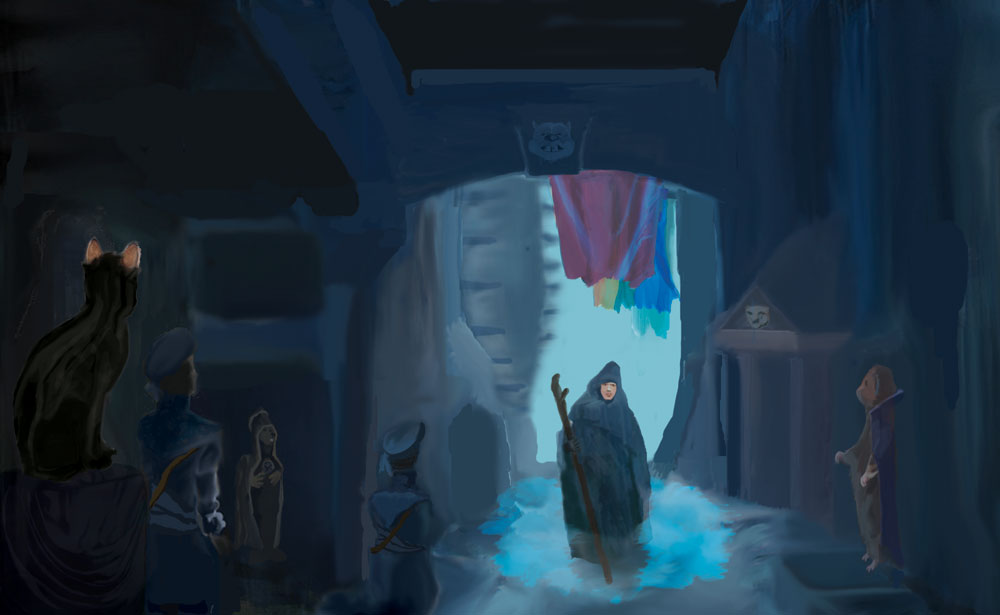
Try this update, am I on the right track have I got the focal point back ?
Last edit: 18 Aug 2014 21:15 by oaktree.
Please Log in or Create an account to join the conversation.
- Digital Dave
-
- Offline
- Platinum Member
-
Less
More
- Posts: 2242
- Thank you received: 163
18 Aug 2014 21:25 - 18 Aug 2014 21:36 #5330
by Digital Dave
I get sketchy around pencils! ...
Replied by Digital Dave on topic CGAN August 2014 Challenge - Ode to Banj - WIPs
I actually liked you previous wip, Oak. The larger opening really gave it a nice enormous feel to it, and I think the colorful banners are now pulling the eye up and away from your main character. ... Funny thing is, I opened your images in another tab to view them together, and he grew a face in the time it took me to view them! But it's up to you, but you might try leaving it as is, and just throw the larger opening back in to see which one you like. It also brings in more light too.
Lastly, make sure to check the 'door' to his left. Now that you enlarged him, he appears to be 3 or 4 feet taller then it.
EDIT: forgot to add this. Micro I did indeed think about adding a tapestry to the BG, but wasn't sure how I wanted to add it? Whether on the wall, behind the shield, or behind the characters? Just haven't had much time to work it in to see how it looks. Maybe sometime this week, if time allows. Thanks.
But it's up to you, but you might try leaving it as is, and just throw the larger opening back in to see which one you like. It also brings in more light too.Lastly, make sure to check the 'door' to his left. Now that you enlarged him, he appears to be 3 or 4 feet taller then it.
EDIT: forgot to add this. Micro I did indeed think about adding a tapestry to the BG, but wasn't sure how I wanted to add it? Whether on the wall, behind the shield, or behind the characters? Just haven't had much time to work it in to see how it looks. Maybe sometime this week, if time allows. Thanks.
I get sketchy around pencils! ...
Last edit: 18 Aug 2014 21:36 by Digital Dave.
Please Log in or Create an account to join the conversation.
18 Aug 2014 21:55 #5331
by AngieA
Replied by AngieA on topic CGAN August 2014 Challenge - Ode to Banj - WIPs
Nice image Oaktree. I like the placing of your main character and the overall mysterious mood but I have to agree with Digital Dave about the banners drawing the eye up and away. I think it's because the red is so strong. Maybe try a version with the banner colours more desaturated and see how that works or try making them smaller.
Please Log in or Create an account to join the conversation.

18 Aug 2014 22:11 #5335
by Domtopia
Everything's on the right!!!
It's like driving abroad!
Replied by Domtopia on topic CGAN August 2014 Challenge - Ode to Banj - WIPs
I think the high contrasts between the colour of his face and his cowl is a perfect device for drawing the eye to the main character. The banners in the background are too bright, as has been commented on. But, I think adding something like that in the foreground, or using objects like that in a linear fashion, say either side if the street, so as to direct the eye to the archway would look awesome.
Some thoughts, but see what you think Oak.
Some thoughts, but see what you think Oak.
Everything's on the right!!!
It's like driving abroad!
Please Log in or Create an account to join the conversation.
Latest Activity

Banj updated their profile picture


Charlotte Still wearing a mask? Is it so we won't see you hoarding food in those cheeks of yours?
See More
Banj Mfmuh Guhmfpf
See More
Charlotte I'll take that as a yes...
See More
Charlotte Why is there a tiny flashing thing in front of the reply link/button? It's so small I can't see if it's an exclamation mark or a question mark... or...both?)
See More
Banj Because? Both!
See More
Charlotte *gasp*
See More

CaptainDeth updated their profile picture

CaptainDeth Ahoy folks, just a newbie here, just getting started. Thanks for allowing me in.
CaptainDeth Thank You
CaptainDeth and Mr.Bungle joined the site


honbasic joined the site


Gawk joined the site