


- Posts: 1140
- Thank you received: 118


I gotta run, bbl

I thought you were a hamster
I'm always lurking, I'm a lurker ![:]](https://cgartnexus.com/images/mod_shoutbox/unsure.png)
or are you usually just lurking until Val shows up?
The shoutbox is unavailable to non-members
Shoutbox History
I gotta run, bbl
I thought you were a hamster
I'm always lurking, I'm a lurker
or are you usually just lurking until Val shows up?
CGAN November 2015 - Dragon Slayer - WIPs
24 Nov 2015 00:38 #12853
by Atto
No smudge tool was harmed in the making of this image.
Replied by Atto on topic CGAN November 2015 - Dragon Slayer - WIPs
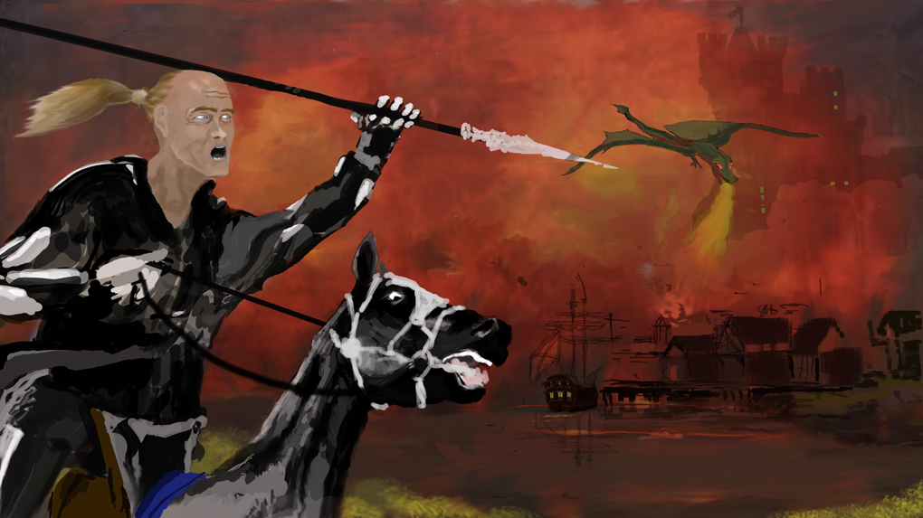
Oaktree - Looking good, that background has a very good feeling of heat and I'm really interested to see how you're gonna suggest the forms of that harbour and water partially hidden behind all those flames. Those dirty browns against those orange and reds are wonderful.
I'm a bit concerned that I'm going to have too much negative space between the two figures on mine. I may have to rethink the BG toward the bottom.
I'm a bit concerned that I'm going to have too much negative space between the two figures on mine. I may have to rethink the BG toward the bottom.
No smudge tool was harmed in the making of this image.
Please Log in or Create an account to join the conversation.
- CherryGraphics
-

- Offline
- Junior Member
-

Less
More
- Posts: 366
- Thank you received: 33
24 Nov 2015 13:40 #12854
by CherryGraphics
Replied by CherryGraphics on topic CGAN November 2015 - Dragon Slayer - WIPs
Thanks Atto for the great tips! ") I know I "forgot" the shadows until now - it is something I always paint at the very end, when I know this is the position I want. but thanks a lot! Oh and thanks Val for the tip with the rotation I'll check this
I know I "forgot" the shadows until now - it is something I always paint at the very end, when I know this is the position I want. but thanks a lot! Oh and thanks Val for the tip with the rotation I'll check this
Atto yous is coming along really nice, I like his ... ehm .. crumpled face a lot, it's a great expression!
oaktree I like the background colors a lot the style here is great! I struggled a bit about the frontal position, I guess his face could be a bit more ... lateral. You know? So we could follow his eyes better. But it's just a thought
I know I "forgot" the shadows until now - it is something I always paint at the very end, when I know this is the position I want. but thanks a lot! Oh and thanks Val for the tip with the rotation I'll check this Atto yous is coming along really nice, I like his ... ehm .. crumpled face a lot, it's a great expression!
oaktree I like the background colors a lot
the style here is great! I struggled a bit about the frontal position, I guess his face could be a bit more ... lateral. You know? So we could follow his eyes better. But it's just a thought Please Log in or Create an account to join the conversation.
25 Nov 2015 09:43 #12857
by oaktree
Replied by oaktree on topic CGAN November 2015 - Dragon Slayer - WIPs
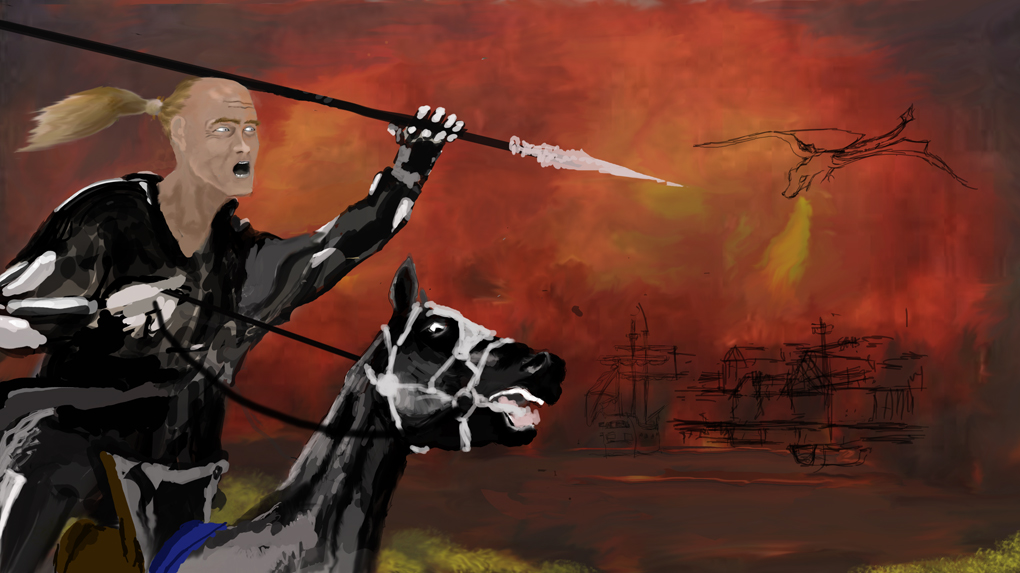
Thanks you so much for the comments everyone . I new there was something that was not right about the slayer he was posing for the camera as he was passing by, Cherry I've moved his head around is that any better, it also gave me a chance to add hair and hopefully increase the feeling of his movement.
Please Log in or Create an account to join the conversation.
- CherryGraphics
-
- Offline
- Junior Member
-
Less
More
- Posts: 366
- Thank you received: 33
25 Nov 2015 14:19 - 25 Nov 2015 14:22 #12858
by CherryGraphics
Replied by CherryGraphics on topic CGAN November 2015 - Dragon Slayer - WIPs
Yep this is pretty much more like a battle scene oak!
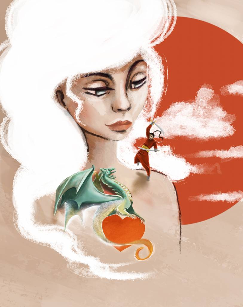
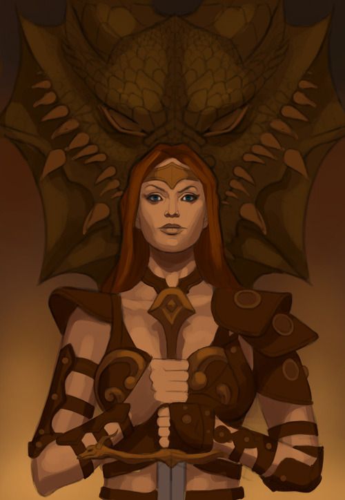
wasn't that much happy with my dragon so I changed the whole tattoo area. I have to say I love the new trend of watercolor tattoos - they look awesome! (And... if I would know a good place I would like to have a watercolor "white rabbit" for that I can be sure to always find my way back to wonderland
  )
)
I finished my "super special edition" from Sandman Overture by Neil Gaiman - if anybody knows - and I lovbed the style of this so much I guess I was a bit inspired from this comic too.....
So with the watercolor dragon wings and body it didn't look right to have dark lines so I changed them to white sparkled / splashed lines - I guess now it looks a bit more dreamy. And yes - I gave the dragon a shadow.")
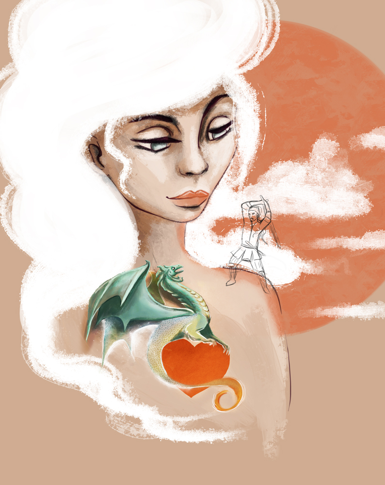
wasn't that much happy with my dragon so I changed the whole tattoo area.
I have to say I love the new trend of watercolor tattoos - they look awesome! (And... if I would know a good place I would like to have a watercolor "white rabbit" for that I can be sure to always find my way back to wonderland )I finished my "super special edition" from Sandman Overture by Neil Gaiman - if anybody knows - and I lovbed the style of this so much I guess I was a bit inspired from this comic too.....
So with the watercolor dragon wings and body it didn't look right to have dark lines so I changed them to white sparkled / splashed lines - I guess now it looks a bit more dreamy. And yes - I gave the dragon a shadow.
Last edit: 25 Nov 2015 14:22 by CherryGraphics.
Please Log in or Create an account to join the conversation.

25 Nov 2015 16:13 #12859
by Valence
Replied by Valence on topic CGAN November 2015 - Dragon Slayer - WIPs
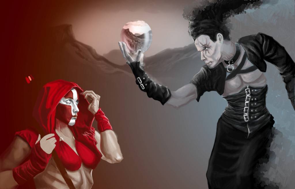
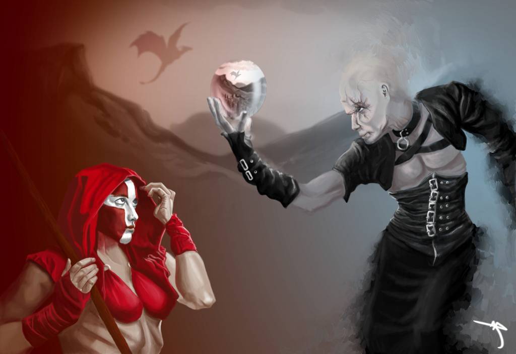
Atto: Nice progress there. Check out the eyes on the red face though, it looks like they're focussed on the hood rather than the crystal ball. I think they just need to diverge a tiny bit more.
Oaktree: Excellent colour choice for the background. The new head angle is a good improvement as is the warmer skin tone. Get that dragon in! Can't wait to see it.
Cherry: Yep. That looks "real" and "3D" in exactly the way that I hoped it would. And the lighter, softer colours look much better than the harsh black of the previous wip. The whole picture look more unified now. Excellent work!
Oaktree: Excellent colour choice for the background. The new head angle is a good improvement as is the warmer skin tone. Get that dragon in!
Can't wait to see it.Cherry: Yep. That looks "real" and "3D" in exactly the way that I hoped it would. And the lighter, softer colours look much better than the harsh black of the previous wip. The whole picture look more unified now. Excellent work!
Please Log in or Create an account to join the conversation.
26 Nov 2015 18:43 - 26 Nov 2015 18:47 #12861
by oaktree
Replied by oaktree on topic CGAN November 2015 - Dragon Slayer - WIPs
Quick update from me
Last edit: 26 Nov 2015 18:47 by oaktree.
Please Log in or Create an account to join the conversation.
27 Nov 2015 00:42 #12862
by Atto
No smudge tool was harmed in the making of this image.
Replied by Atto on topic CGAN November 2015 - Dragon Slayer - WIPs
Ok, well I've ran out of time again, going to be working almost every waking hour now till Tuesday. Thanks for all the great comments everyone, if you see anything glaringly awful please let me know - I may get a little time to do some minor (and I mean minor) alterations.
Oaktree - I much prefer the three quarter view of your slayers head, youre right he did look like he was posing for the camera before. That town, castle and dragon are looking really nice now.
Cherry - That tattoo is now working much better, the changes you've made really sell it as a tattoo that is coming to life and the alterations in colour are first rate.
Val - Ive made some minor changes to the eye as you suggested, thanks again bud, your input is always valued, hope they look a little better now.
See y'all on the other side.
No smudge tool was harmed in the making of this image.
Please Log in or Create an account to join the conversation.
27 Nov 2015 14:18 #12866
by Valence
Replied by Valence on topic CGAN November 2015 - Dragon Slayer - WIPs
Oaktree: Nice subtle detail in those buildings, and you've done it without spoiling the depth and distance of the picture. Well done. A bit of softer shading and blending of the horse and figure and you're virtually done.
Atto: Those painterly strokes on the dark figure look great!
If you do get time to change only one thing then I'd fiddle with the red figure. The near side of the chest looks a little small. If you just select that teardrop shape of red clothing and enlarge it so that it extends behind the staff just a little then it'll be perfect. And if you STILL have a bit of time then a touch of rim light to strengthen the edges on the back of the hood and the staff would pop the figure out from the similar coloured background. But I'm being cheeky with late suggestions even if you don't have time it's OK, the picture still looks good and that dragon silhouette is very effective indeed.
Atto: Those painterly strokes on the dark figure look great!
If you do get time to change only one thing then I'd fiddle with the red figure. The near side of the chest looks a little small. If you just select that teardrop shape of red clothing and enlarge it so that it extends behind the staff just a little then it'll be perfect. And if you STILL have a bit of time then a touch of rim light to strengthen the edges on the back of the hood and the staff would pop the figure out from the similar coloured background. But I'm being cheeky with late suggestions
even if you don't have time it's OK, the picture still looks good and that dragon silhouette is very effective indeed.
The following user(s) said Thank You: Atto
Please Log in or Create an account to join the conversation.
- CherryGraphics
-
- Offline
- Junior Member
-
Less
More
- Posts: 366
- Thank you received: 33
27 Nov 2015 14:42 #12868
by CherryGraphics
Replied by CherryGraphics on topic CGAN November 2015 - Dragon Slayer - WIPs
Thanks for the kind words guys 
This will be my last WIP I guess - still have some work to do, crop and add more ligh effects and the all of these funny things at the end.
reat picture Atto! I really like the swooshy blening from the man into the background.
and oak: nice background so far!
This will be my last WIP I guess - still have some work to do, crop and add more ligh effects and the all of these funny things at the end.
reat picture Atto!
I really like the swooshy blening from the man into the background. and oak: nice background so far!
The following user(s) said Thank You: Atto
Please Log in or Create an account to join the conversation.
- cgmythology
-

- Offline
- Senior Member
-

28 Nov 2015 14:51 #12872
by cgmythology
Replied by cgmythology on topic CGAN November 2015 - Dragon Slayer - WIPs
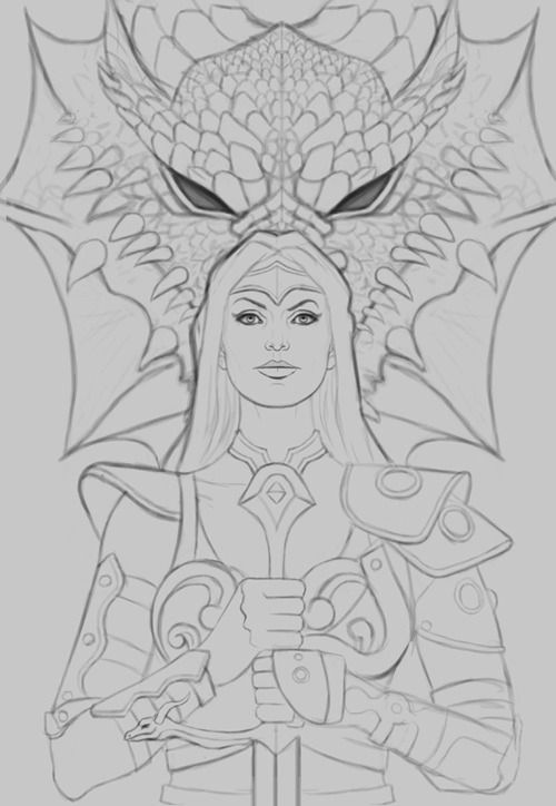
Count me in! I began work on my entry, spent a ton of time on the sketch to make it just right... I'm going for a very iconic feel with this one. Here is the sketch followed by the current WIP:


Please Log in or Create an account to join the conversation.
Latest Activity

Banj updated their profile picture


Charlotte Still wearing a mask? Is it so we won't see you hoarding food in those cheeks of yours?
See More
Banj Mfmuh Guhmfpf
See More
Charlotte I'll take that as a yes...
See More
Charlotte Why is there a tiny flashing thing in front of the reply link/button? It's so small I can't see if it's an exclamation mark or a question mark... or...both?)
See More
Banj Because? Both!
See More
Charlotte *gasp*
See More

CaptainDeth updated their profile picture

CaptainDeth Ahoy folks, just a newbie here, just getting started. Thanks for allowing me in.
CaptainDeth Thank You
CaptainDeth and Mr.Bungle joined the site


honbasic joined the site


Gawk joined the site