


- Posts: 10084
- Thank you received: 475
 Like I said. Now
*presses B again*
![:]](https://cgartnexus.com/images/mod_shoutbox/unsure.png)
He does like meowing a lot.
I meant *here* but I guess Val might be a cat...
Does one belong to a cat?
I suspect there are two brains here. 
The shoutbox is unavailable to non-members
Shoutbox History
Like I said. Now
*presses B again*
He does like meowing a lot.
I meant *here* but I guess Val might be a cat...
Does one belong to a cat?
I suspect there are two brains here.
CGAN November 2015 - Dragon Slayer - WIPs
18 Nov 2015 23:49 #12829
by Valence
Replied by Valence on topic CGAN November 2015 - Dragon Slayer - WIPs
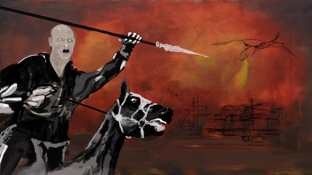
Oaktree: There's some good action depicted in your image and I like the manic eye of that horse and the way it implies all the aggression and physical effort of the dragon chase.
Kodabble: Always the good sketch.") The expression of the dragon is just perfect. He looks like he's fed up of all these wanna-be knights coming to slay him.
The expression of the dragon is just perfect. He looks like he's fed up of all these wanna-be knights coming to slay him.
Kodabble: Always the good sketch.
The expression of the dragon is just perfect. He looks like he's fed up of all these wanna-be knights coming to slay him. Please Log in or Create an account to join the conversation.

19 Nov 2015 00:18 - 19 Nov 2015 00:19 #12831
by Atto
No smudge tool was harmed in the making of this image.
Replied by Atto on topic CGAN November 2015 - Dragon Slayer - WIPs
Kodabble, Oaktree nice to see you guys joining in. Everyones looking really good - I knew this would have a good turn out when I saw the topic.
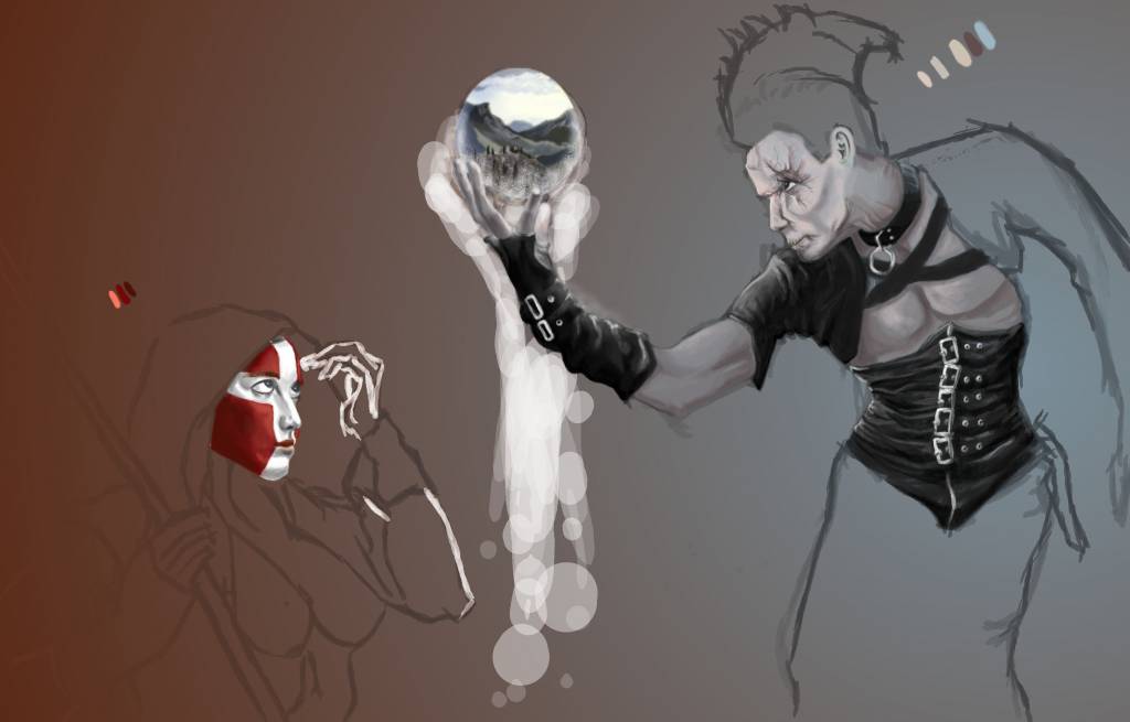
A little more from mine tonight - still not getting enough time to work on it in any serious way.
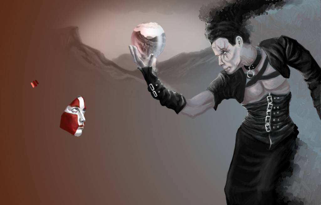
I'm thinking of having a projection from the crystal ball thrown onto the back wall and extending the canvas above their heads so when I add the dragon his shadow can be looming over the wizard. Any one tried something similar before - I'm wondering if I can use my original sketch on a seperate layer set on overlay or soft light to save some time. Any tips would be very welcome. Should be able to post a rough idea of what I mean Friday.
In the meantime.......
A little more from mine tonight - still not getting enough time to work on it in any serious way.
I'm thinking of having a projection from the crystal ball thrown onto the back wall and extending the canvas above their heads so when I add the dragon his shadow can be looming over the wizard. Any one tried something similar before - I'm wondering if I can use my original sketch on a seperate layer set on overlay or soft light to save some time. Any tips would be very welcome. Should be able to post a rough idea of what I mean Friday.
In the meantime.......
No smudge tool was harmed in the making of this image.
Last edit: 19 Nov 2015 00:19 by Atto.
Please Log in or Create an account to join the conversation.
19 Nov 2015 01:19 #12832
by Valence
Replied by Valence on topic CGAN November 2015 - Dragon Slayer - WIPs
I haven't tried a projection before but projections usually brighten whatever they're shining on and overlay/soft light can sometimes darken things. Usually when painting something that's getting brighter, like flares, glare or holograms, then it's best to use Screen or Linear Dodge (I've never been able to understand what Color Dodge does!)
But, like I said, I've never tried a projection so I reserve the right to be wrong.

But, like I said, I've never tried a projection so I reserve the right to be wrong.
Please Log in or Create an account to join the conversation.
- CherryGraphics
-

- Offline
- Junior Member
-

Less
More
- Posts: 366
- Thank you received: 33
20 Nov 2015 12:49 #12834
by CherryGraphics
Replied by CherryGraphics on topic CGAN November 2015 - Dragon Slayer - WIPs
Great to see you back Oaktree and Kodabble! Wonderful sketch Kodabble - as always.
hahaha thanks Schizo - but there are so much great pictures here ... I'm not that sure as you are. (Did you knew the word "Mädchen" or did you need a translator? )
Atto I like the idea a lot and the expression on the red and white face is nice so far!
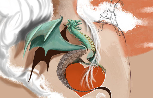
So here comes the next step .. had a bit time for it at least. It's really hard to get this link between alive and tattoo ...
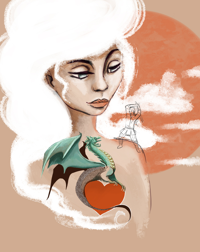
hahaha thanks Schizo - but there are so much great pictures here ... I'm not that sure as you are.
(Did you knew the word "Mädchen" or did you need a translator? )Atto I like the idea a lot and the expression on the red and white face is nice so far!
So here comes the next step .. had a bit time for it at least. It's really hard to get this link between alive and tattoo ...
Please Log in or Create an account to join the conversation.
20 Nov 2015 23:18 - 20 Nov 2015 23:35 #12836
by Valence
Replied by Valence on topic CGAN November 2015 - Dragon Slayer - WIPs
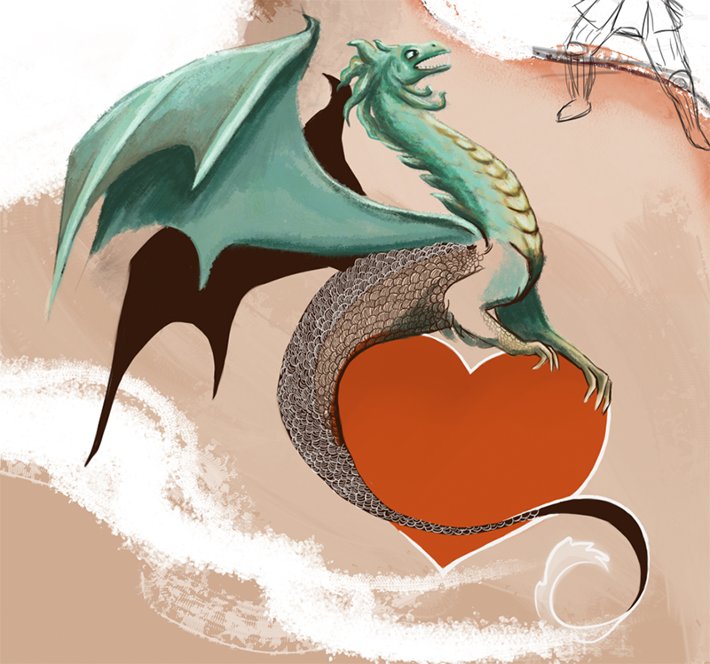
Doing a transition from a tattoo to something real is a tricky one. Tattoos are a bit like watercolour in that the inks are transparent and always darken the skin in a greeny/bluish way. The brightest part of a tattoo is always the bare skin underneath so making some highlights lighter than the skin will make the tattoo look "real". You've already got a bit of this done in the dragon wings.
One other thing you could do to make the real dragon pop out in a three-dimensional way is to have it cast a slight shadow of the head and neck onto the girl's skin angling away from the point of transition to create that separation in space.
EDIT: At the moment it's not completely clear if the dragon's dark wing is one of these types of shadows or if it's the other opposite wing that's still a tattoo. Adding a shadow that's soft and in a warmish colour (like the tone just beneath the girl's jaw) should make it all clear and three dimensional.
Last edit: 20 Nov 2015 23:35 by Valence.
Please Log in or Create an account to join the conversation.
- microscopi
-

- Offline
- Premium Member
-

Less
More
- Posts: 743
- Thank you received: 79
21 Nov 2015 00:15 #12837
by microscopi
Replied by microscopi on topic CGAN November 2015 - Dragon Slayer - WIPs
Hey Oak, great to see you join this month. The guy and horse are looking great so far, especially the horse, can't wait to see the dragon when he's done.
Kod that is another cool sketch you got going, a lot of action and detail in there already, I like the dragons expression.
Cherry your is coming along great, for the dragon tattoo, I like Val's idea a lot. To make the dragon 2 dimensional and then 3 dimensional popping out of the girls arm, casting a shadow would help with this a lot.
Atto, the characters are looking great from what you have detailed already, you captured their expressions really well.
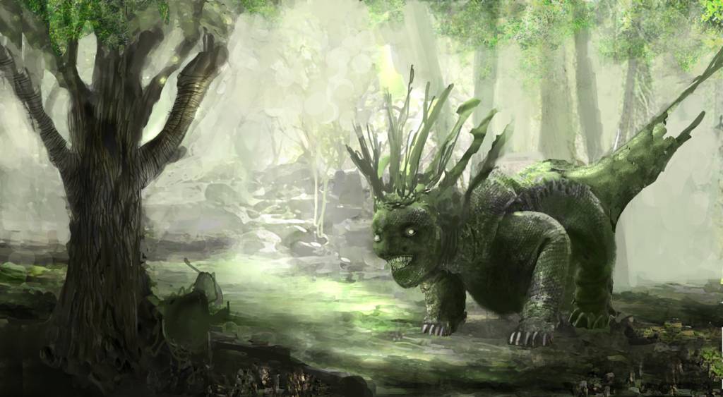
I am sort of stuck on mine, i'm not sure what character i'm going to have facing off against my dragon and there's a lot of background space I need to fill in.
Kod that is another cool sketch you got going, a lot of action and detail in there already, I like the dragons expression.
Cherry your is coming along great, for the dragon tattoo, I like Val's idea a lot. To make the dragon 2 dimensional and then 3 dimensional popping out of the girls arm, casting a shadow would help with this a lot.
Atto, the characters are looking great from what you have detailed already, you captured their expressions really well.
I am sort of stuck on mine, i'm not sure what character i'm going to have facing off against my dragon and there's a lot of background space I need to fill in.
The following user(s) said Thank You: Atto
Please Log in or Create an account to join the conversation.
21 Nov 2015 00:25 #12838
by Atto
No smudge tool was harmed in the making of this image.
Replied by Atto on topic CGAN November 2015 - Dragon Slayer - WIPs
Cherry,
I agree with Val - at least in how tricky it is to do.
I attempted something similar with the Giger challenge some time ago but never really took it far enough to resolve the issue. As well as the advice Val gives I think the use of a device to seperate the forms can also help. For the Giger piece the alien was supposed to be coming alive from one painting to create another. I was going to use his hand to make a distinction between the two planes of the paintings and to add a 3d element over the flat part of the object that was still part of the form. (not sure that makes any sense but posting an image as it may help)
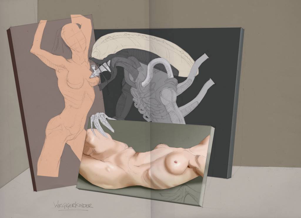
I also tried a very (very, very) quick paint over from your post to try to figure out how you may be able to use something similar. (my apologies for desecrating your work)
The real issue I see here (apart from my awful attempt at hair) is it ruins the composition of the piece with that white hair falling over the other shoulder. Still, hope this may help some
I agree with Val - at least in how tricky it is to do.
I attempted something similar with the Giger challenge some time ago but never really took it far enough to resolve the issue. As well as the advice Val gives I think the use of a device to seperate the forms can also help. For the Giger piece the alien was supposed to be coming alive from one painting to create another. I was going to use his hand to make a distinction between the two planes of the paintings and to add a 3d element over the flat part of the object that was still part of the form. (not sure that makes any sense but posting an image as it may help)
I also tried a very (very, very) quick paint over from your post to try to figure out how you may be able to use something similar. (my apologies for desecrating your work)
The real issue I see here (apart from my awful attempt at hair) is it ruins the composition of the piece with that white hair falling over the other shoulder. Still, hope this may help some
No smudge tool was harmed in the making of this image.
Please Log in or Create an account to join the conversation.
21 Nov 2015 00:29 - 21 Nov 2015 00:39 #12839
by Atto
No smudge tool was harmed in the making of this image.
Replied by Atto on topic CGAN November 2015 - Dragon Slayer - WIPs
Oh yeah and while I'm here may as well post a little update to mine:
By the way Val I thought we had another 24 hours on the scorpio challenge - at least I hope so or I'm late and you're on your own again.
Sorry Micro we were posting at the same time -
Thats looking absolutely awesome! I think the textures to the dragons skin are just about perfect, the watercolour style to the background is fabulous and the branchy looking 'mane' he has is very cool and original. At the moment and I don't know if this was the intention, that little fella in the foreground looks like he's giving the dragon the finger which made me howl when I noticed it and probably woke my wife up!! - PLEASE! PLEASE leave that in the final image!
No smudge tool was harmed in the making of this image.
Last edit: 21 Nov 2015 00:39 by Atto. Reason: Micros post!
Please Log in or Create an account to join the conversation.
21 Nov 2015 02:05 #12840
by Valence
Replied by Valence on topic CGAN November 2015 - Dragon Slayer - WIPs
Atto: Yep there is another 24 hours for the zodiac challenge but I don't usually paint on Saturdays so I had to finish today. I needed another week really for what I wanted to do with it. 
And I too had a little paintover of Cherry's picture while thinking about it but I won't post it If you select and rotate the dragon head/neck a little bit it adds more space behind it for the shadow, lifts it away from the skin and (if you want to go further) makes the nose cross the line of the girl's neck/shoulder to emphasize the solid separation.
Your own pic is coming along nicely too, Atto. And I agree with you about micro's tree-dragon. Brilliant design idea!
And I too had a little paintover of Cherry's picture while thinking about it but I won't post it
If you select and rotate the dragon head/neck a little bit it adds more space behind it for the shadow, lifts it away from the skin and (if you want to go further) makes the nose cross the line of the girl's neck/shoulder to emphasize the solid separation.Your own pic is coming along nicely too, Atto. And I agree with you about micro's tree-dragon. Brilliant design idea!
Please Log in or Create an account to join the conversation.
22 Nov 2015 19:55 #12850
by oaktree
Replied by oaktree on topic CGAN November 2015 - Dragon Slayer - WIPs
Thanks for the welcome back and the comments. Here is an update from me not sure if its in the right direction but not a lot of time left.
Please Log in or Create an account to join the conversation.
Latest Activity

Banj updated their profile picture


Charlotte Still wearing a mask? Is it so we won't see you hoarding food in those cheeks of yours?
See More
Banj Mfmuh Guhmfpf
See More
Charlotte I'll take that as a yes...
See More
Charlotte Why is there a tiny flashing thing in front of the reply link/button? It's so small I can't see if it's an exclamation mark or a question mark... or...both?)
See More
Banj Because? Both!
See More
Charlotte *gasp*
See More

CaptainDeth updated their profile picture

CaptainDeth Ahoy folks, just a newbie here, just getting started. Thanks for allowing me in.
CaptainDeth Thank You
CaptainDeth and Mr.Bungle joined the site


honbasic joined the site


Gawk joined the site