


- Posts: 2242
- Thank you received: 163


Are you trying to spew those lurker tentacles at us and failing or are you just in a state of constant amazement? 
The shoutbox is unavailable to non-members
Shoutbox History
Are you trying to spew those lurker tentacles at us and failing or are you just in a state of constant amazement?
Crow's nest of things and stuff
- Digital Dave
-

- Offline
- Platinum Member
-

Less
More
18 Sep 2014 11:25 #6268
by Digital Dave
I get sketchy around pencils! ...
Replied by Digital Dave on topic Crow's nest of things and stuff
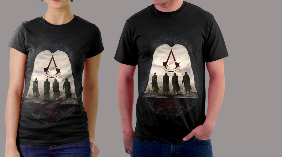
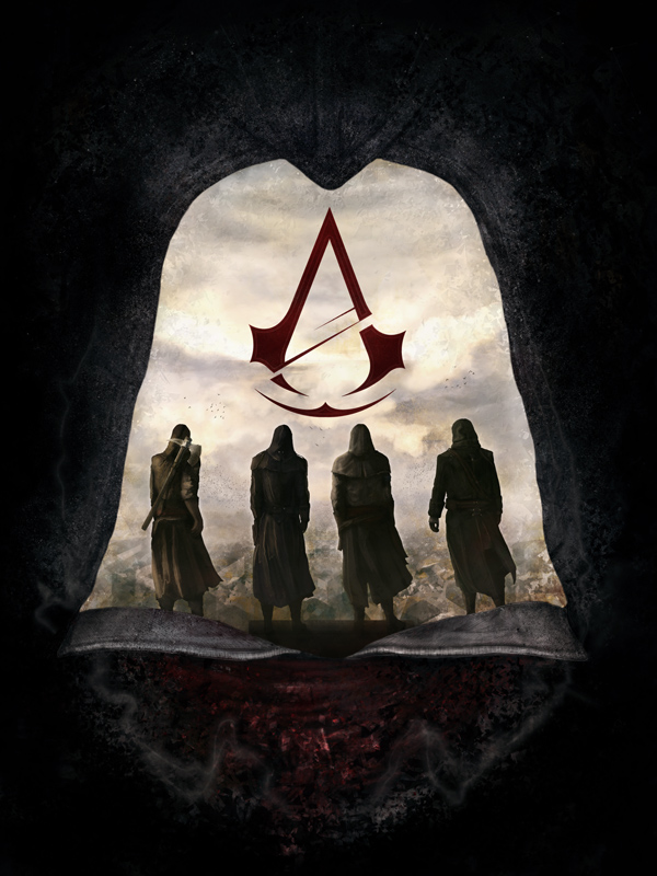
Looking good Claude. Like the Assassin design, though I'm not sure about the bottom of it being so belled out/squared as you presently have it. I would think the cowl would be more rounded. But that's just my personal opinion. ")
I get sketchy around pencils! ...
Please Log in or Create an account to join the conversation.
- ClaudeCrow
-
 Topic Author
- Offline
- New Member
-

Less
More
- Posts: 82
- Thank you received: 8
18 Sep 2014 12:59 - 18 Sep 2014 12:59 #6271
by ClaudeCrow
Replied by ClaudeCrow on topic Crow's nest of things and stuff
I think that's because it actually carries on further than my image and it doesn't curve back in to a centre join. Here's the reference image.

Last edit: 18 Sep 2014 12:59 by ClaudeCrow.
Please Log in or Create an account to join the conversation.
18 Sep 2014 14:50 #6272
by McFish
Replied by McFish on topic Crow's nest of things and stuff
Could just be me but I feel as if the shoulders on some of the characters feel to straight/square. Perhaps relax them a little bit. Also feel some shadows at their feet would help them fit in a bit more.
Please Log in or Create an account to join the conversation.

18 Sep 2014 16:50 #6276
by Charlotte
Any an all misspellings are henceforth blamed on the cats.
Replied by Charlotte on topic Crow's nest of things and stuff
I think the idea of using the hood like this is excellent but I do think the bottom shape looks a bit odd. The collar looks a bit like an open book at the moment. Looking at the reference the white collar is 1) entirely within the cowl so the "tips" don't actually show, and 2) the upper edges are disappearing into the darkness of the cowl itself and the face. So the general shape of the opening should perhaps follow his jawline a bit more, to look less like a book. I also think you might want to show the bottom edges/tips (seams) of the cowl itself where it overlays the collar(s) below and then well... ends...  A bit like what you've done with the seams on that tell tale shape at the top of the cowl.
A bit like what you've done with the seams on that tell tale shape at the top of the cowl. Any an all misspellings are henceforth blamed on the cats.
Please Log in or Create an account to join the conversation.
- ClaudeCrow
-
Topic Author
- Offline
- New Member
-
Less
More
- Posts: 82
- Thank you received: 8
18 Sep 2014 21:17 - 18 Sep 2014 21:17 #6284
by ClaudeCrow
Replied by ClaudeCrow on topic Crow's nest of things and stuff
Thanks for the feedback guys.
McFish, I softened the shoulders of a few of them a little, mainly to the guy second from the left. I also have darkened the whole area around their feet to make it transition a little better to the collar I'm not sure if you feel it would benefit from some distinct shadows?
Charlotte, I'd gone through a few changes already before seeing this so I'll have to ask you how you think it looks now and whether you still feel it needs those amendments. I had adjusted the collar slightly but I'm not sure it's in the places where you've suggested.
Any other feedback on the changes made, whilst there's only a day left, would still be of great help.
Last edit: 18 Sep 2014 21:17 by ClaudeCrow.
Please Log in or Create an account to join the conversation.
- Digital Dave
-
- Offline
- Platinum Member
-
Less
More
- Posts: 2242
- Thank you received: 163
18 Sep 2014 22:59 #6286
by Digital Dave
I see now it's the collar that is holding the cowl out like that, so I see why you did it that way. I just thought it should show some softness to the material, and showing some movement, but can see how they would be held outward as you have made it.
I get sketchy around pencils! ...
Replied by Digital Dave on topic Crow's nest of things and stuff
I think that's because it actually carries on further than my image and it doesn't curve back in to a centre join. Here's the reference image.
I see now it's the collar that is holding the cowl out like that, so I see why you did it that way. I just thought it should show some softness to the material, and showing some movement, but can see how they would be held outward as you have made it.
I get sketchy around pencils! ...
Please Log in or Create an account to join the conversation.
19 Sep 2014 07:45 #6290
by Charlotte
Any an all misspellings are henceforth blamed on the cats.
Replied by Charlotte on topic Crow's nest of things and stuff
I think it's better now but still a bit book like
Any an all misspellings are henceforth blamed on the cats.
Please Log in or Create an account to join the conversation.
23 Sep 2014 19:37 #6352
by Kodabble
Replied by Kodabble on topic Crow's nest of things and stuff
ClaudeCrow - nice design. In regards to ideas, it might work if you used the other elements (figures, mountains, clouds) in the picture to give a feel of the face. Example the figure on the left's cape almost forms the outlines of the face. What if the figure on the right mirrors this to form the right side. Also the strong lines on the mountains in the center could hint at the mouth. Just a thought.
Please Log in or Create an account to join the conversation.
Latest Activity

Banj updated their profile picture


Charlotte Still wearing a mask? Is it so we won't see you hoarding food in those cheeks of yours?
See More
Banj Mfmuh Guhmfpf
See More
Charlotte I'll take that as a yes...
See More
Charlotte Why is there a tiny flashing thing in front of the reply link/button? It's so small I can't see if it's an exclamation mark or a question mark... or...both?)
See More
Banj Because? Both!
See More
Charlotte *gasp*
See More

CaptainDeth updated their profile picture

CaptainDeth Ahoy folks, just a newbie here, just getting started. Thanks for allowing me in.
CaptainDeth Thank You
CaptainDeth and Mr.Bungle joined the site


honbasic joined the site


Gawk joined the site