


- Posts: 2113
- Thank you received: 80


The shoutbox is unavailable to non-members
Crow's nest of things and stuff
07 Jul 2014 07:46 #832
by kazky
Replied by kazky on topic Crow's nest of things and stuff
stunning! dedication and it's paying off!
Please Log in or Create an account to join the conversation.
- ClaudeCrow
-
 Topic Author
- Offline
- New Member
-

Less
More
- Posts: 82
- Thank you received: 8
07 Jul 2014 10:28 #863
by ClaudeCrow
Replied by ClaudeCrow on topic Crow's nest of things and stuff
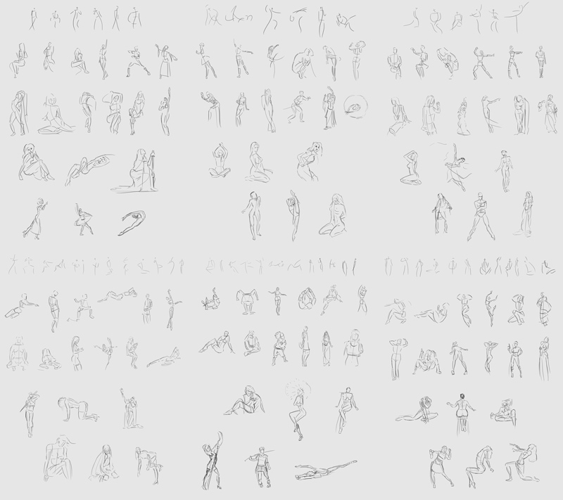
I think it's over 4000.. Each image is 5 sets of 3 30 minute sessions. There's 8 images so that's 40 sets. The ones with just small figures should all have 60 minimum with maybe 1 or extra. There's 9 sets that aren't made up of them so that's 31 sets of 120 figures which is 3720. (might want to check these figures since I'm not using a calculator..) The first 7 sets are made up of 3 x (8+4+2+1) = 45. So 7 of them is 315. So far the total is 4035. then the last 2 sets are made up of 3 30s so that's 180 total. So that should be 4215 plus a few where I did a couple extra.. I think The maths could very easily be off. I always was one too make stupid little mistakes in maths..
Please Log in or Create an account to join the conversation.
- ClaudeCrow
-
Topic Author
- Offline
- New Member
-
Less
More
- Posts: 82
- Thank you received: 8
07 Jul 2014 19:27 #937
by ClaudeCrow
Replied by ClaudeCrow on topic Crow's nest of things and stuff
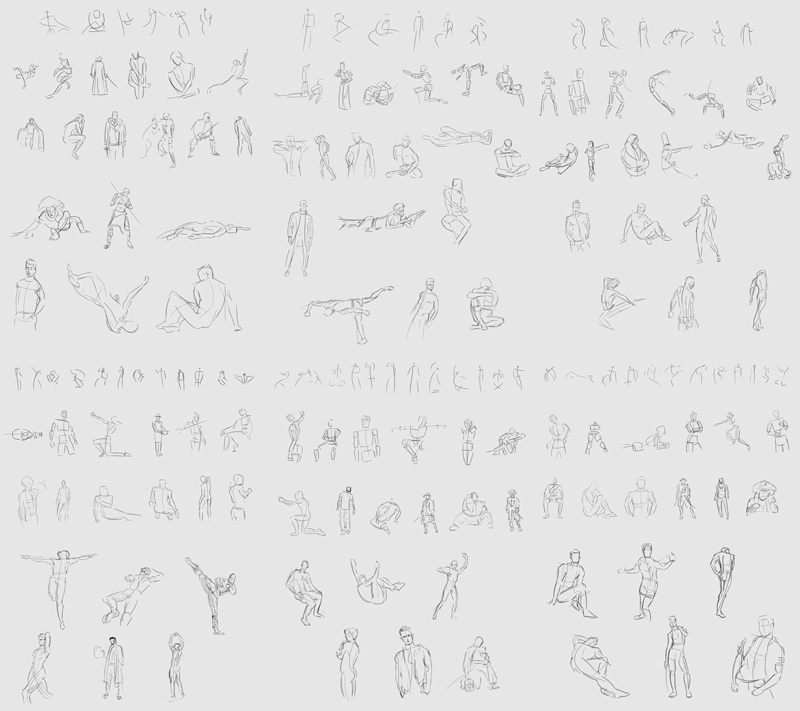
And here's some more gesture from the last week and a bit.. That puts the total now up to ~4215 + 162 + 162 = ~4539 ........I think. Plus 30 form imagination.
Please Log in or Create an account to join the conversation.
08 Jul 2014 08:46 #1042
by Stuart
Replied by Stuart on topic Crow's nest of things and stuff
Those sketches are far more organised than I ever manage! I just have post-its here, half-finished sketchbooks there. Lol.
Please Log in or Create an account to join the conversation.
- Forrestimel
-
- Offline
- New Member
-
Less
More
- Posts: 37
- Thank you received: 4
10 Jul 2014 20:14 #1699
by Forrestimel
Replied by Forrestimel on topic Crow's nest of things and stuff
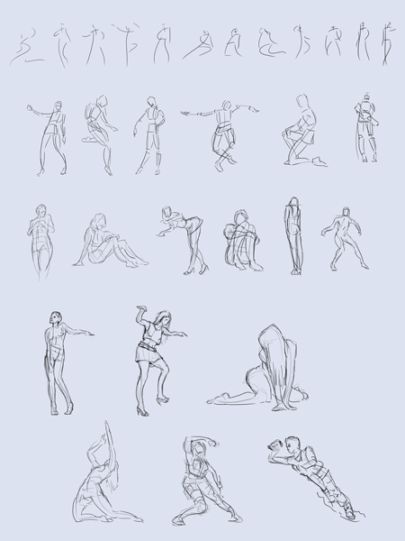
good job on the latest gestures, although I wanna see some more stuff from you 
But I can give you some critique on your ones from imagination. So it seems like your poses are very unbalanced, there are some very vague rules about balance that some artists have talked about in their respective anatomy books like in Hampton's anatomy book or Loomis' Figure Drawing for All it's Worth. But what has been helping me the most with learning to get a balanced pose is actually learning more about the pose I want to do.
So lately if I've had to do a certain illustration and I decided on a thumbnail and know what kind of pose I want for the image I'll do loose gesture/figure studies of people in that specific pose. So like I had to paint Poseidon ready to throw a trident ( forrestimel.deviantart.com/art/Poseidon-460584331 ), so I hopped on to Google and did some gestures of people about to throw javelins. And then I took notes, keeping in mind things like how their body is twisting, how much they're twisting, how far back does their arm go, etc. etc.
The same goes for simple poses ( forrestimel.deviantart.com/art/Lilith-464511972 ), like I just did a character in a simple pose just standing but with most of her weight on one leg causing contrapposto with her pelvis and clavicles. But I wouldn't know how to place her legs and feet and body if I hadn't done some research and gestures of those specific poses. So from doing research I learned that in a tough girl, not going to take shit from you, waiting for a fight kind of a pose generally the spine is upright, head slightly tilted upwards to give a feeling of superiority, one leg planted flat holding the most weight, other leg is further from center of body and acting as a support for weight, the leg with most weight causes the pelvis to tilt which then causes the upper body to balance it out by moving that side of the clavicle down.
So I really recommend trying to work on characters or illustrations with characters that will require a variety of different poses and taking the time to research them and why those poses give off a certain feeling to us, I think it would be very beneficial. But only if you do it for something specific, because you need to apply that knowledge to something")
But I can give you some critique on your ones from imagination. So it seems like your poses are very unbalanced, there are some very vague rules about balance that some artists have talked about in their respective anatomy books like in Hampton's anatomy book or Loomis' Figure Drawing for All it's Worth. But what has been helping me the most with learning to get a balanced pose is actually learning more about the pose I want to do.
So lately if I've had to do a certain illustration and I decided on a thumbnail and know what kind of pose I want for the image I'll do loose gesture/figure studies of people in that specific pose. So like I had to paint Poseidon ready to throw a trident ( forrestimel.deviantart.com/art/Poseidon-460584331 ), so I hopped on to Google and did some gestures of people about to throw javelins. And then I took notes, keeping in mind things like how their body is twisting, how much they're twisting, how far back does their arm go, etc. etc.
The same goes for simple poses ( forrestimel.deviantart.com/art/Lilith-464511972 ), like I just did a character in a simple pose just standing but with most of her weight on one leg causing contrapposto with her pelvis and clavicles. But I wouldn't know how to place her legs and feet and body if I hadn't done some research and gestures of those specific poses. So from doing research I learned that in a tough girl, not going to take shit from you, waiting for a fight kind of a pose generally the spine is upright, head slightly tilted upwards to give a feeling of superiority, one leg planted flat holding the most weight, other leg is further from center of body and acting as a support for weight, the leg with most weight causes the pelvis to tilt which then causes the upper body to balance it out by moving that side of the clavicle down.
So I really recommend trying to work on characters or illustrations with characters that will require a variety of different poses and taking the time to research them and why those poses give off a certain feeling to us, I think it would be very beneficial. But only if you do it for something specific, because you need to apply that knowledge to something
Please Log in or Create an account to join the conversation.
- ClaudeCrow
-
Topic Author
- Offline
- New Member
-
Less
More
- Posts: 82
- Thank you received: 8
15 Jul 2014 21:34 - 15 Jul 2014 23:06 #3030
by ClaudeCrow
Replied by ClaudeCrow on topic Crow's nest of things and stuff
Thanks for the suggestions Forrest, I'll try and get round to putting that advice into practice shortly.
These are a couple of banners I'm working on for a Magic the Gathering card selling site. I'd like to get these pieces really up to standard so any advice would be greatly appreciated. At the moment obviously the second one is still very early stages so it's mainly just the first one I'm interested in.
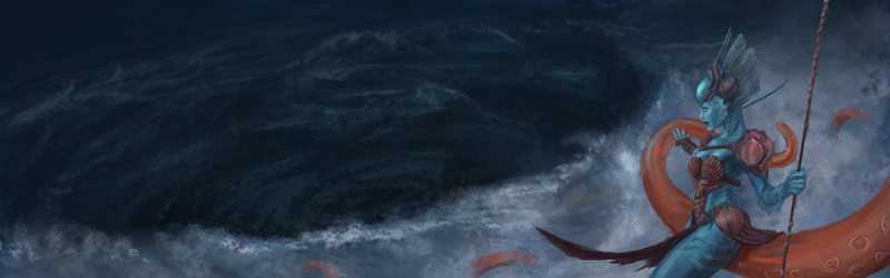
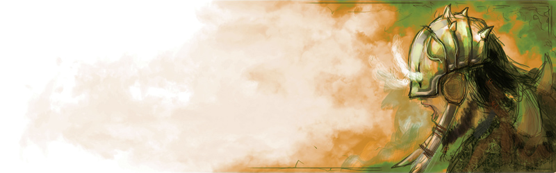
The two should hopefully look similar to their designs in this image by Brad Rigney when I'm done:
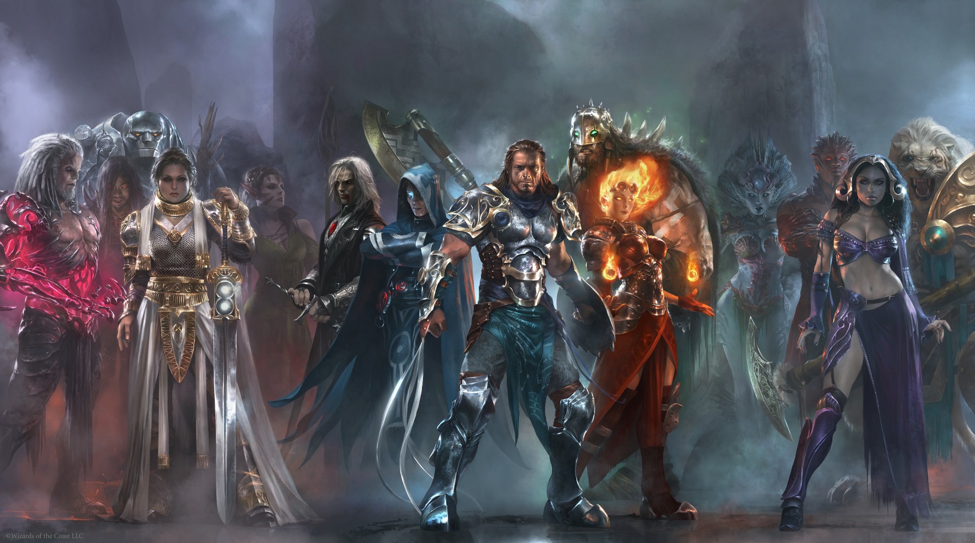
These are a couple of banners I'm working on for a Magic the Gathering card selling site. I'd like to get these pieces really up to standard so any advice would be greatly appreciated. At the moment obviously the second one is still very early stages so it's mainly just the first one I'm interested in.
The two should hopefully look similar to their designs in this image by Brad Rigney when I'm done:
Last edit: 15 Jul 2014 23:06 by ClaudeCrow.
Please Log in or Create an account to join the conversation.
15 Jul 2014 22:32 #3039
by Stuart
Replied by Stuart on topic Crow's nest of things and stuff
Did you paint the last image?
Please Log in or Create an account to join the conversation.
- ClaudeCrow
-
Topic Author
- Offline
- New Member
-
Less
More
- Posts: 82
- Thank you received: 8
15 Jul 2014 23:05 - 15 Jul 2014 23:08 #3042
by ClaudeCrow
Replied by ClaudeCrow on topic Crow's nest of things and stuff
I wish.. No perhaps I should of made it more clear. The last image is by this guy.
Brad Rigney
I've also now edited the previous post so it's more obvious to the next who come..
I've also now edited the previous post so it's more obvious to the next who come..
Last edit: 15 Jul 2014 23:08 by ClaudeCrow.
Please Log in or Create an account to join the conversation.
16 Jul 2014 05:12 #3066
by Stuart
Replied by Stuart on topic Crow's nest of things and stuff
I wasn't sure, but there is obviously a style difference, so I wasn't sure if it was in the coluring. They look good.
Please Log in or Create an account to join the conversation.

16 Jul 2014 10:01 #3076
by Charlotte
Any an all misspellings are henceforth blamed on the cats.
Replied by Charlotte on topic Crow's nest of things and stuff
Well, the Rigney one is looking absolutely awesome so that's really something to strive for!
Regarding your own images, they're rather small so I find it hard to go nitpicking, but I think maybe the girl's torso is a bit short? (or waist area, rather - but it might be due to you having more fabric over her hip than Rigney's version)
The big guy is also recognisable, but I don't get the feeling of his overly huge bulk from your sketch, yet. You might want to emphasize that size of his. Hope this helps
Any an all misspellings are henceforth blamed on the cats.
Please Log in or Create an account to join the conversation.
Latest Activity

Banj updated their profile picture


Charlotte Still wearing a mask? Is it so we won't see you hoarding food in those cheeks of yours?
See More
Banj Mfmuh Guhmfpf
See More
Charlotte I'll take that as a yes...
See More
Charlotte Why is there a tiny flashing thing in front of the reply link/button? It's so small I can't see if it's an exclamation mark or a question mark... or...both?)
See More
Banj Because? Both!
See More
Charlotte *gasp*
See More

CaptainDeth updated their profile picture

CaptainDeth Ahoy folks, just a newbie here, just getting started. Thanks for allowing me in.
CaptainDeth Thank You
CaptainDeth and Mr.Bungle joined the site


honbasic joined the site


Gawk joined the site