


- Posts: 10086
- Thank you received: 475


Are you trying to spew those lurker tentacles at us and failing or are you just in a state of constant amazement? 

The shoutbox is unavailable to non-members
Shoutbox History
Are you trying to spew those lurker tentacles at us and failing or are you just in a state of constant amazement?
CGAN April 2017 - Warlock - WIPs
22 Apr 2017 19:55 #15923
by Valence
Replied by Valence on topic CGAN April 2017 - Warlock - WIPs
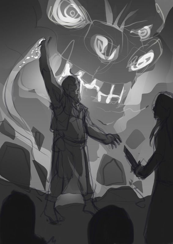
Micro: You have too many ideas  Hope you manage to settle on one before the deadline. I like the shadowy foreground figure. Very dramatic.
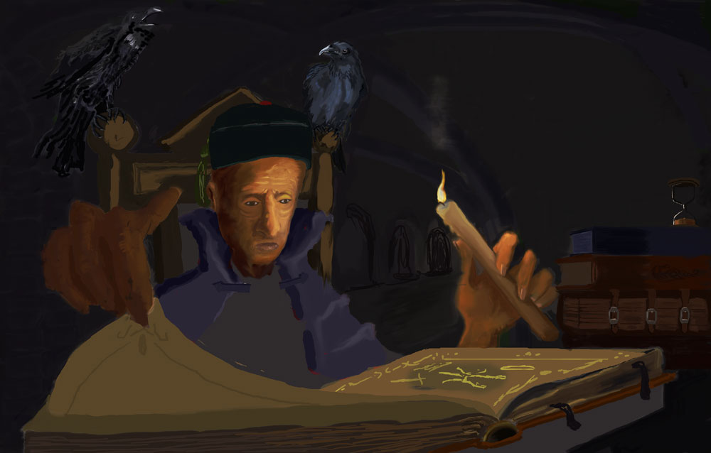
Oaktree: The warm light is looking lovely so far. It reminds me a little of those candlelight pics of George De Latour. Keep it going into the background.
Mr S: I loved all those silhouettes, any one of them would make an excellent picture. But now you've made the choice I can't wait to see how you finish it off.
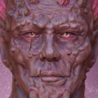
Atto: This is turning into something very impressive. The hair blending into the dark birds is a great idea but more importantly, it's looking very convincing too.
Hope you manage to settle on one before the deadline. I like the shadowy foreground figure. Very dramatic.Oaktree: The warm light is looking lovely so far. It reminds me a little of those candlelight pics of George De Latour. Keep it going into the background.
Mr S: I loved all those silhouettes, any one of them would make an excellent picture. But now you've made the choice I can't wait to see how you finish it off.
Atto: This is turning into something very impressive. The hair blending into the dark birds is a great idea but more importantly, it's looking very convincing too.
Please Log in or Create an account to join the conversation.
- Mr. Sabrosito
-
- Offline
- Junior Member
-

Less
More
- Posts: 131
- Thank you received: 5
22 Apr 2017 23:53 - 22 Apr 2017 23:54 #15924
by Mr. Sabrosito
Replied by Mr. Sabrosito on topic CGAN April 2017 - Warlock - WIPs
well a little bit more progress into this one, i haven´t put much time on this , and next week promises to be busy , i hope i can finish this . 
Last edit: 22 Apr 2017 23:54 by Mr. Sabrosito.
Please Log in or Create an account to join the conversation.
23 Apr 2017 16:46 #15928
by oaktree
Replied by oaktree on topic CGAN April 2017 - Warlock - WIPs
Another update from me
Please Log in or Create an account to join the conversation.

23 Apr 2017 20:25 #15930
by charco
Hey guys, VERY VERY long time no see. I missed monthly challenge fun, so look who came crawling back!
Here's WIP #1 for my warlock, an understated guy whose pacts with fire demons make him a poor choice of mugging victim!
I can almost guarantee I haven't attached this picture correctly XD
Replied by charco on topic CGAN April 2017 - Warlock - WIPs
Hey guys, VERY VERY long time no see. I missed monthly challenge fun, so look who came crawling back!
Here's WIP #1 for my warlock, an understated guy whose pacts with fire demons make him a poor choice of mugging victim!
I can almost guarantee I haven't attached this picture correctly XD
Please Log in or Create an account to join the conversation.

23 Apr 2017 20:29 - 23 Apr 2017 20:30 #15931
by Charlotte
I can almost garantuee that you have")
Any an all misspellings are henceforth blamed on the cats.
Replied by Charlotte on topic CGAN April 2017 - Warlock - WIPs
I can almost guarantee I haven't attached this picture correctly XD
I can almost garantuee that you have
Any an all misspellings are henceforth blamed on the cats.
Last edit: 23 Apr 2017 20:30 by Charlotte.
Please Log in or Create an account to join the conversation.
23 Apr 2017 21:17 - 23 Apr 2017 21:19 #15932
by charco
Replied by charco on topic CGAN April 2017 - Warlock - WIPs
Right, I'ma jump in and do feedback-y stuff seeing as it's WIPs o'clock!
Atto- love your initial sketch, that outstretched hand is great! The newer one is great, looks really freaky and the birdhair is a great idea! The top two birds are spot on, but maybe if the bottom one was heading slight towards camera instead of away it'd match the direction he's facing more?
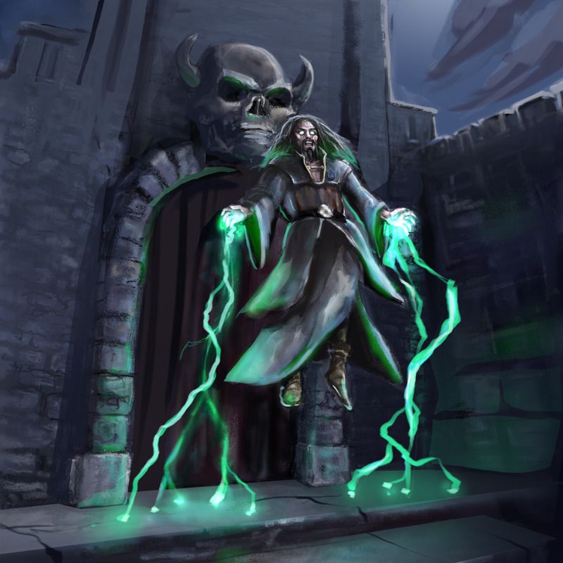
Valence- Neat concept, you said in the first post you weren't sure about the perspective or the colours. I think the green does look nicer. I would suggest that instead of moving the skull, that you move the edge of the door, making it wider on screen left. That'll run your eye to his face a bit more, and not run the gauntlet of tangents/lessening the read on the skull.
I'd also recommend taking the moon out of it, altogether. If you keep your focus on the warlock and prioritize your values to match it'll pack more of a punch . I've done a quick paintover to show what I mean! Hope you don't mind!
Don't worry about having sharp edges everywhere, just put them where you need people to look. if you render every brick, people will be exhausted visually.
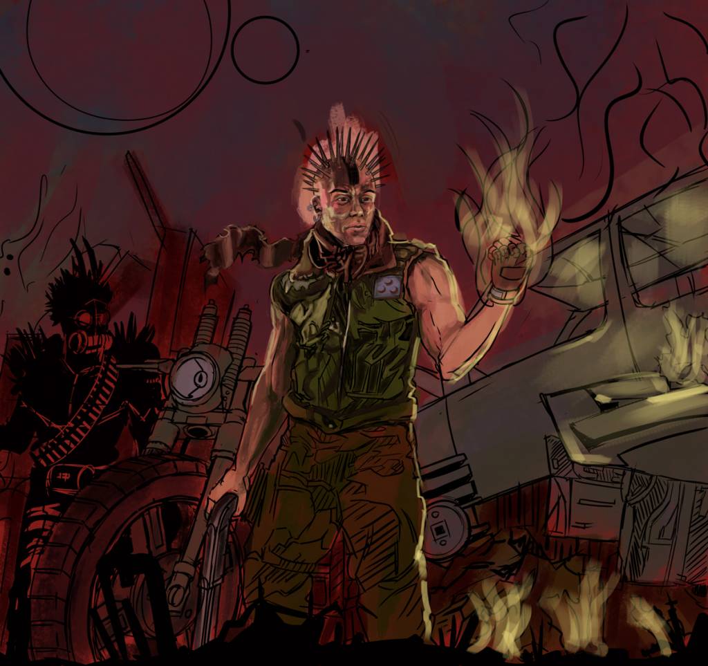
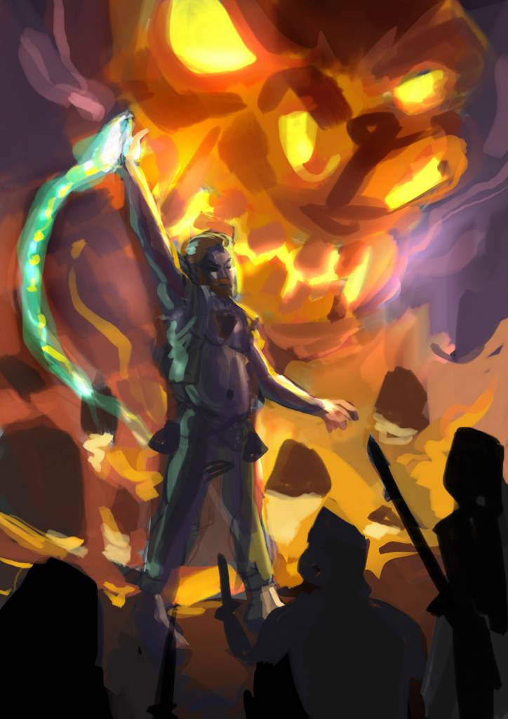
Mr Sabrosito- nice apocalyptic take") Think the composition is ace as is the designs, but I'm worried that with such a red base you might have trouble getting your fire to look hot. Maybe if your underpainting was desaturated a tiny bit, you could pick little moments for higher saturation to get the fire really piping
Think the composition is ace as is the designs, but I'm worried that with such a red base you might have trouble getting your fire to look hot. Maybe if your underpainting was desaturated a tiny bit, you could pick little moments for higher saturation to get the fire really piping  The inking on that vest is really great by the way, I literally went 'OOoh!' when I saw it!
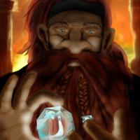
Oaktree- this has a really great vibe to it! I love the falloff of intensity with the candle on the hand, but I think the face might be getting it a little strong as a result. Is that a shadow falling on the page beneath or the beginnings of a glow? For a clearer read, I'd leave it out, and maybe cool down the shadowy parts on the pageturning hand to offset against the candle.
If this is too much, let me know and I'll shut up!
Atto- love your initial sketch, that outstretched hand is great! The newer one is great, looks really freaky and the birdhair is a great idea! The top two birds are spot on, but maybe if the bottom one was heading slight towards camera instead of away it'd match the direction he's facing more?
Valence- Neat concept, you said in the first post you weren't sure about the perspective or the colours. I think the green does look nicer. I would suggest that instead of moving the skull, that you move the edge of the door, making it wider on screen left. That'll run your eye to his face a bit more, and not run the gauntlet of tangents/lessening the read on the skull.
I'd also recommend taking the moon out of it, altogether. If you keep your focus on the warlock and prioritize your values to match it'll pack more of a punch . I've done a quick paintover to show what I mean! Hope you don't mind!
Don't worry about having sharp edges everywhere, just put them where you need people to look. if you render every brick, people will be exhausted visually.
Mr Sabrosito- nice apocalyptic take
Think the composition is ace as is the designs, but I'm worried that with such a red base you might have trouble getting your fire to look hot. Maybe if your underpainting was desaturated a tiny bit, you could pick little moments for higher saturation to get the fire really piping The inking on that vest is really great by the way, I literally went 'OOoh!' when I saw it!Oaktree- this has a really great vibe to it! I love the falloff of intensity with the candle on the hand, but I think the face might be getting it a little strong as a result. Is that a shadow falling on the page beneath or the beginnings of a glow? For a clearer read, I'd leave it out, and maybe cool down the shadowy parts on the pageturning hand to offset against the candle.
If this is too much, let me know and I'll shut up!
Last edit: 23 Apr 2017 21:19 by charco.
The following user(s) said Thank You: Valence
Please Log in or Create an account to join the conversation.
23 Apr 2017 23:17 - 23 Apr 2017 23:19 #15933
by Valence
Replied by Valence on topic CGAN April 2017 - Warlock - WIPs
No, don't shut up, Charco. Not EVER!!
Especially after such good feedback!
That pic looks so much better without the moon. I've been wondering why the brighter values haven't been working for me and now you've pointed it out, I'm certain that this is the reason. It really does simplify the focus and improve the readability of the image. I shall experiment tomorrow! Thank you!
Great wip from you too! The glow of the demon at the back is already looking interesting. I like the way the warlock's head "fits" into the fiery shape of the mouth giving him a magical halo. It really draws you to the character and expresses his importance and power.
Last edit: 23 Apr 2017 23:19 by Valence.
Please Log in or Create an account to join the conversation.
24 Apr 2017 18:13 #15939
by charco
Replied by charco on topic CGAN April 2017 - Warlock - WIPs
Here's a quick colour thumbnail so I know where I'm going
Also trying to attach images directly, LET'S SEE IF THIS WORKS!
Also trying to attach images directly, LET'S SEE IF THIS WORKS!
Please Log in or Create an account to join the conversation.
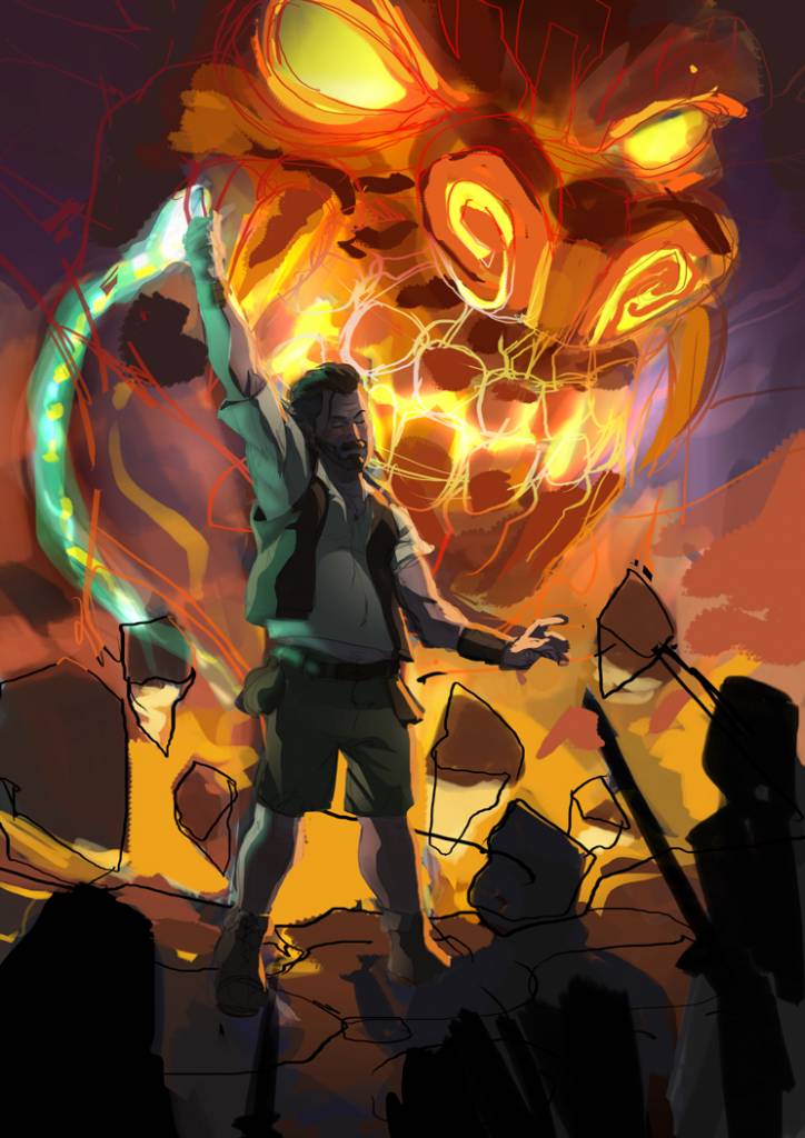
24 Apr 2017 20:27 - 24 Apr 2017 20:48 #15940
by charco
Replied by charco on topic CGAN April 2017 - Warlock - WIPs
EDIT: OK, NOW I'm stopping for the night! Think I need to have a very visually busy demon to counter the passive warlock. Hmm, lots to do. 6ish days to do it!
Last edit: 24 Apr 2017 20:48 by charco.
Please Log in or Create an account to join the conversation.
24 Apr 2017 20:52 #15941
by Valence
Replied by Valence on topic CGAN April 2017 - Warlock - WIPs
That's a cardinal sin??
Oh well, that's another thing to go on my long (looong) list of bad habits.
Good progress there, Charco. The colours are looking really vibrant and I love the little purple accents around the demon.
Oh well, that's another thing to go on my long (looong) list of bad habits.
Good progress there, Charco. The colours are looking really vibrant and I love the little purple accents around the demon.
Please Log in or Create an account to join the conversation.
Latest Activity

Banj updated their profile picture


Charlotte Still wearing a mask? Is it so we won't see you hoarding food in those cheeks of yours?
See More
Banj Mfmuh Guhmfpf
See More
Charlotte I'll take that as a yes...
See More
Charlotte Why is there a tiny flashing thing in front of the reply link/button? It's so small I can't see if it's an exclamation mark or a question mark... or...both?)
See More
Banj Because? Both!
See More
Charlotte *gasp*
See More

CaptainDeth updated their profile picture

CaptainDeth Ahoy folks, just a newbie here, just getting started. Thanks for allowing me in.
CaptainDeth Thank You
CaptainDeth and Mr.Bungle joined the site


honbasic joined the site


Gawk joined the site