


- Posts: 10071
- Thank you received: 475


The shoutbox is unavailable to non-members
CGAN April 2017 - Warlock - WIPs
13 Apr 2017 13:22 #15779
by Valence
Replied by Valence on topic CGAN April 2017 - Warlock - WIPs
Nice updates, everyone.
Atto: I think this pose is more unusual and intriguing than the first. The tensed muscles are looking great and I'm interested to see what's going to happen to the hair.
Oaktree: I was sure I'd seen a sketch from you, then I thought I was going mad and must have imagined it! Hope you get another idea working.
 ")
Micro: That's another great dose of "epic" from you. The mood and atmosphere is fantastic. Mr S makes some interesting points about the scale of your character so it's worth experimenting. But then again, you always do keep changing your pics right until the end.
Atto: I think this pose is more unusual and intriguing than the first. The tensed muscles are looking great and I'm interested to see what's going to happen to the hair.
Oaktree: I was sure I'd seen a sketch from you, then I thought I was going mad and must have imagined it!
Hope you get another idea working. Micro: That's another great dose of "epic" from you. The mood and atmosphere is fantastic. Mr S makes some interesting points about the scale of your character so it's worth experimenting. But then again, you always do keep changing your pics right until the end.
Please Log in or Create an account to join the conversation.
14 Apr 2017 20:05 #15786
by Valence
Replied by Valence on topic CGAN April 2017 - Warlock - WIPs
More of my scribble...
Still a bit sketchy, and I'm not sure if that'll change much but I'll try and tighten it up as I go and maybe find some stronger edges.
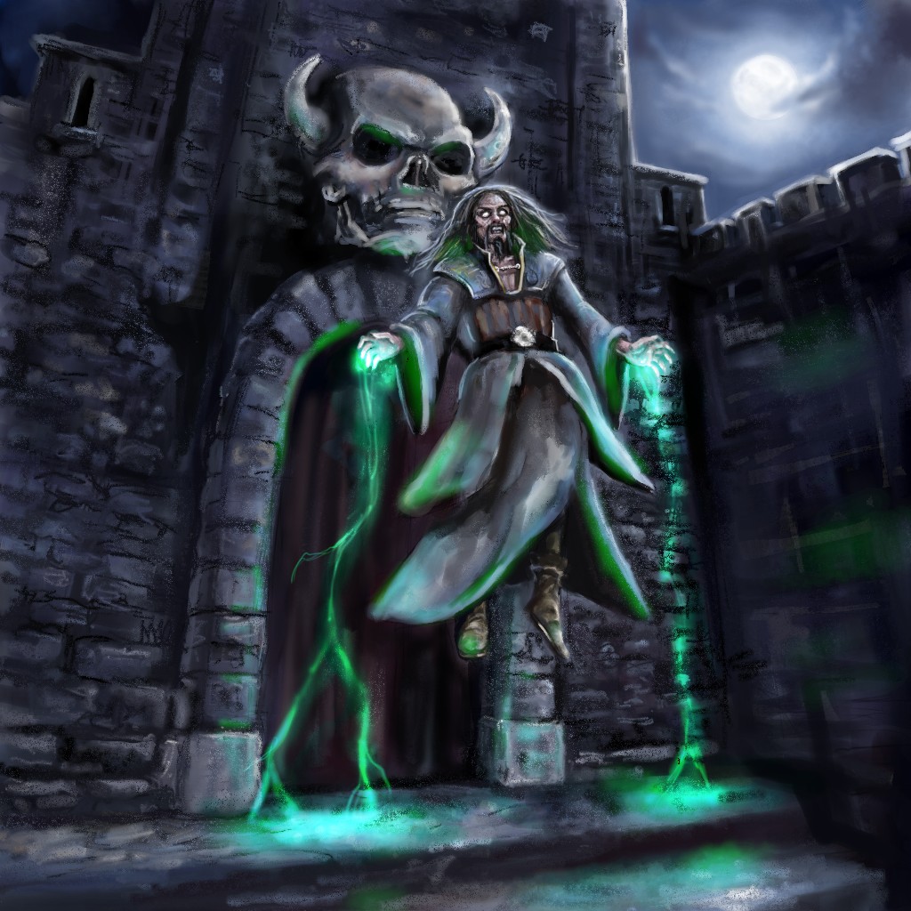
The magic is a bit of a placeholder at the moment so its colour may change but I do prefer this green to the red/orange. Oh, and I'll have to nudge the skull a bit. I've only just realised it's not central with the door.
Still a bit sketchy, and I'm not sure if that'll change much but I'll try and tighten it up as I go and maybe find some stronger edges.
The magic is a bit of a placeholder at the moment so its colour may change but I do prefer this green to the red/orange. Oh, and I'll have to nudge the skull a bit. I've only just realised it's not central with the door.
Please Log in or Create an account to join the conversation.

15 Apr 2017 00:31 #15790
by Atto
No smudge tool was harmed in the making of this image.
Replied by Atto on topic CGAN April 2017 - Warlock - WIPs
I much prefer this colour way Val - I tried something similar to your earlier colour way myself but felt it said more sorcerer than warlock - I always see sorcerers using the elements for their magic. Warlocks to me are more death magic and rituals.
The paintover that Mr S. has done on yours Micro certainly defines the whole action that may be going on in your image. Your mix of texture and lighting should provide a little ambiguity that I think is lacking in the paintover (I know Mr S. it was a quick job but it's a quality I always admire in Micros work).
Played around some more with mine - not sure about the rendering on the hair right now or the position of the birds. I've added a layer to knock the skin tone back some but very aware right now I need to work back into it.
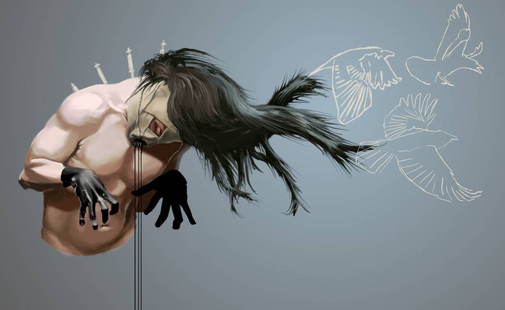
No smudge tool was harmed in the making of this image.
Please Log in or Create an account to join the conversation.
15 Apr 2017 11:52 #15796
by oaktree
Replied by oaktree on topic CGAN April 2017 - Warlock - WIPs
Love whats happening here with all the work its all great. I have spent far to much time trying to get my first idea to work and have finally abandoned it. Going to try this at the moment it is more wizard than warlock but you have to start somewhere.
Please Log in or Create an account to join the conversation.
- microscopi
-

- Offline
- Premium Member
-

Less
More
- Posts: 743
- Thank you received: 79
15 Apr 2017 17:20 - 15 Apr 2017 17:21 #15798
by microscopi
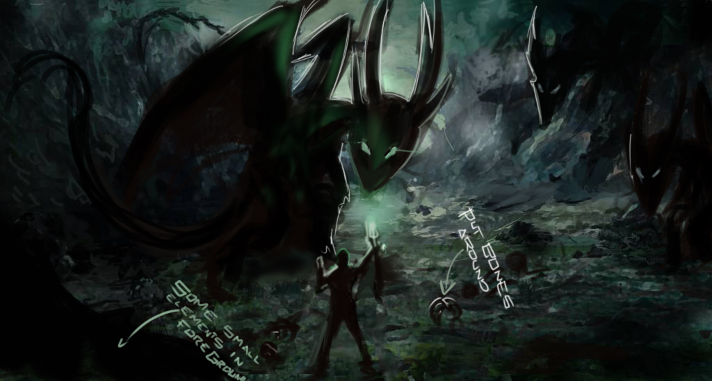
Hey thanks for the positive encouragement Mr S! , I always feel special when someone gets inspired enough to paint over stuff especially so rough! I was trying to go for depth, with a one point perspective and eye level horizon line, I really like what you did with the dragons, I was working on mine yesterday, but I hit that artist wall, where I feel like everything more I do will be cliché.
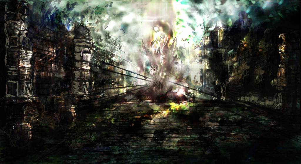
If you see by the update, i'm trying to develop an ancient city, with a lot of spiritual energy as it was a dynasty that was destroyed all the spirits didn't ascend with death. The warlock is attempting to use the spiritual energy to conjure a supreme entity. Although I think the walls look cramped and the perspective is cliche and all I can think of is not making it symmetrical but it's hard because of the composition, also the details are overwhelming me so that's my mindset atm, I think i'm going to take a step back and hope I can progress. I'm glad to see everyone else is doing great.
Look at this mess!
Replied by microscopi on topic CGAN April 2017 - Warlock - WIPs
i painted over a little bit , so you can see how it may work.
i hope this helps you get some ideas.
Hey thanks for the positive encouragement Mr S! , I always feel special when someone gets inspired enough to paint over stuff especially so rough! I was trying to go for depth, with a one point perspective and eye level horizon line, I really like what you did with the dragons, I was working on mine yesterday, but I hit that artist wall, where I feel like everything more I do will be cliché.
If you see by the update, i'm trying to develop an ancient city, with a lot of spiritual energy as it was a dynasty that was destroyed all the spirits didn't ascend with death. The warlock is attempting to use the spiritual energy to conjure a supreme entity. Although I think the walls look cramped and the perspective is cliche and all I can think of is not making it symmetrical but it's hard because of the composition, also the details are overwhelming me so that's my mindset atm, I think i'm going to take a step back and hope I can progress. I'm glad to see everyone else is doing great.
Look at this mess!
Last edit: 15 Apr 2017 17:21 by microscopi.
Please Log in or Create an account to join the conversation.
- microscopi
-
- Offline
- Premium Member
-
Less
More
- Posts: 743
- Thank you received: 79
15 Apr 2017 17:28 #15799
by microscopi
Replied by microscopi on topic CGAN April 2017 - Warlock - WIPs
Atto, really clean and sharp look to your lock, the hair looks great so far as does the skin texture and lighting, really cool design so far, he looks like he's getting electrocuted, but it works!
Val, I love the background with the skull and the character is coming along great, keep going with that one, it's really looking good!
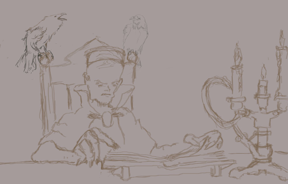
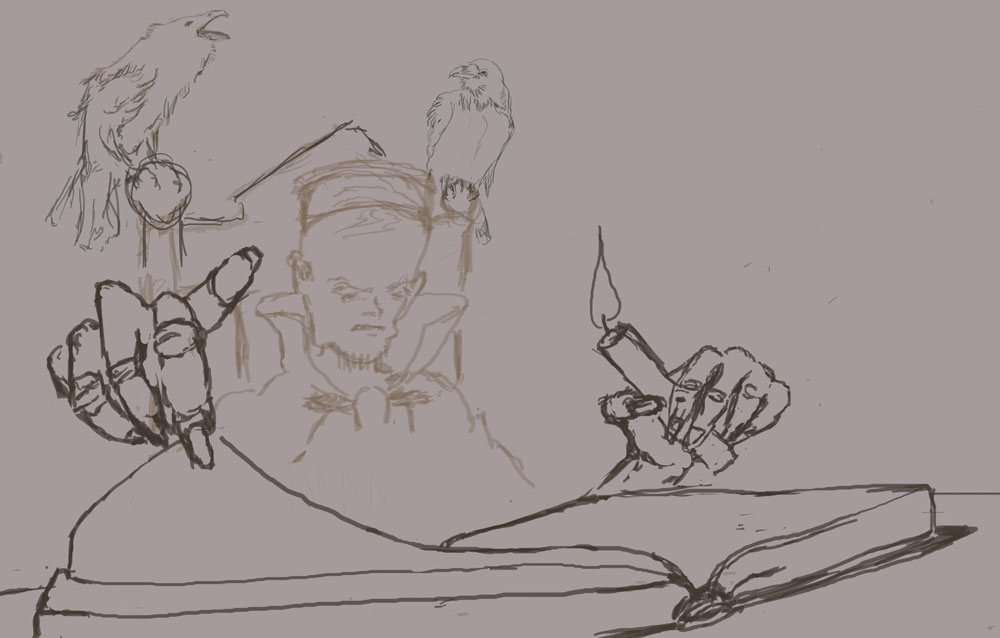
Oak, that's an awesome sketch so far! You could use foreshortening to make the book and his hand seem larger then the rest of his body to show more depth. Warlocks have to study too !
Val, I love the background with the skull and the character is coming along great, keep going with that one, it's really looking good!
Oak, that's an awesome sketch so far! You could use foreshortening to make the book and his hand seem larger then the rest of his body to show more depth. Warlocks have to study too !
Please Log in or Create an account to join the conversation.
16 Apr 2017 11:18 #15800
by oaktree
Replied by oaktree on topic CGAN April 2017 - Warlock - WIPs
Thanks micro for the suggestion here is my first attempt at extreme foreshortening I think this will
working better as a composition.
working better as a composition.
Please Log in or Create an account to join the conversation.
16 Apr 2017 15:06 #15803
by Valence
Replied by Valence on topic CGAN April 2017 - Warlock - WIPs
I like both of those compositions, Oaktree. Those big hands are very expressive and show off the depth of the view. Also I think the candlestick worked very well at balancing the right side. It might be worthwhile to bring it back later in some form if you have time. But I think you should dive in and throw some colour in there! And push those values! ")
And push those values! Please Log in or Create an account to join the conversation.
- Mr. Sabrosito
-
- Offline
- Junior Member
-

Less
More
- Posts: 131
- Thank you received: 5
18 Apr 2017 01:12 #15817
by Mr. Sabrosito
oh sorry to heard that man, well practically everything is cliche in fantasy art if you come to think of it, is just a matter of presentation and giving enough of a twist to the subject to make it appealing.
THIS HAPPENS SOMETIMES , you are painting something and you´re like two hours into it , but in that early stage you get that kind of gut feeling that it is coming all right, and guess what? it will , but sometimes it just doesn´t click, it feels wrong and you can´t seem to make it work, and no matter how much time you spend trying to fix it or make it work, it wont be quite good. It is better to cut your loses and start over, do some more thumbnails until you get a cool idea and develop form there.
Replied by Mr. Sabrosito on topic CGAN April 2017 - Warlock - WIPs
i painted over a little bit , so you can see how it may work.
i hope this helps you get some ideas.
Hey thanks for the positive encouragement Mr S! , I always feel special when someone gets inspired enough to paint over stuff especially so rough! I was trying to go for depth, with a one point perspective and eye level horizon line, I really like what you did with the dragons, I was working on mine yesterday, but I hit that artist wall, where I feel like everything more I do will be cliché.
If you see by the update, i'm trying to develop an ancient city, with a lot of spiritual energy as it was a dynasty that was destroyed all the spirits didn't ascend with death. The warlock is attempting to use the spiritual energy to conjure a supreme entity. Although I think the walls look cramped and the perspective is cliche and all I can think of is not making it symmetrical but it's hard because of the composition, also the details are overwhelming me so that's my mindset atm, I think i'm going to take a step back and hope I can progress. I'm glad to see everyone else is doing great.
Look at this mess!
oh sorry to heard that man, well practically everything is cliche in fantasy art if you come to think of it, is just a matter of presentation and giving enough of a twist to the subject to make it appealing.
THIS HAPPENS SOMETIMES , you are painting something and you´re like two hours into it , but in that early stage you get that kind of gut feeling that it is coming all right, and guess what? it will , but sometimes it just doesn´t click, it feels wrong and you can´t seem to make it work, and no matter how much time you spend trying to fix it or make it work, it wont be quite good. It is better to cut your loses and start over, do some more thumbnails until you get a cool idea and develop form there.
Please Log in or Create an account to join the conversation.
- microscopi
-
- Offline
- Premium Member
-
Less
More
- Posts: 743
- Thank you received: 79
18 Apr 2017 02:07 #15821
by microscopi
Replied by microscopi on topic CGAN April 2017 - Warlock - WIPs
Thanks Mr B that's what I ended up doing, I think i forgot to keep things rough. I was feeling trapped, i'm not as good as exterior interiors then exteriors. Oak I think you should go with what you feel comfortable with, I was feeling the suggestion, but there's so many directions you can take especially when you know what lighting setup you're going with, but look forward to see how it progresses.
I started from scratch, I put two of the reference photos I used so far.
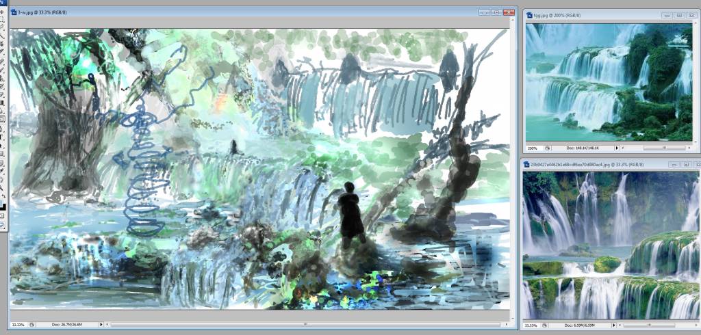
I started from scratch, I put two of the reference photos I used so far.
Please Log in or Create an account to join the conversation.
Latest Activity

Banj updated their profile picture


Charlotte Still wearing a mask? Is it so we won't see you hoarding food in those cheeks of yours?
See More
Banj Mfmuh Guhmfpf
See More
Charlotte I'll take that as a yes...
See More
Charlotte Why is there a tiny flashing thing in front of the reply link/button? It's so small I can't see if it's an exclamation mark or a question mark... or...both?)
See More
Banj Because? Both!
See More
Charlotte *gasp*
See More

CaptainDeth updated their profile picture

CaptainDeth Ahoy folks, just a newbie here, just getting started. Thanks for allowing me in.
CaptainDeth Thank You
CaptainDeth and Mr.Bungle joined the site


honbasic joined the site


Gawk joined the site