


- Posts: 743
- Thank you received: 79
 There's a name I haven't heard since the last time I saw Star Wars
General Kenobi?

Hello there


The shoutbox is unavailable to non-members
Shoutbox History
CGAN July 2014 Challenge - The Big Ad Job - WIPs
- microscopi
-

- Offline
- Premium Member
-

Less
More
10 Jul 2014 15:52 #1652
by microscopi
Replied by microscopi on topic CGAN July 2014 Challenge - The Big Ad Job - WIPs
Stuart you should do all your initial stuff in greyscale and make sure the values are strong, it wouldn't matter much then what color it is, I admire your tenacity !
Please Log in or Create an account to join the conversation.

10 Jul 2014 15:55 #1654
by Stuart
Replied by Stuart on topic CGAN July 2014 Challenge - The Big Ad Job - WIPs
Thanks. I struggle to do that as I haven't got a convincing way of getting it non-muddy. I'll keep trying now and again though.
Please Log in or Create an account to join the conversation.

10 Jul 2014 20:14 - 10 Jul 2014 20:21 #1700
by hansnomad
Replied by hansnomad on topic CGAN July 2014 Challenge - The Big Ad Job - WIPs
Just a mock up of the banner I started working on to see what it looked like in the header (no colors yet). Didn't change any of the text at the moment since I'm just trying to see how the image would read (it is all on a transparent background). Although there is more "real estate" on the forum page banner, not sure if extending art elements beyond the graphic provided as a template is a good idea.
Last edit: 10 Jul 2014 20:21 by hansnomad.
Please Log in or Create an account to join the conversation.
10 Jul 2014 21:58 #1749
by Stuart
Replied by Stuart on topic CGAN July 2014 Challenge - The Big Ad Job - WIPs
Interesting look. Just watch the construction though, the writing's a bit close to her head, so it feels claustrophobic. ")
Please Log in or Create an account to join the conversation.
- microscopi
-
- Offline
- Premium Member
-
Less
More
- Posts: 743
- Thank you received: 79
11 Jul 2014 02:10 #1814
by microscopi
Replied by microscopi on topic CGAN July 2014 Challenge - The Big Ad Job - WIPs
Cool design Hans, I like the direction you're going.
Please Log in or Create an account to join the conversation.

11 Jul 2014 08:36 #1868
by Charlotte
Any an all misspellings are henceforth blamed on the cats.
Replied by Charlotte on topic CGAN July 2014 Challenge - The Big Ad Job - WIPs
I think everyone's entries are looking very fun and promising. Just a reminder though - don't let yourselves be limited by the current banner size or colours. This contest isn't for the real deal, remember? It would be great and we hope to have challenges about the real banner in future but that would require us to set up some more strict parameters to follow regarding proportions and size etc. The current challenge is hypothetical and gives you room to choose advert format.
Just thought I'd remind everyone
Just thought I'd remind everyone
Any an all misspellings are henceforth blamed on the cats.
Please Log in or Create an account to join the conversation.

11 Jul 2014 09:50 #1880
by Domtopia
Everything's on the right!!!
It's like driving abroad!
Replied by Domtopia on topic CGAN July 2014 Challenge - The Big Ad Job - WIPs
That's why I thought a badge format would be fun!
Everything's on the right!!!
It's like driving abroad!
Please Log in or Create an account to join the conversation.
11 Jul 2014 10:46 #1886
by Charlotte
Any an all misspellings are henceforth blamed on the cats.
Replied by Charlotte on topic CGAN July 2014 Challenge - The Big Ad Job - WIPs
That's the idea Dom! I love yours btw, it reminds me a bit of Art Nouveau type advertisements
I love yours btw, it reminds me a bit of Art Nouveau type advertisements Any an all misspellings are henceforth blamed on the cats.
The following user(s) said Thank You: Domtopia
Please Log in or Create an account to join the conversation.
11 Jul 2014 13:10 #1947
by hansnomad
Replied by hansnomad on topic CGAN July 2014 Challenge - The Big Ad Job - WIPs
The restriction on my part on size, etc. was self-imposed. Just wanted to see if I remembered how to work for web use since the requirements are so different with size, resolution, etc. I'll probably blow my resolution up to a much larger size before I do anything else, but I may still keep the dimensions/ratio as a guide.
Please Log in or Create an account to join the conversation.
11 Jul 2014 13:24 #1951
by Domtopia
Everything's on the right!!!
It's like driving abroad!
Replied by Domtopia on topic CGAN July 2014 Challenge - The Big Ad Job - WIPs
Just blocked in some colours and added some lighting to background to give the appropriate mood.
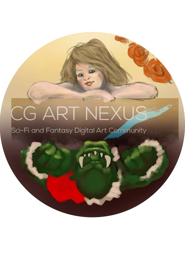
Or upside down if you prefer!
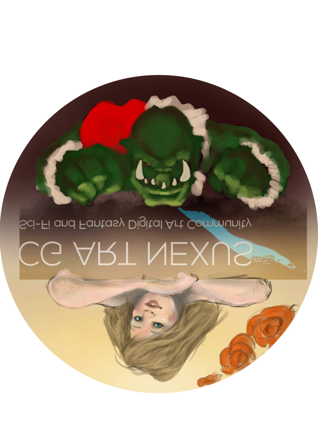
P.S. Painting green skin is hard!!!
Or upside down if you prefer!
P.S. Painting green skin is hard!!!
Everything's on the right!!!
It's like driving abroad!
Please Log in or Create an account to join the conversation.
Latest Activity

Banj updated their profile picture


Charlotte Still wearing a mask? Is it so we won't see you hoarding food in those cheeks of yours?
See More
Banj Mfmuh Guhmfpf
See More
Charlotte I'll take that as a yes...
See More
Charlotte Why is there a tiny flashing thing in front of the reply link/button? It's so small I can't see if it's an exclamation mark or a question mark... or...both?)
See More
Banj Because? Both!
See More
Charlotte *gasp*
See More

CaptainDeth updated their profile picture

CaptainDeth Ahoy folks, just a newbie here, just getting started. Thanks for allowing me in.
CaptainDeth Thank You
CaptainDeth and Mr.Bungle joined the site


honbasic joined the site


Gawk joined the site