


- Posts: 10114
- Thank you received: 476
seems everyone went to bed early yesterday... 
Almost 


Oh. I'd never heard of that until I read about his death yesterday...
Yosser Hughes is the character he played in Boys from the black stuff
The shoutbox is unavailable to non-members
Shoutbox History
seems everyone went to bed early yesterday...
Almost
Oh. I'd never heard of that until I read about his death yesterday...
Yosser Hughes is the character he played in Boys from the black stuff
CGAN Jan 2015 Challenge - White as Snow - WIPs
15 Jan 2015 01:08 - 15 Jan 2015 01:09 #8159
by Valence
Replied by Valence on topic CGAN Jan 2015 Challenge - White as Snow - WIPs
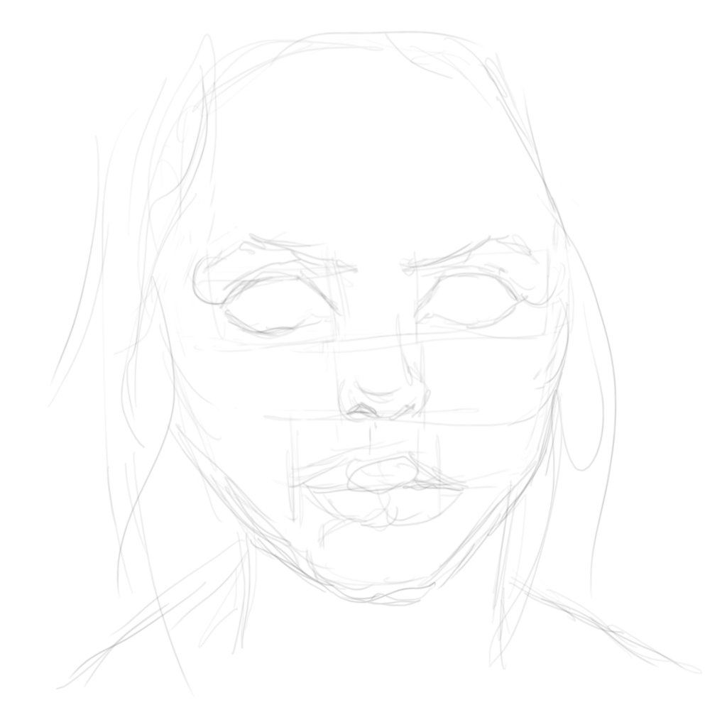
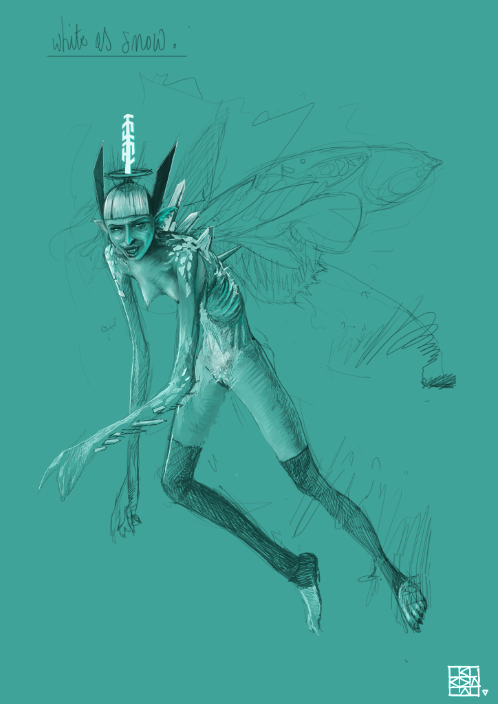
Been having a go at this all week but I haven't posted because I've been trying two separate pictures. But now I've settled on one, I think, so I'll dump the three wips over a couple of posts, although I'm not altogether confident about getting it right.
It's a bit generic (as always) but my first thought with this title was pale porcelain skin, and then that made me think of an old Q&A in the magazine by Melanie Delon about doing a high-key portrait with no shadows.
So I'm trying to do a really pale female face barely emerging from a bright cool background. And if I ever get that far I may introduce some snowflake design at the end.
Here's the first pencil scribble and colour application that I did the other day.
Last edit: 15 Jan 2015 01:09 by Valence.
The following user(s) said Thank You: Mindbender
Please Log in or Create an account to join the conversation.
15 Jan 2015 01:14 #8160
by Valence
Replied by Valence on topic CGAN Jan 2015 Challenge - White as Snow - WIPs
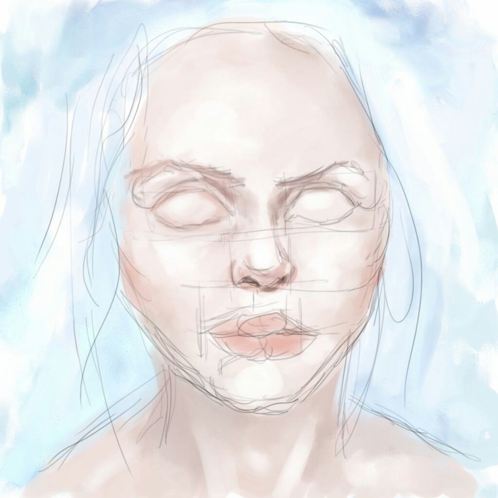
And here's how it progressed today. It was very hard work to get this far, I've had to push some of the proportions around a little bit to lengthen the face and add a bit more form to the cheek areas but there are still some horrific structural problems in there. I'm hoping that the solutions will present themselves to me as I keep working, but I doubt it. ")
The following user(s) said Thank You: Mindbender
Please Log in or Create an account to join the conversation.

15 Jan 2015 12:08 #8163
by Domtopia
Everything's on the right!!!
It's like driving abroad!
Replied by Domtopia on topic CGAN Jan 2015 Challenge - White as Snow - WIPs
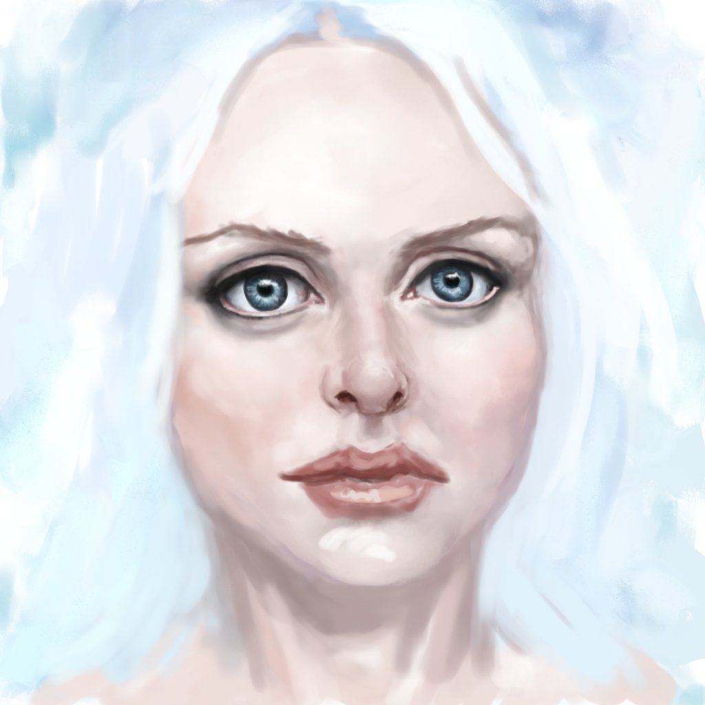
I quite like her great big eyes Val. This will be an interesting piece if it turns out the way you have described. The very bright lighting will be a challenge!
Everything's on the right!!!
It's like driving abroad!
Please Log in or Create an account to join the conversation.
- SchizophreniaWolf
-
- Offline
- Junior Member
-

Less
More
- Posts: 170
- Thank you received: 10
15 Jan 2015 14:28 #8171
by SchizophreniaWolf
Replied by SchizophreniaWolf on topic CGAN Jan 2015 Challenge - White as Snow - WIPs
thx Domtopia, Vanlence and Microscopi!
Valence: you where right about the asymmetry. I think I fixed it.
Now I think that she is looking a bit manly, but maybe it's me.
Valence: you where right about the asymmetry. I think I fixed it.
Now I think that she is looking a bit manly, but maybe it's me.
Please Log in or Create an account to join the conversation.
15 Jan 2015 14:35 - 16 Jan 2015 20:56 #8172
by Valence
Yeah, I always do eyes too big.
Even though they're only … OKish (the right one needs reshaping and the gap between them needs softening) I think the eyes are the only reason I've kept going with this. It's the nose that's the next stumbling block. It looks too tight and constricted, like a default nose (which of course it is!) rather than part of a particular face. Also I like to use the nose to find the right position and shape for the mouth so until I get that right everything else will continue to look ordinary.
The best and easiest way to define facial structure is with bold shadows and edges to mark the different planes (and I think the line drawing of my first wip clearly has the best structure to it, I seem to have lost something since then) so one of the pitfalls of trying to do a soft subtle face is that you can't describe those surface transitions and you end up with a load of separate features that can individually be accurate and detailed and yet still bear no relationship to each other as they just float around in a vague flesh coloured space. And that's sadly where I currently am.
I'm hoping that it may start to take a better shape as I build up some soft layered shading, but if not I can always take refuge in the liquify function. Ah liquify, the last stop on the road to poor portraits!
Schizo: That looks fantastic. The dark and light on the midtone background looks really three dimensional but in an understated suggestive way. Great work!
Replied by Valence on topic CGAN Jan 2015 Challenge - White as Snow - WIPs
I quite like her great big eyes Val.
Yeah, I always do eyes too big.
Even though they're only … OKish (the right one needs reshaping and the gap between them needs softening) I think the eyes are the only reason I've kept going with this. It's the nose that's the next stumbling block. It looks too tight and constricted, like a default nose (which of course it is!) rather than part of a particular face. Also I like to use the nose to find the right position and shape for the mouth so until I get that right everything else will continue to look ordinary.
The best and easiest way to define facial structure is with bold shadows and edges to mark the different planes (and I think the line drawing of my first wip clearly has the best structure to it, I seem to have lost something since then) so one of the pitfalls of trying to do a soft subtle face is that you can't describe those surface transitions and you end up with a load of separate features that can individually be accurate and detailed and yet still bear no relationship to each other as they just float around in a vague flesh coloured space. And that's sadly where I currently am.
I'm hoping that it may start to take a better shape as I build up some soft layered shading, but if not I can always take refuge in the liquify function. Ah liquify, the last stop on the road to poor portraits!
Schizo: That looks fantastic. The dark and light on the midtone background looks really three dimensional but in an understated suggestive way. Great work!
Last edit: 16 Jan 2015 20:56 by Valence.
Please Log in or Create an account to join the conversation.
- microscopi
-

- Offline
- Premium Member
-

Less
More
- Posts: 743
- Thank you received: 79
16 Jan 2015 00:00 - 16 Jan 2015 00:05 #8173
by microscopi
Replied by microscopi on topic CGAN Jan 2015 Challenge - White as Snow - WIPs
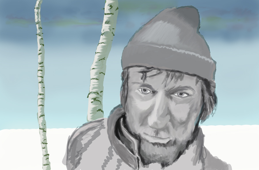
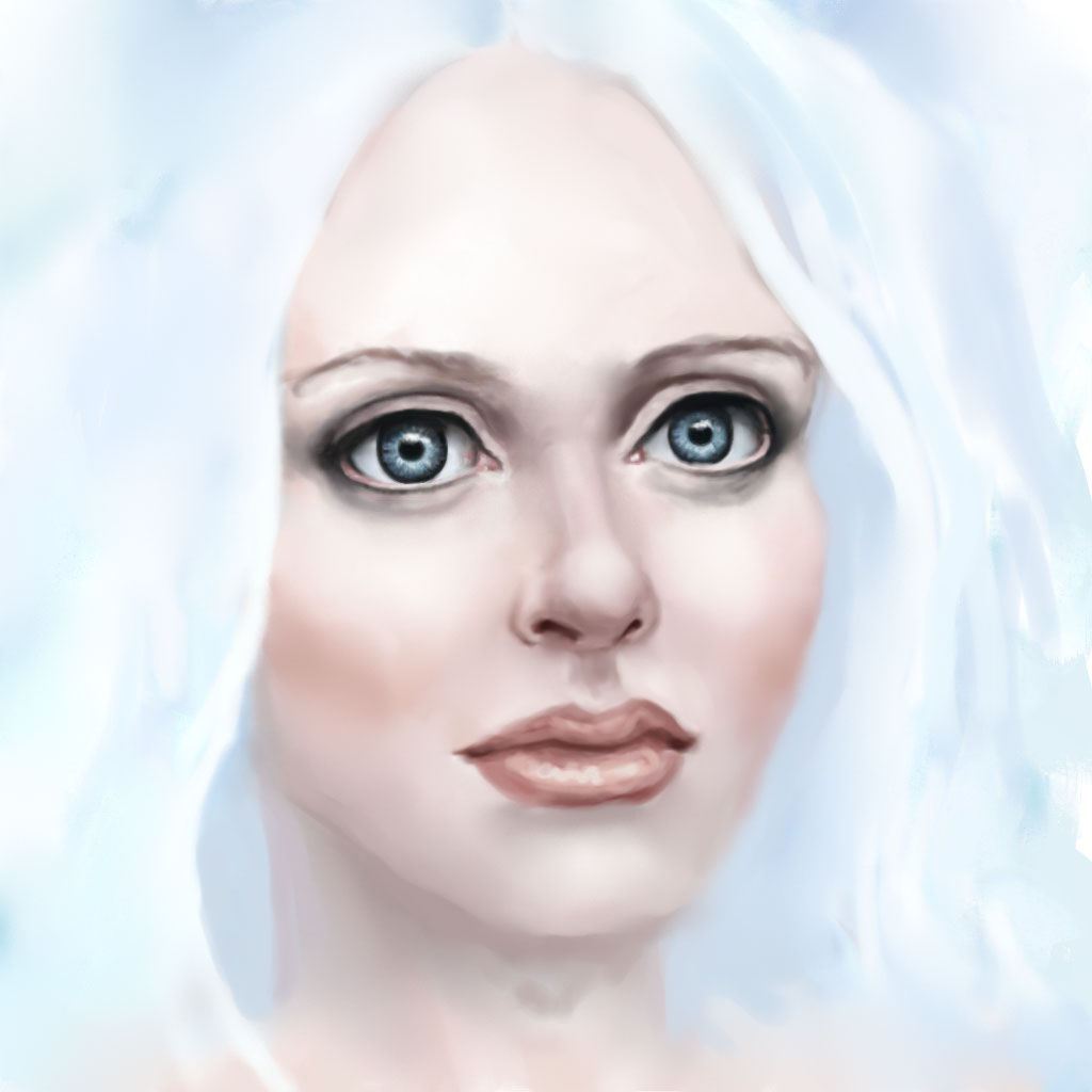
Hey Valence looking great so far! She looks a bit anime with the large eyes, but reminds me of the main female character from Dark Crystal a bit too. Her nose looks fine to me but I would make it a bit wider to match the eyes.
Schizo, can't wait to see how you progress yours, it's looking really cool so far.the eyes are whats making her look more masculine though, you should make them bigger and prettier, or anti prettier lol but more female!
I really haven't done much to mine, it's going to be mostly blue and white, but with lots of detail! I hope
Last edit: 16 Jan 2015 00:05 by microscopi.
Please Log in or Create an account to join the conversation.
16 Jan 2015 13:20 #8176
by Domtopia
Everything's on the right!!!
It's like driving abroad!
Replied by Domtopia on topic CGAN Jan 2015 Challenge - White as Snow - WIPs
Schizo, that looks great. I love her cheeky face and the proportions are just the right side of creepy. Cool stuff so far.
Mic, looking forward to seeing the detail!
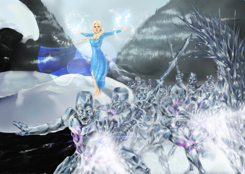
Here's where I am with some lighting effects. Gimme some c&c's!!
Mic, looking forward to seeing the detail!
Here's where I am with some lighting effects. Gimme some c&c's!!
Everything's on the right!!!
It's like driving abroad!
Please Log in or Create an account to join the conversation.
16 Jan 2015 19:47 #8177
by oaktree
Replied by oaktree on topic CGAN Jan 2015 Challenge - White as Snow - WIPs
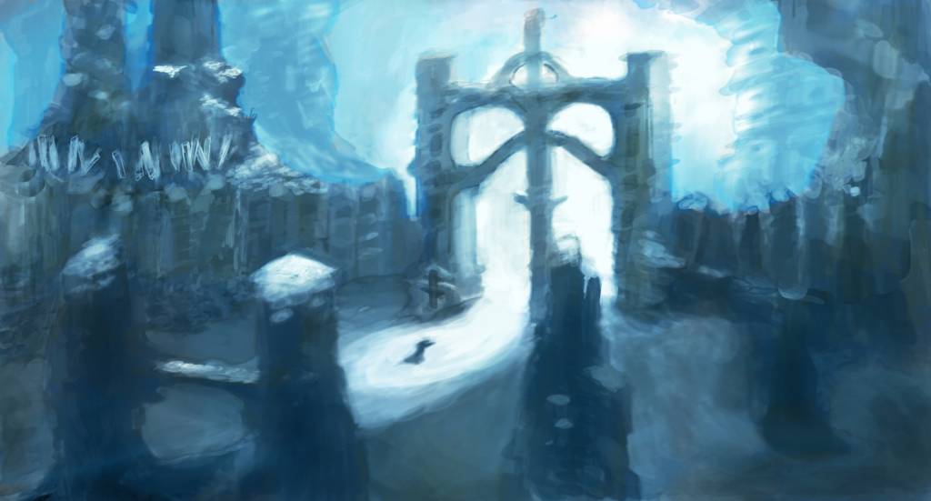
update from me
Please Log in or Create an account to join the conversation.

16 Jan 2015 20:21 #8178
by Charlotte
Any an all misspellings are henceforth blamed on the cats.
Replied by Charlotte on topic CGAN Jan 2015 Challenge - White as Snow - WIPs
Great to see all the entries progress
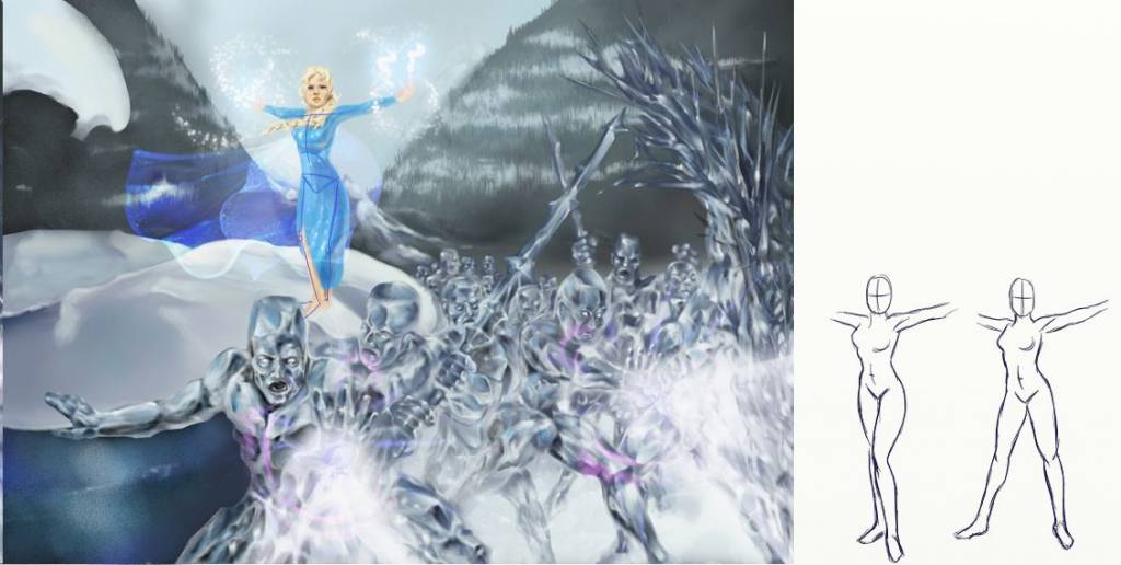
Dom, I have a couple of thoughts regarding yours. See paintover below.
1) I can't quite read Elsa's pose. It seems to me that her legs are crossing (but I'm not sure because can't tell if it's her left or right foot in front) and also that she's "kneeing" a little. Not exactly a mighty magician pose, but perhaps I'm just not seeing it yet. I did a couple of scribbles next to the paintover to show some alternative poses (admittedly rather cliché but they still feel more natural to me - not that I know exactly how to stand when casting magic... maybe kaz knows") )
)
2) There are two very dark areas on the left hand side that draw attention. I guess they might just not be worked yet, but I'd make them paler so that Elsa and her boys are what pops. In my paintover I tried making the foreground (lower) area icy using the existing colours of the icemen.
Just my two cents for now
Dom, I have a couple of thoughts regarding yours. See paintover below.
1) I can't quite read Elsa's pose. It seems to me that her legs are crossing (but I'm not sure because can't tell if it's her left or right foot in front) and also that she's "kneeing" a little. Not exactly a mighty magician pose, but perhaps I'm just not seeing it yet. I did a couple of scribbles next to the paintover to show some alternative poses (admittedly rather cliché but they still feel more natural to me - not that I know exactly how to stand when casting magic... maybe kaz knows
)2) There are two very dark areas on the left hand side that draw attention. I guess they might just not be worked yet, but I'd make them paler so that Elsa and her boys are what pops. In my paintover I tried making the foreground (lower) area icy using the existing colours of the icemen.
Just my two cents for now
Any an all misspellings are henceforth blamed on the cats.
Please Log in or Create an account to join the conversation.
16 Jan 2015 20:52 - 17 Jan 2015 00:18 #8179
by Valence
Replied by Valence on topic CGAN Jan 2015 Challenge - White as Snow - WIPs
Nice updates from everyone.
Micro. That's a much better value range in your picture now. There's a much smoother transition not only in brightness but also in depth. Having harsh dark and lights everywhere can create a cardboard cutout effect but your pic has a real continuous transition into the landscape.
Oaktree. I like a good face and that is a good face! Can't wait to see you get in and paint the skin. The sparse background is nicely rendered and it will be interesting to see how it balances with the colour of the face.
Dom. I love those icemen! Really well done, they look glassy and transparent yet still aggressively there. Charlotte makes some good points, as always, and I kind of agree about the dark bits. The bit at the bottom left corner looks a little awkward with that edge coinciding with the iceman's thrusting arm. But it is impressive how this is progressing.
Time to lower the standard now with mine...
I've now switched to Photoshop because 1: it's a bit quicker to do soft blending. 2: its easier to do pixelly details and 3: I'll need it for some layer effects later on.
It's all a bit smoother and the nose is a little better without being right. I can't help but notice that the face seems to be turning a little as I try to get the balance between the features. Not entirely intended but I'll go with it. I'm now just trying to find the right line for the cheek and jaw, especially on that left side.
It still looks embarrassingly naive to my eyes but I still think there's the potential for improvement so I'll keep at it next week after a bit of a break. I shall then want to add some detail and a bit of texture to the lips (which I always find difficult) and I also want to expand the canvas to open up the composition and give the character a bit of space.
Edit: Was just doing some experiments on my tablet to see how best to expand the canvas and reposition the figure and realised that a few of my problems and struggles seem to be caused by the slight tilt to the face. Just rotating the facial features clockwise and dropping them a little makes it look somewhat better so that shall be step one on Monday.
Last edit: 17 Jan 2015 00:18 by Valence.
Please Log in or Create an account to join the conversation.
Latest Activity

Banj updated their profile picture


Charlotte Still wearing a mask? Is it so we won't see you hoarding food in those cheeks of yours?
See More
Banj Mfmuh Guhmfpf
See More
Charlotte I'll take that as a yes...
See More
Charlotte Why is there a tiny flashing thing in front of the reply link/button? It's so small I can't see if it's an exclamation mark or a question mark... or...both?)
See More
Banj Because? Both!
See More
Charlotte *gasp*
See More

CaptainDeth updated their profile picture

CaptainDeth Ahoy folks, just a newbie here, just getting started. Thanks for allowing me in.
CaptainDeth Thank You
CaptainDeth and Mr.Bungle joined the site


honbasic joined the site


Gawk joined the site