

October Challenge: Horror rework
September entries: Legend


Important, change your password!
Go here for further information: https://cgartnexus.com/index.php/forum/announcements/840-hacked
CGAN August 2015 Challenge - Ganymede - Finals
Poll: Ganymede Dance Off! Vote by Sunday 13th! (was ended 2015-09-14 00:00:00)
| Kodabble |
|
1 | 25% |
| Robin |
|
3 | 75% |
| Total number of voters: 4 ( Kodabble, evilrobot, Atto, Valence , ) | |||
| Only registered users can participate to this poll | |||
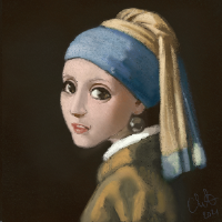

Brief: Banj says this is an open topic with possibilities ranging from historical to futuristic/sci-fi. So read up a bit and then run away with your imagination. Just don't forget to come back now and then to post your images

Deadline: Monday 31st of August, by midnight GMT.
[EDIT] First Poll Result:
microscopi 0%
Robin 40%
Valence 20%
Kodabble 40%
And because we had a tie we have a second vote. Or dance off

This is, assuming I can figure out how to edit the poll... or if Banj comes along and saves the day...
This is where you posts your FINAL ENTRIES
Your WIPs should be posted over here ...
Challenge rules and guidelines:
cgartnexus.com/index.php/forums/challenge-rules/39-challenge-rules
Rules in brief:
All challenge entries must be your own work.
You should post at least two WIP images that are clearly different from your final entry and each other.
Your final entry should contain your image (inserted so it shows up full size) and at least two links to your WIP posts on the forum.
No chatter in the finals thread – if you have questions, post them in the WIP thread or PM an admin.
Feedback is allowed & encouraged together with the voting and in the WIP thread.
Deadline is given in UK time (midnight GMT) with a grace period of 5 minutes for getting the post sorted.
Each member may cast one vote
No cheating! Admins may decide to disqualify an entry that does not adhere to the above rules.
...
FINAL WINNER: Robin
Any an all misspellings are henceforth blamed on the cats.
Please Log in or Create an account to join the conversation.
 .
.
Please Log in or Create an account to join the conversation.
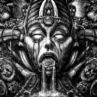

1: Flapping Zeus.
2: No, Scratch That. Tall Zeus Is Better.
3: Zeus Has A Big Head. And Ganymede's Gone!
4: But Now He's Back, And More Central Too.
Good Luck everyone, hope you all finish in time.
Please Log in or Create an account to join the conversation.


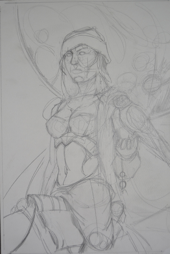
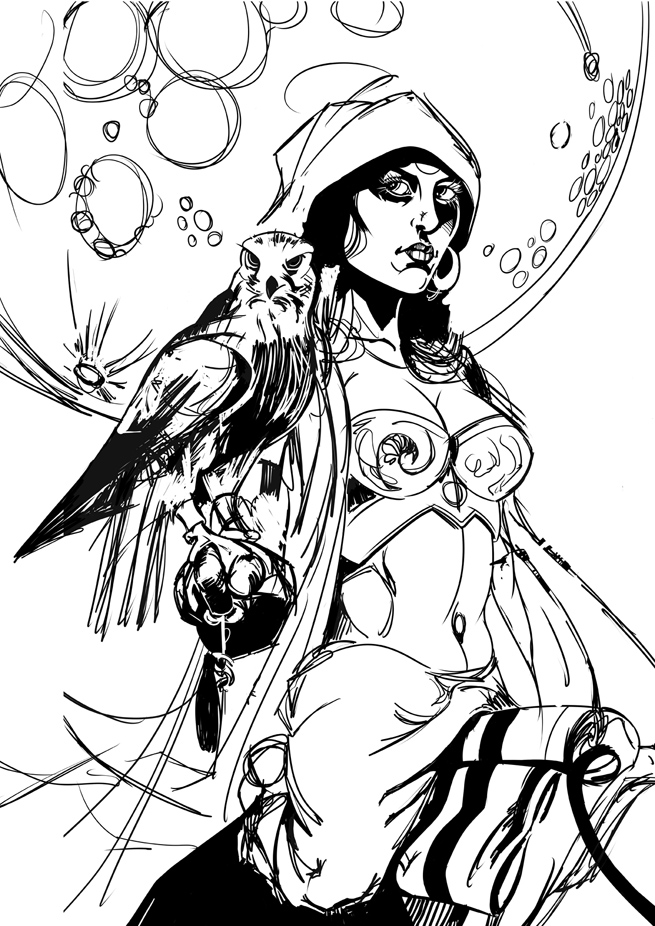
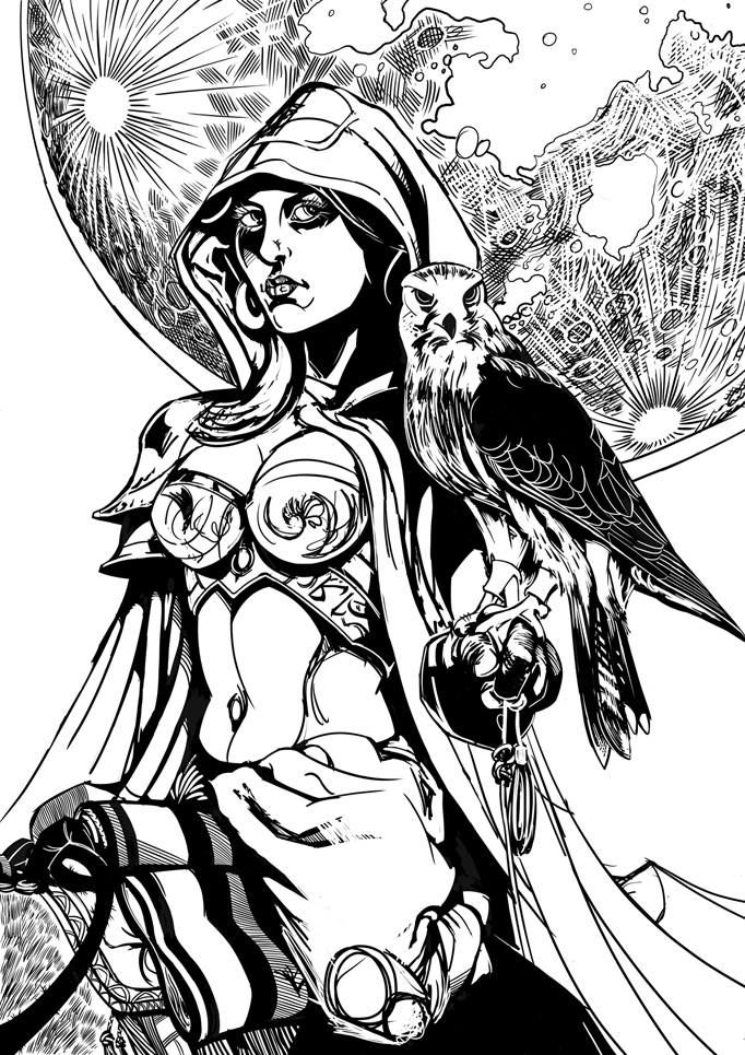
Please Log in or Create an account to join the conversation.
- microscopi
-
- Offline
- Premium Member
-

- Posts: 743
- Thank you received: 79
Please Log in or Create an account to join the conversation.
Time for some self-indulgent rambling to justify my decision… (save your eyes and skip to the next post.)
Kodabble:
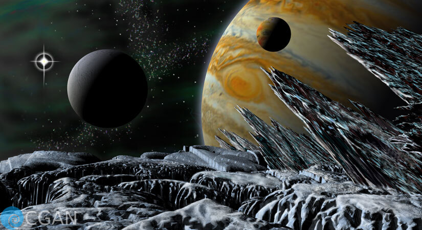
This is exactly the kind of space idea that I would have liked to have done, if I'd had the vision and imagination. I really like the composition too. The different sized spheres of the planet and moons give an epic sense of scale and depth that recedes to the starfield… (A digression: One of my pet hates in SciFi paintings is when the artist incorrectly paints stars in front of the dark side of moons, this happens far too often so I was super pleased that you didn't do that and got the depth order correct! Well Done!) …and those smooth round shapes are boldly contrasted against the harsh, jagged forms of the foreground that point your gaze back into the picture. It's a very well-formed arrangement that wouldn't look out of place on the cover of a SciFi novel.
The iconic red spot is given a welcome prominence and the gentle haze at the planet's edge softens the harshness that can sometimes affect these types of images.
As I said in the wip thread (perhaps a little too late, sorry) I think some sharper, higher resolution work in the foreground (in both geometry and texture) would have pushed the picture even further. It is tricky to do though, the close up region is often where CGI illusions break down and I can think of several big budget movies where otherwise decent effects fall apart when they appear too close to the camera. Thankfully, as a result of your efforts, that's not what happens with this image but just a little extra fine detail at the front would still boost the realism a touch.
The inclusion of the illuminating, overseeing star is also a good choice, so much so that I think it's worth making that even brighter too. Actually I might have tried to use a lens flare there, and yes, I know lots of people really hate lens flares but (whisper it amongst my other sins and taboos) I do kind of like them when they're in the appropriate place and this is definitely appropriate. Also I think I've bleated on before (during a previous challenge) about my admiration for the work and tutorials of Tim Barton. His YouTube channel is a must watch for anyone wanting to paint stars and nebulae. In fact there's one video in particular that shows how he creates those intricate diffraction spikes that give these types of stars their familiar photographic glow. I also find that using horizontal and vertical Motion Blurs and Zoom Blurs can be quite effective in this area, as is the use of Linear Dodge layers.
Overall this is a classic, traditional space scene of the kind that I wish I'd been brave enough to try and one that captures the epic, endless depths of space.
Microscopi:
As usual you worked through many ideas and once again you settled on the best one, so extra points for your decision making. The moon, looming large in the centre, dominates the picture in all possible ways: detail, position and size. Even the landscape warps and curves around it as if bending to the force of its will. And just like the dutch tilt of your previous sorcerer picture it's another imaginative composition with the sphere of the moon and the almost hyperbolic twist of the world beneath linking together like a surreal conjunction of positive and negative curvature, all of which is kind of interesting (well, interesting to uber-boring maths nerds like me) especially when my own pictures are plagued with such bland, linear compositions.
The slight downside to all this is that the figure, the bird and their story are somewhat overpowered by all that abstract geometry. Outlining the eagle does help but as Kodabble suggested, increasing the size of the figure and/or the bird could have given them more emphasis. Also the position of the figure does still confuse the eye a little. Having it almost coincide with the horizon creates an ambiguity of depth: is the character in the foreground on a dark hill? Or is the dark area a path leading into the distance where a much taller figure stands. Of course the first option is the right one but because of the near tangent of the figure and horizon your eye wants to see both options. Just a slight alteration to the position of the figure would break the symmetry and pull him away from the background and give him the visual standing that matches the textured environments that you do so consistently.
Robin:
Play some sad music, perhaps something with violins, to accompany this confession… I can't do line work. Can't do any kind of inking really.
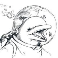
 And as a result of that ineptitude I really appreciate and acknowledge the superior skill going on in this picture. The image looked pretty good at the early sketching stage but it really came to life and popped out of the screen when all those deep darks went in, creating such a powerful contrast that burns onto your eye like some kind of branded stencil.
The subject matter and composition contain all the necessary themes and motifs of the brief even though it doesn't directly refer to the story. Instead it takes that as a starting point to provoke you to imagine other stories, which all great character work should do. But the real selling point of the picture is the technique on show. There is such a widely varied use of line here, in some areas they delineate edges and silhouettes, in other areas they describe the three dimensional form by wrapping around the objects and elsewhere the patches of cross-hatched shading explain the rough textures of surfaces. The density of detail is thorough and well-clustered to always seem interesting to the eye.
Part of me wishes that you'd added colouring, if only so that I could learn how to do that too, but in no way does that take anything away from the picture. The stark black and white, with no intermediate shade, is bold, expressive and very successful. It looks just like a comic book panel and all I want is to turn the page and see the next one. Therefore this is my winner.
CherryGraphics:
I half-suspected that you wouldn't have time to finish this with it being stuck between your vacation and the imminent Virgo challenge that you were waiting for. But it was still nice to see a quick, colourful sketch. The image of Ganymede hanging on while being spirited away is good fun and does have the feel of a Disney animation. One nice little touch is the way that the curls in the hair are repeated in the shape of the cloud which together reminded me of the scrolls at the top of columns in orders of classical Greek architecture (hmm, is it doric or ionic? Can't remember and can't be bothered to look it up just now
 ) and all of that gives it an unmistakable Greek look which is appropriate to the myth. Sad it didn't get any further but looking forward to seeing the next one.
 Please Log in or Create an account to join the conversation.
- CherryGraphics
-
- Offline
- Junior Member
-

- Posts: 366
- Thank you received: 33
I'm a bit sad I couldn't finished my work, but as I said - I have / had a lot of work to do for now :oBUt nevertheless I want to vote
Robin - you're my winner this time, too! I love your linework and the idea which is something different.
your lines are really clean and all well placed. I did sooomething like this the last challenge with alice in wonderland but I'm not that clean-line worker I had to find out... xDVal: this a strong painting! Zeus looks great - the eagle looks great- Ganymede looks also great ! I just have problem with the division (?) how all build a line from earth to heaven. they're all almost the same size, have the same importance so it is hard to find a point to start looking at the picture. But I love the idea how Zeus controls the eagle.
Micro: I love your landscapes. The moon is great painted and all that shining gives it a solemny atmosphere. Just one thought: I had to look at the picture 4 times until I found the man standing on the mountain. ^^ he is like a chameleon. A bit more of brightness or lines or other eyecatching things would be nice.
kodabble: I like the idea of showing the universe with Ganymede here
you did a great job with the icy surface. It's just a personal opinion but there's often a lack of emotion, atmosphere and mood in 3D pictures and I really don't know why but it looks a bit too clean for me. Don't be angry with me Please Log in or Create an account to join the conversation.
Please Log in or Create an account to join the conversation.
- microscopi
-
- Offline
- Premium Member
-
- Posts: 743
- Thank you received: 79

Val, you really improved on yours near the end, all the characters are very well detailed, as a whole creates a lot of dynamisism with the storytelling element, not sure nudity was required tho
Robin, like everyone else the linework was really awesome, really appreciate a solid sketch and you have one there with a great character, color would just take to another level.

Struggled with mine near the end, I tried to make the eagle larger and the main character larger and focused but nothing I tried really worked, ah well, over and done now! Thanks for the feedback
Please Log in or Create an account to join the conversation.
Please Log in or Create an account to join the conversation.
Facebook Feed
Member Statistics
- Total Users: 228
- Latest User: DanielWilson
- Online Users: 2
- Users Today: 0
- Users this Week: 0
- Users this Month: 0
- Users this Year: 2
Members Online
NOTE! This site uses cookies and similar technologies.
By using this website you agree to the use of cookies and related data storage as detailed in our privacy policy. Learn more
Site design Mad Hamster Studios. All content is protected under © and the property of the various contributers and not to be reproduced without permission of the creator.