


- Posts: 18
- Thank you received: 0


Are you trying to spew those lurker tentacles at us and failing or are you just in a state of constant amazement? 

The shoutbox is unavailable to non-members
Shoutbox History
Are you trying to spew those lurker tentacles at us and failing or are you just in a state of constant amazement?
comitofobe's WIP's
- comitofobe
-
 Topic Author
- Offline
- New Member
-

Less
More
25 Jan 2015 20:04 #8386
by comitofobe
comitofobe's WIP's was created by comitofobe
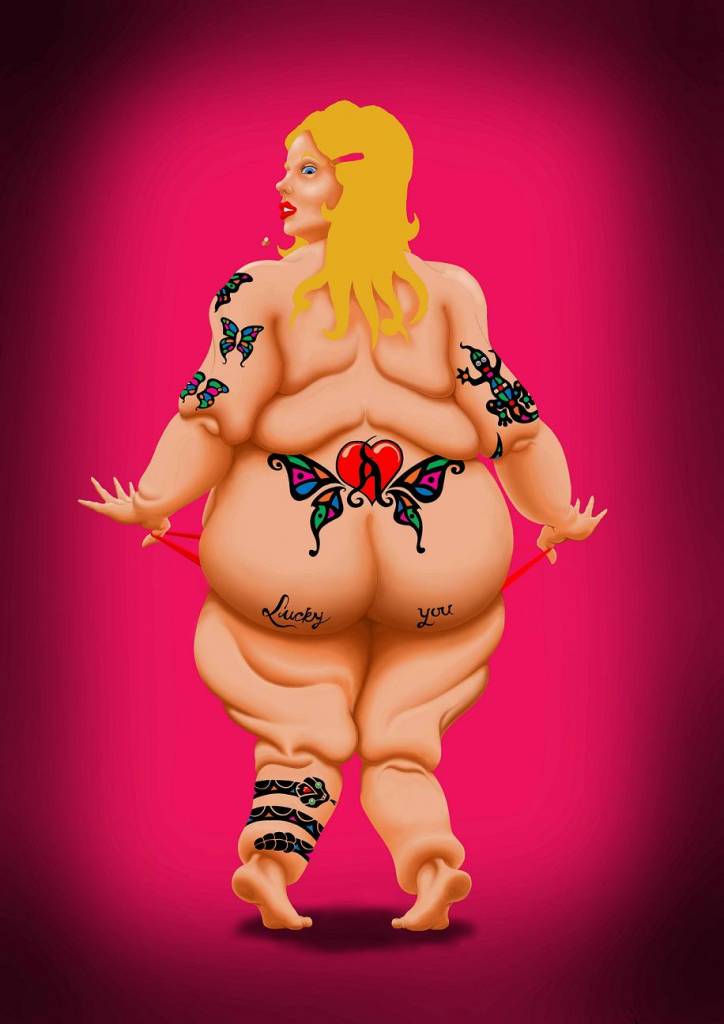
Hi guys.
First time poster here at the site.
I have been working on this one for a good while now. I was wondering if anybody has any tips about putting tattoos on ones charachters. As you can see, right now they look very superimposed (spelling?).
Like inkdrawings on a photograph or something.
Any pointers? Or even a good online video on the subject?
Please Log in or Create an account to join the conversation.
- Digital Dave
-

- Offline
- Platinum Member
-

Less
More
- Posts: 2242
- Thank you received: 163
25 Jan 2015 20:13 #8387
by Digital Dave
I get sketchy around pencils! ...
Replied by Digital Dave on topic comitofobe's WIP's
First, welcome! ... As far as the tats, I've never done any myself, but I would think the first thing you could do is dial down the saturation levels on them to meet with the rest of her skin tone. The other thing is to make sure they follow the characters form, to help make them appear fixed to her.
I get sketchy around pencils! ...
Please Log in or Create an account to join the conversation.

25 Jan 2015 21:08 #8389
by Valence
Replied by Valence on topic comitofobe's WIP's
Welcome! And thank you for sharing your work.
One note for new posters, when you attach a file make sure you click "Insert File" then your image will appear rather than being a small clickable thumbnail.
As for tattoos: the brightest part of any tattoo will just be the skin colour, also you want the form and shading of the skin to show through. The best way to achieve both of these things is to paint the tattoo on a layer set to Multiply and adjust the opacity down to your satisfaction. The warp tool is also very useful to help make the tattoo fit the shape of the body beneath.
Please Log in or Create an account to join the conversation.
- comitofobe
-
Topic Author
- Offline
- New Member
-
Less
More
- Posts: 18
- Thank you received: 0
25 Jan 2015 21:13 #8390
by comitofobe
Replied by comitofobe on topic comitofobe's WIP's
Thanks Dave ")
I've been thinking in the same lines. Just playing around with the fill-slider for the layer with the tats actually helps the image. I think the shapes follow the body farely well, but i guess some tweeking could be in order.
I've been thinking in the same lines. Just playing around with the fill-slider for the layer with the tats actually helps the image. I think the shapes follow the body farely well, but i guess some tweeking could be in order.
Please Log in or Create an account to join the conversation.
- comitofobe
-
Topic Author
- Offline
- New Member
-
Less
More
- Posts: 18
- Thank you received: 0
25 Jan 2015 21:38 #8391
by comitofobe
Replied by comitofobe on topic comitofobe's WIP's
Thank you, Valence
The layer settings you suggested helped and i've started to play around with the warp tool. I have never really gotten familiar with it before and its both fun and good photoshop practice. Really helpfull advice.
Also, thanks for the tip about making the image appear. I'll do that next time.
The layer settings you suggested helped and i've started to play around with the warp tool. I have never really gotten familiar with it before and its both fun and good photoshop practice. Really helpfull advice.
Also, thanks for the tip about making the image appear. I'll do that next time.
Please Log in or Create an account to join the conversation.

26 Jan 2015 15:23 #8414
by Domtopia
Everything's on the right!!!
It's like driving abroad!
Replied by Domtopia on topic comitofobe's WIP's
Try Multiply, Overlay and Softlight layers for applying tattoos and other decorative skin features. THey all blend well with the contours of pre-painted skin, but all have some drawbacks too. Multiply will darken you tattoo, but overlay will distort the colour. Softlight is very subtle, so may give an indefinite result. If you want some funky and interesting tattoos (like holographic tattoos) then try luminosity or screen. Both are interesting blend modes that sharply brighten and enhance the layers under them.
It's all a bit of an experiment. Keep it coming and welcome to the forums Comi!!!
It's all a bit of an experiment. Keep it coming and welcome to the forums Comi!!!
Everything's on the right!!!
It's like driving abroad!
Please Log in or Create an account to join the conversation.
- comitofobe
-
Topic Author
- Offline
- New Member
-
Less
More
- Posts: 18
- Thank you received: 0
26 Jan 2015 21:00 #8423
by comitofobe
Replied by comitofobe on topic comitofobe's WIP's
Thanks Domtopia
I've played around with the layer settings and it is very much as you say. The best change seems to happen when i set it to multiply and dial down the opacity to about 80%. It gets darker and loses alot of vibrance, but it also seems more attached to the skin. I should probably see if i can get a better result by changing the colour setting slightly.
The work continues
Please Log in or Create an account to join the conversation.
- comitofobe
-
Topic Author
- Offline
- New Member
-
Less
More
- Posts: 18
- Thank you received: 0
26 Jan 2015 21:04 #8424
by comitofobe
Replied by comitofobe on topic comitofobe's WIP's
Please Log in or Create an account to join the conversation.
26 Jan 2015 21:14 #8425
by Domtopia
Everything's on the right!!!
It's like driving abroad!
Replied by Domtopia on topic comitofobe's WIP's
The rendering looks really good btw.
Her legs are a bit weird though, in that she looks like she is wearing a fat suit! Interesting idea though!
Her legs are a bit weird though, in that she looks like she is wearing a fat suit! Interesting idea though!
Everything's on the right!!!
It's like driving abroad!
Please Log in or Create an account to join the conversation.
- comitofobe
-
Topic Author
- Offline
- New Member
-
Less
More
- Posts: 18
- Thank you received: 0
26 Jan 2015 21:54 #8428
by comitofobe
Replied by comitofobe on topic comitofobe's WIP's
Thanks
Yeah, i see what you mean about the legs. The whole thing started as a joke on a colleague of mine who nagged me to draw him a tattoo. A pinup of my own design.
I came up with this unorthodox version that weekend and sort of just threw the drawing together with not so much attention to detail and reference. Needless to say he never got it inked on him
A couple of months later i elected to use the drawing as the base for skin painting practice. I never corrected the anatomy flaws since it was never supposed to be more than a excercise. But it grew on me.
Please Log in or Create an account to join the conversation.
Latest Activity

Banj updated their profile picture


Charlotte Still wearing a mask? Is it so we won't see you hoarding food in those cheeks of yours?
See More
Banj Mfmuh Guhmfpf
See More
Charlotte I'll take that as a yes...
See More
Charlotte Why is there a tiny flashing thing in front of the reply link/button? It's so small I can't see if it's an exclamation mark or a question mark... or...both?)
See More
Banj Because? Both!
See More
Charlotte *gasp*
See More

CaptainDeth updated their profile picture

CaptainDeth Ahoy folks, just a newbie here, just getting started. Thanks for allowing me in.
CaptainDeth Thank You
CaptainDeth and Mr.Bungle joined the site


honbasic joined the site


Gawk joined the site