


I haven't seen any sign of Z words today 


The shoutbox is unavailable to non-members
comitofobe's WIP's

05 Feb 2015 17:41 #8776
by Charlotte
Any an all misspellings are henceforth blamed on the cats.
Replied by Charlotte on topic comitofobe's WIP's
It's been a while since I used photoshop, but I think you can both try using colour balance to change all colours in the tattoo layer (I think you can also choose the change the reds OR the greeens OR the blues or some such but I'm not too sure), and you can try selecting a colour and then just replacing that colour (there's an effect or something called replace colour, and you can change how specific that change will be - from the exact shade you want to change to all shades that are similar - with a slider. At least that's how it worked in the old version I had ")
Any an all misspellings are henceforth blamed on the cats.
Please Log in or Create an account to join the conversation.

06 Feb 2015 00:49 - 06 Feb 2015 00:57 #8785
by Valence
Replied by Valence on topic comitofobe's WIP's
It's the Hue-Saturation-Value adjustment that lets you select which colours (or rather hues) to act on (well it is on mine.) You can also select a custom colour range by dragging some little arrows around.
Edit:
There used to be a tattoo related tutorial by Hoang Nguyen in the depths of the old IFX site but like my recent failed attempt to find a Marta Dahlig tut, it seems like the IFX beta site has gone and been subsumed into that Creative Bloq. Can't find anything there anymore.
Edit:
There used to be a tattoo related tutorial by Hoang Nguyen in the depths of the old IFX site but like my recent failed attempt to find a Marta Dahlig tut, it seems like the IFX beta site has gone and been subsumed into that Creative Bloq. Can't find anything there anymore.
Last edit: 06 Feb 2015 00:57 by Valence.
Please Log in or Create an account to join the conversation.
- comitofobe
-
 Topic Author
- Offline
- New Member
-

Less
More
- Posts: 18
- Thank you received: 0
15 Feb 2015 20:53 #8942
by comitofobe
Replied by comitofobe on topic comitofobe's WIP's
I suddenly went from comfortably unemployed to working outside of town this week and the transition stopped me from wanting to paint for a while. But i have been playing around a little with the tips i've been getting and wanted to show the little change i've managed so far.
Colour Balanced, Normal setting, 100% opacity.
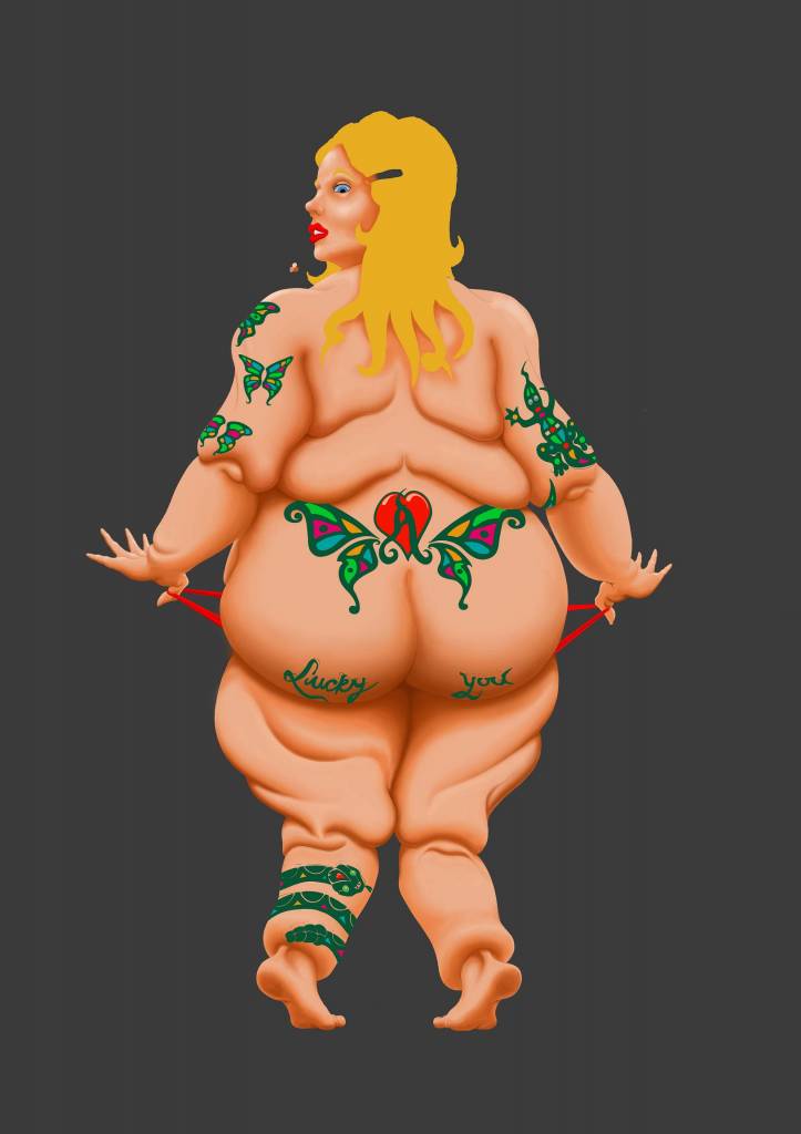
Layer set to Multiply, 82% opacity.
Colour Balanced, Normal setting, 100% opacity.
Layer set to Multiply, 82% opacity.
Please Log in or Create an account to join the conversation.
16 Feb 2015 19:24 - 16 Feb 2015 20:51 #8948
by Valence
Replied by Valence on topic comitofobe's WIP's
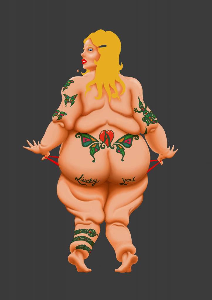
The Lucky You phrase looks good and sits well on the skin on that shaded area. The others have the right colour but still look a bit too light. When I use multiply layers they go way darker than that.
Edit: Just been playing around with this and I think that the problem is that the skin is too light and too flat. The back is effectively a few shadows on a light midtone and there isn't enough texture and form to show through the tattoos. If you add another multiply layer and paint a more graduated transition on the skin from the light to the dark, with a bit of texture too, then the tattoos do look more integrated with the figure.
Edit: Just been playing around with this and I think that the problem is that the skin is too light and too flat. The back is effectively a few shadows on a light midtone and there isn't enough texture and form to show through the tattoos. If you add another multiply layer and paint a more graduated transition on the skin from the light to the dark, with a bit of texture too, then the tattoos do look more integrated with the figure.
Last edit: 16 Feb 2015 20:51 by Valence.
Please Log in or Create an account to join the conversation.

17 Feb 2015 16:53 #8964
by Domtopia
Everything's on the right!!!
It's like driving abroad!
Replied by Domtopia on topic comitofobe's WIP's
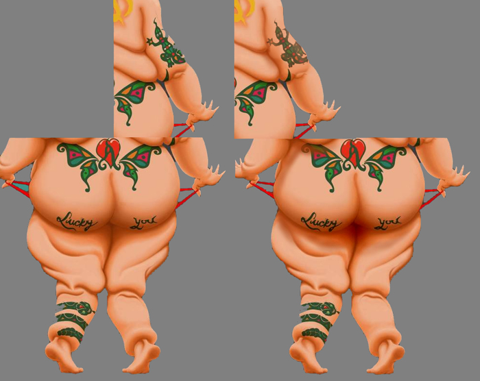
Remember to paint the contours of the skin back on top of the tattoo. You want to keep the impression that they are following the form of her body.
I have done a paintover. Like you, I set the blend mode to multiply, turned the opacity down to around 80%, but then put a layer over the top of that, applied the highlight and shadow (colour picked from the rest of the image) and then painted them over the tattoo. Then I applied a gaussian blur to that layer.
I also used the burn tool under her prodigious bottom. The effect is some subsurface scattering, which I think makes the lighting and form more believable.
Hope that helped!
Everything's on the right!!!
It's like driving abroad!
Please Log in or Create an account to join the conversation.
- comitofobe
-
Topic Author
- Offline
- New Member
-
Less
More
- Posts: 18
- Thank you received: 0
19 Feb 2015 20:00 #8989
by comitofobe
Replied by comitofobe on topic comitofobe's WIP's
Valence and Domtopia
I feel you are both on to the same issue about my image.
It really does lack shape-giving shadows and textures for the tattoos to interact with. I must admit to maybe jumping the gun a bit by raising the question about the tattoos before i was completely done with that aspect of the image.
In fact, as you might have noticed, i had not even placed any actual highlights on her body at all.
I also see now that almost none of the tattoos interact with any creese or fold of the skin. Adding to their flat appearance.
You both suggested another multliply layer over the tattoo-layer for rectifying the shadow/highlight aspect and i will definetly try that out.
I also see what you mean about darkening and maybe reddening the underside of her buttocks for effect, Domtopia.
That paintover blew my mind I did not think anybody would care enough to do that.
Thank you to both of you for your continued help and interest.
I feel you are both on to the same issue about my image.
It really does lack shape-giving shadows and textures for the tattoos to interact with. I must admit to maybe jumping the gun a bit by raising the question about the tattoos before i was completely done with that aspect of the image.
In fact, as you might have noticed, i had not even placed any actual highlights on her body at all.
I also see now that almost none of the tattoos interact with any creese or fold of the skin. Adding to their flat appearance.
You both suggested another multliply layer over the tattoo-layer for rectifying the shadow/highlight aspect and i will definetly try that out.
I also see what you mean about darkening and maybe reddening the underside of her buttocks for effect, Domtopia.
That paintover blew my mind
I did not think anybody would care enough to do that.Thank you to both of you for your continued help and interest.
Please Log in or Create an account to join the conversation.
- comitofobe
-
Topic Author
- Offline
- New Member
-
Less
More
- Posts: 18
- Thank you received: 0
08 Mar 2015 15:05 #9438
by comitofobe
Replied by comitofobe on topic comitofobe's WIP's
I have not been painting too much lately. Mostly because i find my dayjob very uninspiring but also due to a short stint in the hospital due to a bad back. But since i'm now on sick-leave, i've put down a little effort and this is the results so far.
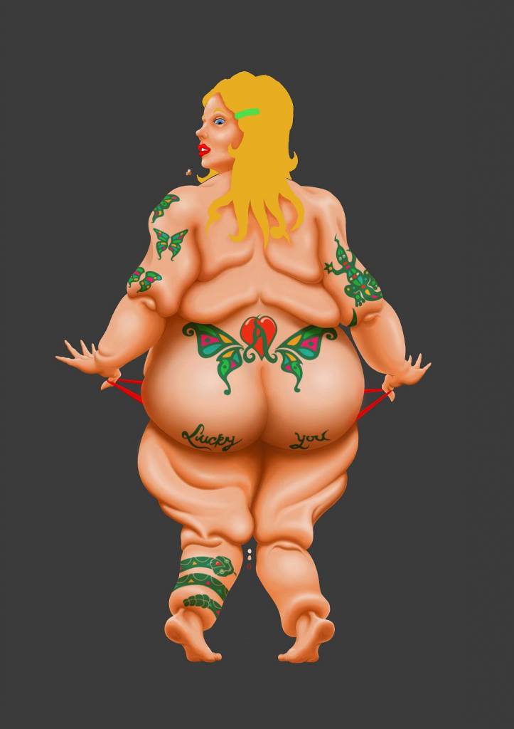
Starting to feel sort of satisfied with the body and considering moving on to detailing the face now.
Starting to feel sort of satisfied with the body and considering moving on to detailing the face now.
Please Log in or Create an account to join the conversation.
- microscopi
-

- Offline
- Premium Member
-

Less
More
- Posts: 743
- Thank you received: 79
14 Mar 2015 17:45 - 14 Mar 2015 17:47 #9585
by microscopi
Replied by microscopi on topic comitofobe's WIP's
This is looking much better com I've been checking out the progress, what helps me a lot is making a light source and using that as a base for where you should put shadows and highlights, Adding darker and lighter areas that separate the flat base color, can add more realism, same with the hair.
Try playing with the dodge and burn tool, (if you're using photoshop) it's a quick guide to get the lighting down roughly, it can really help you see things, that you might not of noticed before. You have to be careful though, if you use it too much your stuff can look oversaturated or muddy,
I've been checking out the progress, what helps me a lot is making a light source and using that as a base for where you should put shadows and highlights, Adding darker and lighter areas that separate the flat base color, can add more realism, same with the hair.Try playing with the dodge and burn tool, (if you're using photoshop) it's a quick guide to get the lighting down roughly, it can really help you see things, that you might not of noticed before. You have to be careful though, if you use it too much your stuff can look oversaturated or muddy,
Last edit: 14 Mar 2015 17:47 by microscopi. Reason: spelling
Please Log in or Create an account to join the conversation.
14 Mar 2015 18:47 #9590
by Domtopia
Everything's on the right!!!
It's like driving abroad!
Replied by Domtopia on topic comitofobe's WIP's
It's useful for adding subsurface scattering on the skin too.
Everything's on the right!!!
It's like driving abroad!
Please Log in or Create an account to join the conversation.
Latest Activity

Banj updated their profile picture


Charlotte Still wearing a mask? Is it so we won't see you hoarding food in those cheeks of yours?
See More
Banj Mfmuh Guhmfpf
See More
Charlotte I'll take that as a yes...
See More
Charlotte Why is there a tiny flashing thing in front of the reply link/button? It's so small I can't see if it's an exclamation mark or a question mark... or...both?)
See More
Banj Because? Both!
See More
Charlotte *gasp*
See More

CaptainDeth updated their profile picture

CaptainDeth Ahoy folks, just a newbie here, just getting started. Thanks for allowing me in.
CaptainDeth Thank You
CaptainDeth and Mr.Bungle joined the site


honbasic joined the site


Gawk joined the site