


- Posts: 10086
- Thank you received: 475


Are you trying to spew those lurker tentacles at us and failing or are you just in a state of constant amazement? 
The shoutbox is unavailable to non-members
Shoutbox History
Are you trying to spew those lurker tentacles at us and failing or are you just in a state of constant amazement?
CGAN May 2016 "Fallen" - WIPs
18 May 2016 20:24 #13783
by Valence
Replied by Valence on topic CGAN May 2016 "Fallen" - WIPs
Hi, Jessie. ")
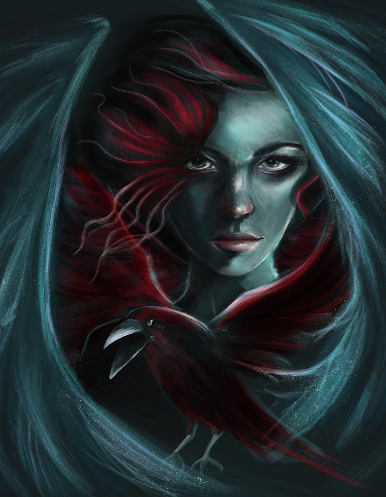
Cherry: That's coming along nicely with the extra narrative details and having the face peep through the dark wings is really moody and matches the expression. A little touch of warmth on the nose will look good when you start to smooth out the skin.
Hansnomad: That's a very well structured drawing. You've defined all those tricky planes of the anatomy and it looks like a really solid three dimensional body. Looking forward to more!
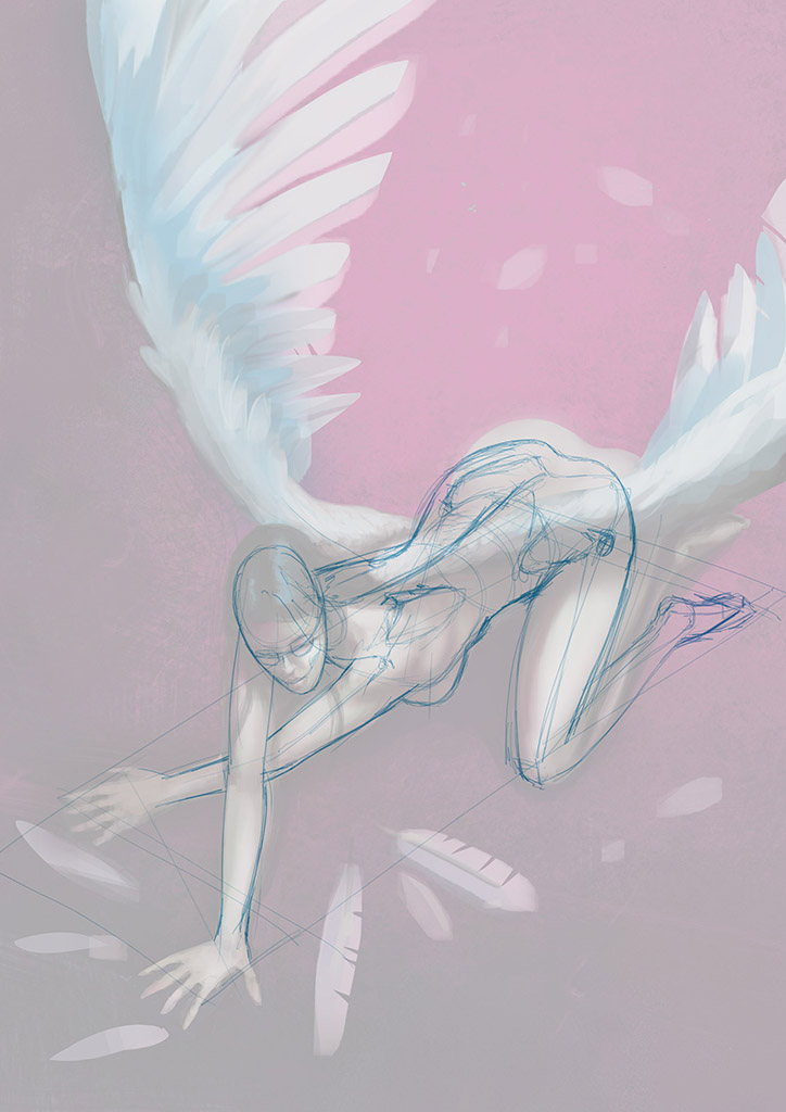
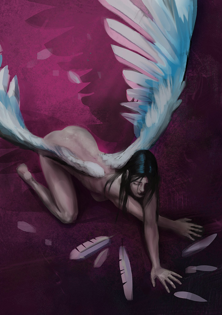
Tyl: I love the pose in this, especially how the line of the wings is extended down through the arms ending in that cross that adds a bit of tension. At one point I wasn't sure if the torso was a touch too long but I think it'll work and that length does help emphasize the implied curve of the spine.
But that purple/cyan colour combo is a visual treat for the eyes!
Cherry: That's coming along nicely with the extra narrative details and having the face peep through the dark wings is really moody and matches the expression. A little touch of warmth on the nose will look good when you start to smooth out the skin.
Hansnomad: That's a very well structured drawing. You've defined all those tricky planes of the anatomy and it looks like a really solid three dimensional body. Looking forward to more!
Tyl: I love the pose in this, especially how the line of the wings is extended down through the arms ending in that cross that adds a bit of tension. At one point I wasn't sure if the torso was a touch too long but I think it'll work and that length does help emphasize the implied curve of the spine.
But that purple/cyan colour combo is a visual treat for the eyes!
Please Log in or Create an account to join the conversation.
- CherryGraphics
-

- Offline
- Junior Member
-

Less
More
- Posts: 366
- Thank you received: 33
20 May 2016 13:13 #13784
by CherryGraphics
Replied by CherryGraphics on topic CGAN May 2016 "Fallen" - WIPs
Hi Jessie!  Nice to see you again here!
And thanks a lot Val and Jessie I polished my painting a bit - but I want this to have a painterly style so I guess this is the right amount.
Played with blues and reds and some heaven-reminded stars and cropped it a bit.
Nice to see you again here!And thanks a lot Val and Jessie
I polished my painting a bit - but I want this to have a painterly style so I guess this is the right amount.Played with blues and reds and some heaven-reminded stars and cropped it a bit.
Please Log in or Create an account to join the conversation.
20 May 2016 14:15 #13785
by Tyl
Replied by Tyl on topic CGAN May 2016 "Fallen" - WIPs
Valence: You’re right about the anatomy, it's off. When it feels wrong it probably is. Tweaking and deforming doesn't work. There is no quick fix. I flipped the image to have a fresh view and drawn a skeleton as a guide. Now I see clearly what needs to be changed.
Cherry: Great improvements.
Cherry: Great improvements.
Please Log in or Create an account to join the conversation.
20 May 2016 20:03 #13786
by Valence
Replied by Valence on topic CGAN May 2016 "Fallen" - WIPs
Tyl: That line drawing does look better. Just a bit of cut and paste on that rear end should do the trick. I always prefer a quick transform to a repaint! 
Cherry: Nice use of red on the birds wings. It's a good choice to go against the blue/green surroundings and the whole picture is an interesting contrast to your usual brighter style of painting. Keep exploring that dark side!
Cherry: Nice use of red on the birds wings. It's a good choice to go against the blue/green surroundings and the whole picture is an interesting contrast to your usual brighter style of painting. Keep exploring that dark side!
Please Log in or Create an account to join the conversation.
- microscopi
-

- Offline
- Premium Member
-

Less
More
- Posts: 743
- Thank you received: 79
22 May 2016 07:25 - 22 May 2016 09:09 #13790
by microscopi
Replied by microscopi on topic CGAN May 2016 "Fallen" - WIPs
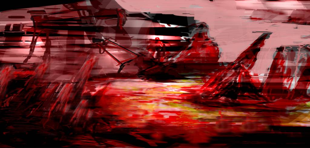
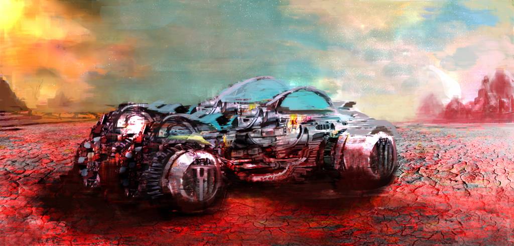
I wasn't going to join in this month, but I got to sketchin today and came up with this, seemed like a bit of order from chaos, fallen spaceship, stranded on a desolate class 'F' planet
I think i always struggle with the placement of environment objects and getting stuck with the jagged rocks already, I also used the metallic texture from robocop and spread it out over the vehicle so it might look familiar!
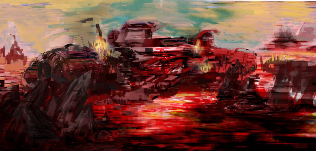
I think i always struggle with the placement of environment objects and getting stuck with the jagged rocks already, I also used the metallic texture from robocop and spread it out over the vehicle so it might look familiar!
Last edit: 22 May 2016 09:09 by microscopi.
Please Log in or Create an account to join the conversation.
22 May 2016 12:02 #13792
by Valence
Replied by Valence on topic CGAN May 2016 "Fallen" - WIPs
That's a nice variation on the theme, micro. And those vivid reds look great, giving the impression of a very harsh atmosphere.
Hope you get time to develop and finish.
Hope you get time to develop and finish.
Please Log in or Create an account to join the conversation.
- SchizophreniaWolf
-
- Offline
- Junior Member
-
Less
More
- Posts: 170
- Thank you received: 10
23 May 2016 23:31 #13798
by SchizophreniaWolf
Replied by SchizophreniaWolf on topic CGAN May 2016 "Fallen" - WIPs
Please Log in or Create an account to join the conversation.

24 May 2016 15:02 #13802
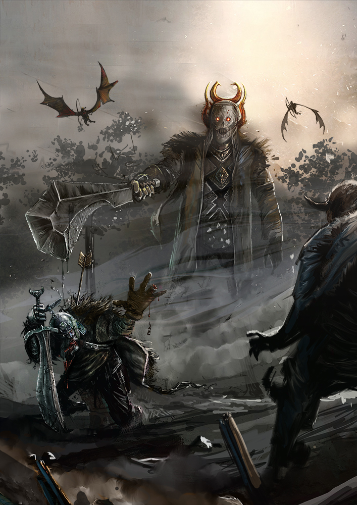
by Atto
No smudge tool was harmed in the making of this image.
Replied by Atto on topic CGAN May 2016 "Fallen" - WIPs
Cherry: The red addition is really nice - helps push those blacks back and the cyan to the fore.
Tyl: Much better now on that anatomy - she also occupies 'space' a lot more realistically too. I wish I could construct figures this accurately in 3D space.
Micro: I was thinking of something similar to yours but chickened out due to the technical implications of it. Go for it dude! A very atmospheric start.
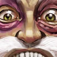
Schizo: I'm not going to even bother, it's just awesome.
A little bit more from me - the show season has now begun in earnest and we're launching our new summer lines on the website so I'm getting less and less time to concentrate on this now - I'm determined to get something up this month though.
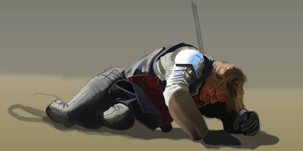
Tyl: Much better now on that anatomy - she also occupies 'space' a lot more realistically too. I wish I could construct figures this accurately in 3D space.
Micro: I was thinking of something similar to yours but chickened out due to the technical implications of it. Go for it dude! A very atmospheric start.
Schizo: I'm not going to even bother, it's just awesome.
A little bit more from me - the show season has now begun in earnest and we're launching our new summer lines on the website so I'm getting less and less time to concentrate on this now - I'm determined to get something up this month though.
No smudge tool was harmed in the making of this image.
Please Log in or Create an account to join the conversation.
25 May 2016 11:26 #13803
by Tyl
Replied by Tyl on topic CGAN May 2016 "Fallen" - WIPs
Atto: The rendering looks great. The metal really drags the attention to the right spot.
The following user(s) said Thank You: Atto
Please Log in or Create an account to join the conversation.
- microscopi
-
- Offline
- Premium Member
-
Less
More
- Posts: 743
- Thank you received: 79
26 May 2016 22:40 - 26 May 2016 22:50 #13807
by microscopi
Replied by microscopi on topic CGAN May 2016 "Fallen" - WIPs
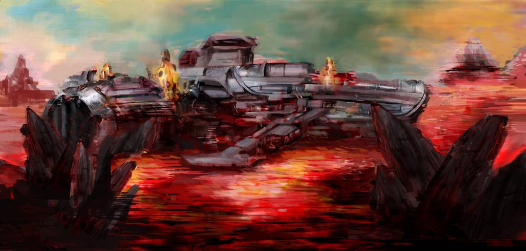
Everybody's update is looking great so far!  Im just going to focus on detail to make everything solid then i'm done!
 ")
Atto really spot on with the character pose and anatomy. The clothing looks great, and I agree about the highlight on his shoulder, the realism really draws your eye to his expression of torture.
Wolf, the detail you have in yours this month is awesome, you can be awesome with lighter subjects too!
Cherry, she looks so realistic with her expression, you really nailed it, almost like she is someone I know in life The colors go really well with the mood, cooler tones make it seem darker more somber.
Tyl, I really like the purple hue on your pic and the overall pose you chose for the anatomy, very difficult with the arms outstretched like that and her arched back. I almost think she would look cooler with the skeleton under painting!
Im just going to focus on detail to make everything solid then i'm done! Atto really spot on with the character pose and anatomy. The clothing looks great, and I agree about the highlight on his shoulder, the realism really draws your eye to his expression of torture.
Wolf, the detail you have in yours this month is awesome, you can be awesome with lighter subjects too!
Cherry, she looks so realistic with her expression, you really nailed it, almost like she is someone I know in life
The colors go really well with the mood, cooler tones make it seem darker more somber.Tyl, I really like the purple hue on your pic and the overall pose you chose for the anatomy, very difficult with the arms outstretched like that and her arched back. I almost think she would look cooler with the skeleton under painting!
Last edit: 26 May 2016 22:50 by microscopi.
Please Log in or Create an account to join the conversation.
Latest Activity

Banj updated their profile picture


Charlotte Still wearing a mask? Is it so we won't see you hoarding food in those cheeks of yours?
See More
Banj Mfmuh Guhmfpf
See More
Charlotte I'll take that as a yes...
See More
Charlotte Why is there a tiny flashing thing in front of the reply link/button? It's so small I can't see if it's an exclamation mark or a question mark... or...both?)
See More
Banj Because? Both!
See More
Charlotte *gasp*
See More

CaptainDeth updated their profile picture

CaptainDeth Ahoy folks, just a newbie here, just getting started. Thanks for allowing me in.
CaptainDeth Thank You
CaptainDeth and Mr.Bungle joined the site


honbasic joined the site


Gawk joined the site