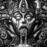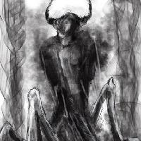
oops 


I think they're moving in a circle... possibly around an easy prey of some sort, like a hamster... 

The shoutbox is unavailable to non-members
Shoutbox History

oops 


I think they're moving in a circle... possibly around an easy prey of some sort, like a hamster... 

CGAN May 2016 "Fallen" - WIPs
Please Log in or Create an account to join the conversation.
- microscopi
-
- Offline
- Premium Member
-

- Posts: 743
- Thank you received: 79
Just adding more detail to mine, its going to be more like a flying car type ship, I guess..
Please Log in or Create an account to join the conversation.
I wasted a day or two last week trying to do a fallen dragon. But I really can't draw dragons so it quietly went away.
So I tried a different kind of sketch yesterday. Seeing as everyone else's pics are dark and moody I thought I'd go the opposite way and do a kind of so-cute-it's-creepy children's illustration of a big eyed girl catching a fallen star, watched by a mildly surprised owl, along with a couple of other predictable tropes.
I'll try to put in some extra work over the weekend to see if I can finish in time.
Micro: Great texture in that. Just needs a bit more light and shade to develop the form a little more clearly.
Hansnomad: The sketch looks really good with all that extra detail. Can't wait for colour!
Please Log in or Create an account to join the conversation.
- microscopi
-

- Offline
- Premium Member
-

- Posts: 743
- Thank you received: 79
I admit have to clean up the messy lines so my shapes make more sense, I seem to get stuck trying to pick the perfect direction to go in, like there's a real solution as if it's a math problem, but I have to be confident on what I pick to look the best.
Please Log in or Create an account to join the conversation.
The owl's going well though.
Please Log in or Create an account to join the conversation.
- microscopi
-

- Offline
- Premium Member
-

- Posts: 743
- Thank you received: 79
I love Bobby Chiu's style, the evil grey care bear is pretty sadistic lol, it's about time someone did that, I was tortured by that show!
Although his style does have a 3D element to it, so maybe you can zbrush it up, or go for realistic lighting for the final, that could give it that 3D simulated look.!
Please Log in or Create an account to join the conversation.
Here's a couple of WIPs. This first one is me just throwing colors under the drawing (just a detail, not the whole piece). Couldn't decide the color of the sky, so it looks like mud on that first WIP.
The second it's much farther along and a closer detail on the back skin I'm trying to make realistic as well as the surgical scar of the removed wing. Had to look at references for that one (and that was quite unpleasant).
Please Log in or Create an account to join the conversation.
Here's a bit more of my terrifyingly twee little girl. *shudder*
A lot of this weekend work was done on my tablet so it looks a little too scribbly in a fat finger way. Hopefully I'll be able to sharpen and solidify the details and edges tomorrow on my PC.
In the end I want it to have the full "book cover" look with text ... if I can find the right font.
I wish I'd had more time to try out some different designs for faces, expressions and clothing but its my own fault for starting late so I'm stuck with what I've got.
Please Log in or Create an account to join the conversation.
- SchizophreniaWolf
-
- Offline
- Junior Member
-

- Posts: 170
- Thank you received: 10
hihi Valence, that cute! I like it.
hey hansnomad, good to have you back!
so I finished this time! and the crowd goes wild!!!
Please Log in or Create an account to join the conversation.
Valence: Great color work--and the look on her face is both cute and unsettling (that's hard to pull off). She reminds me of the little racer girl in Wreck-it-Ralph.
Tyl: I like everything about yours at this point. Leave it alone!
Atto: Yours is probably the most dramatic entry. You can actually feel the figure struggling and in pain (great face). Hold on to those limited colors--they are working well for you.
Cherry: Very haunting portrait. Is there any significance to the crow? I like adding crows to some of my pieces, just because they add an air of mystery, and they're just cool-looking birds.
Below is another WIP detail. My original scar (as much as I liked it), was getting lost in the painting. I opted for a slightly more gruesome look, like the wings were burned or ripped off. It reads better when you see the whole thing. Almost done.
Also, in case you find it useful, I've been using some of the Photoshop brushes from this site (pixelstains.net/category/downloads/). It has one of the most useful collection of textured brushes anywhere.
Please Log in or Create an account to join the conversation.
Latest Activity
