

 And anyway

 You can practically go outside and make snowmen

- Posts: 11990
- Thank you received: 514
June challenge here: The Leprechaun
May entries - Submarine
The shoutbox is unavailable to non-members
Shoutbox History
CGMythology's Sketchbook (nudity)
07 May 2025 13:45 #54621
by Valence
Replied by Valence on topic CGMythology's Sketchbook (nudity)
I kinda like D and F as the brighter backgrounds seem to create a stronger silhouette but I'm sure you can make your favourite work as well. ")
Take care with the shading that you develop in the face cos at the moment there doesn't seem to be a lot of structure to the head. It currently looks like the individual features are just pasted on a flat shape and that can be a struggle to work with later on so get those facial planes defined as soon as you can.
Take care with the shading that you develop in the face cos at the moment there doesn't seem to be a lot of structure to the head. It currently looks like the individual features are just pasted on a flat shape and that can be a struggle to work with later on so get those facial planes defined as soon as you can.
The following user(s) said Thank You: cgmythology
Please Log in or Create an account to join the conversation.

07 May 2025 15:27 #54622
by Charlotte
Any an all misspellings are henceforth blamed on the cats.
Replied by Charlotte on topic CGMythology's Sketchbook (nudity)
Well, I like blue-green and that's basically all of them but C and yet, C could make a nice goldfish type mermaid, so... I am unhelpful and vote for all of them
Any an all misspellings are henceforth blamed on the cats.
The following user(s) said Thank You: cgmythology
Please Log in or Create an account to join the conversation.
- cgmythology
-
 Topic Author
- Offline
- Premium Member
-

19 May 2025 13:28 #54727
by cgmythology
Replied by cgmythology on topic CGMythology's Sketchbook (nudity)
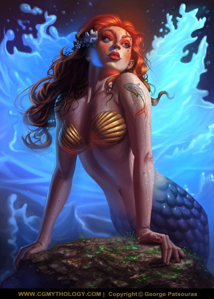
Valence: Great suggestions, I think the values work better with the ones you suggested. I decided to go with 'B' but I adjusted the colors so much during the painting process that it evolved to something else entirely (for the better I hope!). Great point regarding the face, hopefully it reads better now that it's fully shaded, please let me know!
Charlotte: Oh nice, like the idea of a gold fish type mermaid. Might do that for my next Mermay challenge, although a bit more creature like as I feel that would be more creative. Thanks for your input!
.................................
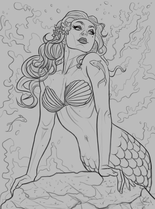
Went ahead and finished up the painting process. The waves gave me a bit of trouble, I wasn't handling them correctly initially but I'm happy with how they turned out now. The image is pretty much done but I'm open to tweaking it and doing some light adjustments if something feels off, so please let me know! Below is the current progress followed by the steps for those interested:
Charlotte: Oh nice, like the idea of a gold fish type mermaid. Might do that for my next Mermay challenge, although a bit more creature like as I feel that would be more creative. Thanks for your input!
.................................
Went ahead and finished up the painting process. The waves gave me a bit of trouble, I wasn't handling them correctly initially but I'm happy with how they turned out now. The image is pretty much done but I'm open to tweaking it and doing some light adjustments if something feels off, so please let me know! Below is the current progress followed by the steps for those interested:
Please Log in or Create an account to join the conversation.
19 May 2025 13:54 #54730
by Charlotte
Any an all misspellings are henceforth blamed on the cats.
Replied by Charlotte on topic CGMythology's Sketchbook (nudity)
Looking lovely, though I think the light/shade makes her chin look very small (not sure if it is a bit small or just looks it) and I think her nose is facing a slightly different way than the rest of her face? 🧜♀️
Any an all misspellings are henceforth blamed on the cats.
The following user(s) said Thank You: cgmythology
Please Log in or Create an account to join the conversation.
- cgmythology
-
Topic Author
- Offline
- Premium Member
-
22 May 2025 18:02 - 22 May 2025 18:03 #54761
by cgmythology
Replied by cgmythology on topic CGMythology's Sketchbook (nudity)
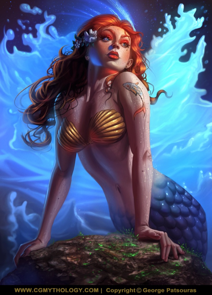
Charlotte: Great input! I agree about the chin so I reworked it, hopefully it looks more natural now!
....................
Went ahead and updated the mermaid, did some minor refinements to her face and added some shooting stars in the background for a more fantastical feel. I feel it works quite well. I think I'll call it done now unless there is something major off, so do let me know if that's the case! Here is the current image:
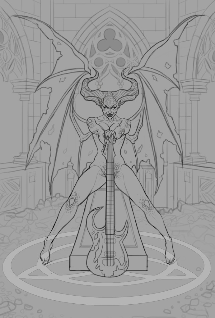
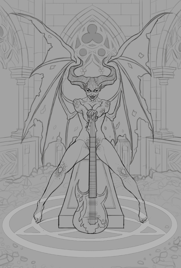
Next up a new illustration, began on the sketch quite some time ago but just finished it today. The character design was inspired by the 'Diablo' game that came out recently (have yet to play it but I love the artwork for it!). I had a reference for the general pose which I did my best to recreate for the figure, you can view that here . I have a strong idea for the colors as well, but I just wanted to drop the sketch here before I begin the painting process for any feedback, so please feel free to let me know any input! Below is the sketch:
....................
Went ahead and updated the mermaid, did some minor refinements to her face and added some shooting stars in the background for a more fantastical feel. I feel it works quite well. I think I'll call it done now unless there is something major off, so do let me know if that's the case! Here is the current image:
Next up a new illustration, began on the sketch quite some time ago but just finished it today. The character design was inspired by the 'Diablo' game that came out recently (have yet to play it but I love the artwork for it!). I had a reference for the general pose which I did my best to recreate for the figure, you can view that here . I have a strong idea for the colors as well, but I just wanted to drop the sketch here before I begin the painting process for any feedback, so please feel free to let me know any input! Below is the sketch:
Last edit: 22 May 2025 18:03 by cgmythology.
Please Log in or Create an account to join the conversation.
- cgmythology
-
Topic Author
- Offline
- Premium Member
-
11 Jun 2025 16:41 #55004
by cgmythology
Replied by cgmythology on topic CGMythology's Sketchbook (nudity)
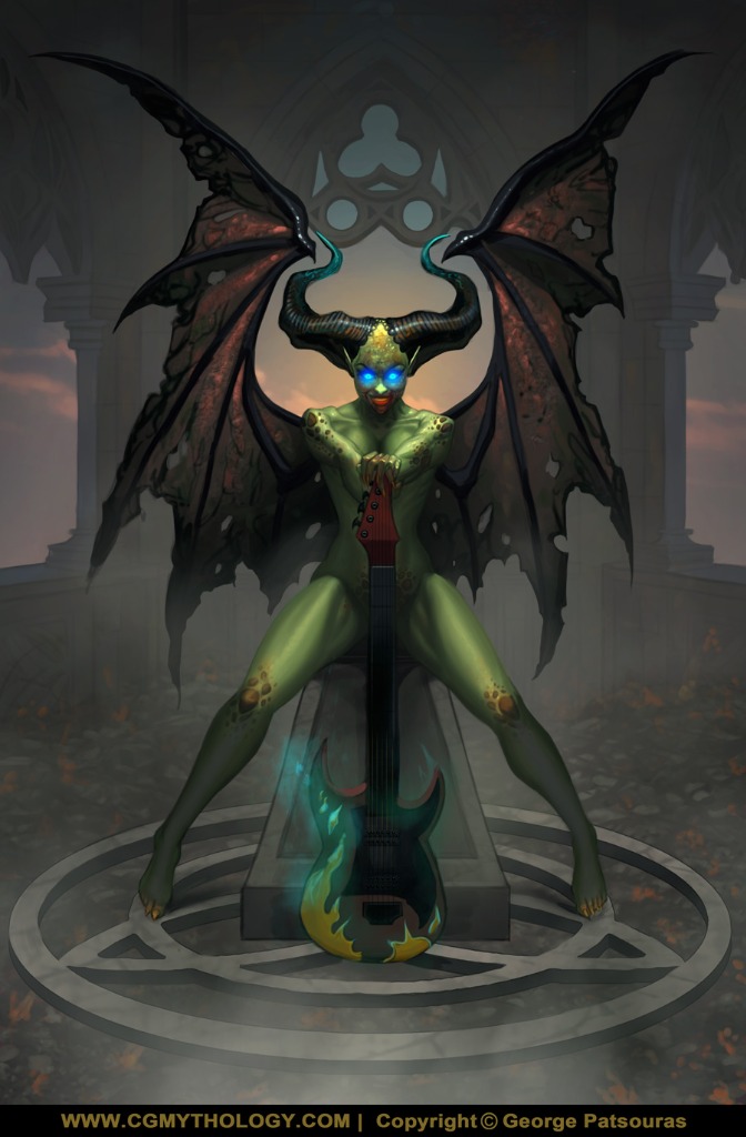
Went ahead and painted the image in. The values in the background gave me a bit of trouble, but ultimately I decided to use a neutral gray color mostly for it to help the figure pop even if it cost me a bit of detail work. Pretty satisfied with the image overall. I'm open to tweaking the image a bit further if needed if something feels off, so please feel free to let me know your feedback! Below is the current progress followed by the steps for those interested:
Please Log in or Create an account to join the conversation.
11 Jun 2025 18:01 #55008
by Charlotte
Any an all misspellings are henceforth blamed on the cats.
Replied by Charlotte on topic CGMythology's Sketchbook (nudity)
I really like how you did the background - it really does make the character pop and the wings look great (both by themselves and against the muted background).
I do have a couple of issues - one I should probably have mentioned earlier. I think her boobs are a bit high. She'd have to make a real effort to lift them like that only with her upper arms... But, more importantly, I'm not sure I care for how the face turned out. The circles of blue light can basically be read as big blue eye globes. Together with the lit up nose and what seems to be a glowing red mouth, I think it ends up looking a bit like a clown face. And I am assuming that's not intentional... Otherwise looking great, though 
I do have a couple of issues - one I should probably have mentioned earlier. I think her boobs are a bit high. She'd have to make a real effort to lift them like that only with her upper arms... But, more importantly, I'm not sure I care for how the face turned out. The circles of blue light can basically be read as big blue eye globes. Together with the lit up nose and what seems to be a glowing red mouth, I think it ends up looking a bit like a clown face. And I am assuming that's not intentional... Otherwise looking great, though
Any an all misspellings are henceforth blamed on the cats.
The following user(s) said Thank You: cgmythology
Please Log in or Create an account to join the conversation.
- cgmythology
-
Topic Author
- Offline
- Premium Member
-
12 Jun 2025 17:02 #55029
by cgmythology
Replied by cgmythology on topic CGMythology's Sketchbook (nudity)
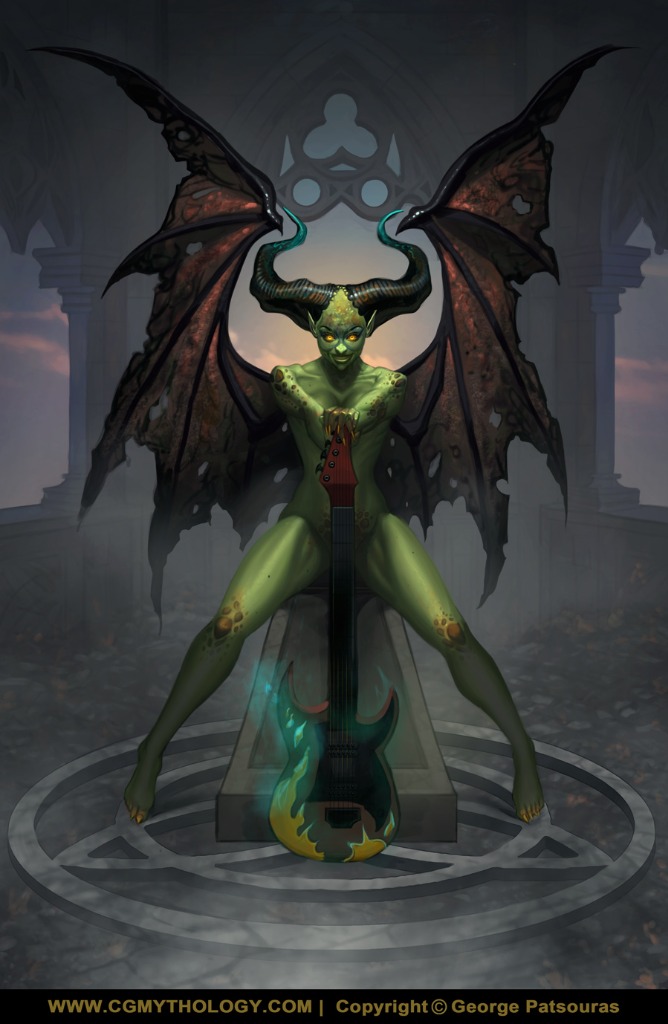
Charlotte: Excellent input! Agree about everything you said, especially the 'joker' face. I was obsessed with making it pop out so I think it was over stylized, so I just went with a much more natural look now which I feel works better!
.............
Here's another update, I think I'm calling it final unless there's something majorly off, so please let me know if that's the case!
.............
Here's another update, I think I'm calling it final unless there's something majorly off, so please let me know if that's the case!
Please Log in or Create an account to join the conversation.
12 Jun 2025 17:37 - 12 Jun 2025 17:37 #55030
by Charlotte
Any an all misspellings are henceforth blamed on the cats.
Replied by Charlotte on topic CGMythology's Sketchbook (nudity)
It works much better now, though I'm still a little bothered... I couldn't put my finger on it, except the nose seemed a bit too bright still, so I fiddled a bit in artRage and ... Well, I added (darker) pupils and highlights in the eyes (although if they glow I understand why they look like they do), darkened and shortened the nose slightly and also reduced the lower lip - I think maybe we see a tad bit much of it given the angle of her head.
But it's your piece, you be the judge of which version you prefer and if you're finished or not
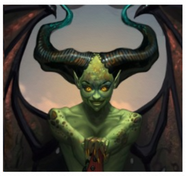
Edit: I think I darkened the corners of her mouth and teeth as well...
But it's your piece, you be the judge of which version you prefer and if you're finished or not
Edit: I think I darkened the corners of her mouth and teeth as well...
Any an all misspellings are henceforth blamed on the cats.
Last edit: 12 Jun 2025 17:37 by Charlotte.
The following user(s) said Thank You: cgmythology
Please Log in or Create an account to join the conversation.

12 Jun 2025 17:52 #55031
by Banj
Replied by Banj on topic CGMythology's Sketchbook (nudity)
If the head is lit from above like that you would usually get some light hitting the sides of the nose as well as the top as seen in my quick mock up here...
The following user(s) said Thank You: cgmythology
Please Log in or Create an account to join the conversation.
Facebook Feed
Member Statistics
- Total Users: 226
- Latest User: norajohnson
- Online Users: 0
- Users Today: 0
- Users this Week: 0
- Users this Month: 0
- Users this Year: 0
NOTE! This site uses cookies and similar technologies.
By using this website you agree to the use of cookies and related data storage as detailed in our privacy policy. Learn more
I understand
Site design Mad Hamster Studios. All content is protected under © and the property of the various contributers and not to be reproduced without permission of the creator.