
 I'm not here either. It's a weeknight so I am obviously asleep.

 It's Monday


- Posts: 43
- Thank you received: 4


The shoutbox is unavailable to non-members
Important, change your password!
Go here for further information: https://cgartnexus.com/index.php/forum/announcements/840-hacked
CGAN - June 2015 - IT Movie Poster - Pennywise remake - WIPS
- ArtbyAlReid
-

- Offline
- New Member
-

Less
More
24 Jun 2015 19:09 #11479
by ArtbyAlReid
Replied by ArtbyAlReid on topic CGAN - June 2015 - IT Movie Poster - Pennywise remake - WIPS
Ello troops!
This challenge is right up my dark alley! Glad I popped by for a look.
Quick sketch based on photographic reference by Colin Stebbing / bgphotographer.co.uk/
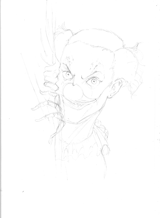
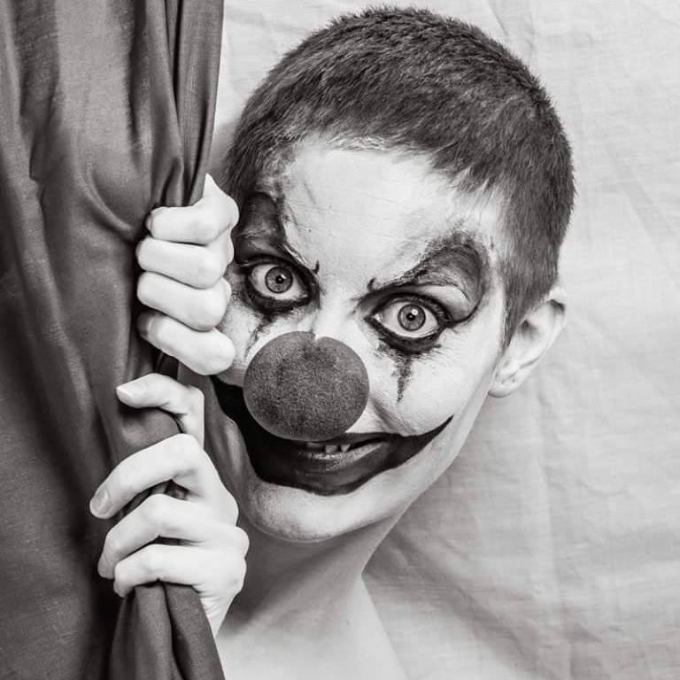
This challenge is right up my dark alley! Glad I popped by for a look.
Quick sketch based on photographic reference by Colin Stebbing / bgphotographer.co.uk/
Please Log in or Create an account to join the conversation.


24 Jun 2015 19:42 - 24 Jun 2015 19:43 #11480
by Valence
Replied by Valence on topic CGAN - June 2015 - IT Movie Poster - Pennywise remake - WIPS
Cherry: The cracked face looks much better now. And I notice a better ear too. Well done.
Banj: The texture of the kerb looks very authentic in the way it catches the light. And I have no idea how you would even start to model an origami paper boat yet even without the newspaper texture it looks correct.
Haywire: Excellent first sketch. And is that gonna be a creepy spider hand? (shudder) I don't want to know!
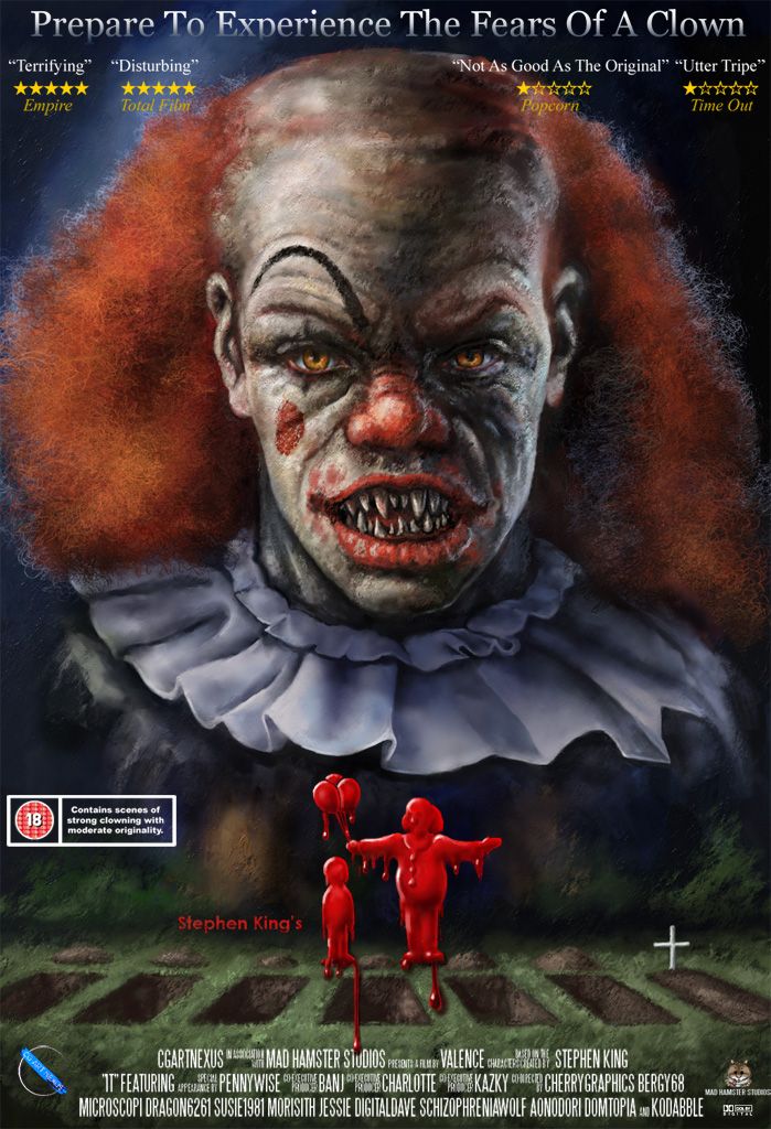
I'm almost finished with mine. I just have some final decisions about how bright to make the dripping blood logo and how much of the text to leave in. (I think I overdosed on text but it was great fun!) I've tried to cram everyone on this thread into the credits so sorry if I've left anyone out (ie latecomers like Haywire. Oops.) There's only a finite amount of space there and it's not as if you're all getting royalties of anything. 5% of nothing is still nothing.
Banj: The texture of the kerb looks very authentic in the way it catches the light. And I have no idea how you would even start to model an origami paper boat yet even without the newspaper texture it looks correct.
Haywire: Excellent first sketch. And is that gonna be a creepy spider hand? (shudder) I don't want to know!
I'm almost finished with mine. I just have some final decisions about how bright to make the dripping blood logo and how much of the text to leave in. (I think I overdosed on text but it was great fun!) I've tried to cram everyone on this thread into the credits so sorry if I've left anyone out (ie latecomers like Haywire. Oops.) There's only a finite amount of space there and it's not as if you're all getting royalties of anything.
5% of nothing is still nothing.
Last edit: 24 Jun 2015 19:43 by Valence.
Please Log in or Create an account to join the conversation.
- microscopi
-

- Offline
- Premium Member
-

Less
More
- Posts: 743
- Thank you received: 79
24 Jun 2015 22:39 #11484
by microscopi
Replied by microscopi on topic CGAN - June 2015 - IT Movie Poster - Pennywise remake - WIPS
Looking great Haywire, I can see you doing all kinds of things with this design.
Val tthe text on top of your clowns forehead would look better a little further down and in the middle spaced out, dont be afraid to cover his forehead, it will give off the poster look more. I think all the little additions are a nice touch though The top text should be moved down to the bottom of the poster and just have the reviews there, and also should be in block letters and less brightness, just my ideas, it's looking almost done now! Last suggestion about the text, the warning label stands out too much atm, along with the brightness of the letters, I think would look great rusty and bleeding with some scratches or something to match rest of the clowns texture. Just an idea
The boat looks great, I'd do it with some beveled boxes and add some inside but it actually looks like folded peices of paper which is pretty cool.
Val tthe text on top of your clowns forehead would look better a little further down and in the middle spaced out, dont be afraid to cover his forehead, it will give off the poster look more. I think all the little additions are a nice touch though
The top text should be moved down to the bottom of the poster and just have the reviews there, and also should be in block letters and less brightness, just my ideas, it's looking almost done now! Last suggestion about the text, the warning label stands out too much atm, along with the brightness of the letters, I think would look great rusty and bleeding with some scratches or something to match rest of the clowns texture. Just an ideaThe boat looks great, I'd do it with some beveled boxes and add some inside but it actually looks like folded peices of paper which is pretty cool.
The following user(s) said Thank You: Valence
Please Log in or Create an account to join the conversation.
25 Jun 2015 00:34 #11486
by Valence
Replied by Valence on topic CGAN - June 2015 - IT Movie Poster - Pennywise remake - WIPS
Thanks micro, you made some good observations there.
I can now see that the 18 certificate box is fighting against the cross on the opposite side. The box is usually black on a white background and inverting it has made it too prominent. I think a thinner line may work.
And yes I was very afraid of covering the forehead! If I can overcome that fear then swapping the positions of the tagline and reviews (and spacing them out evenly) could be a better option.
I can now see that the 18 certificate box is fighting against the cross on the opposite side. The box is usually black on a white background and inverting it has made it too prominent. I think a thinner line may work.
And yes I was very afraid of covering the forehead!
If I can overcome that fear then swapping the positions of the tagline and reviews (and spacing them out evenly) could be a better option. Please Log in or Create an account to join the conversation.
- SchizophreniaWolf
-
- Offline
- Junior Member
-

Less
More
- Posts: 170
- Thank you received: 10
25 Jun 2015 06:28 #11488
by SchizophreniaWolf
Replied by SchizophreniaWolf on topic CGAN - June 2015 - IT Movie Poster - Pennywise remake - WIPS
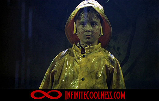
Valence!: That's great ha! I'm in your movie, can I play Georgie?
Please Log in or Create an account to join the conversation.


25 Jun 2015 08:06 #11489
by kazky
Replied by kazky on topic CGAN - June 2015 - IT Movie Poster - Pennywise remake - WIPS
wow Valence, that looks very impressive, it really came together great! and love the credits, thank you
Al, finally you joined us!! welcome home
Schizo, you've seen the movie right??
Al, finally you joined us!!
welcome homeSchizo, you've seen the movie right??
Please Log in or Create an account to join the conversation.
- CherryGraphics
-

- Offline
- Junior Member
-
Less
More
- Posts: 366
- Thank you received: 33
25 Jun 2015 09:26 - 25 Jun 2015 09:38 #11491
by CherryGraphics
Replied by CherryGraphics on topic CGAN - June 2015 - IT Movie Poster - Pennywise remake - WIPS
wonderful sketch Hay! btw ... the picture looks scary enough so I'm really curious how your clown will turn out
Val this looks like a real poster now just one thought: as micro said, use just block letters and maybe use another font for the sentence if you'll keep it.
I also changed the font a bit and gave credit to the children.
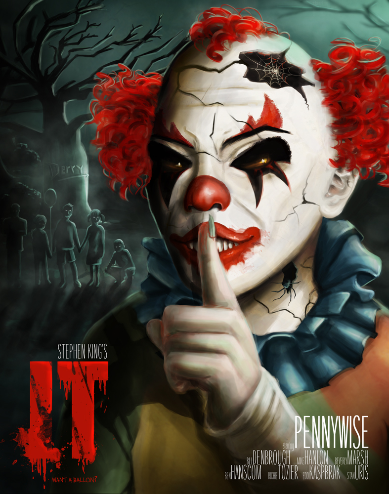
Val this looks like a real poster now
just one thought: as micro said, use just block letters and maybe use another font for the sentence if you'll keep it.I also changed the font a bit and gave credit to the children.
Last edit: 25 Jun 2015 09:38 by CherryGraphics.
Please Log in or Create an account to join the conversation.
25 Jun 2015 11:20 #11493
by kazky
Replied by kazky on topic CGAN - June 2015 - IT Movie Poster - Pennywise remake - WIPS
brilliant Cherry! again it came together fantastically! i love the 'IT' and the credits, just brilliant
Please Log in or Create an account to join the conversation.
25 Jun 2015 13:32 #11494
by Valence
Replied by Valence on topic CGAN - June 2015 - IT Movie Poster - Pennywise remake - WIPS
I can be such an idiot sometimes! I've just had to Google to work out what "block lettering" means! D'oh. <headslap> (Clearly I haven't filled out enough forms in my life.)
But now I understand: Capital letters for the tagline. Gotcha.
Cherry: Looks nice with credits. Really well balanced as a whole.
Schizo: You want to be Georgie?! You just love gruesome deaths, don't you? Well it's better than being that writer with the stylish clip-on ponytail.
But now I understand: Capital letters for the tagline. Gotcha.
Cherry: Looks nice with credits. Really well balanced as a whole.
Schizo: You want to be Georgie?! You just love gruesome deaths, don't you?
Well it's better than being that writer with the stylish clip-on ponytail. Please Log in or Create an account to join the conversation.
25 Jun 2015 13:49 #11495
by kazky
yep i agree though
Replied by kazky on topic CGAN - June 2015 - IT Movie Poster - Pennywise remake - WIPS
John Boy, you're dissing John Boy?Valence wrote: Well it's better than being that writer with the stylish clip-on ponytail.
yep i agree though Please Log in or Create an account to join the conversation.
Facebook Feed
Member Statistics
- Total Users: 228
- Latest User: DanielWilson
- Online Users: 0
- Users Today: 0
- Users this Week: 0
- Users this Month: 2
- Users this Year: 2
NOTE! This site uses cookies and similar technologies.
By using this website you agree to the use of cookies and related data storage as detailed in our privacy policy. Learn more
I understand
Site design Mad Hamster Studios. All content is protected under © and the property of the various contributers and not to be reproduced without permission of the creator.