


- Posts: 24
- Thank you received: 0
 I didn't go to bed early, in fact I was probably up later than I normally am last night
seems everyone went to bed early yesterday... 
Almost 


Oh. I'd never heard of that until I read about his death yesterday...
The shoutbox is unavailable to non-members
Shoutbox History
I didn't go to bed early, in fact I was probably up later than I normally am last night
seems everyone went to bed early yesterday...
Almost
Oh. I'd never heard of that until I read about his death yesterday...
WIPs of Roz
28 Aug 2014 06:41 - 28 Aug 2014 06:43 #5657
by roz
WIPs of Roz was created by roz
There are a few WIPs that I'd like to share with you guys, hoping that you'll put some friendly pressure on me and I'll finally finish them 
The first one I did as a homework for an online art history class I took in February, I think. The goal was to create an artwork that utilized some of the themes in Velazquez' Las Meninas - mirror and reflection, seeing and being seen and so on. So I chose the first two together with somewhat of a try to place my character in the same era. I'm sure there are problems with her clothing history-wise but finding costumes from a certain century and certain country online proved to be quite difficult, as you get all kinds of stuff, mostly from other periods and places. Anyway, I ended up with this:
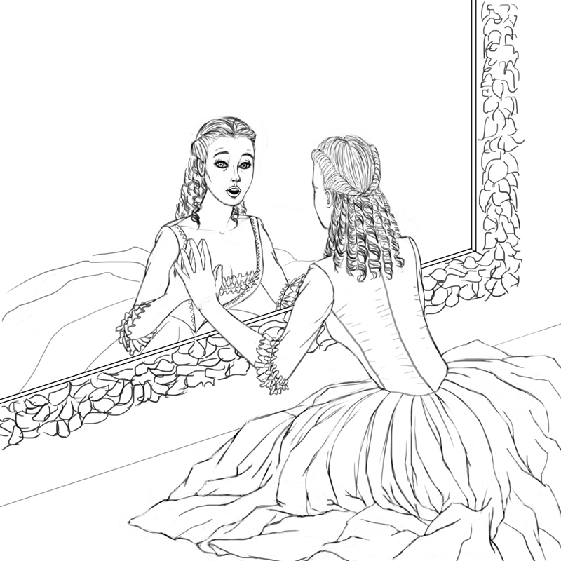
Don't ask me why it's square, I don't know. I intend to crop it so the lady's face ends up close to the top right corner and emphasize it as a focal point.
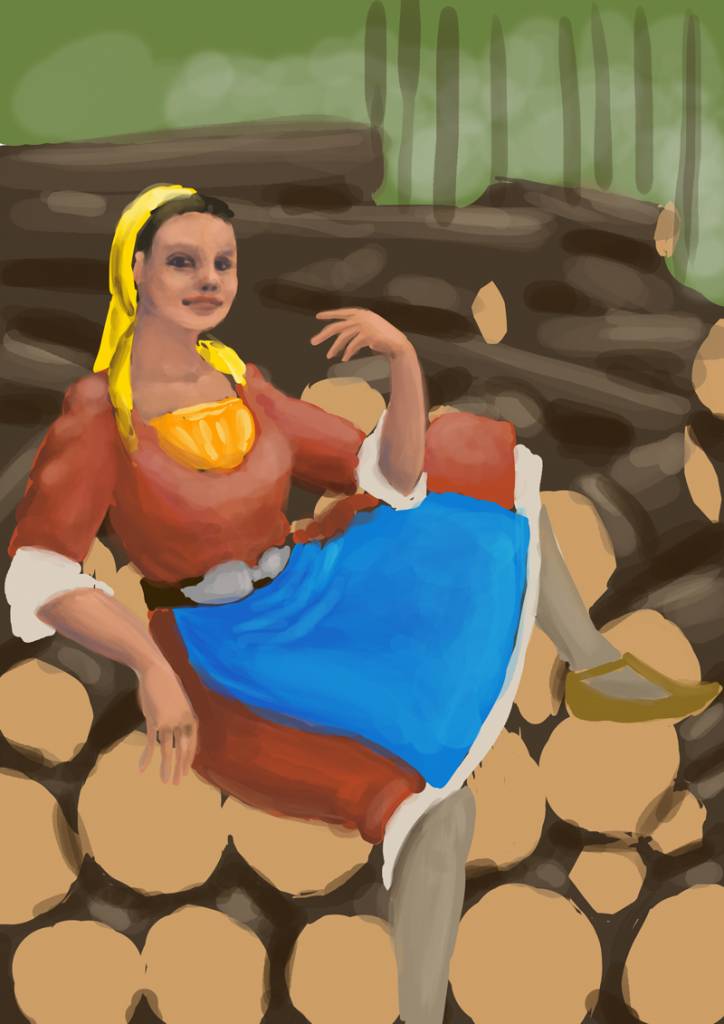
The next painting has a pretty big idea behind itself. You see, I'm from Bulgaria and I'm really interested in local folklore, especially as it seems to be kind of forgotten around here. I'm also interested in fantasy and back when the idea for this painting occurred to me I had been watching Avatar - the Last Airbender, so I got hooked up to bending in general. Additionally, I have that dream to one day be able to paint for Applibot. The combination of these three to me looks like this: fire, air, water and earth benders, women, dressed in Bulgarian national costumes (I don't intend to be precise here as we have LOTS of different national costumes in the different areas of the country, so it will be a mix of elements that I like), depicted in their calm and angry state. That would be a total of 8 paintings and I'm aiming for realism here.
The picture below has a working title Firewood Mischief. A small flame is going to come from the hand that's close to her face, and I intend to make her face clearly mischievous, as to imply "see that flame? see the firewood I'm sittin' on? you now what may happen next, don't ya?". I got stuck with it because I simply cant figure out how to paint her apron realistically - I have no idea how it will fold given her pose. What adds to this problem is that in national costumes the thickness and stiffness of fabric varies, at least from what I've seen so far. And I haven't figured out the fabric of the apron yet.
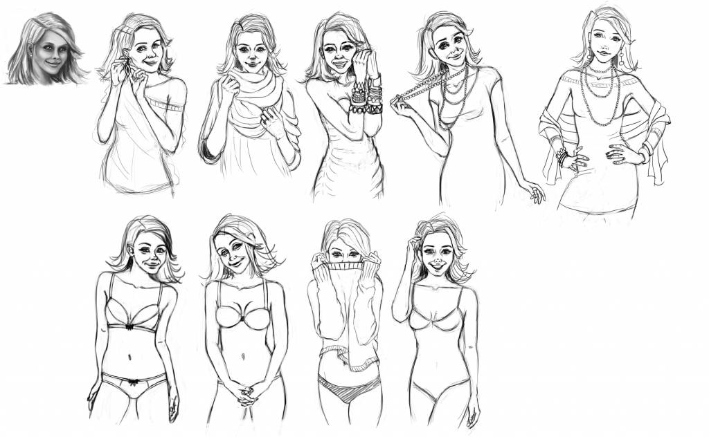
And the last project, the one that's actually a commission and I'm currently working on, involves the complete development of a character. Her name's Molly and she'll be the mascot of an online store. My client's already taken a look at the sketches, approved them (except for some of the facial expressions, which I'll be correcting as I go), so I'll be moving on to the painting stage. I aim for a sweet, innocent, semi-realistic style here, so she'll end up looking a bit like Barbie, but as long as my client likes her, I'm happy") Oh and her head is a bit bigger than what's considered proportionate but I did that intentionally, in order to emphasize on the sweetness of her face. That's the main deal here - sweetness and kindness.
Oh and her head is a bit bigger than what's considered proportionate but I did that intentionally, in order to emphasize on the sweetness of her face. That's the main deal here - sweetness and kindness.
I would love some input on those, especially the first two, as they're purely personal projects that I intend to add to my portfolio eventually, so they need to be absolutely awesome
Thank you for your time!
The first one I did as a homework for an online art history class I took in February, I think. The goal was to create an artwork that utilized some of the themes in Velazquez' Las Meninas - mirror and reflection, seeing and being seen and so on. So I chose the first two together with somewhat of a try to place my character in the same era. I'm sure there are problems with her clothing history-wise but finding costumes from a certain century and certain country online proved to be quite difficult, as you get all kinds of stuff, mostly from other periods and places. Anyway, I ended up with this:
Don't ask me why it's square, I don't know. I intend to crop it so the lady's face ends up close to the top right corner and emphasize it as a focal point.
The next painting has a pretty big idea behind itself. You see, I'm from Bulgaria and I'm really interested in local folklore, especially as it seems to be kind of forgotten around here. I'm also interested in fantasy and back when the idea for this painting occurred to me I had been watching Avatar - the Last Airbender, so I got hooked up to bending in general. Additionally, I have that dream to one day be able to paint for Applibot. The combination of these three to me looks like this: fire, air, water and earth benders, women, dressed in Bulgarian national costumes (I don't intend to be precise here as we have LOTS of different national costumes in the different areas of the country, so it will be a mix of elements that I like), depicted in their calm and angry state. That would be a total of 8 paintings and I'm aiming for realism here.
The picture below has a working title Firewood Mischief. A small flame is going to come from the hand that's close to her face, and I intend to make her face clearly mischievous, as to imply "see that flame? see the firewood I'm sittin' on? you now what may happen next, don't ya?". I got stuck with it because I simply cant figure out how to paint her apron realistically - I have no idea how it will fold given her pose. What adds to this problem is that in national costumes the thickness and stiffness of fabric varies, at least from what I've seen so far. And I haven't figured out the fabric of the apron yet.
And the last project, the one that's actually a commission and I'm currently working on, involves the complete development of a character. Her name's Molly and she'll be the mascot of an online store. My client's already taken a look at the sketches, approved them (except for some of the facial expressions, which I'll be correcting as I go), so I'll be moving on to the painting stage. I aim for a sweet, innocent, semi-realistic style here, so she'll end up looking a bit like Barbie, but as long as my client likes her, I'm happy
Oh and her head is a bit bigger than what's considered proportionate but I did that intentionally, in order to emphasize on the sweetness of her face. That's the main deal here - sweetness and kindness.I would love some input on those, especially the first two, as they're purely personal projects that I intend to add to my portfolio eventually, so they need to be absolutely awesome
Thank you for your time!
Last edit: 28 Aug 2014 06:43 by roz.
Please Log in or Create an account to join the conversation.
28 Aug 2014 15:28 - 28 Aug 2014 15:29 #5663
by roz
Replied by roz on topic WIPs of Roz
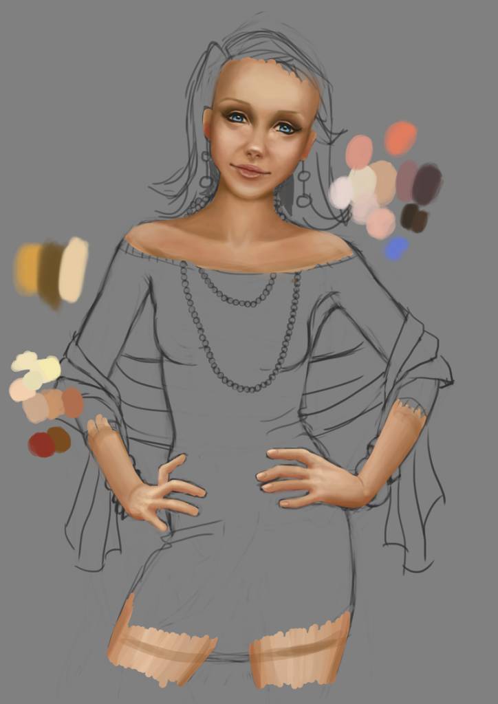
That's it. I'm calling it a day. After heavily struggling with her face, and after being able to paint it as I want and actually move forward, I am SO tired that I simply can't wrap myself around painting anymore today.
Last edit: 28 Aug 2014 15:29 by roz.
Please Log in or Create an account to join the conversation.

28 Aug 2014 22:50 #5669
by Domtopia
Everything's on the right!!!
It's like driving abroad!
Replied by Domtopia on topic WIPs of Roz
I like it Roz. The skin tones are nice and she has a lovely cheeky face!
I think that the skin could use a few more colours in it, to add realism and variety to it. Add some reds to her cheeks and nose, some blues/greys around her eye sockets and some yellows around her chin and forehead. Some blue around her neck and in her arms is usually quite effective too. Skin is complex stuff!
Keep it up!
Everything's on the right!!!
It's like driving abroad!
The following user(s) said Thank You: roz
Please Log in or Create an account to join the conversation.
29 Aug 2014 06:33 #5673
by roz
Replied by roz on topic WIPs of Roz
Thanks for the tips, Domtopia! As well as I know about the importance of adding different hues to the skin, yesterday I was SO consumed with getting her facial features right that I completely forgot about that! Great reminder and just in time!
On a side note, I sent this WIP to my client and she loves it. And I'm very happy about that as you can imagine!
On a side note, I sent this WIP to my client and she loves it. And I'm very happy about that as you can imagine!
Please Log in or Create an account to join the conversation.

29 Aug 2014 07:21 #5674
by Charlotte
Any an all misspellings are henceforth blamed on the cats.
Replied by Charlotte on topic WIPs of Roz
I agree with Dom that the skin looks great (but for a few more hues) and she looks cute. Personally I'd find it easier to add additional hues once I know the colours of the background and clothes though, since these will reflect a bit on the skin. But that's probably more relevant to her arms than her face, and regardless of surrounding colours the tips about slightly redder cheecks and nose (as well as other hues) are absolutely right!
Any an all misspellings are henceforth blamed on the cats.
Please Log in or Create an account to join the conversation.
- Digital Dave
-

- Offline
- Platinum Member
-

Less
More
- Posts: 2242
- Thank you received: 163
29 Aug 2014 11:32 #5677
by Digital Dave
I get sketchy around pencils! ...
Replied by Digital Dave on topic WIPs of Roz
Agree with those above on the color suggestions. Also, her left hand (our right) appears a little long and puffy from knuckles to wrist.
I get sketchy around pencils! ...
Please Log in or Create an account to join the conversation.
30 Aug 2014 23:26 #5750
by em...
Replied by em... on topic WIPs of Roz
Are you basing her appearance (albeit vaguely) on anyone, or a combination of people? Unless you have someone to model for you, It's probably the best way to try and ensure consistency across several illustrations.
I say that specifically in relation to the one you have done further work on, as it's the one (in the original sketches) that looks most different to the others - the eyes look proportionately smaller and further apart; and the nose significantly longer.
I say that specifically in relation to the one you have done further work on, as it's the one (in the original sketches) that looks most different to the others - the eyes look proportionately smaller and further apart; and the nose significantly longer.
Please Log in or Create an account to join the conversation.
06 Sep 2014 15:45 - 06 Sep 2014 16:33 #5966
by roz
Replied by roz on topic WIPs of Roz
Wow, I had no idea there were so many new replies!
Thank you for all the suggestions everyone.
@em, I'm painting her in a way that my client likes. She finds the character's face really important, so this first illustration will serve as my guideline later on, if my client approves everything. I'm well aware that all the faces are different. Making them look similar was a real pain in the a$$. So far my client has approved of her face, so I went on and finished the illustration.
Here's what I came up with. If there are any glaring issues with it, please tell me, so I could at least keep them in mind for the next illustrations (and correct this one, if possible). Other than that I don't intend on detailing the character any further as it will make it waaaaay more expensive than what I quoted. It actually already is, but oh well..
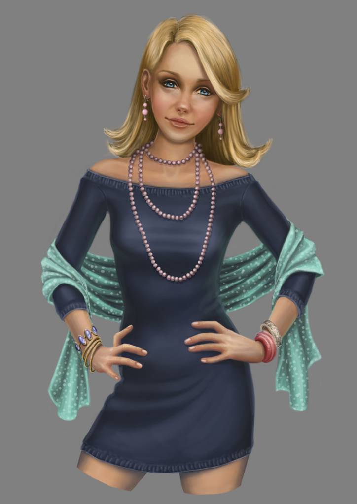
Cheers and have a wonderful weekend!
Thank you for all the suggestions everyone.
@em, I'm painting her in a way that my client likes. She finds the character's face really important, so this first illustration will serve as my guideline later on, if my client approves everything. I'm well aware that all the faces are different. Making them look similar was a real pain in the a$$. So far my client has approved of her face, so I went on and finished the illustration.
Here's what I came up with. If there are any glaring issues with it, please tell me, so I could at least keep them in mind for the next illustrations (and correct this one, if possible). Other than that I don't intend on detailing the character any further as it will make it waaaaay more expensive than what I quoted. It actually already is, but oh well..
Cheers and have a wonderful weekend!
Last edit: 06 Sep 2014 16:33 by roz.
Please Log in or Create an account to join the conversation.
06 Sep 2014 20:26 #5974
by Domtopia
Everything's on the right!!!
It's like driving abroad!
Replied by Domtopia on topic WIPs of Roz
Looks pretty good Roz.
Her right hand (our left) is troubling me though. Her index finger looks pretty badly broken! I think we should be able to see at least some knuckle there. Otherwise, I think it is fine. For me though, I might forego the the highlight on her belly, just to flatter the lady a bit. That's just a personal thing though.
Also, I would lower her right (our left) arm pit to try and match the thickness of the other one. It seems really wirey at the moment.
These are some observations. See what you think.
Everything's on the right!!!
It's like driving abroad!
The following user(s) said Thank You: roz
Please Log in or Create an account to join the conversation.
07 Sep 2014 08:20 #5978
by roz
Replied by roz on topic WIPs of Roz
Thanks for the critique, Domtopia!
Drawing and painting hands is such a huge challenge for me and I can see how far off I've gone from my initial reference. Probably that's why it looks so odd.
I decided to follow all the advice you gave me and I think it looks better now. What do you think?

Drawing and painting hands is such a huge challenge for me and I can see how far off I've gone from my initial reference. Probably that's why it looks so odd.
I decided to follow all the advice you gave me and I think it looks better now. What do you think?
Please Log in or Create an account to join the conversation.
Latest Activity

Banj updated their profile picture


Charlotte Still wearing a mask? Is it so we won't see you hoarding food in those cheeks of yours?
See More
Banj Mfmuh Guhmfpf
See More
Charlotte I'll take that as a yes...
See More
Charlotte Why is there a tiny flashing thing in front of the reply link/button? It's so small I can't see if it's an exclamation mark or a question mark... or...both?)
See More
Banj Because? Both!
See More
Charlotte *gasp*
See More

CaptainDeth updated their profile picture

CaptainDeth Ahoy folks, just a newbie here, just getting started. Thanks for allowing me in.
CaptainDeth Thank You
CaptainDeth and Mr.Bungle joined the site


honbasic joined the site


Gawk joined the site