July challenge here: Cyber crime
June entries - The Leprechaun
The shoutbox is unavailable to non-members
 It's a while until the next update surely?
  (and
(and  )
)

 Need more surf boards and balls and stuff
Important, change your password!
Go here for further information: https://cgartnexus.com/index.php/forum/announcements/840-hacked
The Nexus Coloring Book

I still suggest you just use the Attachments to add it directly to your post...
")
Any an all misspellings are henceforth blamed on the cats.
Please Log in or Create an account to join the conversation.

Edit: In preview the attachment doesn't show up, hence I assumed it wasn't working either. There we go then.
Please Log in or Create an account to join the conversation.

Any an all misspellings are henceforth blamed on the cats.
Please Log in or Create an account to join the conversation.
Please Log in or Create an account to join the conversation.
- Digital Dave
-
 Topic Author
- Offline
- Platinum Member
-

- Posts: 2247
- Thank you received: 163
I get sketchy around pencils! ...

Please Log in or Create an account to join the conversation.
Please Log in or Create an account to join the conversation.
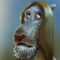
I intended to show the original to the left, Evil's advice regarding brightness and a Multiply layer in the middle and Valence's advice regarding the initial values and a Color layer to the right. But after trying to remember what shades I'd used in the middle and selecting them again, I realised I could just copy the paint (duh) and well... That looked awful.
So what I ended up with is a multiply layer and mostly bright colours in the middle, a colour layer to the right, set to 50 or so 0percent opacity because before that it looked garish. And a combination of the two layers, both at reduced opacity, to the left.
Personally I think I like the middle one best, but the right most certainly comes out brighter and less "muddy". I guess the right most could have looked entirely different with other colours though...
And regarding colours... This is the colour wheel in ArtRage... This one is called LS/H picker, where I assume L is Lightness? Since the central colours are greyish (and the "bottom left" is dark, "top right" light) I went for the colours closest to the rainbow like thingymagicky. But they're probably just the most saturated colours, not the brightest ones. I could also set the colour wheel to LH/S or SH/L but that just makes them even harder for me to understand... In conclusion I probably chose the wrong colours for BOTH versions of the image...
Any an all misspellings are henceforth blamed on the cats.
Please Log in or Create an account to join the conversation.
Please Log in or Create an account to join the conversation.

In the example I posted both the colour layer and the soft light layer were used at 100% and painted with a brush with pressure set to opacity and in this way the choice of colour and the way you use it is not too different to painting "normally".
Please Log in or Create an account to join the conversation.
- Digital Dave
-
Topic Author
- Offline
- Platinum Member
-
- Posts: 2247
- Thank you received: 163
Stuart wrote: Thanks Dave, I can't see how to delete it though. I can edit it fine, but not delete. Is there some tiny little button squirrelled away somewhere that only women can find!?
 I wouldn't know.. I'm not a gurl.
 There isn't a button so to speak, but if you look at the bottom area, below the image, you will see a red, round icon with an exclamation mark in it. See attached pic below.
I get sketchy around pencils! ...
Please Log in or Create an account to join the conversation.
Facebook Feed
Member Statistics
- Total Users: 226
- Latest User: norajohnson
- Online Users: 0
- Users Today: 0
- Users this Week: 0
- Users this Month: 0
- Users this Year: 0
NOTE! This site uses cookies and similar technologies.
By using this website you agree to the use of cookies and related data storage as detailed in our privacy policy. Learn more
Site design Mad Hamster Studios. All content is protected under © and the property of the various contributers and not to be reproduced without permission of the creator.