
- Posts: 2242
- Thank you received: 163
June challenge here: The Leprechaun
May entries - Submarine
Charlotte's Finished
- Digital Dave
-

- Offline
- Platinum Member
-

Less
More
05 Jan 2023 20:03 #43795
by Digital Dave
I get sketchy around pencils! ...
Replied by Digital Dave on topic Charlotte's Finished
Agree with Val, and also like the ornament image.
I get sketchy around pencils! ...
The following user(s) said Thank You: Charlotte
Please Log in or Create an account to join the conversation.
- cgmythology
-

- Offline
- Premium Member
-

08 Feb 2024 13:41 #49121
by cgmythology
Replied by cgmythology on topic Charlotte's Finished
Great work here, hope to see more works from you soon!
The following user(s) said Thank You: Charlotte
Please Log in or Create an account to join the conversation.

07 Jun 2024 10:00 - 07 Jun 2024 10:03 #50507
by Charlotte
Any an all misspellings are henceforth blamed on the cats.
Replied by Charlotte on topic Charlotte's Finished
Look what I found! *referring to thread*
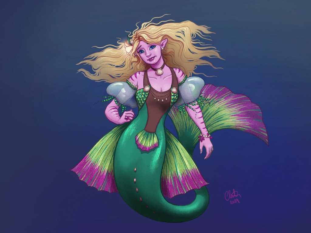

Edit: and as usual... the "creases" on the fish tail could certainly have been made softer...
Edit: and as usual...
the "creases" on the fish tail could certainly have been made softer... Any an all misspellings are henceforth blamed on the cats.
Last edit: 07 Jun 2024 10:03 by Charlotte.
Please Log in or Create an account to join the conversation.

08 Jun 2024 12:09 #50512
by Valence
Replied by Valence on topic Charlotte's Finished
These look fantastic when shown together. The shading and definition are so clean and consistent across both images and the result is very satisfying. 
Please Log in or Create an account to join the conversation.
08 Jun 2024 15:44 #50514
by Charlotte
Any an all misspellings are henceforth blamed on the cats.
Replied by Charlotte on topic Charlotte's Finished
Thank you ")
Though I kind of think showing them together makes the second one look a bit drab as the first one is much more colourful :p
Though I kind of think showing them together makes the second one look a bit drab as the first one is much more colourful :p
Any an all misspellings are henceforth blamed on the cats.
Please Log in or Create an account to join the conversation.
06 Aug 2024 17:16 - 06 Aug 2024 17:19 #51275
by Charlotte
Any an all misspellings are henceforth blamed on the cats.
Replied by Charlotte on topic Charlotte's Finished
After several adjustments but not yet any checking on other devices such as my cell phone, I think maybe my website is finally updated...
www.charlotteahlgren.com/
Let me know if you think images are too big or small or text is unreadable or misspelled or if there's anything else looking off or not working. I've made some changes after feedback from Banj, so, hopefully it's not crazy bad...
Oh and I really need to make at least a couple more finished pieces that aren't fan art this year...
Edit: I have now checked on my phone and I need to make it responsive I guess, but once I shrink each page they look fine... to me...
Any an all misspellings are henceforth blamed on the cats.
Last edit: 06 Aug 2024 17:19 by Charlotte.
Please Log in or Create an account to join the conversation.

06 Aug 2024 18:02 #51277
by Banj

Replied by Banj on topic Charlotte's Finished
Right click in the browser and select inspect or inspect element (depends on browser) in the tool bar of the palette that opens is an option to view as various devices to check responsiveness/different screen sizes (the icon is usually a couple of overlapping rectangles).After several adjustments but not yet any checking on other devices such as my cell phone,
Please Log in or Create an account to join the conversation.
06 Aug 2024 18:13 #51279
by Charlotte
Any an all misspellings are henceforth blamed on the cats.
Replied by Charlotte on topic Charlotte's Finished
I had forgotten about that, thanks. Though I did edit my post too 
Any an all misspellings are henceforth blamed on the cats.
Please Log in or Create an account to join the conversation.
06 Aug 2024 20:46 #51280
by Valence
Replied by Valence on topic Charlotte's Finished
When I view it on my tablet the site is larger than the screen so I have to pinch/zoom out to see everything.
Also (after zooming out to the full view) the "column" of art and text is aligned with the right margin whereas when I view it on my PC all the art and text is aligned centrally.
And as I know nothing about website design I don't know if this is a good or bad thing or if it's deliberate or unintentional.
Just thought I'd mention the difference.
Please Log in or Create an account to join the conversation.
07 Aug 2024 11:05 #51282
by Banj
Replied by Banj on topic Charlotte's Finished
Yep, at the moment it's a fixed size and needs scrolling horizontally to see the page content. I noticed a typo on the about page where you are missing a d in address.
 crabsnake. Although they are capitalised for emphasis, the text links on the socials aren't immediately obvious as links (maybe add a colour to them).
And that dragon thingy in the Mucha style pic is still pretty cool (oh wow that's so great).
And that dragon thingy in the Mucha style pic is still pretty cool (oh wow that's so great).
Please Log in or Create an account to join the conversation.
Facebook Feed
Member Statistics
- Total Users: 226
- Latest User: norajohnson
- Online Users: 0
- Users Today: 0
- Users this Week: 0
- Users this Month: 0
- Users this Year: 0
NOTE! This site uses cookies and similar technologies.
By using this website you agree to the use of cookies and related data storage as detailed in our privacy policy. Learn more
I understand
Site design Mad Hamster Studios. All content is protected under © and the property of the various contributers and not to be reproduced without permission of the creator.