


 Probably not

- Posts: 1256
- Thank you received: 96


October Challenge: Horror rework
September entries: Legend
Important, change your password!
Go here for further information: https://cgartnexus.com/index.php/forum/announcements/840-hacked
CGAN Jan 2015 Challenge - White as Snow - WIPs
27 Jan 2015 11:26 #8446
by Domtopia
Everything's on the right!!!
It's like driving abroad!
Replied by Domtopia on topic CGAN Jan 2015 Challenge - White as Snow - WIPs
There's an atmosphere of snow and a slight haze in the air too. I added it just to break up the darker areas.
Thanks for the feedback guys.
Mic, the reason why I did not make the foreground characters darker was because it has the affect of pushing them back into the image. Typically foreground objects should be brighter and have greater contrast, whilst the background should be darker. Thanks for the paint over. I always like to see the forumites doing that!
Thanks for the feedback guys.
Mic, the reason why I did not make the foreground characters darker was because it has the affect of pushing them back into the image. Typically foreground objects should be brighter and have greater contrast, whilst the background should be darker. Thanks for the paint over. I always like to see the forumites doing that!
Everything's on the right!!!
It's like driving abroad!
Please Log in or Create an account to join the conversation.
- SchizophreniaWolf
-
- Offline
- Junior Member
-

Less
More
- Posts: 170
- Thank you received: 10
27 Jan 2015 12:49 #8451
by SchizophreniaWolf
Replied by SchizophreniaWolf on topic CGAN Jan 2015 Challenge - White as Snow - WIPs
Micro: I Your image with the gate is nice, you really feel the scale, not easy with that 'cameraview'.
Dom: Nice, lots of action. It also has this retro-complexity to it.
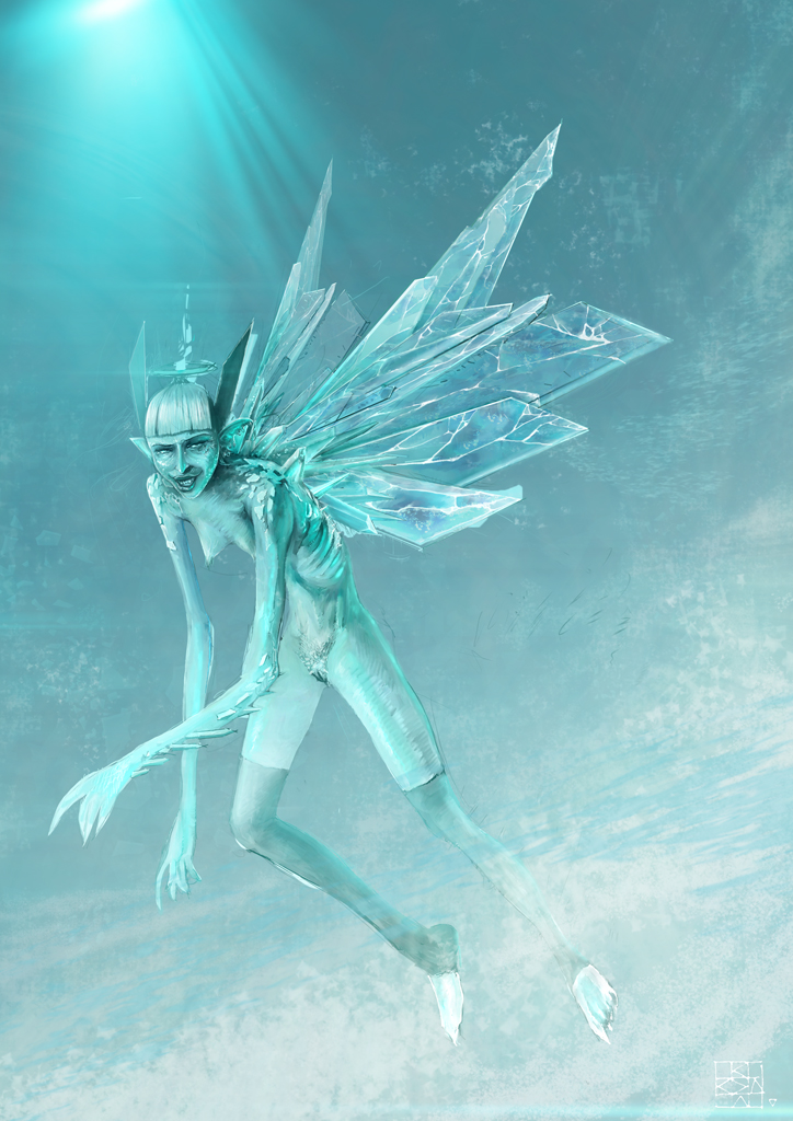
Here is my update, I don't have alot of time for this because I have a very heavy deadline at work. Lets see.
Dom: Nice, lots of action. It also has this retro-complexity to it.
Here is my update, I don't have alot of time for this because I have a very heavy deadline at work. Lets see.
Please Log in or Create an account to join the conversation.
27 Jan 2015 12:55 #8452
by Domtopia
Everything's on the right!!!
It's like driving abroad!
Replied by Domtopia on topic CGAN Jan 2015 Challenge - White as Snow - WIPs
The ice/crystal wings are awesome Schizo! It is such an interesting interpretation of the brief too!
I am really impressed by the breadth of ideas being churned out for this challenge!
I am really impressed by the breadth of ideas being churned out for this challenge!
Everything's on the right!!!
It's like driving abroad!
Please Log in or Create an account to join the conversation.
27 Jan 2015 14:40 #8453
by Valence
Replied by Valence on topic CGAN Jan 2015 Challenge - White as Snow - WIPs
Dom: Aerial perspective is not just about things being darker or brighter, it's about reducing the value range. For instance, if an object in the foreground has a full value range with white highlights and a black shadow then the same object further away would have a narrower value range with light grey highlights and dark grey shadows. As the distance increases this value compression would continue until in the far background the highlights and shadows would converge and the object would appear as a midtone silhouette with no detail. (At this point I should admit that you can probably find millions of great paintings that break this rule in the same way that you can find great paintings that break any rule. That doesn't stop it being a fact of the way that light propagates through atmosphere. I'll take off my Pedantic Scientist Hat now.)
The dark area at the top right corner of your picture (and particularly the hard edge it makes with the brighter sky) has a really distinct value difference, compared with the Elsa figure who has a fairly high key (bright) but narrow value range. This is why the dark bit seems to push itself forward in your mind.
Adding a bit of snow/mist/haze over the more distant areas but NOT over the nearer figures should separate them. Also blurring the distant parts a little may add a depth of field type effect (Pedantic Scientist Again: although that may not be technically correct for a wide landscape view it still might work.)
Schizo: Hmm, where's the emoticon for "furious envy"?
That's brilliant, the icy wings, the colour and that volumetric light stabbing down from the top corner. Please find the time to finish. Quit your job if necessary!
The dark area at the top right corner of your picture (and particularly the hard edge it makes with the brighter sky) has a really distinct value difference, compared with the Elsa figure who has a fairly high key (bright) but narrow value range. This is why the dark bit seems to push itself forward in your mind.
Adding a bit of snow/mist/haze over the more distant areas but NOT over the nearer figures should separate them. Also blurring the distant parts a little may add a depth of field type effect (Pedantic Scientist Again: although that may not be technically correct for a wide landscape view it still might work.)
Schizo: Hmm, where's the emoticon for "furious envy"?
That's brilliant, the icy wings, the colour and that volumetric light stabbing down from the top corner. Please find the time to finish. Quit your job if necessary!
Please Log in or Create an account to join the conversation.
27 Jan 2015 19:08 #8460
by Domtopia
Everything's on the right!!!
It's like driving abroad!
Replied by Domtopia on topic CGAN Jan 2015 Challenge - White as Snow - WIPs
Thanks Val.
Everything's on the right!!!
It's like driving abroad!
Please Log in or Create an account to join the conversation.
27 Jan 2015 19:52 - 27 Jan 2015 19:54 #8463
by Valence
Replied by Valence on topic CGAN Jan 2015 Challenge - White as Snow - WIPs
Just had an idea about your pic Dom.
I've been mentioning the dark bit a lot and I suddenly just thought: instead of trying to tone that down it might be better to do something elsewhere to draw your eye away from it. The idea I had was to brighten the area behind Elsa's body (there's a nice V shape converging there already) maybe even with pure white and then darken her dress a little especially round the hips and the waist. This would create a high contrast area a bit like halos in religious paintings and would immediately draw your eye to Elsa who is after all the star of the image. And once you've got the attention there the darker bits won't matter at all.
I've been mentioning the dark bit a lot and I suddenly just thought: instead of trying to tone that down it might be better to do something elsewhere to draw your eye away from it. The idea I had was to brighten the area behind Elsa's body (there's a nice V shape converging there already) maybe even with pure white and then darken her dress a little especially round the hips and the waist. This would create a high contrast area a bit like halos in religious paintings and would immediately draw your eye to Elsa who is after all the star of the image. And once you've got the attention there the darker bits won't matter at all.
Last edit: 27 Jan 2015 19:54 by Valence.
Please Log in or Create an account to join the conversation.
27 Jan 2015 21:25 #8474
by Domtopia
Everything's on the right!!!
It's like driving abroad!
Replied by Domtopia on topic CGAN Jan 2015 Challenge - White as Snow - WIPs
Thanks again!
I will give it some thought. Actually, I had the idea of making her more pale and pushing her further back. There are some scaling issues that are sitting uncomfortably with me.
I will see what I can do.
I will give it some thought. Actually, I had the idea of making her more pale and pushing her further back. There are some scaling issues that are sitting uncomfortably with me.
I will see what I can do.
Everything's on the right!!!
It's like driving abroad!
Please Log in or Create an account to join the conversation.
- microscopi
-
- Offline
- Premium Member
-

Less
More
- Posts: 743
- Thank you received: 79
27 Jan 2015 22:54 #8477
by microscopi
Replied by microscopi on topic CGAN Jan 2015 Challenge - White as Snow - WIPs
Hey Schizo awesome update, the wings look really well detailed now and her boobs are almost as pointy !
I can see where your going with the lighting and background, hope you have time to finish.
Thanks for comment on mine, I have been struggling with a good 'camera angle' perspective without using 3D package.
Dom doing the paint over was cool, it reminded me of doing a coloring book as a kid but with way better art!
I think what you have now looks great. If I had to change anything would be to scale some of the guys in the background
down and add more of them to show more depth.
Cherry thanks for the thumbs up, as Dom said as well as yourself, my pics look so desolate and lonely, I don't know why that is, maybe i'm just a huge loner!? lol To be honest I put the guy in just to show scale of the gate, but maybe ill give him a little doggy to keep him company
I can see where your going with the lighting and background, hope you have time to finish.
Thanks for comment on mine, I have been struggling with a good 'camera angle' perspective without using 3D package.
Dom doing the paint over was cool, it reminded me of doing a coloring book as a kid but with way better art!
I think what you have now looks great. If I had to change anything would be to scale some of the guys in the background
down and add more of them to show more depth.
Cherry thanks for the thumbs up, as Dom said as well as yourself, my pics look so desolate and lonely, I don't know why that is, maybe i'm just a huge loner!?
lol To be honest I put the guy in just to show scale of the gate, but maybe ill give him a little doggy to keep him company Please Log in or Create an account to join the conversation.
27 Jan 2015 23:22 #8479
by Domtopia
See, that's much nicer isn't it!!
Everything's on the right!!!
It's like driving abroad!
Replied by Domtopia on topic CGAN Jan 2015 Challenge - White as Snow - WIPs
microscopi wrote: maybe ill give him a little doggy to keep him company
See, that's much nicer isn't it!!
Everything's on the right!!!
It's like driving abroad!
Please Log in or Create an account to join the conversation.
27 Jan 2015 23:30 #8480
by Kodabble
Replied by Kodabble on topic CGAN Jan 2015 Challenge - White as Snow - WIPs
Great Updates everyone…
Schizo: Nice update, like the wing/ ice crystals. Looking forward to the final.
Domtopia: Looking good and I think the legs read much better. One thought with the wind apparently blowing to her right then her skirt might wrap tighter to the shape of her left leg.
Oaktree: Update is looking great. I agree with Charlotte and Dom about the snow. The current snow looks great in the background but if it is supposed to be in front they would be larger.
Microscopi: The new update is looking really good. This shows a much better feel of spring and winter. The log wall looks nice. If you had made it out of ice it would look like the Wall in Game of Thrones.
CherryGraphics: Like update especially the frozen flame. But now I wonder have the kids frozen a flame breathing dragon, like a young Elsa, or is the dragon firing flames that freeze as it leaves his mouth.
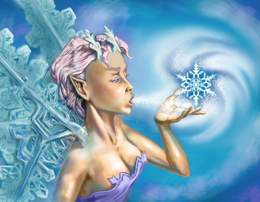
And now my latest WIP:
Schizo: Nice update, like the wing/ ice crystals. Looking forward to the final.
Domtopia: Looking good and I think the legs read much better. One thought with the wind apparently blowing to her right then her skirt might wrap tighter to the shape of her left leg.
Oaktree: Update is looking great. I agree with Charlotte and Dom about the snow. The current snow looks great in the background but if it is supposed to be in front they would be larger.
Microscopi: The new update is looking really good. This shows a much better feel of spring and winter. The log wall looks nice. If you had made it out of ice it would look like the Wall in Game of Thrones.
CherryGraphics: Like update especially the frozen flame. But now I wonder have the kids frozen a flame breathing dragon, like a young Elsa, or is the dragon firing flames that freeze as it leaves his mouth.
And now my latest WIP:
Please Log in or Create an account to join the conversation.
Facebook Feed
Member Statistics
- Total Users: 228
- Latest User: DanielWilson
- Online Users: 0
- Users Today: 0
- Users this Week: 0
- Users this Month: 0
- Users this Year: 2
NOTE! This site uses cookies and similar technologies.
By using this website you agree to the use of cookies and related data storage as detailed in our privacy policy. Learn more
I understand
Site design Mad Hamster Studios. All content is protected under © and the property of the various contributers and not to be reproduced without permission of the creator.