


- Posts: 1449
- Thank you received: 55
I can't sleep  Again
Again


His papa is English
 He can speak English?
Merlin says
The shoutbox is unavailable to non-members
Shoutbox History
Turbine powerplant by crankshaft
- crankshaft
-
 Topic Author
- Offline
- Platinum Member
-

Less
More
19 Aug 2014 20:32 #5385
by crankshaft
Turbine powerplant by crankshaft was created by crankshaft
Hey guys. It's crankshaft from Imaginefx. I've made some progress on my turbine powerplant (it's slow because I can only draw roughly 30 min a day. I'm also doing two versions simultaneously ). I've posted this wip on other forums/sites but got no feedback which is very frustrating. It may be a little late to fix any problems but I want to at least know what they are so I can improve for next time. Another note: This is a photo of the piece taken by an old camera...The original looks much sharper/better.
A few questions: Where do your eyes first land? (I've asked this before but now there is tone added) I've made the focal the turbine. I'll be making a digital version of this as well and I'll make sure to add more space around the turbine.
What do you think of the lighting? It's supposed to be a late afternoon/almost night time scene.
Please tell me what you think. Any and every critique is greatly appreciated. Looking forward to the community here.
Please Log in or Create an account to join the conversation.
- ClaudeCrow
-

- Offline
- New Member
-

Less
More
- Posts: 82
- Thank you received: 8
19 Aug 2014 21:19 - 19 Aug 2014 21:19 #5388
by ClaudeCrow
Replied by ClaudeCrow on topic Turbine powerplant by crankshaft
Hey Crankshaft.
Firstly, I think your values are pretty reasonable though you could probably do with some hard shadows to make the lighting a little clearer.
I think you've got some slight perspective problems across the image as a whole. The most obvious part being the lower half of the front of your power plant. That said it's not really something you can fix at this stage but I'd certainly look at trying to sort it when you get to the digital version. It is a complex shape with all those curves so it might be difficult but you should be able to manage it.
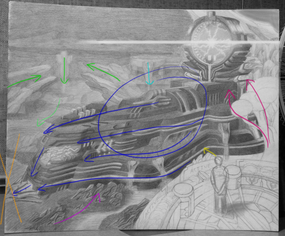
The main issue at the moment is, certainly as I see it anyway, that most of your lines and shapes are taking the viewer away from the focal point. I did a quick little draw over of where I think the eyes are being drawn at the moment. I felt that generally I was ending up going from the main structure straight to the bottom left (Orange X) area.
If you make sure it looks like the guy in the front is looking towards the turbine that will help a bit. Just make sure his head is clearly angled straight at it.
This again goes for the digital version. I'd probably also suggest extending your image by about a third or so on the left side and try and add something without too much detail or focus but connects the orange X up to the green line coming in from the left and the purple arrow coming in at the bottom. Basically something to take the eye from that lower left hand side and send it back to your focal point.
A slightly more interesting sky might also help you to do this with some good cloud shapes.
That's what I see at the moment anyway. I'd wait for some more feedback before doing anything to rash though")
Good luck with it and I'll look forward to seeing you get onto a digital version since that's more my area of things.
Firstly, I think your values are pretty reasonable though you could probably do with some hard shadows to make the lighting a little clearer.
I think you've got some slight perspective problems across the image as a whole. The most obvious part being the lower half of the front of your power plant. That said it's not really something you can fix at this stage but I'd certainly look at trying to sort it when you get to the digital version. It is a complex shape with all those curves so it might be difficult but you should be able to manage it.
The main issue at the moment is, certainly as I see it anyway, that most of your lines and shapes are taking the viewer away from the focal point. I did a quick little draw over of where I think the eyes are being drawn at the moment. I felt that generally I was ending up going from the main structure straight to the bottom left (Orange X) area.
If you make sure it looks like the guy in the front is looking towards the turbine that will help a bit. Just make sure his head is clearly angled straight at it.
This again goes for the digital version. I'd probably also suggest extending your image by about a third or so on the left side and try and add something without too much detail or focus but connects the orange X up to the green line coming in from the left and the purple arrow coming in at the bottom. Basically something to take the eye from that lower left hand side and send it back to your focal point.
A slightly more interesting sky might also help you to do this with some good cloud shapes.
That's what I see at the moment anyway. I'd wait for some more feedback before doing anything to rash though
Good luck with it and I'll look forward to seeing you get onto a digital version since that's more my area of things.
Last edit: 19 Aug 2014 21:19 by ClaudeCrow.
Please Log in or Create an account to join the conversation.
- Digital Dave
-

- Offline
- Platinum Member
-
Less
More
- Posts: 2242
- Thank you received: 163
20 Aug 2014 00:25 - 20 Aug 2014 11:09 #5397
by Digital Dave
I get sketchy around pencils! ...
Replied by Digital Dave on topic Turbine powerplant by crankshaft
I agree with what Claude had to say about your focal point on this one, and putting in some clouds with distinctive shapes could indeed help with what he mentions. Some very good advice there too.
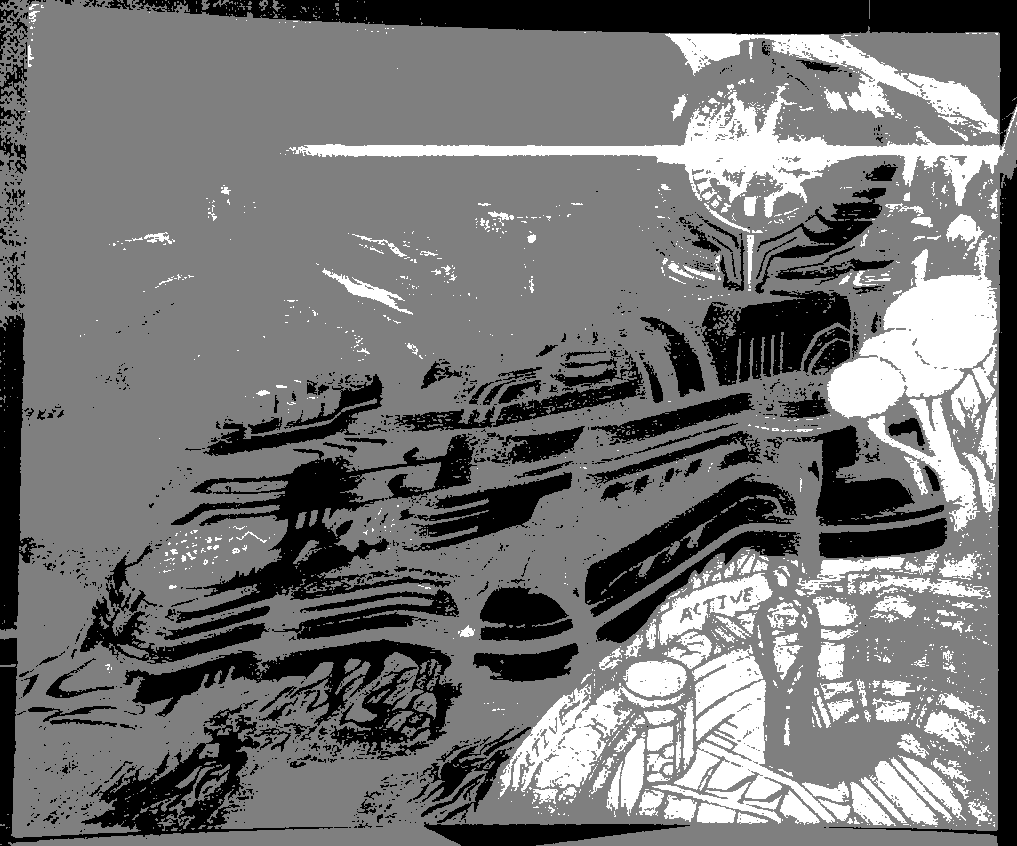
I also took you image into PS real quick, and firstly just laid a posterize layer on top set @ 3 to show you how your darks, middle and lighter tones are showing at the present moment. (First image below) you can see there is not a lot of variation at the moment, but that's something you can fix quite quickly in PS, or whatever program you might be using. ... In the second image, I simply duplicated the layer, set it to multiply and did a quick adjustment for Brightness/Contrast. Brightness 50 and Contrast at 70, just to show how it looks darken up some.
Hope this is helpful in some way. Hope to see an update on it. Oh, and not sure if you were aware of this, but once you upload your image, clicking on the insert button will place the picture into the post, and not just add it as an attachment.
Was having some issues getting the second image to post up, and ended up having to resize since it was over the 512mb? limit on images. But you can compare this with your original, and see what else you might be able to do with it, even without taking it into digital if you wanted to darken in some areas.
I get sketchy around pencils! ...
Last edit: 20 Aug 2014 11:09 by Digital Dave.
Please Log in or Create an account to join the conversation.

20 Aug 2014 07:21 #5408
by Charlotte
Any an all misspellings are henceforth blamed on the cats.
Replied by Charlotte on topic Turbine powerplant by crankshaft
Hey Crank,
good to see you made it over here. For feedback I pretty much agree with Crow and Dave. My eyes go first to the turbine (assuming that's the bright thing at the top) and then follows the structure down to where the perspective issues become apparent. And from there there's currently "nowhere to go" so I agree with Crow's suggestion of adding something to bring the eye back up towards the turbine.
When it comes to Dave's posterized image I rather like the result in a way! It's nice to see how the structural details are still visible when the plant is basically only black and grey. But I think the light areas of the structure and the dark areas of the background should be more distinct. Posterizing into only three shades like Dave did is a good way of telling if the different elements in the picture are clearly readable or not. In this case, with only three values, the plant should preferably have shown up all black against the grey background and with some white detail by the focal point. The foreground could be either white or grey. (As it is, it turns out white because it's not finished, obviously.)
Hope I'm not just saying obvous things
Any an all misspellings are henceforth blamed on the cats.
Please Log in or Create an account to join the conversation.

20 Aug 2014 12:12 - 20 Aug 2014 12:14 #5417
by Domtopia
Everything's on the right!!!
It's like driving abroad!
Replied by Domtopia on topic Turbine powerplant by crankshaft
I actually found that my eye was first drawn to the pale area at the bottom right. The high contrast attracted my eye.
You have heard the observation of the others on perspective and lighting, so I will not repeat the same, but I will say that having three distinct values in fore, mid and backgrounds is a good idea. If you can keep them distinct and clear then it will create depth. I think that sticking with the pale foreground is a good idea, but I would move that over to the left hand corner because, as has been observed, the flow of the drawing goes along the line of the turbine and ends in nothing. If it ended with the guy at the controls, it would add story telling interest.
It's a very detailed drawing and will look great in colour too. Looking forward to seeing more of this.
Thanks for sharing Crank!
Everything's on the right!!!
It's like driving abroad!
Last edit: 20 Aug 2014 12:14 by Domtopia.
Please Log in or Create an account to join the conversation.
- crankshaft
-
Topic Author
- Offline
- Platinum Member
-
Less
More
- Posts: 1449
- Thank you received: 55
20 Aug 2014 23:17 - 20 Aug 2014 23:18 #5444
by crankshaft
Replied by crankshaft on topic Turbine powerplant by crankshaft
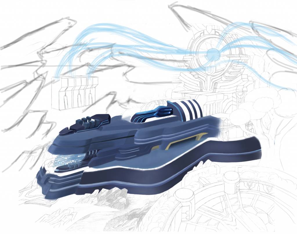
Thank you so much for the insightful and detailed replies. I come from a background of drawing mainly line art and cars so this piece was a big learning experience. Eg This is my first time drawing mountains, trees and adding color. Here is the digital wip, quickly edited based on your feedback.
With the paper version, I agree with the shadows. The picture does seem low contrast/muted but I figured the lightning from the turbine would only be readily visible during darker hours. My thinking was that everything gets muted at dusk/night except for whatever intense light source there is, in this case the turbine. I was going to simply intensify the contrast of the turbine and lighten/darker in areas. Other than that I am at a lost for where to place additional shadows/lighting.
Perspective: I figured out the perspective manually to the best of my ability and it was a brutal experience to do. Fortunately I scanned the piece before going any further and used the vanishing point from photoshop to check for accuracy. To me the only problem I see would be the front but extra eyes would help.
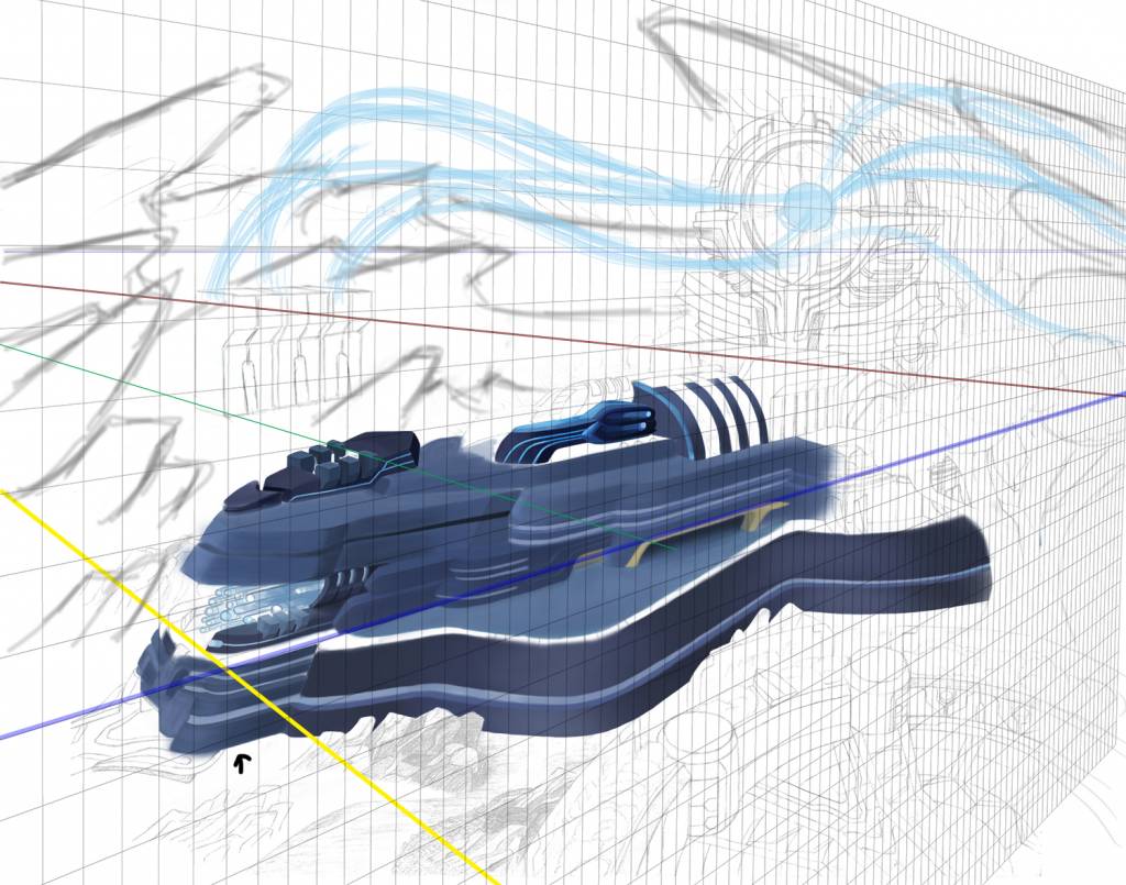
Flow: I agreed with the paint over. I've added more canvas space and smoke stacks/electrical towers that feed the turbine via energy rays. I think now, even though this is a wip, that the focal is more clear cut. I don't know if I'll be able to change the original structure design through. I'm also going to crank the contrast of the turbine to make it more obvious. I wish I had this kind of feedback before otherwise I wouldn't of made these blatant mistakes!
Lastly, what do you think of the color?
The paper version will look similar but the composition will be a bit off since I can't add to the canvas. Do you guys think this fixes most of the problems? Anything else to add?
With the paper version, I agree with the shadows. The picture does seem low contrast/muted but I figured the lightning from the turbine would only be readily visible during darker hours. My thinking was that everything gets muted at dusk/night except for whatever intense light source there is, in this case the turbine. I was going to simply intensify the contrast of the turbine and lighten/darker in areas. Other than that I am at a lost for where to place additional shadows/lighting.
Perspective: I figured out the perspective manually to the best of my ability and it was a brutal experience to do. Fortunately I scanned the piece before going any further and used the vanishing point from photoshop to check for accuracy. To me the only problem I see would be the front but extra eyes would help.
Flow: I agreed with the paint over. I've added more canvas space and smoke stacks/electrical towers that feed the turbine via energy rays. I think now, even though this is a wip, that the focal is more clear cut. I don't know if I'll be able to change the original structure design through. I'm also going to crank the contrast of the turbine to make it more obvious. I wish I had this kind of feedback before otherwise I wouldn't of made these blatant mistakes!
Lastly, what do you think of the color?
The paper version will look similar but the composition will be a bit off since I can't add to the canvas. Do you guys think this fixes most of the problems? Anything else to add?
Last edit: 20 Aug 2014 23:18 by crankshaft. Reason: pictures
Please Log in or Create an account to join the conversation.
31 Aug 2014 21:54 #5794
by Domtopia
Everything's on the right!!!
It's like driving abroad!
Replied by Domtopia on topic Turbine powerplant by crankshaft
Wow! the perspective tools have really made an improvement!
The building is looking solid and realistic already. Really nice start!
The building is looking solid and realistic already. Really nice start!
Everything's on the right!!!
It's like driving abroad!
Please Log in or Create an account to join the conversation.
- crankshaft
-
Topic Author
- Offline
- Platinum Member
-
Less
More
- Posts: 1449
- Thank you received: 55
06 Sep 2014 01:45 #5943
by crankshaft
Replied by crankshaft on topic Turbine powerplant by crankshaft
Thanks for the compliment. Feedback like that really keeps me going. I won't be working on the digital version as much for now in order to get the traditional drawing done and out of the way.
Please Log in or Create an account to join the conversation.
Latest Activity

Banj updated their profile picture


Charlotte Still wearing a mask? Is it so we won't see you hoarding food in those cheeks of yours?
See More
Banj Mfmuh Guhmfpf
See More
Charlotte I'll take that as a yes...
See More
Charlotte Why is there a tiny flashing thing in front of the reply link/button? It's so small I can't see if it's an exclamation mark or a question mark... or...both?)
See More
Banj Because? Both!
See More
Charlotte *gasp*
See More

CaptainDeth updated their profile picture

CaptainDeth Ahoy folks, just a newbie here, just getting started. Thanks for allowing me in.
CaptainDeth Thank You
CaptainDeth and Mr.Bungle joined the site


honbasic joined the site


Gawk joined the site