


- Posts: 6
- Thank you received: 2


Are you trying to spew those lurker tentacles at us and failing or are you just in a state of constant amazement? 
The shoutbox is unavailable to non-members
Shoutbox History
Are you trying to spew those lurker tentacles at us and failing or are you just in a state of constant amazement?
Ali's Sketchbook & Improvement
07 Jul 2014 21:10 - 07 Jul 2014 21:11 #956
by Aislynne
Ali's Sketchbook & Improvement was created by Aislynne
Hey guys! I'm very happy to be a part of this forum. I'm in this very motivated improvement stage of my life and hope to learn and share my experiences with everyone.
To start off, I will post a WIP that I've been working on lately. It's been incredibly frustrating to work on, which means I definitely need to do more studies on it. Weapons, especially, are a very huge weak spot for me.
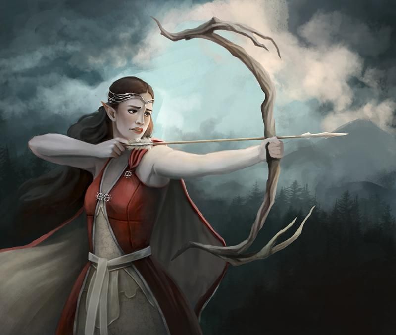
To start off, I will post a WIP that I've been working on lately. It's been incredibly frustrating to work on, which means I definitely need to do more studies on it. Weapons, especially, are a very huge weak spot for me.
Last edit: 07 Jul 2014 21:11 by Aislynne.
The following user(s) said Thank You: Smolin
Please Log in or Create an account to join the conversation.

07 Jul 2014 21:15 #957
by Domtopia
Everything's on the right!!!
It's like driving abroad!
Replied by Domtopia on topic !Ali's Sketchbook & Improvement
Hiya Ali, and welcome to the forum!!
This place is really friendly, so have a blast whilst you are here!!!!
What is it that's frustrating you with this image?? I think it looks pretty good at the moment. The lighting is good around her lower body, but given the elven nature of her dress and face, I think this would benefit from being brighter, especially in the face area.
Plus, her arms are a bit heavy for an elf I think. Keep it coming Ali!!
Everything's on the right!!!
It's like driving abroad!
Please Log in or Create an account to join the conversation.

07 Jul 2014 21:16 #959
by Charlotte
Any an all misspellings are henceforth blamed on the cats.
Replied by Charlotte on topic Ali's Sketchbook & Improvement
Hi Ali ")
Welcome to these brand new forums! I visited your website earlier (yes I stalk all our new members ) and you have some wonderful things on there! I especially admire how you paint fabrics. I will look forward to seeing what you share with us!
Welcome to these brand new forums! I visited your website earlier (yes I stalk all our new members
) and you have some wonderful things on there! I especially admire how you paint fabrics. I will look forward to seeing what you share with us! Any an all misspellings are henceforth blamed on the cats.
Please Log in or Create an account to join the conversation.
07 Jul 2014 21:31 #961
by Aislynne
Replied by Aislynne on topic Ali's Sketchbook & Improvement
Wow, thank you two for the amazing welcome! It feels so nice <3
@Domtopia: Thank you for the feedback about using brighter lights, and the heavier arms. I didn't even notice the shape of the arms because I've been so focused on the things that I don't like about it. I think my biggest issue right now is that I designed the composition in a way that will force the string of the bow to go directly across her face and it's very distracting. I'm trying to figure out a way to keep it somewhat thin and transparent-looking so that it isn't too noticeable. I'm also not yet happy with how "smooth" everything looks, but textures are usually the last thing I will do in a painting. I started with color with this one instead of black/white to establish values, so I think the struggle to get the values correct is what I'm not liking about it right now. I'll keep working at it, though!
@Charlotte: Hi! Thank you for looking at my website and for the compliment on the fabrics. I still feel like fabric materials (silk, leather, cotton, lace, etc) are very foreign to me, but the pursuit of artistic success is never-ending There will always be something to improve. I checked out your website too and REALLY love your use of colors, and you have such great ideas!
<3@Domtopia: Thank you for the feedback about using brighter lights, and the heavier arms. I didn't even notice the shape of the arms because I've been so focused on the things that I don't like about it. I think my biggest issue right now is that I designed the composition in a way that will force the string of the bow to go directly across her face and it's very distracting. I'm trying to figure out a way to keep it somewhat thin and transparent-looking so that it isn't too noticeable. I'm also not yet happy with how "smooth" everything looks, but textures are usually the last thing I will do in a painting. I started with color with this one instead of black/white to establish values, so I think the struggle to get the values correct is what I'm not liking about it right now. I'll keep working at it, though!
@Charlotte: Hi! Thank you for looking at my website and for the compliment on the fabrics. I still feel like fabric materials (silk, leather, cotton, lace, etc) are very foreign to me, but the pursuit of artistic success is never-ending
There will always be something to improve. I checked out your website too and REALLY love your use of colors, and you have such great ideas! Please Log in or Create an account to join the conversation.
07 Jul 2014 21:38 #962
by Charlotte
Any an all misspellings are henceforth blamed on the cats.
Replied by Charlotte on topic Ali's Sketchbook & Improvement
Oh thank you! *blushes* 
Any an all misspellings are henceforth blamed on the cats.
Please Log in or Create an account to join the conversation.
08 Jul 2014 08:48 #1043
by Stuart
Replied by Stuart on topic Ali's Sketchbook & Improvement
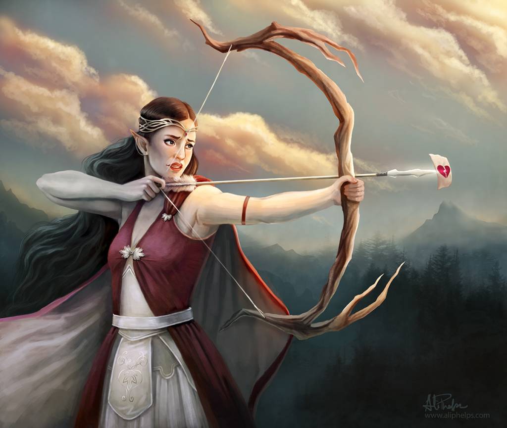
Nice work. My small critique would be that I would like to see a little more colour use, it feels very grey/blue to me, which is a good basis to put some highlights in somewhere to draw the focus.
Please Log in or Create an account to join the conversation.

08 Jul 2014 09:07 #1052
by kazky
Replied by kazky on topic Ali's Sketchbook & Improvement
I agree with Stuart, I know it's supposed to be a dark and dramatic image, but I think adding in a shot of colour would really make it pop
Please Log in or Create an account to join the conversation.
12 Jul 2014 07:06 - 12 Jul 2014 07:09 #2223
by Aislynne
Replied by Aislynne on topic Ali's Sketchbook & Improvement
Thanks SO much everyone for the feedback! I fought with this piece with many ups and down this entire week and finally found a color scheme that I really enjoy. I'm very glad I received the feedback that I did. I feel like it helped me create something that I'm proud of, and a new portfolio piece. !
The attachment feature seems to butcher the quality a little bit, so if anyone is interested in seeing some of the detail, you can quickly glance at my deviantart located here: fav.me/d7qan5r
!The attachment feature seems to butcher the quality a little bit, so if anyone is interested in seeing some of the detail, you can quickly glance at my deviantart located here: fav.me/d7qan5r
Last edit: 12 Jul 2014 07:09 by Aislynne.
Please Log in or Create an account to join the conversation.
12 Jul 2014 08:06 #2234
by Stuart
Replied by Stuart on topic Ali's Sketchbook & Improvement
That looks a lot better now. Maybe you can build a little yellow into the sky just to vary it a little, but I'd say you're just about there.
Please Log in or Create an account to join the conversation.
12 Jul 2014 09:29 - 12 Jul 2014 09:31 #2239
by Charlotte
Any an all misspellings are henceforth blamed on the cats.
Replied by Charlotte on topic Ali's Sketchbook & Improvement
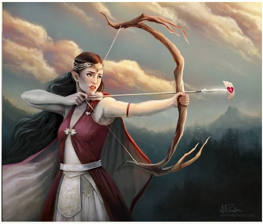
I understand that it's finished but I do have one slight suggestion. I think the sky's just fine but currently she has one arm that is basically all warm coloured and one which is all cool or greyish. I think the part of her chest and shoulder facing us could be made more grey too, to tie to two sides of her together. I did a very quick tiny paintover, so you can see what you think.
(EDIT: It helps to include the image...)
Edit again: I forgot to say I love the little note at the end of the arrow. She looks so sad and concerned and then there's that little bright bit of humour in there
(EDIT: It helps to include the image...)
Edit again: I forgot to say I love the little note at the end of the arrow. She looks so sad and concerned and then there's that little bright bit of humour in there
Any an all misspellings are henceforth blamed on the cats.
Last edit: 12 Jul 2014 09:31 by Charlotte.
The following user(s) said Thank You: Aislynne
Please Log in or Create an account to join the conversation.
Latest Activity

Banj updated their profile picture


Charlotte Still wearing a mask? Is it so we won't see you hoarding food in those cheeks of yours?
See More
Banj Mfmuh Guhmfpf
See More
Charlotte I'll take that as a yes...
See More
Charlotte Why is there a tiny flashing thing in front of the reply link/button? It's so small I can't see if it's an exclamation mark or a question mark... or...both?)
See More
Banj Because? Both!
See More
Charlotte *gasp*
See More

CaptainDeth updated their profile picture

CaptainDeth Ahoy folks, just a newbie here, just getting started. Thanks for allowing me in.
CaptainDeth Thank You
CaptainDeth and Mr.Bungle joined the site


honbasic joined the site


Gawk joined the site