


Important, change your password!
Go here for further information: https://cgartnexus.com/index.php/forum/announcements/840-hacked
WIPs of Roz
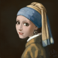


No I get what you mean and I don't think you should lose the shadows completely. Especially the middle image catch the expression of smiling eyes very well. I'm not sure how to both keep expression and make her look a bit less tired, but I think maybe just lightening the shading a bit might help. I dunno why I see it more when all of the images are viewed together, but it's also possible that if they're placed in different places in the shop, they won't give the same "tired" impression...
Any an all misspellings are henceforth blamed on the cats.
Please Log in or Create an account to join the conversation.


Please Log in or Create an account to join the conversation.


I did a quick paintover to reduce the darkness under her eyes. I think raising the cheeks will give the happy eyes look you want.
Plus, I used the burn tool to create some subsurface scattering, just to give the skin a bit more colour and depth.
I did a little bit of tweaking on the hair too just to give it a more natural colour and texture. It was quick, but could give you an idea of where to take it.
Some thoughts there.
Everything's on the right!!!
It's like driving abroad!
Please Log in or Create an account to join the conversation.
However, what you've suggested here in terms of her face really changes her features and that's not what we want, especially as my client has already approved of her face. I like her natural looking hair though, I think I could get back to it sometime else when I'm painting more realistic blonde people. For now the character I'm working on is more on the cartoony side.
Here's what I just did with all the images:
1. Reduced the puffy eyes on all of the girls and they DO look better, which is fantastic!
2. I fixed the bangs of the third one as to reveal a bit more of her face and also placed a whole new cast shadow underneat. I'm quite fine with how it turned out.
3. I turned her hips to face us frontally and it definitely looks more correct this way.
Here's the new version:
I'm sending it over to my client and moving onto the next one. Of course I'm open to minor tweaks on each of the girls but I really need to paint them all first 'cause I'm running out of time.
See ya and have a wonderful day! Keep in mind that I really value your feedback and I'm grateful to have you around me to help me develop and polish my skills.

Please Log in or Create an account to join the conversation.
Any an all misspellings are henceforth blamed on the cats.
Please Log in or Create an account to join the conversation.
If you decide to move on to something else, then maybe some of the suggestions in the paintover may come in handy.
I too have found the feedback on this forum to be very very helpful!
Everything's on the right!!!
It's like driving abroad!
Please Log in or Create an account to join the conversation.
Soooo, a week later, here's number 4: Molly with earrings (for the earrings category of the shop, of course):
And here's my ref (again used only for the initial pose. This time I didn't even use it when painting the hands, cause I think I'm getting the hang of them finally):
I think I like this one and the one with the scarf the most so far and I'm also considering going back to the first one and fixing some of her features - mostly to make them all look like the same person (as I see that as much as I try, only 2, 3 and 4 may pass as the same person as they are now). BUT that will be in the end. I have two more jewelry related girls to paint before I revise them all together and fix the last tiny bits.
I really hope to be able to finish the next one around midweek next week.
Have a nice weekend y'all
Please Log in or Create an account to join the conversation.
The only critique I would dare to add is about the left (my left) hand of the girl on the far left. It's bit visually confusing to work out which finger is which. If you darken the lowest finger with a bit of shadow it would push it back in space between the other two and make the hand pose easier to understand.
Please Log in or Create an account to join the conversation.
Consistency is difficult to achieve. Don't ask me how many hours I spend with each face in order to make them look like the same person. Still, one could argue they don't look alike and I'll agree. It's just so darn difficult! I also really despise painting her hair.. But honestly, I'm quite happy with my results even though they're definitely not flawless.
I'll see what I can do about the finger you're talking about. I think you're right it needs a bit more shadow
I'll also hopefully revisit the very first character, especially her mouth and neck, but I still need to paint one more first and then find the time for various tweaks where needed.
Here's the new one, Molly with bracelets, for the Bracelets category in the store (in the middle):
And here's my ref for this one (used only for the sketch again, and NOT for painting):
Attachment stock-photo-portrait-of-young-beautiful-brunette-woman-in-blue-dress-bracelets-rings-ear-rings-and-beads-103634834.jpg not found
Aaaand one can clearly see how much I've changed the pose. But I still like my version
Have a great week everyone!
Please Log in or Create an account to join the conversation.
Facebook Feed
Member Statistics
- Total Users: 228
- Latest User: DanielWilson
- Online Users: 2
- Users Today: 0
- Users this Week: 1
- Users this Month: 2
- Users this Year: 2
NOTE! This site uses cookies and similar technologies.
By using this website you agree to the use of cookies and related data storage as detailed in our privacy policy. Learn more
Site design Mad Hamster Studios. All content is protected under © and the property of the various contributers and not to be reproduced without permission of the creator.