



- Posts: 1256
- Thank you received: 96


Important, change your password!
Go here for further information: https://cgartnexus.com/index.php/forum/announcements/840-hacked
WIPs of Roz
07 Sep 2014 10:41 #5979
by Domtopia
Everything's on the right!!!
It's like driving abroad!
Replied by Domtopia on topic WIPs of Roz
The changes to the hand do look better Roz.
It's looking quite nice on the whole. Any chance we could see the reference image? It might be helpful to compare them, especially to double check the accuracy of the arm thickness and wrist placements. Foreshortening is a factor, as is lighting, so comparing the references with its lighting and this painting and its lighting will be helpful. As it stands, the left hand (her right) is quite a bit smaller than the right hand (her left). The comparison will help to show that up.
What is your client asking for? Is it a portrait, or a caricature? I ask, because the head is quite large, giving her a very youthful set of proportions. That may be what you are going for, but makes the image more of a caricature than a portrait I think.
Keep the updates coming!
It's looking quite nice on the whole. Any chance we could see the reference image? It might be helpful to compare them, especially to double check the accuracy of the arm thickness and wrist placements. Foreshortening is a factor, as is lighting, so comparing the references with its lighting and this painting and its lighting will be helpful. As it stands, the left hand (her right) is quite a bit smaller than the right hand (her left). The comparison will help to show that up.
What is your client asking for? Is it a portrait, or a caricature? I ask, because the head is quite large, giving her a very youthful set of proportions. That may be what you are going for, but makes the image more of a caricature than a portrait I think.
Keep the updates coming!
Everything's on the right!!!
It's like driving abroad!
Please Log in or Create an account to join the conversation.


07 Sep 2014 11:11 - 07 Sep 2014 11:12 #5983
by roz
Replied by roz on topic WIPs of Roz
My client just asked for a mascot for the online store she's launching in the Fall. We agreed upon a young, kind, sweet looking girl, but nothing more. You can see the initial image I created in the top left of the sketches image above. Then when she liked it, I prepared said sketches - there's a different one for each product sub/category she will initially have in her store.
She liked the face of the top right girl, and everything else in the rest of the sketches, so I had to paint one face, see if she continues to like it and then proceed. Which is exactly what I did. She approved of the first version I showed you - the one with just the skin, so I continued. My client has more or less left everything to my own judgement (we grew up together as neighbors, so it's not that formal of a relationship that we have).
That's why I said in the beginning that Ive drawn my character's head intentionally bigger, but just slightly, in order to emphasize on how cute she is as a person. I do not aim for 1:1 realism, so I guess it's not a portrait, or at least not the classical way one understands it. But I do want to make her look right and proportionate in her own way, that's why I make sure I ask you, people who draw and pain themselves, for critique.
I've used references for all poses, not so much for the proportion (as I can see now that I've just started with another image, my proportions from one sketch to another are a bit off as it seems), but for the pose itself. And I didn't use a reference when painting, only for the sketch.
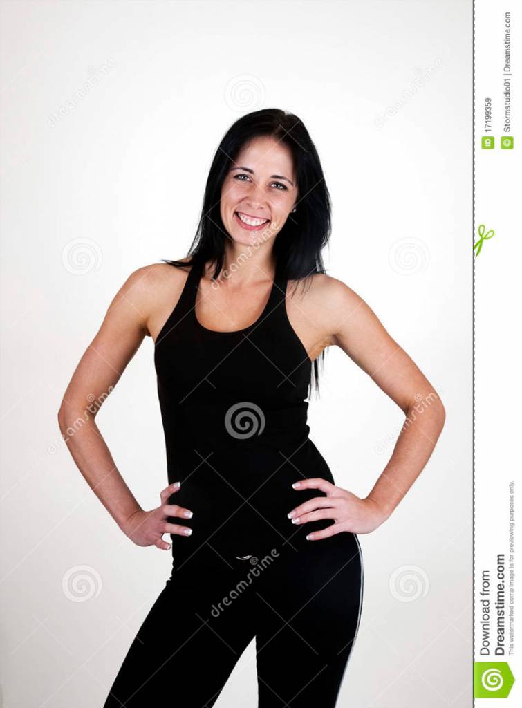
Here's the image I was using as a reference for this particular image we're discussing right now:
She liked the face of the top right girl, and everything else in the rest of the sketches, so I had to paint one face, see if she continues to like it and then proceed. Which is exactly what I did. She approved of the first version I showed you - the one with just the skin, so I continued. My client has more or less left everything to my own judgement (we grew up together as neighbors, so it's not that formal of a relationship that we have).
That's why I said in the beginning that Ive drawn my character's head intentionally bigger, but just slightly, in order to emphasize on how cute she is as a person. I do not aim for 1:1 realism, so I guess it's not a portrait, or at least not the classical way one understands it. But I do want to make her look right and proportionate in her own way, that's why I make sure I ask you, people who draw and pain themselves, for critique.
I've used references for all poses, not so much for the proportion (as I can see now that I've just started with another image, my proportions from one sketch to another are a bit off as it seems), but for the pose itself. And I didn't use a reference when painting, only for the sketch.
Here's the image I was using as a reference for this particular image we're discussing right now:
Last edit: 07 Sep 2014 11:12 by roz.
Please Log in or Create an account to join the conversation.

08 Sep 2014 13:49 #6002
by Charlotte
Any an all misspellings are henceforth blamed on the cats.
Replied by Charlotte on topic WIPs of Roz
I think it's looking quite nice. I'm not sure what your friend is selling in her shop but it puts me in mind of girly stuff  Anyway, comparing with the reference, I think the hands look a little strange because you've not placed them in the same spots on her hips as on the reference. The hand you changed, with the "broken" finger, actually did look like you first painted it, in the reference, but the hand sits more firmly right at the edge of her hip. In your image both hands are slightly "inside" the edges of her hips/shape. And I think it's even more obvious with the hand to our right - on the ref, the "hipline" pretty much follows the line of her knuckles, but in your version the hand is further in on her belly and I think therefore maybe we should see here thumb. There's no way it can be "behind her" like it is for the photo ref. This is part of what makes hands tricky - they're so flexible that even small shifts in placements will make them look and behave differently.
I still think the finished image looks good, though, even if I nitpick about the hands
Anyway, comparing with the reference, I think the hands look a little strange because you've not placed them in the same spots on her hips as on the reference. The hand you changed, with the "broken" finger, actually did look like you first painted it, in the reference, but the hand sits more firmly right at the edge of her hip. In your image both hands are slightly "inside" the edges of her hips/shape. And I think it's even more obvious with the hand to our right - on the ref, the "hipline" pretty much follows the line of her knuckles, but in your version the hand is further in on her belly and I think therefore maybe we should see here thumb. There's no way it can be "behind her" like it is for the photo ref. This is part of what makes hands tricky - they're so flexible that even small shifts in placements will make them look and behave differently.I still think the finished image looks good, though, even if I nitpick about the hands
Any an all misspellings are henceforth blamed on the cats.
The following user(s) said Thank You: roz
Please Log in or Create an account to join the conversation.
08 Sep 2014 14:02 #6003
by roz
Replied by roz on topic WIPs of Roz
Oh Charlotte, I really appreciate the nitpicking (not usually but this time it's really welcome), so thanks for the input.
Now that I look at my image I think I could add one or two thumbs more easily than it would be to change the hands again (last time was quite frustrating). I'll see when I'll be able to do that and will post that version and we'll discuss again.
In the mean time I've started working on the "Scarf" sketch - the second from left to right on the top row, so I'll be posting my take on it soon, too.
And yep, she'll be selling accessories and underwear for girls/young women and the girly look is absolutely mandatory, so seeing that you get that girly feeling makes me happy - means we're on the right track
Now that I look at my image I think I could add one or two thumbs more easily than it would be to change the hands again (last time was quite frustrating). I'll see when I'll be able to do that and will post that version and we'll discuss again.
In the mean time I've started working on the "Scarf" sketch - the second from left to right on the top row, so I'll be posting my take on it soon, too.
And yep, she'll be selling accessories and underwear for girls/young women and the girly look is absolutely mandatory, so seeing that you get that girly feeling makes me happy - means we're on the right track
Please Log in or Create an account to join the conversation.
13 Sep 2014 12:12 - 13 Sep 2014 12:55 #6167
by roz
Replied by roz on topic WIPs of Roz
Hi guys
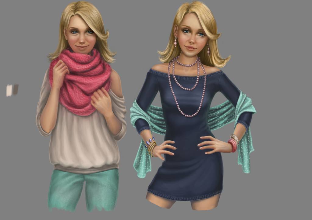
I've been working on the second illustration on and off for the past week and I'm about to call it done. Just thought I'd show it to you in case I'm missing something huge.
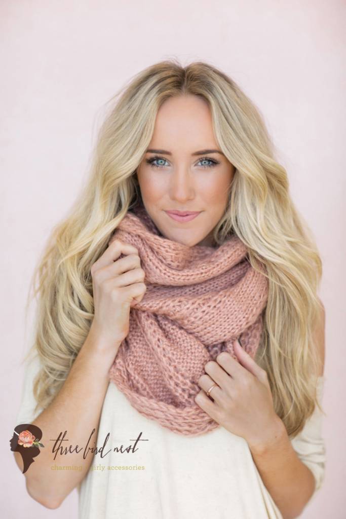
Here it is, together with the first one (and I corrected the first one's left - our right - hand):
Also, here's my ref for this one:
Have a nice weekend!
I've been working on the second illustration on and off for the past week and I'm about to call it done. Just thought I'd show it to you in case I'm missing something huge.
Here it is, together with the first one (and I corrected the first one's left - our right - hand):
Also, here's my ref for this one:
Have a nice weekend!
Last edit: 13 Sep 2014 12:55 by roz.
Please Log in or Create an account to join the conversation.

14 Sep 2014 18:22 #6177
by Kodabble
Replied by Kodabble on topic WIPs of Roz
Second image is looking good. Nice use of a reference without being a complete copy, so it is your own.
One observation, especially on the first image is the corners of the mouth. You are using a very dark line to define the mouth and they appear to be very long, thin and dark. Look at your reference, the mouth line varies in width and shade. Anyway, keep going they are coming along nicely.
One observation, especially on the first image is the corners of the mouth. You are using a very dark line to define the mouth and they appear to be very long, thin and dark. Look at your reference, the mouth line varies in width and shade. Anyway, keep going they are coming along nicely.
The following user(s) said Thank You: roz
Please Log in or Create an account to join the conversation.
15 Sep 2014 05:44 #6181
by roz
Replied by roz on topic WIPs of Roz
Thanks for the input, Kodabble. I'll keep your tip in mind when I'm painting in a more realistic style, I think that would help a great deal to achieve realism (one thing I definitely do want to achieve some day).
Glad you like 'em so far
Glad you like 'em so far
Please Log in or Create an account to join the conversation.
18 Sep 2014 12:04 #6270
by roz
Replied by roz on topic WIPs of Roz
Hey guys
I've been working on the third of a total of nine images and here's what I've come up so far:

Here's my reference:
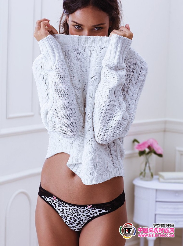
Now, as with the previous image, I haven't followed my reference 1:1. I'd like to point out that her shoulders are elevated (I played a bit in front of the mirror and saw that's pretty possible when taking a pose like this) and her head is tilted down a bit. Her elevated shoulders cause her torso to elongate a bit and I think as a result she can look a bit slimmer than the rest as they are in more relaxed poses. But she seems off and I think I see a few things that could be fixed:
1. I think I should darken the area around her left (our right) eye that is partially covered by hair, as I now see it's a little too light.
2. I'm considering turning her hips to the absolute front, as they're now a bit to the side and that's partially what bothers me. My ref is shot from a different angle, so it doesn't help with this exact issue, I think. It really helped in painting the hands, though. Really, thank god there's reference for me to look at while drawing and painting hands!
I hope to be able to do those things tomorrow, as I'd like to move on with the rest over the weekend.
Are there any things that you notice other than what I mentioned that bother you? Please share, I really appreciate your input.
Have a nice day, everyone!
I've been working on the third of a total of nine images and here's what I've come up so far:
Here's my reference:
Now, as with the previous image, I haven't followed my reference 1:1. I'd like to point out that her shoulders are elevated (I played a bit in front of the mirror and saw that's pretty possible when taking a pose like this) and her head is tilted down a bit. Her elevated shoulders cause her torso to elongate a bit and I think as a result she can look a bit slimmer than the rest as they are in more relaxed poses. But she seems off and I think I see a few things that could be fixed:
1. I think I should darken the area around her left (our right) eye that is partially covered by hair, as I now see it's a little too light.
2. I'm considering turning her hips to the absolute front, as they're now a bit to the side and that's partially what bothers me. My ref is shot from a different angle, so it doesn't help with this exact issue, I think. It really helped in painting the hands, though. Really, thank god there's reference for me to look at while drawing and painting hands!
I hope to be able to do those things tomorrow, as I'd like to move on with the rest over the weekend.
Are there any things that you notice other than what I mentioned that bother you? Please share, I really appreciate your input.
Have a nice day, everyone!
Please Log in or Create an account to join the conversation.
18 Sep 2014 16:29 #6274
by Charlotte
Any an all misspellings are henceforth blamed on the cats.
Replied by Charlotte on topic WIPs of Roz
I think you have a pretty clear idea of what needs to be fixed (just posting online always helps me to see things that feel "off"). There are a couple of issues for me though - one is only the last character: the shape of her belly isn't "rounded" in the way of the reference, and I think that it would look more natural. The two "lines" on the sides of the belly just seem to be straight and diverging in your picture where they should really sort of curve and connect under the belly. Not sure if I explain that well - on the ref it's a very discreet bit of shading that does it - and maybe the curve of the line of the panties as well.
The second is actually all your images. The more I see them all together, the more tired she seems to look. I think, since she's so young, you might want to ease up a bit on the shadows under the eyes. I think it's one of those things that are difficult in pictures because young people do get shadows and "wrinkles" or bags under the eyes but in paintings such features easily make them look older or more tired, even when you follow reference...
The second is actually all your images. The more I see them all together, the more tired she seems to look. I think, since she's so young, you might want to ease up a bit on the shadows under the eyes. I think it's one of those things that are difficult in pictures because young people do get shadows and "wrinkles" or bags under the eyes but in paintings such features easily make them look older or more tired, even when you follow reference...
Any an all misspellings are henceforth blamed on the cats.
The following user(s) said Thank You: roz
Please Log in or Create an account to join the conversation.
18 Sep 2014 16:37 #6275
by roz
Replied by roz on topic WIPs of Roz
Thanks for your comment, Charlotte
I was a little reluctant to round up the belly as to not make it look too round as she's in a pretty decent shape, a bit on the slimmer side. But I'll see what I can do about that. I think I understood you pretty well.
The other thing you mention is also reasonable. My only concern would be losing part of her expression if I lighten the shadows under her eyes a bit.. I was looking at my reflection in the mirror for both today's image and the second one, as they're both smiling (even though it doesn't show much under that sweater.. and I thought the shape of her eyes and the flesh beneath them is my only chance to make her hidden smile read to the viewer) and I saw clearly that those wrinkles make the eyes smiling, too, not just the mouth. And practically make all the difference between a fake and a real smile to me. I hope you get my point. But then again, I'll see what I can do about that.
Although I think she's getting tired of modeling
I was a little reluctant to round up the belly as to not make it look too round as she's in a pretty decent shape, a bit on the slimmer side. But I'll see what I can do about that. I think I understood you pretty well.
The other thing you mention is also reasonable. My only concern would be losing part of her expression if I lighten the shadows under her eyes a bit.. I was looking at my reflection in the mirror for both today's image and the second one, as they're both smiling (even though it doesn't show much under that sweater.. and I thought the shape of her eyes and the flesh beneath them is my only chance to make her hidden smile read to the viewer) and I saw clearly that those wrinkles make the eyes smiling, too, not just the mouth. And practically make all the difference between a fake and a real smile to me. I hope you get my point. But then again, I'll see what I can do about that.
Although I think she's getting tired of modeling
Please Log in or Create an account to join the conversation.
Facebook Feed
Member Statistics
- Total Users: 228
- Latest User: DanielWilson
- Online Users: 2
- Users Today: 0
- Users this Week: 1
- Users this Month: 2
- Users this Year: 2
NOTE! This site uses cookies and similar technologies.
By using this website you agree to the use of cookies and related data storage as detailed in our privacy policy. Learn more
I understand
Site design Mad Hamster Studios. All content is protected under © and the property of the various contributers and not to be reproduced without permission of the creator.