
- Posts: 11895
- Thank you received: 513
April challenge here: Elder God
March entries - Egg Bunnies
The shoutbox is unavailable to non-members
Shoutbox History
I've posted new challenges but not fixed the countdown clock etc. Brain capacity ran out. 
2 hours ago
CGAN Sept. 2014 Challenge - The Wrath of Kat - WIP
19 Sep 2014 18:07 - 19 Sep 2014 18:08 #6295
by Valence
Replied by Valence on topic CGAN Sept. 2014 Challenge - The Wrath of Kat - WIP
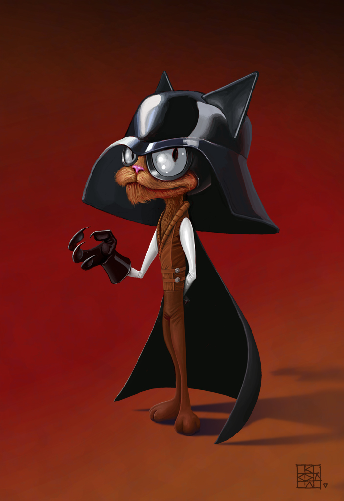
SchizoWolf: I can't believe there's someone who hasn't heard of Wrath Of Khan. Shameful! But I'll forgive you considering the excellent progress of your picture. The helmet with ears is especially witty and works a treat.
AngieA: I'm impressed by texture in your image, it really gives it a fantastic mood that makes the character seem scary but also intriguing.
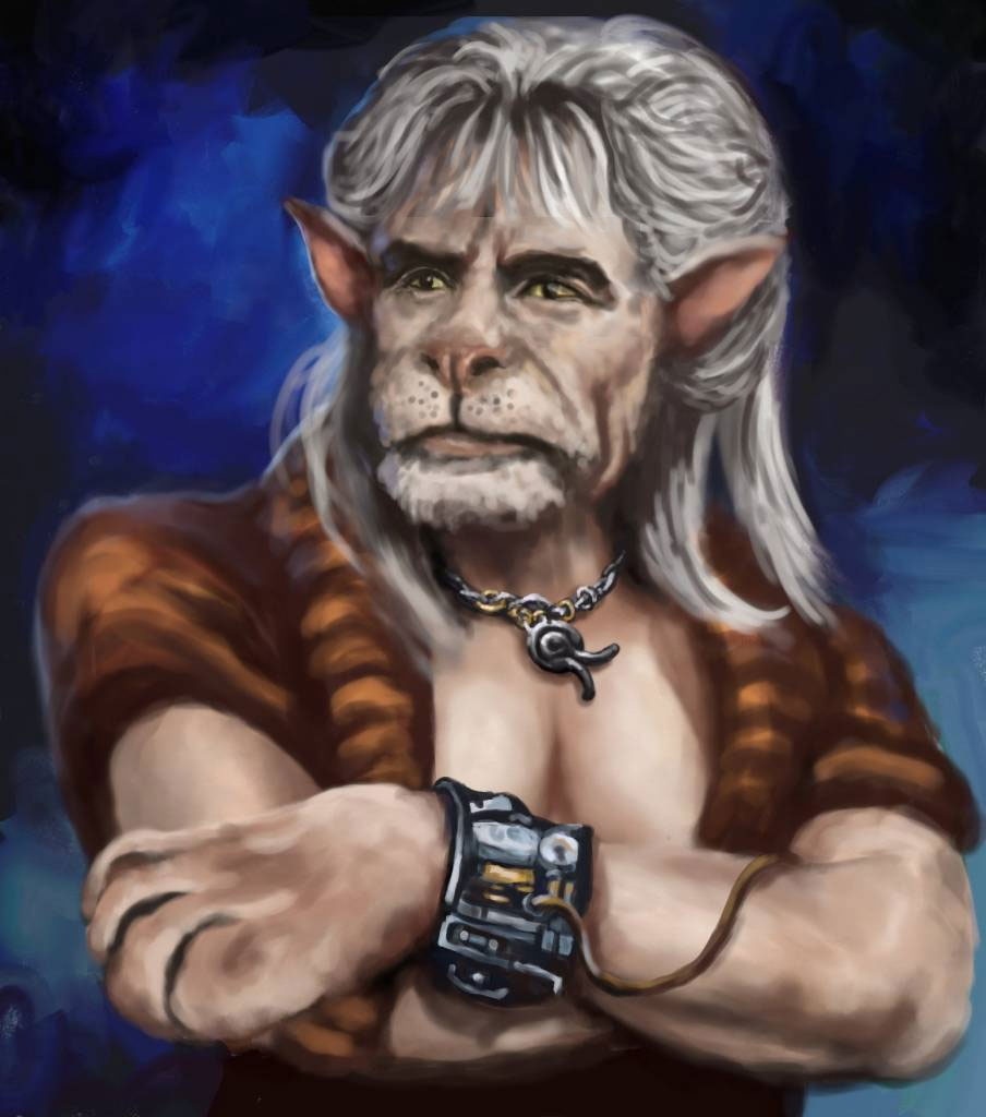
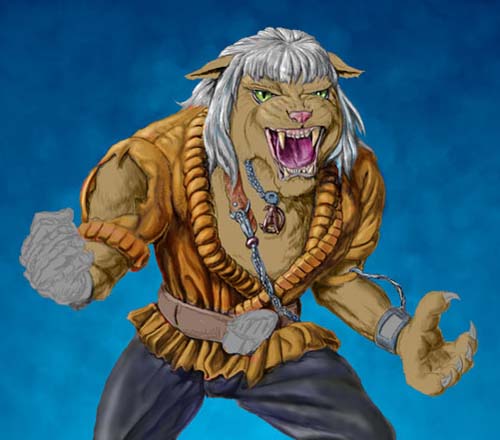
I've done a bit more work on mine. After fooling around and making a bit of a mess I realised I hadn't bothered to look at any lion reference. So I plundered my usual unimaginative source (the first page of Google Images. ahem) and made a bit of progress.
Now he looks more lionish but sadly has lost the expression I wanted and all pretence of getting some kind of Montalban likeness has long since evaporated.
And herein lies my problem with Furries: I can just about paint the animal. I can sort of paint the human. But I can't just get that credible combination of the two. It's a mystery to me.
I shall look again with new eyes next week and shall hopefully add some more detail to the hair/mane and try to make his skin look more like fur (I've found a brush in Android Sketchbook Pro that might do the trick although the plan to switch to tablet may be hindered by my fat fingers!)

AngieA: I'm impressed by texture in your image, it really gives it a fantastic mood that makes the character seem scary but also intriguing.
I've done a bit more work on mine. After fooling around and making a bit of a mess I realised I hadn't bothered to look at any lion reference. So I plundered my usual unimaginative source (the first page of Google Images. ahem) and made a bit of progress.
Now he looks more lionish but sadly has lost the expression I wanted and all pretence of getting some kind of Montalban likeness has long since evaporated.
And herein lies my problem with Furries: I can just about paint the animal. I can sort of paint the human. But I can't just get that credible combination of the two. It's a mystery to me.
I shall look again with new eyes next week and shall hopefully add some more detail to the hair/mane and try to make his skin look more like fur (I've found a brush in Android Sketchbook Pro that might do the trick although the plan to switch to tablet may be hindered by my fat fingers!)
Last edit: 19 Sep 2014 18:08 by Valence. Reason: typo typo typo
Please Log in or Create an account to join the conversation.
- SchizophreniaWolf
-
- Offline
- Junior Member
-

Less
More
- Posts: 170
- Thank you received: 10
21 Sep 2014 19:18 - 22 Sep 2014 15:58 #6308
by SchizophreniaWolf
Replied by SchizophreniaWolf on topic CGAN Sept. 2014 Challenge - The Wrath of Kat - WIP
Almost done!
Valence: Yeah I know sorry haha. I like your paint too. The only thing I can say is that he holds his sholders a bit high. Or maybe his neck is too short. The face is very cool.
AngieA: I looks like someone of the Island of Dr. Moreau , nice paint! But use some reference for the posing, a screenshot from a movie or whatever.
Valence: Yeah I know sorry haha. I like your paint too. The only thing I can say is that he holds his sholders a bit high. Or maybe his neck is too short. The face is very cool.
AngieA: I looks like someone of the Island of Dr. Moreau
, nice paint! But use some reference for the posing, a screenshot from a movie or whatever.
Last edit: 22 Sep 2014 15:58 by SchizophreniaWolf.
Please Log in or Create an account to join the conversation.
21 Sep 2014 19:59 #6309
by oaktree
Replied by oaktree on topic CGAN Sept. 2014 Challenge - The Wrath of Kat - WIP
Thank you all for the kind comments.
AngieA I agree with Valence love the textures.
Valence Really like the way you are working with the idea keep it up.
SchizophreniaWolf Love the expression and the eyes are great
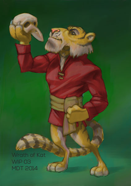
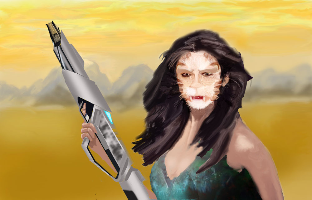
So I think that my Kat will be female and have made a start in that direction.
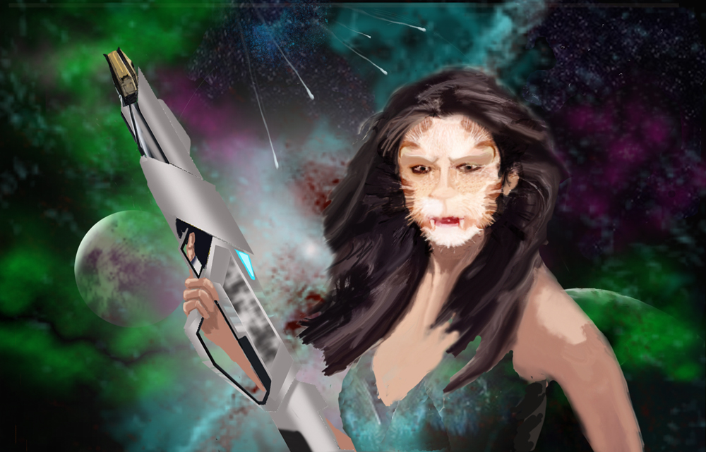
I've added a Duck gun ( Star Trek in style to my mind).
For the time being I am trying out a space type background but could go back to the much simpler background in the earlier sketch depending on what people say.
AngieA I agree with Valence love the textures.
Valence Really like the way you are working with the idea keep it up.
SchizophreniaWolf Love the expression and the eyes are great
So I think that my Kat will be female and have made a start in that direction.
I've added a Duck gun ( Star Trek in style to my mind).
For the time being I am trying out a space type background but could go back to the much simpler background in the earlier sketch depending on what people say.
Please Log in or Create an account to join the conversation.

21 Sep 2014 21:43 - 21 Sep 2014 21:43 #6310
by Domtopia
Everything's on the right!!!
It's like driving abroad!
Replied by Domtopia on topic CGAN Sept. 2014 Challenge - The Wrath of Kat - WIP
These are all really good ideas.
Schizo: The cartoony style is unique. I love the colour application too! But I would try to find a higher level of contrast between the colour of his fur and his clothes, especially around the chest area. Given that the original Khan had such an epic chest, I think it might look good if you gave the cat some pale patches there, or some other markings. The variety in the colours will add visual interest too
Valance: I like the heavy paint feel to this. It has a nice weight to it that I quite like. The faithfulness to the original Khan is nice to see too. Let's see a bit more!
Oak: A female take on the character is an interesting idea. Instead of a non-specific background, I might suggest something a little more identifiable as the bridge of a ship, or a sandy, storm ridden wilderness. Something to connect the character and the background together would be a better choice I think.
She's also going to have an epic cleavage, judging by the amount of flesh on show here!! I guess that's in keeping with the Khan character too! ha!
Everything's on the right!!!
It's like driving abroad!
Last edit: 21 Sep 2014 21:43 by Domtopia.
The following user(s) said Thank You: SchizophreniaWolf
Please Log in or Create an account to join the conversation.
- SchizophreniaWolf
-
- Offline
- Junior Member
-
Less
More
- Posts: 170
- Thank you received: 10
22 Sep 2014 07:44 #6313
by SchizophreniaWolf
Domtopia: Nice comment, thx Domtopia! I'm going to work on that.
Replied by SchizophreniaWolf on topic CGAN Sept. 2014 Challenge - The Wrath of Kat - WIP
Domtopia wrote:
Schizo: The cartoony style is unique. I love the colour application too! But I would try to find a higher level of contrast between the colour of his fur and his clothes, especially around the chest area. Given that the original Khan had such an epic chest, I think it might look good if you gave the cat some pale patches there, or some other markings. The variety in the colours will add visual interest too
Domtopia: Nice comment, thx Domtopia! I'm going to work on that.
Please Log in or Create an account to join the conversation.

22 Sep 2014 08:59 #6314
by Banj
I think it's around the eyes that is losing it. If you bring back more of the eyes from the previous WIP it looks more Montalbahn like. Currently I think you pushed it too far to Lion and lost some of the Human.
Replied by Banj on topic CGAN Sept. 2014 Challenge - The Wrath of Kat - WIP
Valence wrote: Now he looks more lionish but sadly has lost the expression I wanted and all pretence of getting some kind of Montalban likeness has long since evaporated.
And herein lies my problem with Furries: I can just about paint the animal. I can sort of paint the human. But I can't just get that credible combination of the two. It's a mystery to me.
I think it's around the eyes that is losing it. If you bring back more of the eyes from the previous WIP it looks more Montalbahn like. Currently I think you pushed it too far to Lion and lost some of the Human.
Please Log in or Create an account to join the conversation.
22 Sep 2014 13:41 #6321
by Banj
Replied by Banj on topic CGAN Sept. 2014 Challenge - The Wrath of Kat - WIP
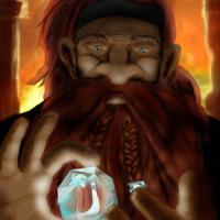
Despite Painter an Photoshop conspiring against me to handle layers in a completely and utterly different way ( KHAAAAAAAAAANNNNNN!!!) I have begun adding colour. Still need to tidy it up alot.
KHAAAAAAAAAANNNNNN!!!) I have begun adding colour. Still need to tidy it up alot.Please Log in or Create an account to join the conversation.
22 Sep 2014 18:41 - 22 Sep 2014 19:39 #6322
by Valence
Replied by Valence on topic CGAN Sept. 2014 Challenge - The Wrath of Kat - WIP
Banj: I'm loving his Original Series style outfit. And the Hamlet pose is classic Khan.
Oaktree: I quite like the spacey background. And the shooting stars act as a nice compositional tool both describing a vanishing point in deep space and spotlighting the character. Can't wait to see what you do with the face.
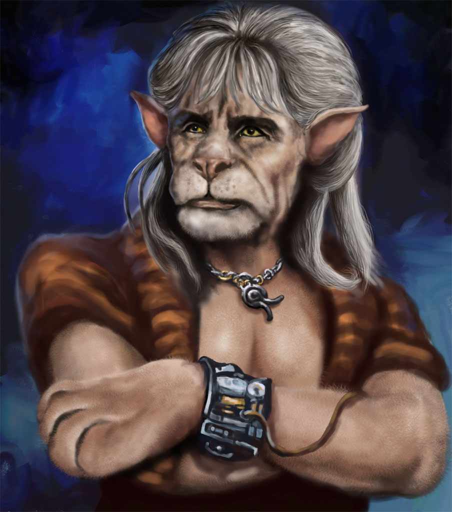
Sadly mine has deteriorated further. Banj was right about the eyes. I think also the gap between the eyes is important. The likeness demands a really small gap between the brows but the lion face requires a fat nose and no eyebrows at all. It's an endless tug-of-war between anatomies.
Also Schizo was right about the shoulder, it looked OK during the human sketching but adding lion bits made it look somewhat deformed. Thankfully a quick cut and paste did the trick.
I added some fur in Sketchbook and the resulting effect was rather inconsistent, it looks great in some areas and yet others sadly do not. And of course once you take the image out of ArtRage you lose all the paint depth information so I'm now trying to finish it in Photoshop which will inevitably result in inconsistent texture. Also the hair/mane looks a bit of a mess and it all seems to have gone a bit too dark in places. I don't know why. I wonder if switching between software has changed the colour profile or maybe my eyes are playing tricks on me.
Anyhoo I'll try to rescue it during the next session and call it quits whatever it looks like.
Oaktree: I quite like the spacey background. And the shooting stars act as a nice compositional tool both describing a vanishing point in deep space and spotlighting the character. Can't wait to see what you do with the face.
Sadly mine has deteriorated further. Banj was right about the eyes. I think also the gap between the eyes is important. The likeness demands a really small gap between the brows but the lion face requires a fat nose and no eyebrows at all. It's an endless tug-of-war between anatomies.
Also Schizo was right about the shoulder, it looked OK during the human sketching but adding lion bits made it look somewhat deformed. Thankfully a quick cut and paste did the trick.
I added some fur in Sketchbook and the resulting effect was rather inconsistent, it looks great in some areas and yet others sadly do not. And of course once you take the image out of ArtRage you lose all the paint depth information so I'm now trying to finish it in Photoshop which will inevitably result in inconsistent texture. Also the hair/mane looks a bit of a mess and it all seems to have gone a bit too dark in places. I don't know why. I wonder if switching between software has changed the colour profile or maybe my eyes are playing tricks on me.
Anyhoo I'll try to rescue it during the next session and call it quits whatever it looks like.
Last edit: 22 Sep 2014 19:39 by Valence.
Please Log in or Create an account to join the conversation.
23 Sep 2014 18:38 #6345
by Kodabble
Replied by Kodabble on topic CGAN Sept. 2014 Challenge - The Wrath of Kat - WIP
It’s good to see all the great but different ideas.
Valence: I think it’s looking good. This one has the Ricardo Montalban/Khan look. As this is a morph type character human-cat it seems to me that he can have eyebrows. I’ve tried to incorporate them in mine too.
Banj: The Jungle book Khan is looking great. Love the pose.
Oaktree: The female is a clever idea. Only issue at this time is the use of the gun in smooth cg and the rest of the painted effect. I assume you are going to make them match? Keep going she’s looking great.
SchizophreniaWolf: What can I say; love it and the cross movie concept, and he fits in with the other characters of the Enterpond crew.
AngieA: Nice, I hadn’t even thought of the Khan from the “Into the Darkness” movie. He’s looking good and I like the use of the movie poster type background.
Rorke: hopefully you didn’t get scared off. Looks like you and I were on the same mind track and I liked your pose.
Em and Charlotte where are yours, this is a new site and new comp? CherryGraphics sorry you bowed out too you have original ideas on other challenges.
Anyway had some time to work on mine so here is the latest WIP. (Crits are welcome)
Please Log in or Create an account to join the conversation.
23 Sep 2014 22:22 #6358
by oaktree
Replied by oaktree on topic CGAN Sept. 2014 Challenge - The Wrath of Kat - WIP
Keep up the good work everyone. Thanks for all of the comments folks. Felling utterly confused at the moment but will keep at it for the time being.
Had a quick sketch at a desert environment just to see how it would go.
Had a quick sketch at a desert environment just to see how it would go.
Please Log in or Create an account to join the conversation.
Facebook Feed
Member Statistics
- Total Users: 226
- Latest User: norajohnson
- Online Users: 2
- Users Today: 0
- Users this Week: 0
- Users this Month: 0
- Users this Year: 0
Members Online
NOTE! This site uses cookies and similar technologies.
By using this website you agree to the use of cookies and related data storage as detailed in our privacy policy. Learn more
I understand
Site design Mad Hamster Studios. All content is protected under © and the property of the various contributers and not to be reproduced without permission of the creator.