

- Posts: 10
- Thank you received: 0
April challenge here: Elder God
March entries - Egg Bunnies
Vektor's Visuals
06 Jun 2018 18:53 #21356
by Vektor
Vektor's Visuals was created by Vektor
This is my first post since the old ImagineFX forums went bye-bye. Been busy with all kinds of things mostly unrelated to artistic pursuits but I'm finally getting back into it.
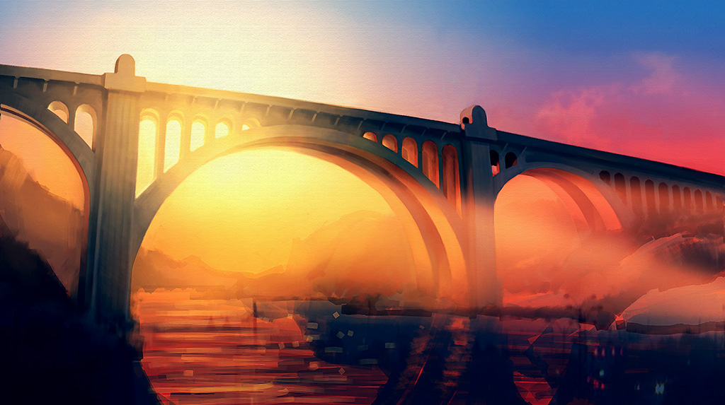
I have a new project I'm working on, an illustration of a local landmark called the Monroe Street Bridge. Nothing sci-fi or fantastical about it, though I am trying to infuse it with a certain epic quality.
It's still very much a work in progress. Lots of details to be added and some perspective problems to fix. The river flowing below is still in the rough-in stage and is one of the next items on my list. At the moment I'm focused on color and values and trying to decide between at least two widely different versions. I could really use some feedback and advice from fellow artists to help me decide which direction to go.
By the way, my ultimate intention is to break this up into a four-panel set (hence the vertical black lines in one of the WIPs) and mount it on my living room wall.
Thanks for looking.
Please Log in or Create an account to join the conversation.

06 Jun 2018 19:21 #21357
by Charlotte
Any an all misspellings are henceforth blamed on the cats.
Replied by Charlotte on topic Vektor's Visuals
Nice to se an old Imagine FX forumite resurfacing here! ")
I have to say i think the image look great already - it's a wonderful light coming in under the bridge. As for colour versions, at thumbnail size the warmer one looks very appealing - but also more "cliché" as a colourful sunset... The other one, especially viewed up large could be very nice too - and could almost get a futuristc or sci fi wibe instead (add a plane trail in the sky for instance, and maybe cool down the blues further towards blue-green...)
Not sure my ideas would work, but it's what i thought when I looked. So I hope it helps some
Any an all misspellings are henceforth blamed on the cats.
Please Log in or Create an account to join the conversation.

06 Jun 2018 20:07 #21358
by Valence
Replied by Valence on topic Vektor's Visuals
All of these look fantastic! Picking one will be down to personal preference and mood, and for what it's worth, I like the one with the warmer light too. That one has a subtlety and harmony that I find appealing.
Also I love the idea of splitting the image into panels, it'll work really well with the strong horizontal line of the bridge.
Ps. After you've uploaded images, click "Insert" to make them appear full-size in the post.")
Also I love the idea of splitting the image into panels, it'll work really well with the strong horizontal line of the bridge.
Ps. After you've uploaded images, click "Insert" to make them appear full-size in the post.
Please Log in or Create an account to join the conversation.
06 Jun 2018 20:48 #21359
by Charlotte
Any an all misspellings are henceforth blamed on the cats.
Replied by Charlotte on topic Vektor's Visuals
Right - I forgot both to mention the PS (insert image or insert all) and that maybe your choice should be influenced by the rest of the room you plan to place it in
Any an all misspellings are henceforth blamed on the cats.
Please Log in or Create an account to join the conversation.
06 Jun 2018 21:38 #21361
by Vektor
Replied by Vektor on topic Vektor's Visuals
I figured out the image insertion option but it didn't want to let me do all five in one post. Probably should have just in-lined one of the last two and done the rest as attachments, but whatever.
The consensus of those I've showed these to does seem to be in favor of the warmer color tone, and it's probably a better fit for the living room decor. The base image I'm actually painting is what's shown in WIP008 with both the warm and cool variations as overlays, so I may end up doing both and using the cool version in my office at work.
Any other thoughts or suggestions? Things like composition, focal points, etc. are things I'm always trying to improve on.
Please Log in or Create an account to join the conversation.

07 Jun 2018 07:20 #21362
by kazky
Replied by kazky on topic Vektor's Visuals
hi and welcome back to the gang
I love the image, it's looking beautiful, I too prefer the warm colours, but the cool looks stunning too. Good idea to use both.
I love the image, it's looking beautiful, I too prefer the warm colours, but the cool looks stunning too. Good idea to use both.
Please Log in or Create an account to join the conversation.
07 Jun 2018 20:08 #21370
by Vektor
Replied by Vektor on topic Vektor's Visuals
Small update with some details added along with some tweaks to the bridge geometry and light and shadow adjustments.
Please Log in or Create an account to join the conversation.
08 Jun 2018 06:35 #21371
by Charlotte
Any an all misspellings are henceforth blamed on the cats.
Replied by Charlotte on topic Vektor's Visuals
I find my eyes would like to see a bit more of the bridge to the left side, but I guess that'd upset the four panel layout... Other than that, still lookinig good and I like the idea of making two versions
Any an all misspellings are henceforth blamed on the cats.
Please Log in or Create an account to join the conversation.
08 Jun 2018 07:09 #21373
by Vektor
Replied by Vektor on topic Vektor's Visuals
Last one for tonight. Finally got the river and some of the landscape filled in, though there's a lot of detail work yet to be added.
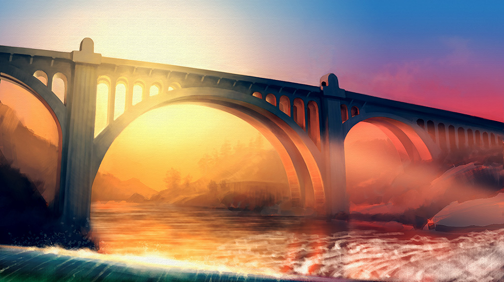
The falls in the foreground may or may not stay. They actually do exist along with some much bigger and more impressive falls off to the right, but their distance from the bridge is wrong and from this POV all you would likely see is a big expanse of concrete observation deck taking up most of the foreground. I added the falls in an attempt to lighten the left side of the image and throw in another color element. I also toned down the orange tint slightly from its previous forest fire intensity. Overall it's not bad but I'm far from sold on it.
I'm about half tempted to replace the falls with the actual observation deck, maybe even throw in a couple of people standing at the rail, something like that.
Please Log in or Create an account to join the conversation.
10 Jun 2018 17:07 #21386
by Vektor
Replied by Vektor on topic Vektor's Visuals
Okay, I slept on it, stared at it for a while, and finally realized it wasn't working.
The line of the falls cannot be aligned with the bridge. It throws the whole composition out of balance and makes it look tilted. The first thing that occurred to me was to mirror the falls to the opposite side so their angle counters the slope of the bridge instead of reinforcing it, which did help but the falls themselves still looked out of place. They don't really look like falls but more like tidal wave bearing down on the bridge like a scene out of some disaster movie.

Another problem is something Charlotte keyed on with her comment about wanting to see more of the bridge on the left side. This, too, was fundamentally a balance problem; there was just too much "mass" on the left side. As Charlotte mentioned, that would have been difficult to fix without throwing off the positioning for the four-panel arrangement, so I decided to add a fifth panel on the left end. The whole arrangement winds up to be more panoramic than I intended but that, plus the elimination of the falls, definitely makes everything more balanced.
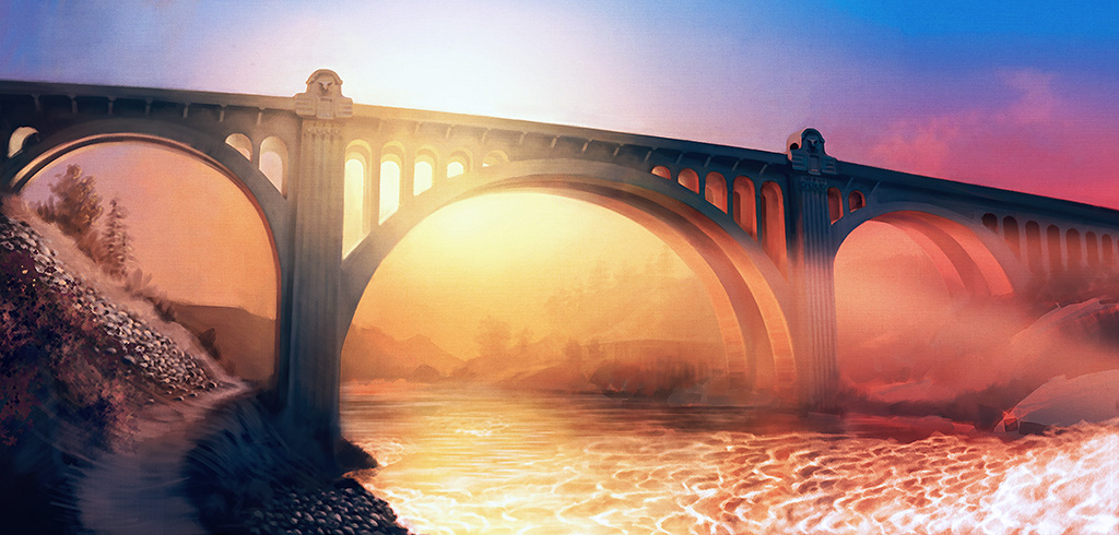
I'm still adding details and refinements, smoothing out some tonal areas and tweaking color and saturation, but I'd say this piece is about 90% of the way to completion.
The line of the falls cannot be aligned with the bridge. It throws the whole composition out of balance and makes it look tilted. The first thing that occurred to me was to mirror the falls to the opposite side so their angle counters the slope of the bridge instead of reinforcing it, which did help but the falls themselves still looked out of place. They don't really look like falls but more like tidal wave bearing down on the bridge like a scene out of some disaster movie.
Another problem is something Charlotte keyed on with her comment about wanting to see more of the bridge on the left side. This, too, was fundamentally a balance problem; there was just too much "mass" on the left side. As Charlotte mentioned, that would have been difficult to fix without throwing off the positioning for the four-panel arrangement, so I decided to add a fifth panel on the left end. The whole arrangement winds up to be more panoramic than I intended but that, plus the elimination of the falls, definitely makes everything more balanced.
I'm still adding details and refinements, smoothing out some tonal areas and tweaking color and saturation, but I'd say this piece is about 90% of the way to completion.
Please Log in or Create an account to join the conversation.
Facebook Feed
Member Statistics
- Total Users: 226
- Latest User: norajohnson
- Online Users: 3
- Users Today: 0
- Users this Week: 0
- Users this Month: 0
- Users this Year: 0
NOTE! This site uses cookies and similar technologies.
By using this website you agree to the use of cookies and related data storage as detailed in our privacy policy. Learn more
I understand
Site design Mad Hamster Studios. All content is protected under © and the property of the various contributers and not to be reproduced without permission of the creator.