


- Posts: 12090
- Thank you received: 516


Important, change your password!
Go here for further information: https://cgartnexus.com/index.php/forum/announcements/840-hacked
Attos' Sketchbook and Studies NSFW Nudity
17 Mar 2016 19:30 #13554
by Valence
Replied by Valence on topic Attos' Sketchbook and Studies NSFW Nudity
What software do you use then? I'm intrigued, is it Sketchbook? I do like to try and guess what everyone uses.  I just assumed it was Ps from previous discussions about the smudge tool.
As for the back arm you should make the dark part of the creases darker. (Look how dark they are on the other arm.)
If you look at the area which is effectively the armpit (and I mean the back arm again,) the underside of the sleeve (which would be shaded) is almost the same value as the side of the jacket hanging down (which would be fully lit.) By deepening the creases, especially on the underside, this would create a series of strong edges which would visually imply one part of the jacket in front of another and would help the arm recede. I've just tried it out and I think it works.
I just assumed it was Ps from previous discussions about the smudge tool.As for the back arm you should make the dark part of the creases darker. (Look how dark they are on the other arm.)
If you look at the area which is effectively the armpit (and I mean the back arm again,) the underside of the sleeve (which would be shaded) is almost the same value as the side of the jacket hanging down (which would be fully lit.) By deepening the creases, especially on the underside, this would create a series of strong edges which would visually imply one part of the jacket in front of another and would help the arm recede. I've just tried it out and I think it works.
The following user(s) said Thank You: Atto
Please Log in or Create an account to join the conversation.
17 Mar 2016 20:30 #13556
by Atto
No smudge tool was harmed in the making of this image.
Replied by Atto on topic Attos' Sketchbook and Studies NSFW Nudity
I use Photoshop for The Skint. Commonly known as Corel Paint Shop Pro Photo (and its version X2 - Ithink its around 6 years old now) It has similar tools to photoshop and I used to work with the Adobe set of programmes when I was working as an interior designer and illustrator.
The majority of the work I did back then was coloured sections and plans for Architectural companies. I literally imported CAD drawings and added colour and lighting. As such I rarely flexed my traditional drawing muscles.
I did work as a graphic designer/illustrator for around 18 months but as I was also the studio manager my main role was managing workflow. I did spend 6 months training two traditional artists on photoshop shortly after which the company made me redundant and the other two artists shared my work load. :angry:
I've just checked my ref and those areas you mention are actually very light however if it will work better like you suggest I'll give it a go. Thanks again bud.
The majority of the work I did back then was coloured sections and plans for Architectural companies. I literally imported CAD drawings and added colour and lighting. As such I rarely flexed my traditional drawing muscles.
I did work as a graphic designer/illustrator for around 18 months but as I was also the studio manager my main role was managing workflow. I did spend 6 months training two traditional artists on photoshop shortly after which the company made me redundant and the other two artists shared my work load. :angry:
I've just checked my ref and those areas you mention are actually very light however if it will work better like you suggest I'll give it a go. Thanks again bud.
No smudge tool was harmed in the making of this image.
Please Log in or Create an account to join the conversation.
17 Mar 2016 21:40 - 17 Mar 2016 21:54 #13557
by Valence
Replied by Valence on topic Attos' Sketchbook and Studies NSFW Nudity
I'm also a connoisseur of cheap (or free!) software. Gotta love the free! 
I think Artweaver allows you to do thick paint effects and everyone seems to rave about Krita but I don't know enough about that one and its features.
I always find it frustrating too when you can't get the same effect as the reference even though everything seems the same in your painting. I think when the eye (or the brain?) sees something that's photo realistic it automatically makes a set of assumptions about that object in space but when faced with the same thing in a painting with a different level of detail and texture it doesn't always make that conceptual leap so you have to push some things a little further to get the same effect.
I don't think your pic needs too much of a change there, it's just a subtle alteration to encourage the viewer to understand.
I think Artweaver allows you to do thick paint effects and everyone seems to rave about Krita but I don't know enough about that one and its features.
I always find it frustrating too when you can't get the same effect as the reference even though everything seems the same in your painting. I think when the eye (or the brain?) sees something that's photo realistic it automatically makes a set of assumptions about that object in space but when faced with the same thing in a painting with a different level of detail and texture it doesn't always make that conceptual leap so you have to push some things a little further to get the same effect.
I don't think your pic needs too much of a change there, it's just a subtle alteration to encourage the viewer to understand.
Last edit: 17 Mar 2016 21:54 by Valence.
The following user(s) said Thank You: Atto
Please Log in or Create an account to join the conversation.
21 Mar 2016 02:50 #13579
by Atto
No smudge tool was harmed in the making of this image.
Replied by Atto on topic Attos' Sketchbook and Studies NSFW Nudity
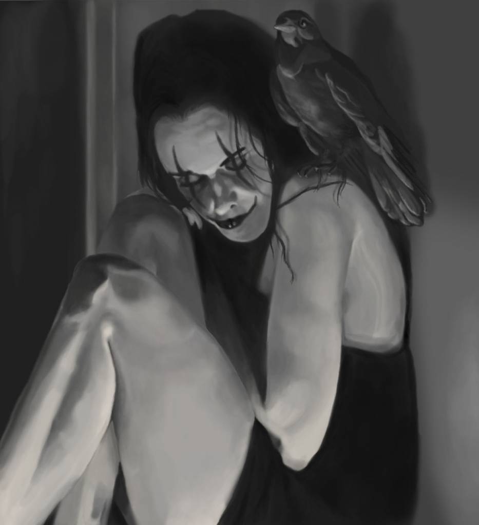
There really is nowhere to hide when working in just greyscale. Working a lot smaller on this one 10 x 12 cm at 300dpi - thought it may speed my process up a little but its ending up taking just as long.
No smudge tool was harmed in the making of this image.
Please Log in or Create an account to join the conversation.
21 Mar 2016 23:29 - 21 Mar 2016 23:32 #13581
by Atto
 Finally heard back about the commission and its a go! I can share it with you guys but they have asked me not to reveal the company logo.
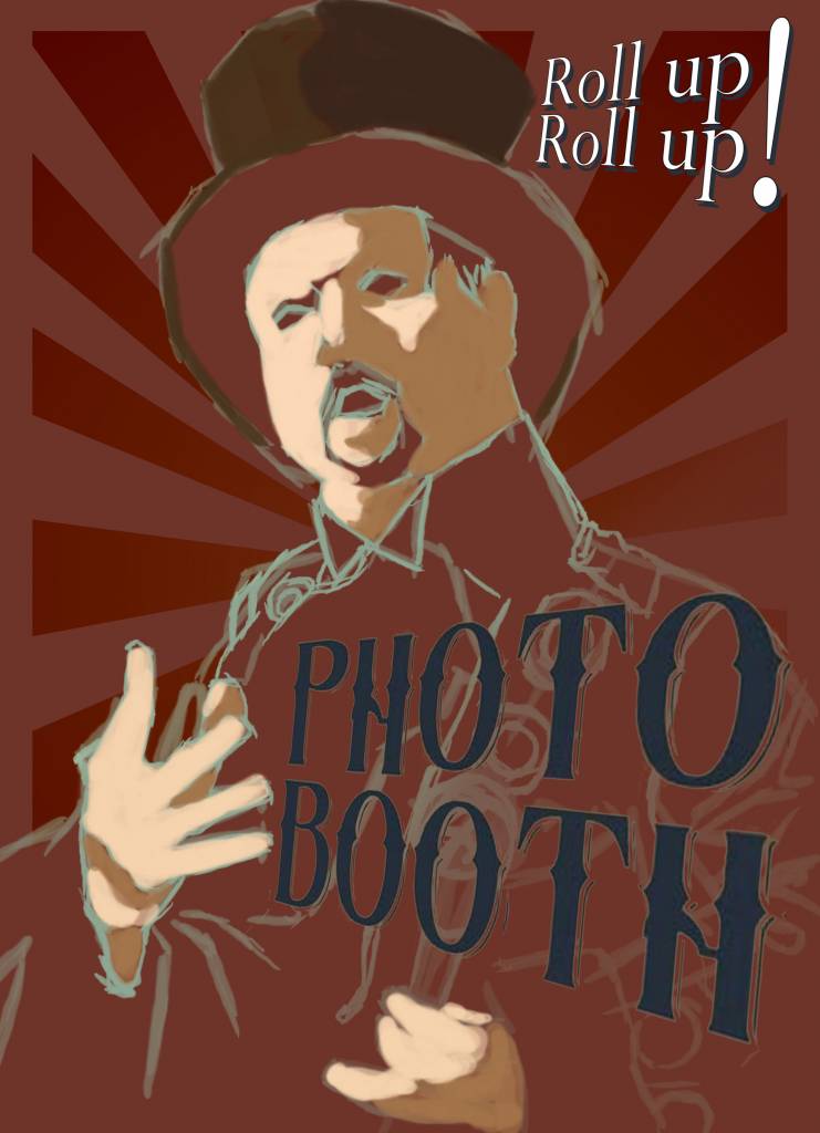
Please let me know what you guys think. It's a design for an A board for a mobile photography company who run a photo booth at various events - most notably music festivals and V-dub rallies. Really rough right now but this was the layout I sent that they have approved in principle. I've got quite some leeway here so any crits would be really valuable.
Edit: I'm going to rework the text so it reads as more of a sign written text and the roll up roll up is horrible right now I know.
No smudge tool was harmed in the making of this image.
Replied by Atto on topic Attos' Sketchbook and Studies NSFW Nudity
Finally heard back about the commission and its a go! I can share it with you guys but they have asked me not to reveal the company logo.Please let me know what you guys think. It's a design for an A board for a mobile photography company who run a photo booth at various events - most notably music festivals and V-dub rallies. Really rough right now but this was the layout I sent that they have approved in principle. I've got quite some leeway here so any crits would be really valuable.
Edit: I'm going to rework the text so it reads as more of a sign written text and the roll up roll up is horrible right now I know.
No smudge tool was harmed in the making of this image.
Last edit: 21 Mar 2016 23:32 by Atto.
Please Log in or Create an account to join the conversation.
22 Mar 2016 01:07 #13582
by Valence
Replied by Valence on topic Attos' Sketchbook and Studies NSFW Nudity
I'm a bit out of my depth with professional work so I'll tread carefully with my inexperienced eye but it looks good to me so far.
I would say (and I mean this in the general sense) that you should always keep in mind the centre line of the face. It actually looks fine at this stage but I noticed that in your challenge pic and that black and white image above that the faces lost a bit of alignment during the development. As long as you keep checking as you go along you should be fine. I'm looking forward to seeing this one progress.
And your "small" black and white canvas is still bigger than nearly all of my pictures.
I would say (and I mean this in the general sense) that you should always keep in mind the centre line of the face. It actually looks fine at this stage but I noticed that in your challenge pic and that black and white image above that the faces lost a bit of alignment during the development. As long as you keep checking as you go along you should be fine.
I'm looking forward to seeing this one progress.And your "small" black and white canvas is still bigger than nearly all of my pictures.
The following user(s) said Thank You: Atto
Please Log in or Create an account to join the conversation.
22 Mar 2016 15:37 #13586
by Atto
No smudge tool was harmed in the making of this image.
Replied by Atto on topic Attos' Sketchbook and Studies NSFW Nudity
Keeping that centre line through the development is something I always struggle with so you're spot on there. I often get so into rendering the features it slips. My sketches are normally so loose and completed with such a large brush that there is normally some question as to where the actual central point is. I'm going to try to produce a sharper and more accurate line drawing as I move into the detail.
That 'small' black and white is about half the size of my normal images, perhaps that is why I struggle to maintain any texture in my rendering. How large do you normally work then?
This commission is to be printed A1 size so I'll have to get the basics down then scale it up and work back into it. It's something I have done before with a reasonable amount of success but it still makes me nervous. At least this is for an A board to be viewed at a distance so there is slightly less pressure on me to get a perfectly detailed render.
Oh yeah and I can't believe at your level you aren't producing anything commercial!! This commission was just the result of someone seeing my work on facebook on my personal page. Now I feel like a bit of a pretender!
That 'small' black and white is about half the size of my normal images, perhaps that is why I struggle to maintain any texture in my rendering. How large do you normally work then?
This commission is to be printed A1 size so I'll have to get the basics down then scale it up and work back into it. It's something I have done before with a reasonable amount of success but it still makes me nervous. At least this is for an A board to be viewed at a distance so there is slightly less pressure on me to get a perfectly detailed render.
Oh yeah and I can't believe at your level you aren't producing anything commercial!!
This commission was just the result of someone seeing my work on facebook on my personal page. Now I feel like a bit of a pretender! No smudge tool was harmed in the making of this image.
Please Log in or Create an account to join the conversation.
22 Mar 2016 20:44 #13588
by Valence
Replied by Valence on topic Attos' Sketchbook and Studies NSFW Nudity
Doesn't everyone feel like a pretender?  I know I do.
My pics are pretty much the same size I post them give or take a few pixels. I start at about 1200px and never bother to scale them up. It's easier on the RAM and on my patience. They'd probably look awfully blocky if I ever printed them out.
A1 sounds like a chunky file, how many pixels is that? It'd be about 9K! Ouch. I imagine it'd be tricky keeping a consistent level of detail.
The more you consciously think about facial alignment then the more it will become a habit as you work and in the end you won't think about it at all and it'll just be instinctive.
And nerves are good, they keep you focused and spur you on to get it right. And I think it'll work fine with this pic.
I know I do. My pics are pretty much the same size I post them give or take a few pixels. I start at about 1200px and never bother to scale them up. It's easier on the RAM and on my patience. They'd probably look awfully blocky if I ever printed them out.
A1 sounds like a chunky file, how many pixels is that? It'd be about 9K! Ouch. I imagine it'd be tricky keeping a consistent level of detail.
The more you consciously think about facial alignment then the more it will become a habit as you work and in the end you won't think about it at all and it'll just be instinctive.
And nerves are good, they keep you focused and spur you on to get it right. And I think it'll work fine with this pic.
The following user(s) said Thank You: Atto
Please Log in or Create an account to join the conversation.
23 Mar 2016 17:49 #13590
by Atto
No smudge tool was harmed in the making of this image.
Replied by Atto on topic Attos' Sketchbook and Studies NSFW Nudity
Enjoying this immensely, being able to take my time over it, as opposed to worrying about whether I should be doing something more (financially) productive is a great weight off my shoulders.
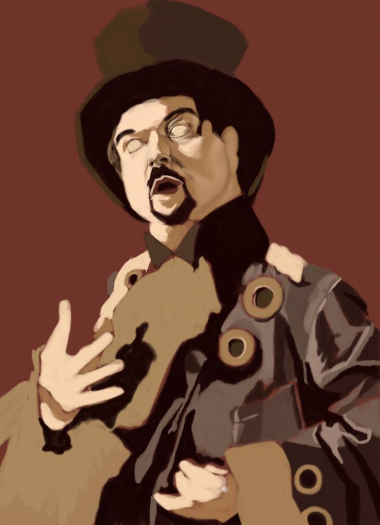
No smudge tool was harmed in the making of this image.
Please Log in or Create an account to join the conversation.
- crankshaft
-
- Offline
- Platinum Member
-

Less
More
- Posts: 1564
- Thank you received: 55
26 Mar 2016 00:37 #13598
by crankshaft
Replied by crankshaft on topic Attos' Sketchbook and Studies NSFW Nudity
Looking good! Not much to critique as I think it looks good already. Maybe try giving it a rim light to make things pop even more?
The following user(s) said Thank You: Atto
Please Log in or Create an account to join the conversation.
Facebook Feed
Member Statistics
- Total Users: 227
- Latest User: greenreleafdispensary
- Online Users: 3
- Users Today: 1
- Users this Week: 1
- Users this Month: 1
- Users this Year: 1
NOTE! This site uses cookies and similar technologies.
By using this website you agree to the use of cookies and related data storage as detailed in our privacy policy. Learn more
I understand
Site design Mad Hamster Studios. All content is protected under © and the property of the various contributers and not to be reproduced without permission of the creator.